By Aileen Buckley, Mapping Center Lead
In a previous blog entry, I asked, “Do all maps need a scale bar and north arrow?” I answered, “No” and talked a little about direction indicators like north arrows, but I didn’t really go into any detail about scale bars. Here is a bit more on map scale indicators, like scale bars.
OVERVIEW
Almost all maps are drawn to a scale, so it should be possible for these maps to indicate what the scale of the map is. There are three primary ways to indicate scale on a map: a representative fraction (e.g., 1:24,000), a verbal scale (e.g., “One inch to the mile”), or a graphic scale bar. Each of these can easily be added to your layout in ArcMap.
Three primary scale indicators
If the map is NOT drawn to scale (that is, the scale varies widely across the map), then it is even more important that you indicate that this is the case! For maps that involve distance concepts, such as road or railroad lines, airplane routes or flow lines, scale should most certainly be indicated.
All map scale indicators can be used 1) to determine the extent to which a geographic region has been reduced from its actual size and 2) to help the map reader determine distance on the map. However, some are better for understanding the amount of reduction and others are better for determining distances. Let’s start with scale bars.
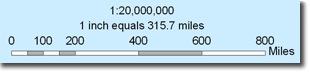
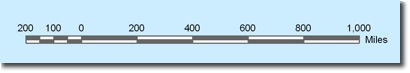
SCALE BAR
Scale bars, also called bar scales, look like a small ruler on or near the map. Since most map readers have some experience using a ruler, these are often easy for the reader to understand and use. They can be used to measure the distance between two ticks on a scrap of paper that indicate the distance between two features of interest. If the distance between the two ticks is longer than the scale bar, the reader can lay it next to the scale bar multiple times to determine the total distance.
A scale bar can be used like a small ruler to determine distances on maps.
These are easy to add to your map – simply click Insert on the top bar menu, then select Scale Bar. There are a number of predefined scale bars to choose from – after you select one, you can change many of its properties. Once inserted, you can also double click the scale bar to change even more properties.
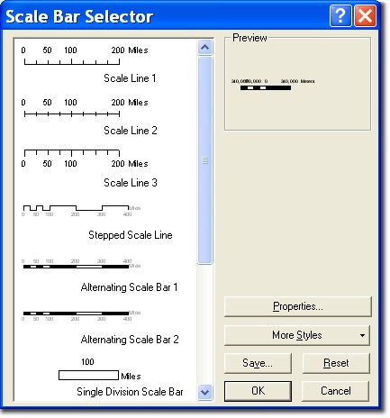
The Scale Bar Selector dialog is used to select and change the properties of the scale bar you want to insert on your map.
On maps showing the whole globe, the map scale may vary significantly from one part of the map to another. Usually the scale varies systematically from the equator to the poles. For these maps it is useful to show a variable scale bar like the one shown below instead of a single scale bar. By using a set of scale bars that relate to the scale along selected the parallels (lines of latitude), the map reader can determine what the scale will be across the entire map. Even if the location of interest is not specifically indicated on the variable scale bar, the reader can either visually or physically (by drawing it) add in a scale bar for the latitude as a horizontal line that is placed in the correct vertical position on the variable scale bar. For the scale at 45°, you would draw a horizontal line half way between the 40° and 50° scale bars, for example.
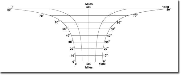
Example of a variable scale bar for a map using a Mercator projection.
Advantages and disadvantages
The scale bar has three features that make it especially useful. First, it is easy to use when figuring distances on a map since most map readers are used to working with rulers. Second, if the map is enlarged or reduced using some method of photocopying or screen display, the scale bar changes size in direct proportion to the physical size of the map. The other two scale indicators — verbal scales and representative fraction — on the other hand, will become incorrect when the map changes size. Third, both kilometers and miles can be shown conveniently on the same bar scale.
Design
The scale bar should be subtle and it should not attract the attention of the map reader – instead they should have to shift their attention in order to find it on the page. Only use as many intermediate divisions are required. The scale bar should be thinner rather than thicker, and it should use thin lines for the bar and the ticks (make sure you do this for all the lines that make up the scale bar including the ticks!) The font used to label the scale bar should be some of the smallest type of the page. Using more ticks than you need, thick lines, a wide scale bar and larger text unnecessarily complicates this map element and forces it to a higher level than it belongs in the visual hierarchy on the page.
The optimal length of the scale bar is related to: 1) the amount of space on the page devoted to the map, and 2) the distances on the map that you expect the reader to measure. The scale bar should shorter than the map itself. The largest distance (represented by the overall length of the scale bar) should be a round number, for example 1,000, and the subdivisions distances should be 50%, 25%, or 20% of that length. The width of a subdivision or combination of subdivisions should be roughly the width of the average person’s thumb, hence the phrase, “rule of thumb.”
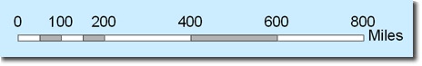
You can also design your scale bar to include an extension scale (below) which can be used for smaller distance determinations. Sometime you will see the extension scale to the left of the zero and sometimes it can be found as a greater umber of divisions to the right.
An extension scale which shows finer subdivisions of the scale bar allows for smaller distance measurements.
The scale bar is usually placed below the map, but this will depend on your page layout. An advantage of placing the scale bar at the bottom of the page is that it serves as an anchoring element that ties the page space to the edge of the page.
If you have decided to use a scale bar and you have more than one mapped area (e.g., the coterminous U.S., Alaska and Hawaii), each mapped area requires its own scale bar if they are shown at different scales.
Uses
If the map is to be used to determine distance relationships, then a scale bar is very useful to include. Most will include scale bars because route planning, navigation, and understanding about distances between places are common uses of reference maps. For , a scale bar should be used if distance determination can enhance the readers understanding of the theme shown. If the theme does not have to do with distances, then a representative fraction can be used instead to indicate the amount of scale reduction that went into making the map. You usually do not need to include an extension scale on a scale bar for a thematic map – in fact, doing so may confuse the map reader because when they see it, they will wonder what they are supposed to be using it for. For either reference or thematic maps, if you think the map will be enlarged or reduced, you should include a scale bar so that the scale indication will remain accurate.
Look for my next blog entry on another method for indicating scale on maps – representative fractions.
Following on my previous blog entry, here are my recommendations for using representative fractions to indicate scale on maps.

Article Discussion: