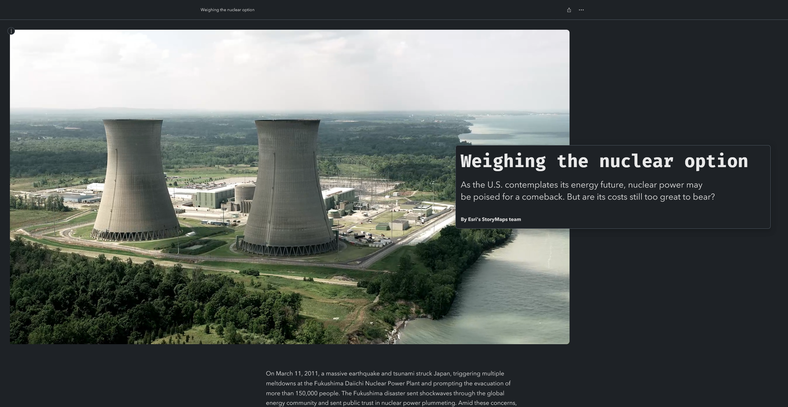
The StoryMaps team recently published Weighing the nuclear option, a visual, data-driven exploration of nuclear energy in the U.S. This article highlights some of the subtle but impactful cartographic tricks we employed in Map Viewer to clarify and contextualize the maps and datasets that form the backbone of the story.
The best place-based stories are often stronger than the sum of their individual parts. And while the techniques described below are individually insignificant, they complement and play off each other to establish a visually cohesive, immersive, and effective narrative experience. If you’re a GIS storyteller looking to elevate your web maps, you might find these tips helpful in your own ArcGIS StoryMaps projects.
Packed circles
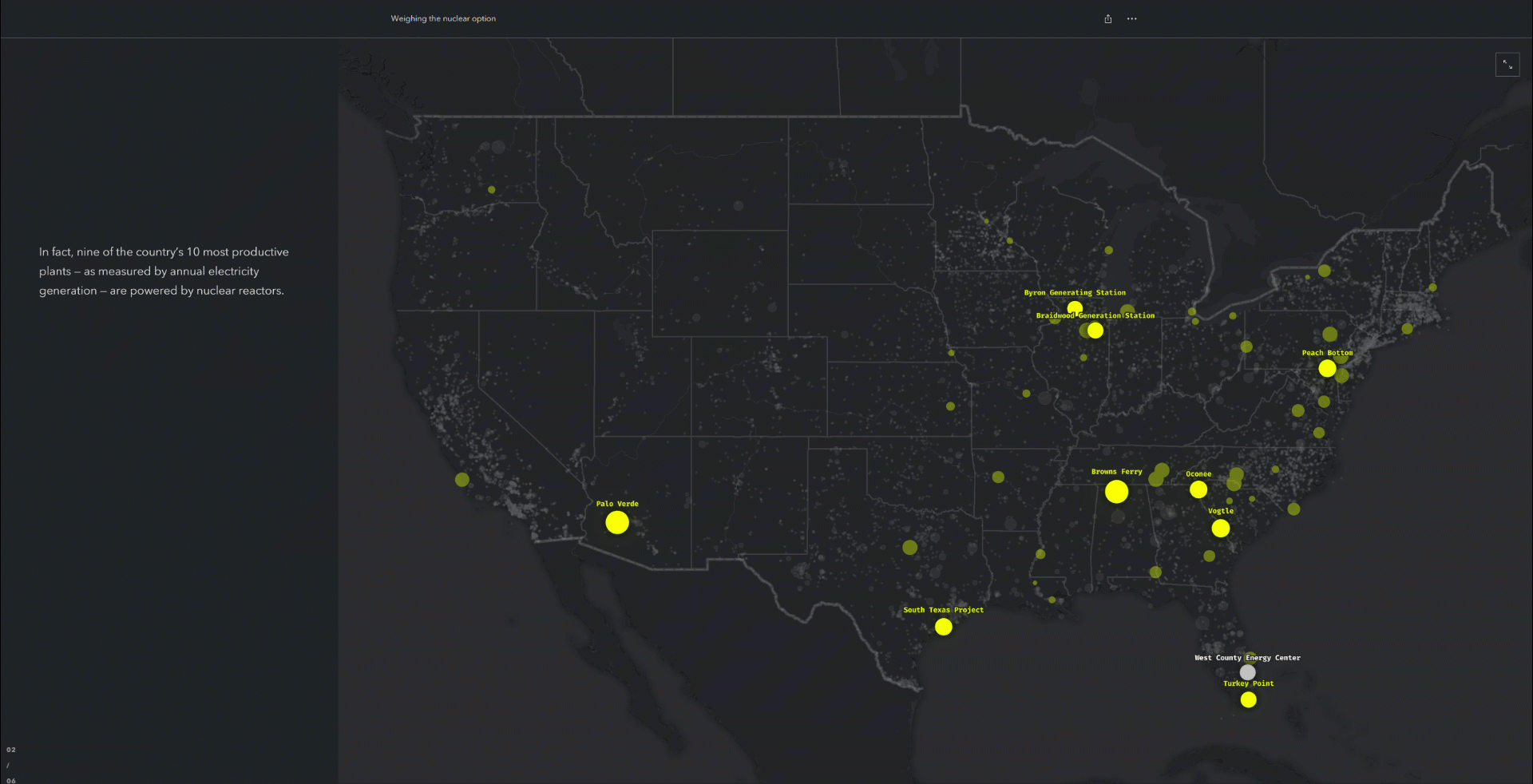
Geography is at the heart of many stories created with ArcGIS StoryMaps, and Weighing the nuclear option is no exception. But in some cases, it can be beneficial to introduce key datasets in a non-spatial manner before placing them on a map. This approach can help readers familiarize themselves with big-picture patterns in the data. It’s especially useful when the data is geographically clustered, or spread out over a vast area, or otherwise distributed in such a manner that impedes direct comparisons.
To this end, this story uses packed circles to visualize the quantity and capacity of all U.S. power plants. Individual facilities are grouped by fuel type, and sized according to their net annual electricity generation. The chart reveals a key pattern in the data that would be difficult to discern on a map: Nuclear power plants are small in number, but big in output. (In contrast, solar power plants are much more numerous but don’t produce as much energy individually.) This statistical reality is one of the story’s central themes, which is why we took care to present it in plain terms at the beginning of the narrative.

To create these packed circles, we used a lightly modified version of a script developed by my mega-talented colleague Warren Davison. The script ingests a point feature layer, then scales and groups its constituent features according to user-defined input attributes, and finally generates a new polygon layer of packed circles. Of course, the resulting features are no longer positioned in their real-world geographic locations. But the layer itself can still be added to a web map, and its features scaled and re-positioned like any other editable feature layer. This allows you to create clever map choreography sequences that transition elegantly from the non-spatial to the spatial, like the example above.
(Pro tip: Including a subtle zoom effect between the packed circles and the geographic map can smooth out the transition between the two separate layer groups, and create a more dynamic presentation.)
Generate packed circles in ArcGIS Pro →
Animated symbols
Another subtle but deliberate cartographic detail in this story is the selective use of animated symbols. Like many eye-catching cartographic techniques, animated symbols are most effective when used in moderation — for example, to create foreground-background separation or to draw readers’ attention to a few key features or areas of interest.
In the nuclear power story, we used animated symbols to highlight the 10 most powerful power plants in the U.S. (while still showing all other power plants). The pulsating symbols serve as soft storytelling cues, gently guiding readers’ attention to key features on the map without requiring explicit descriptions or annotations. Other power plants are still visible on the map, but are pushed into the background to provide context without distraction.
Learn more about animated symbols →
Media layers
The addition of media layers to ArcGIS Online unlocks some creative new cartographic possibilities. For example, in Weighing the nuclear option we used media layers to superimpose a hand-illustrated diagram onto a web map — a clever technique that we’ve explored and documented previously.

But we also used a media layer to place a photo of a specific nuclear plant directly onto the map, adjacent to the corresponding feature. While the image isn’t the focal point of the map, it still serves a dual purpose: Improving the map’s visual balance by filling an otherwise empty space, and connecting abstract data to the real world by showing what the nearby map feature actually represents.
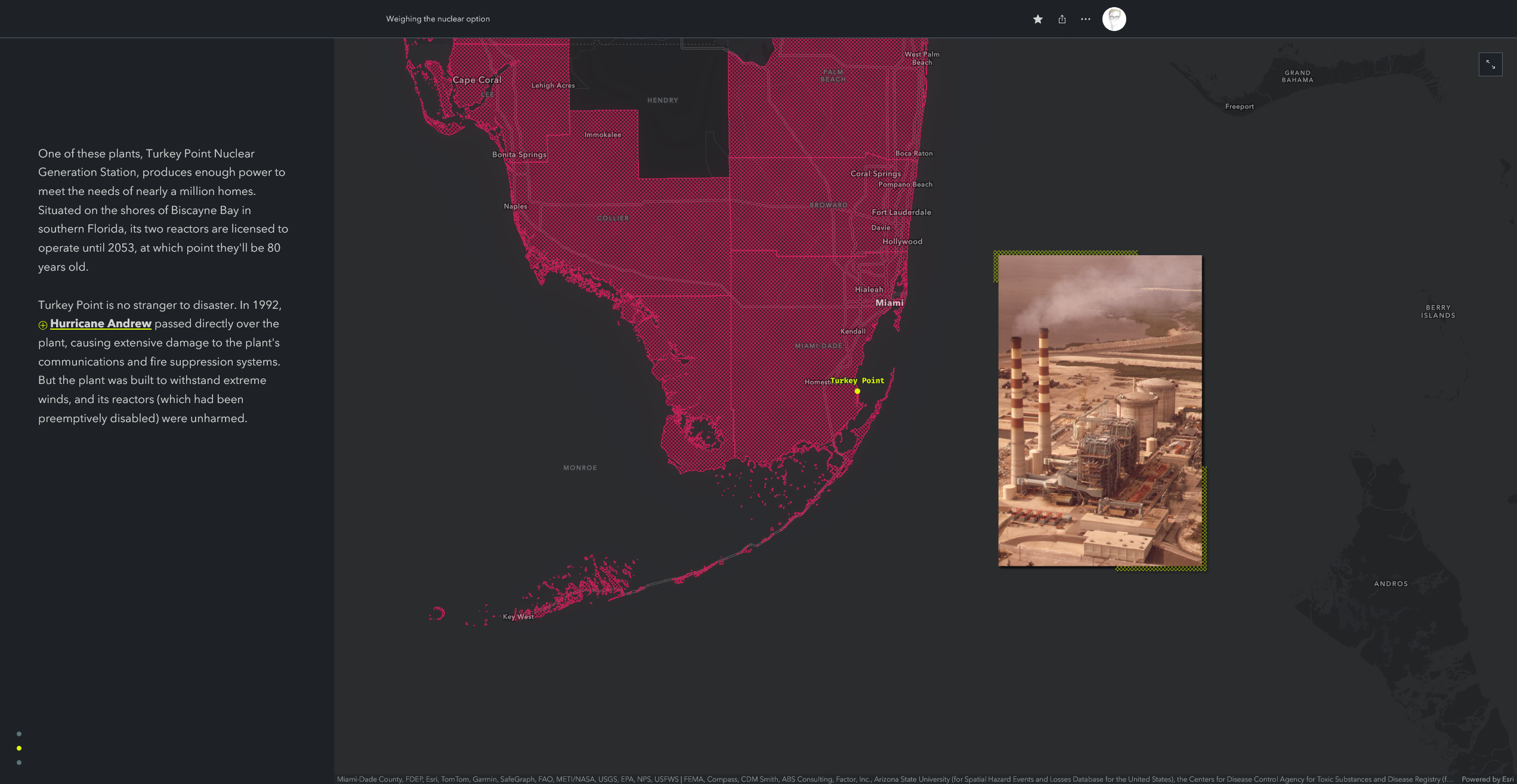
Applying layer effects to the media layer (such as a subtle drop shadow or glow) can also help the image stand out against the basemap.
Incorporate media layers into your maps →
Gradients and vignettes
It’s a common cartographic practice to symbolize well-defined areas (such as administrative boundaries or building footprints) with sharp, crisp lines. But when mapping more generalized or uncertain areas (like habitat ranges or radiation plumes), hard borders can imply a level of precision that doesn’t actually exist.
Transparency gradients can minimize the risk of implied specificity by blurring or softening area boundaries. Such cartographic styles suggest that the areas they represent are generalized, or imprecise, rather than clear-cut. In the nuclear story, for example, we combined hatched fills (a polygon style included with Map Viewer) with transparency gradients to represent the traditional lands of the Western Shoshone and Southern Paiute people. This approach masks the coarse resolution of the underlying dataset, and also improves the legibility of overlapping areas.
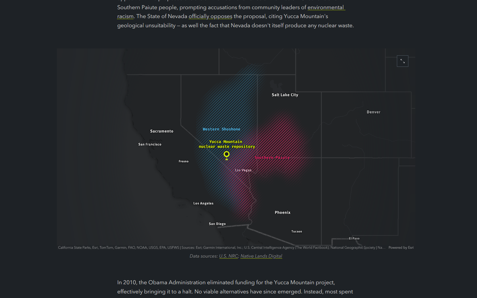
Speaking of fuzzy boundaries, a vignette — or a subtle darkening (or lightening) of the edges of a map or image — can also help guide a viewer’s eye toward the intended subject. The best vignettes are subtle; in my opinion, they should only be noticeable in side-by-side comparisons. We applied a subtle vignette to the map above in order to minimize background noise at the map’s periphery. (If you don’t notice the vignette, well, that means it’s working!)
Like the other techniques mentioned in this article, vignettes and gradients fulfill functional purposes while also contributing to an aesthetic that feels intentional and refined. Both of these edge-blurring techniques can be achieved in Map Viewer using a combination of sketch layers, layer effects, and blend modes. The video above highlights the basic workflow, which you can tweak to achieve your desired effect. Alternatively, you can check out the tribal lands web map featured above to see exactly how we implemented these styles in Map Viewer.
Apply vignettes and gradient fills in Map Viewer →
Wrap-up
These techniques are by no means groundbreaking, or especially noteworthy on their own— but together, they help build a clear, cohesive, and compelling visual narrative. Lest we forget, geographic storytelling isn’t about cramming as much information as possible onto a map — it’s about guiding your readers’ attention to specific features and locations, at specific times, and in specific sequences, in order to enhance their understanding.
We encourage you to try one or two of these techniques in your next geographic story. And if you have a favorite trick of your own, let us know! We’re always curious to see what you’re making.

Article Discussion: