Modern GIS is an important part of open science—that international movement toward making scientific research as open and accessible as possible so it can foster scientific growth and innovation and also be of practical use to society. But what does open science really mean?
The term, first coined by Canadian engineer and inventor Steve Mann in 1998, strongly implies open data, open source, open workflows, more open and transparent peer reviews (of research, data, and software), open educational resources, and—perhaps most importantly—open access.
Open access to what, though? Certainly to scientific publications, research data, lab and field samples, source code, and a treasure trove of apps for mobile devices or web browsers. And open access for whom? For other scientists in a given field, researchers in all disciplines, governments, industry sectors, schools, nonprofit organizations, and anyone else who is interested.
In short, open science is seen by many as a way to reassert science as a global public good.

If we assume, and even insist, that open science is good science, what is the best approach to doing it? How do we open our data and services to make them FAIR—findable, accessible, interoperable, and reusable?
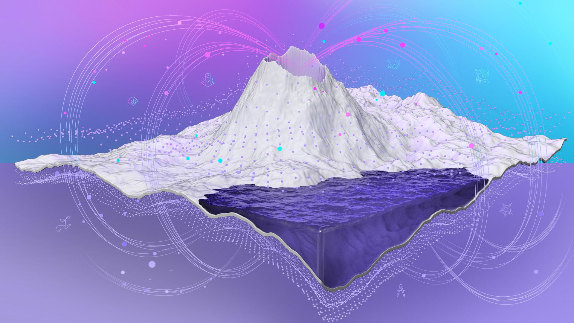
There is now literally a rainbow of open science practices to choose from that address everything from data search, analysis, and writing to publication, outreach, and assessment. But our research and communication tools are constantly changing. And many of our online labs are still a chaotic, unsearchable mess that don’t receive the same care and maintenance that brick-and-mortar laboratories do.
In his 2011 book Reinventing Discovery: The New Era of Networked Science, Michael Nielsen writes: “All that’s needed for open science to succeed is for the sharing of scientific knowledge in new media [and for that] to carry the same kind of cachet that papers do today.” Almost a decade later, the cachet of new media is actually increasing, with innovations that better democratize data, maps, apps, scientific storytelling, and more. I am, of course, talking about next generation geospatial content management systems that scientists can and should employ.
ArcGIS Hub, for one, is an easy-to-configure, cloud-based portal and community engagement platform that helps organizations work more effectively with their communities. It’s useful for scientists, too, in keeping their own communities, networks, and desired audiences informed of—and involved with—their scientific work.
Hub achieves this by organizing not just data but also tools and even people by way of information-driven initiatives. An initiative allows people to bundle content around a particular project, topic, or goal. Every initiative has a website, a core team, and the ability to send messages and content to specific audiences, including the public. Core team members can also create templates of their initiatives that include the relevant sites, apps, and pages so others within the organization or community can configure standardized content as their own.
Hopefully the power of this approach is readily apparent, especially by way of the following science exemplars.
From the nonprofit science world, there is NatureServe’s Map of Biodiversity Importance, which provides a spatial modeling infrastructure with data from more than 1,000 botanists and zoologists within NatureServe’s network. A series of compelling ArcGIS StoryMaps stories and select layers from ArcGIS Living Atlas of the World reveals, in unprecedented detail, the geographic distribution of over 2,000 at-risk species. All this information is stacked in a way that identifies the places that matter most for sustaining biodiversity in the United States.

Similarly, Conservation International has been working with Esri on a series of hub sites to support the Ocean Health Index (OHI), the first program to comprehensively assess ocean health globally and aid governments in setting appropriate ocean management priorities and policies. The first hub site, now under construction, is focused on the Philippines. This hub site provides not only data and map narratives but also gateways to ArcGIS Dashboards, ArcGIS Survey123, and developer APIs that are especially helpful for those who want to customize workflows and apps using OHI’s open data science tools. The aim is to streamline data management, target setting, and communication within that single hub site to make it easier for scientists, managers, nonprofits, governmental agencies, and citizens to access this data and collaborate.
Speaking of citizens, one of the richest resources for professional and citizen scientists alike is the Earth Challenge 2020 hub site. A collaboration among the Wilson Center, the Earth Day Network, and the United States Department of State, the resources within the hub site are guided by research initiatives aimed at raising global awareness around plastics pollution, differences in air quality, changing insect populations, and more. Within each initiative, citizen scientists can use an app to collect and integrate billions of applicable data points. [For more information about the app, see “Citizen Science App Helps Mitigate Threats to the Environment“.] They can also see their data come alive in an interactive web map or dashboard; view a range of map narratives on prior efforts; and work with a sequence of educational materials either before, during, or after data collection. This more fully engages participants in the scientific method.
Another hub site that’s extremely rich in content and variety is the Agricultural Collaborative Research Outcomes System (AgCROS) site, put together by the United States Department of Agriculture’s (USDA) Agricultural Research Service. This hub site makes it easier for staff members across the agency to share the complex data relationships that emerge from the hundreds of scientific measurements and experiments they conduct. It’s also intended to make it easier for the USDA to align with other agencies, such as the Environmental Protection Agency (EPA), the United States Geological Survey (USGS), and the National Oceanic and Atmospheric Administration (NOAA); universities; industry partners; and other stakeholders.
In addition, ArcGIS Hub is an excellent framework for quickly sharing workshops or conference proceedings, as demonstrated by the National Geospatial Technology Center of Excellence. For its GeoEd’20 conference, the organization compiled a hub site that features maps and pie charts of attendee data, as well as recordings of the sessions. This, to me, signifies conference proceedings of the future, as we continue to virtualize our scientific meetings by necessity.
On the university front, I have two favorite hub sites. The first is the California State University, Los Angeles’s Community Data Initiative, which gives students an opportunity to use open data from the City of Los Angeles to help local nonprofits tackle real-world problems. The second is the University of Michigan’s Matthaei Botanical Gardens and Nichols Arboretum hub site, which features maps, apps, and other data about the surrounding area’s plants, soils, and geology.
A final favorite is the Pacific Ocean Data Portal, being developed by the United Nations Economic and Social Commission for Asia and the Pacific (ESCAP). It aims to comprehensively monitor the sustainability of the Pacific Ocean by openly compiling assessments of regional-scale environmental and economic statistics. [For more information on this, see “The Power of Shared Information for the Pacific Ocean,” from the winter 2020 issue of ArcNews, along with a video from the 2019 Esri Ocean and Atmospheric GIS Forum.]
May the examples above serve as inspiration to those seeking to ensure that geospatial science remains—and becomes more—open so it can foster unencumbered scientific methods, workflows, interpretation, and explanation and lead to greater insight about our complex, interconnected world. Open science is good science.