Creating accessible web content matters to everyone. If your organization uses ArcGIS Hub or ArcGIS Enterprise to create sites and pages, understanding and applying the principles of accessible web design will help you provide the best experience for all visitors to your site, including those with situational, permanent, or temporary disabilities.
What Is Accessibility?
It is imperative to provide equal access to website content. Many countries seek to improve the accessibility of their web content by adhering to the Web Content Accessibility Guidelines (WCAG) at https://www.w3.org/WAI/standards-guidelines/wcag/. This set of international standards has been used to define regulations in Canada, Germany, New Zealand, and other countries with the goal of improving inclusivity.
In this article, accessibility is used as an umbrella term to refer to WCAG 2.1, Section 508, and Title III of the Americans with Disabilities Act (ADA). In the United States, WCAG sets the foundation for Section 508, a federal regulation that applies to all federally produced web content, as well as being the recommended practice for ADA compliance.
Accessibility and the Site Builder
The site builder in ArcGIS Hub lets you feature a range of content types—web maps, images, video, and text—using drag-and-drop cards. Although ArcGIS Hub works behind the scenes to ensure WCAG 2.1 AA compliance, there are still several guidelines that you should consider as you customize your site.
Site Settings and Theme
Underlined Links, enabled by default for all newly created sites, helps your site pass the WCAG 2.1 1.4.1 Use of Color guideline, which requires a noncolor visual distinction for body links. This benefits individuals experiencing partial sight, color blindness, or those using text-only displays.
Using an ArcGIS Online shared theme allows you to compare contrast between foreground and background colors, and any sites created with Hub or ArcGIS Enterprise Sites will automatically import the shared theme. Contrast is important, as it helps individuals with varying visual abilities access your information.
According to the WCAG guideline 1.4.3 Contrast (Minimum), color luminance contrast between text and background color should be greater than or equal to 4.5:1 for small text and 3.1 for large text.
WCAG guideline 1.4.11 Non-Text Contrast extends the 3:1 contrast ratio to icons and graphic elements.
If you are setting the theme within the site theme panel, you may want to verify the contrast of your selected colors with an external tool. A number of free color contrast analysis tools can be used online, such as the WCAG Luminosity Contrast Ratio Analyzer, a Google Chrome extension that allows you to compare colors with an eyedropper tool and preview your site through a range of color blindness simulators. You can also use a web resource such as WebAIM’s Contrast Checker to compare two colors by manually entering their RGB hexadecimal values.
Organize an Accessible Content Structure
As you use the cards available in the layout builder, consider the WCAG guidelines 2.4.4. Link Purpose (In Context) and 2.4.6 Headings and Labels to create a structured narrative that’s easy to navigate. Each page you publish should have at least one <h1> heading to provide visitors with context.
Row Card
Row cards are the building blocks of your site. They can be filled with any combination of additional cards, such as web map, video, image, text, and chart cards. When configuring the settings for a row, you can set a background color or upload an image. Whichever you choose, make sure that there is sufficiently high color contrast between the background and any content displayed by other cards, such as the text or category cards. If you are not sure whether a row background image provides enough color contrast, then add a light or dark background color to the row and adjust the color’s transparency.
Text Card
Sharing narratives connects your audience with the information that users need to understand your message and take necessary action. When using the text card, there are several ways you can create an accessible content structure.
Structure your narratives with sections to make it easier for screen readers to navigate text. Be sure to use the correct hierarchy of header levels, and don’t skip heading levels. Do not use headings decoratively to increase font size.
If you link to additional resources, such as external sites and pages, ensure that your text is descriptive. Rather than saying, “click here,” invite people to follow the link with phrasing like, “to learn more about x…” This strategy helps assistive technologies that may use shortcuts to rapidly jump through all the links on a page without having to read the text around those links.
As part of WCAG guideline 3.2.2 On Input, Technique G201 recommends avoiding opening links in new tabs or windows unless you provide the user with advanced warning.
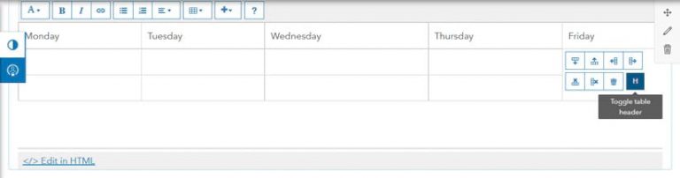
Avoid using tables to structure your layout. Tables should be reserved for basic data. Use the Toggle table header (H) option that comes with the text card table to structure your tables to provide an optimal experience for users of assistive technologies.
Don’t forget to check color contrast of a card’s link text by selecting Theme on the Customize panel and adjusting the Body Link Color.
Category Card
Category cards visualize groups of similar datasets. Choose from the library of icons for category cards that are provided as scalable vector graphics (SVGs), an image file format that can be used at different sizes without affecting image quality. Alternative text (Alt text) is automatically provided for each SVG by tying it to the link text you provide via an Accessible Rich Internet Applications (ARIA) tag.
You can also upload a custom image for your category card. If you want to use your own image, you can provide a URL for an SVG or transparent PNG file. Be sure to write alt text in the provided field so that your image is accessible to screen readers.
Share Accessible Visuals and Media
Adding images and media is a simple way to enhance your sites and pages. When choosing visuals or media to add, consider content that provides value rather than redundancy.
Image Card
The image card settings provide you with several options for customizing the display of your image, including the option to provide image alt text. Alt text is a specific attribute that is attached to an image to give screen readers a description for nonsighted users. Here are some things to consider when providing alt text:
- Alt text should be provided for all images on your site.
- Descriptions should be brief but provide enough context to justify the value of the image.
- Alt text is different from an image caption. Don’t copy and paste an image caption as alt text. If you do that, the screen reader will read the same thing twice.
- Refrain from using “image of” or “picture of” in your alt text.
- If you want your image to link to something, make sure that your image hyperlink is set to open in the same tab. Doing this makes things easier for a sighted user to navigate.
Gallery Card
Gallery cards are used to display a range of content types like apps, dashboards, web maps, documents, and additional sites and pages. Whether you style your gallery with icons or thumbnails, the images will automatically be marked as decorative to avoid redundant text descriptions. However, tying back into content structure, you may want to adjust the Gallery Card Title Heading. This will not change font size but can help you better order your nested headings.
Video Card
Per WCAG guideline 1.2.2 Captions, you will have to caption any video added to video cards, but YouTube, Vimeo, and Facebook videos are supported. (Note: ArcGIS Enterprise 10.7 provides support only for Facebook videos.)
Embedded content should always contain titles so that people using assistive technologies know whether or not they want to enter into that section of your page. Use the title setting on the video card to describe what will be presented in your video. The same goes for any content embedded through the iframe card. Always add a title describing what content can be found within the iframe.
Social Media Card
With the social media card, you can provide Facebook or Twitter posts in-line. Unfortunately, content being shown from either platforms cannot be controlled, so color contrast violations can occur. However, a toggle for the Twitter Dark Theme is included, which does pass color contrast requirements.
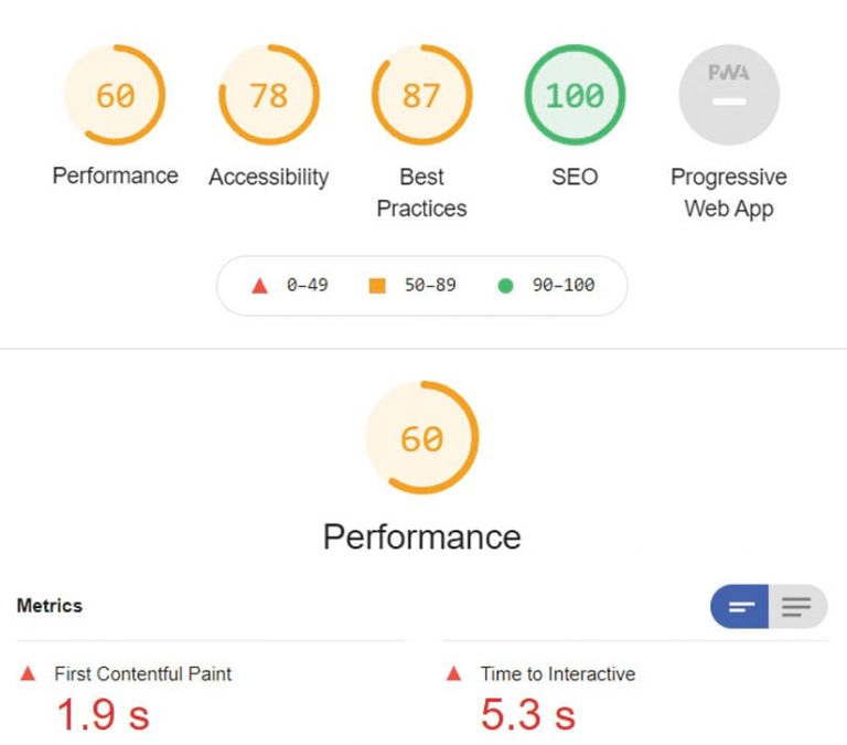
Automated Accessibility Testing Tools
There are also several tools that can run automated tests of your entire web page to check for accessibility violations. The ArcGIS Hub team uses axe by Deque as part of its development process. Lighthouse by Google is also available. Both axe and Lighthouse have Chrome extensions that can be installed so these auditing tools can run in your browser.
Get Started
Create a new site or review existing sites for accessibility improvements. If you have any questions or comments, go to the ArcGIS Hub section of Esri Community. The ArcGIS Hub Changelog is updated regularly to reflect the changes in product accessibility. For overall product accessibility status reports, visit ArcGIS Hub or ArcGIS Enterprise Sites.
About the authors

Katie Thompson