ArcGIS Living Atlas of the World provides a collection of curated maps, apps, and data layers that is continually updated and augmented. It is contributed by Esri and the global GIS user community. This content includes basemaps, world elevation and imagery layers, policy and community maps, and analysis-ready layers and tools.
Content from ArcGIS Living Atlas of the World can be mashed up with an organization’s data using tools from the ArcGIS system to make apps for visualization and analysis that provide insight and promote solutions.
Outstanding examples of apps are available through the Living Atlas interface. A curated group of apps can be found under the Apps tab or all available apps can be found via the search box on the Browse tab. CovidPulse, U.S. High Tide Flooding, and U.S. Vessel Traffic are examples of powerful apps that were created using ArcGIS Living Atlas content and ArcGIS tools.
Browse the apps and content available from ArcGIS Living Atlas of the World website (livingatlas.ArcGIS.com) for ideas on how to use this data and other resources to build apps and solve problems.
CovidPulse App
The app presents daily rates of COVID-19 infection, death, and cumulative cases as simple lines that show visual trends over time in a fashion similar to the continually updated data provided by a stock ticker. To show the proportion of infected persons in a community as it rises and falls, CovidPulse displays not only the current rate of infection but also prior ones for all 50 US states; Washington DC; and more than 3,000 US counties.
The app provides interactive access to three day-over-day trend visualizations: new cases per capita, deaths per capita, and cumulative cases (which is another per capita measurement). Normalizing the data generates a per capita rate that makes valid comparisons possible between states and counties that encompass different geographic areas.
Using the options available in CovidPulse, all three dimensions of analysis can be displayed. For each option, a tremendous amount of data can be communicated effectively because sparklines present it in an intuitive and efficient way. This data-dense technique integrates data and graphics and is hundreds of years old. The style of the visualization used in CovidPulse was inspired by COVID-19 case trend lines created by Mathieu Rajerison, U.S. and charts showing localized outbreaks during the 1918 influenza pandemic drawn by Riley D. Champine.

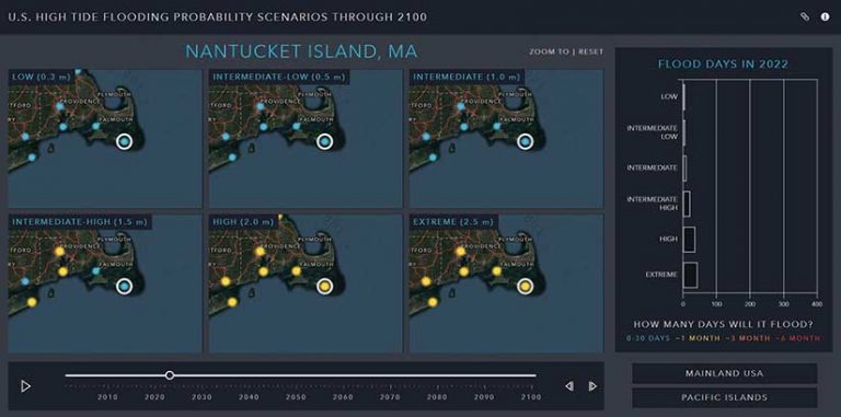
U.S. High Tide Flooding App
U.S. High Tide Flooding app allows quick visualization and understanding of US high tide flooding probability scenarios through 2100. Users can quickly assess how many flooding days are expected to occur within coastal communities each year for the different flooding scenarios, ranging from low to extreme. Coastal planners, state and local municipal leaders, regional planning councils, and alike need this information to better understand potential impacts to help plan accordingly. Increasing this understanding can help impact policy and protect the investments of citizens.
The data in this app came from the National Oceanic and Atmospheric Administration (NOAA) Technical Report NOS CO-OPS 086: Patterns and Projections of High Tide Flooding Along the U.S. Coastline Using a Common Impact Threshold and aggregated for visualization and sharing in ArcGIS Pro. The application was built with the ArcGIS API for JavaScript and uses a feature service and point layer from the Living Atlas.
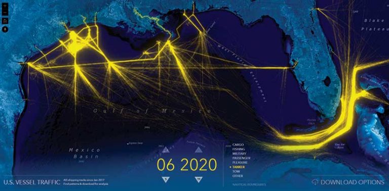
U.S. Vessel Traffic App
This web app was built with ArcGIS API for JavaScript as a simple tool for visualizing and accessing the nautical transportation and commerce data provided by the Automatic Identification System (AIS). Transmissions collected by the US Coast Guard (USCG) from onboard navigation safety devices, AIS data provides the characteristics and current locations of vessels in US and international waters for safe navigation and collision avoidance purposes. This massive data source is provided by the USCG, NOAA, and the Bureau of Ocean Energy Management (BOEM) through Marine Cadastre, an integrated marine information system.
While AIS data can be both useful and fascinating, its enormous size can hamper its use because it contains both current and historical data points. Rather than downloading, converting, and managing gigabytes of AIS data, the U.S. Vessel Traffic app lets its users visualize and export of a geographically specified subset of that data that is further filtered by time period.