You may have heard that data from the 2020 Decennial Census has been protected using differential privacy and have questions about mapping this data.
The US Census Bureau’s twin aims of ensuring both privacy and accuracy are inherently in conflict. This is especially true with the increasing availability of advanced computing and data linking. The Census Bureau protected the privacy of the 2020 Census by applying differential privacy through injecting noise into the data and doing additional data processing. In short, the trade-off in the 2020 Decennial data is that census respondents’ data will be more private, but individual values at the lower levels of geography will be less accurate.
What Does This Mean for Census Data?
Think of a pointillist painting. At the individual brushstroke level, the painting makes no sense. But when you stand back and can view all the points in the painting, the picture becomes clear.
The Census Bureau “fuzzed” data at very low levels of geography—such as block, block group, and tract—to protect respondents’ privacy. Census guidance on working with this data is simple: aggregate up.
What Are Layer Effects?
Layer effects bring Photoshop-like capabilities to the layers in web maps. Some examples of effects are bloom, drop shadow, hue rotate, and sepia. One effect that I find useful is blur. Blur defocuses or softens feature edges. It was originally designed to soften edges of a polygon when mapping data—such as the range of grizzly bears—that lacks a precise boundary or has a shifting boundary.
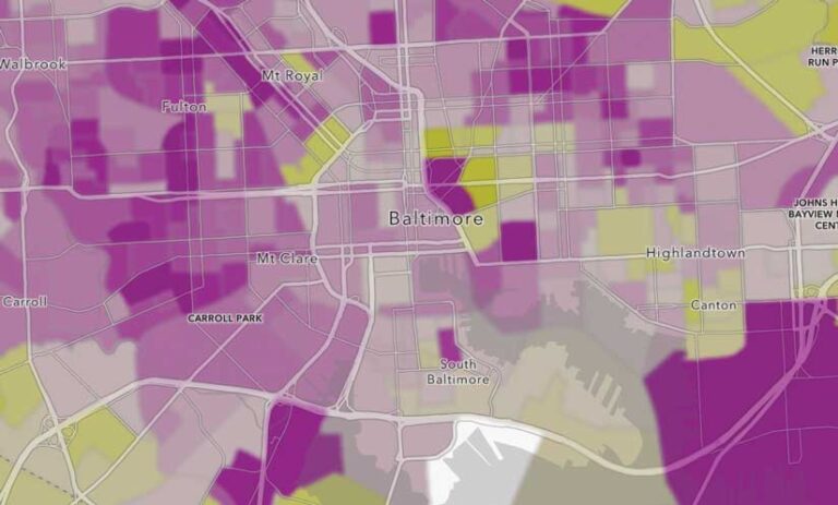
Blur is the perfect effect for data that has been protected with differential privacy. Blur provides a visual cue to anyone reading your map that things aren’t accurate at the individual block, block group, or even tract level. Figure 1 is a map of housing vacancy rates at the block group level in Baltimore, and the blur effect was not applied.

Figure 2 shows the same map with the blur effect applied. It’s harder to tell the vacancy rate for an individual block group because it is difficult to tell the color of individual block groups. Yet, you can still see that there are different areas within Baltimore with various vacancy rates.
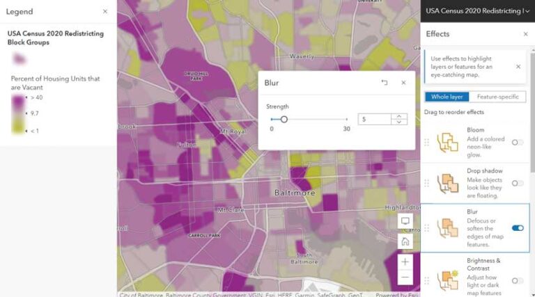
In the case of multiscale maps, the blur strength can increase as the geographic resolution increases. The blur strength determines the intensity. The higher the value, the stronger the blur. With census data, apply the strongest blur to blocks, a less strong blur to block groups, and an even less strong blur to tracts. This rewards your map’s audience for zooming out with an increasingly clear picture. Your map reader will be visually aggregating up as the Census Bureau recommends, which improves accuracy.
What Blur Does and Doesn’t Do
Blur simply creates a fuzzy look in your map, which signals to your map’s audience that there is some fuzziness to the data. This can visually communicate that there’s some noise in the data. The blurred effect comes through in your map’s legend, which is the main way the map’s author communicates what the map shows.
Applying a blurred effect does not make the entire map fuzzy. If there are points or lines on top of the blurred polygons, they will be sharp (unless blur has also been applied to them). Basemap labels and details will have their usual high resolution. Figure 3 shows how the blur effect is selectively applied so that the streets and labels from the Human Geography basemap are crisply rendered.
Blur, like all layer effects, does not change the underlying values in the data. Any analysis performed using your map will not be affected.
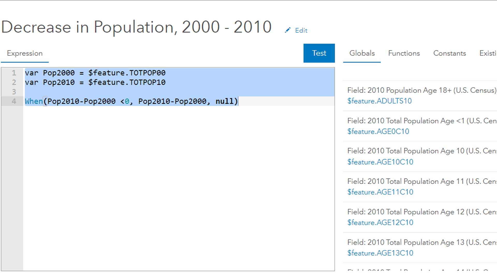
You can take blur one step further and present an aggregated calculation of some of the attribute fields. The 2020 Census redistricting data and maps available in ArcGIS Living Atlas includes the ArcGIS Arcade expression used by ArcGIS Living Atlas of the World team members to incorporate the values of adjacent features when presenting data in pop-ups.
Will you use blur when mapping census data or other noisy data? Share your experiences on Esri Community.
Additional Resources
See What is Differential Privacy? How will it affect our work?, an ArcGIS StoryMaps story that introduces differential privacy.
Visit Esri’s Differential Privacy Resources site, which was specifically designed for GIS analysts.
Visit the US Census Bureau’s comprehensive resource site on this topic.
Read the ArcGIS Online help documentation to learn more about layer effects.
For all the details on the census redistricting data that’s available in ArcGIS Living Atlas, see the “Census redistricting data and maps available in ArcGIS Living Atlas” blog post.
For a list of all the 2020 Census data that is available throughout ArcGIS products, see the “Access 2020 US Census Data with Esri” blog post.