Traditionally, using American Community Survey (ACS) data required processing the newest estimates from the US Census Bureau each year, which could take days or weeks.
Since 2018, ArcGIS Living Atlas of the World has made many ACS tables readily available for use with your GIS workflows. These layers are updated automatically each year when the US Census Bureau releases its annual estimates.
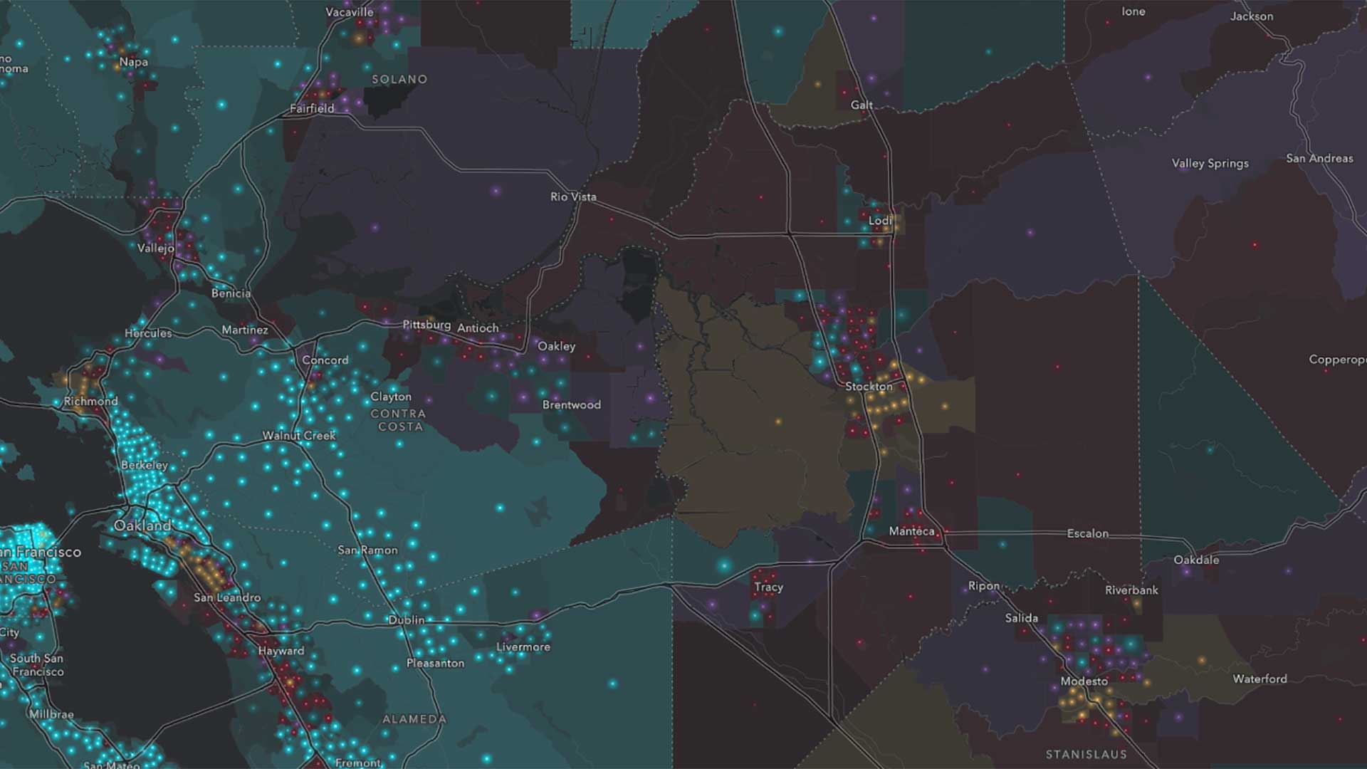
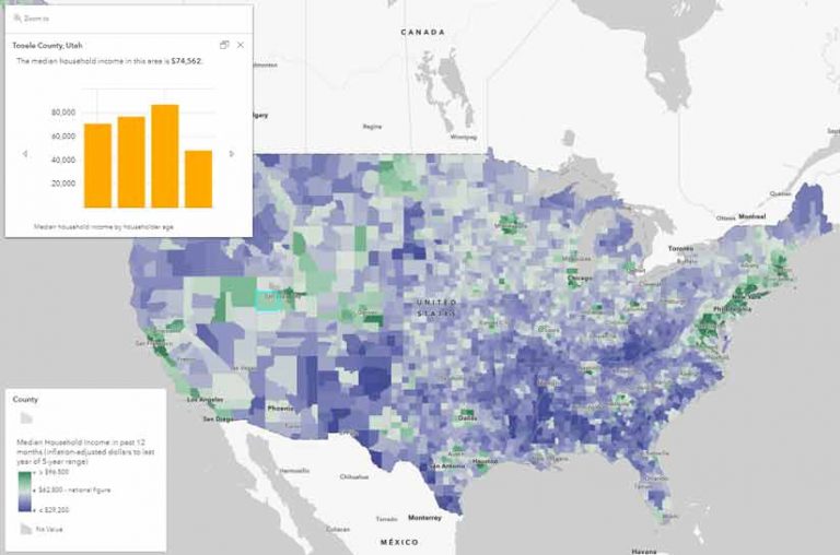
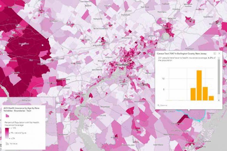
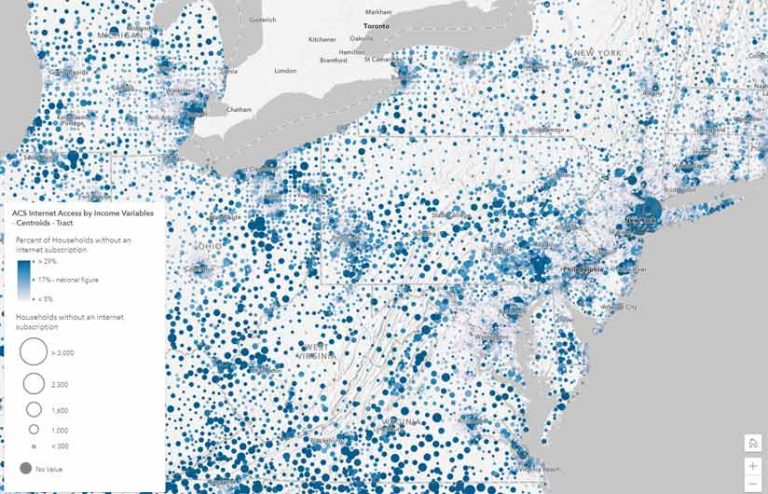
You can quickly map more than 1,700 ACS attributes covering a wide range of demographic topics such as income, housing, age, race, and education. Each layer maps an interesting subject with informative pop-ups. You can immediately see important patterns anywhere in the United States or Puerto Rico. You can also use the layers to create your own customized web maps and applications to tell an endless number of stories about the population or housing in an area.
These layers are accessible in ArcGIS software, are free to use, sourced directly from the US Census Bureau API and require no login or credits. To make using these layers even easier, percentages and related margins of error have already been calculated. These layers are provided as both boundaries and centroids layers.
New Enhancements with this Release
As of December 11, 2020, these layers contain the newest 5-year estimates for 2015-2019. Boundaries layers always reflect TIGER (Topologically Integrated Geographic Encoding and Referencing) boundaries that are appropriate for the newest ACS figures. In this update, many layers have adjusted cartography that highlights the national rate of the attribute being mapped and legends that clearly state the national figure, which helps create a reference point for map readers.
The alias names have been updated to describe race and ethnicity attributes to be consistent with the ACS race and ethnicity categories as published by the US Census Bureau.
Some attributes with precalculated percentages now have revised calculations based on feedback from the US Census Bureau. These attributes help you map a normalized attribute quickly without needing to research what the denominator should be.
New Attributes Allow for More Mapping Possibilities
ACS layers in the ArcGIS Living Atlas of the World cover a host of topics around housing, income, internet access, education, disability, and other characteristics, created in response to user requests. New attributes include:
- Disability by Type—This attribute shows types of disability and persons who have difficulty living independently.
- Health Insurance by Race and Age—This attribute lets you see where there are disparities in the rates of uninsured persons.
- Household Size—This attribute identifies communities with many one-person and two-person households. See how household size differs between owners and renters and map the average household size anywhere in the country.
- Housing Units Vacancy Status—This attribute shows areas with many seasonal or recreational homes. You can explore the rental and homeownership vacancy rates to see where these markets have been tight.
- Housing Units in Structure—This housing attribute provides data on single-family detached, small multifamily units, high-rise apartments, and mobile homes, and the type of occupancy.
- Housing Units by Year Built—The attribute provides the location of newer and older housing units and the type of occupancy.
- Internet Access by Income—Assess the state of the digital divide in a community using this attribute.
New 2010–2014 layers allow for comparisons over time. Many users have requested historical ACS data so that they can compare how patterns have changed over time. Because the 2010–2014 layers and the most recent 2015–2019 data match and are symbolized in the same way and none of the survey years overlap, they can be used to compared changes in patterns of distribution in a map.
There are several tools for comparing layers. The Compare App (https://bit.ly/3asMtgv), a free configurable app template, supports side-by-side or stacked comparison of two maps or scenes. Swipe comparisons in an ArcGIS StoryMaps story, classic Esri Story Maps app, or ArcGIS Web AppBuilder app are also supported by this data. Also bring layers into ArcGIS Pro to join, analyze, and map change over time.
Get Started Today with These Resources
- Learn where to find these census ACS layers and how to start using them in your mapping and analysis workflows from this story map, “Easily Access and Use American Community Survey Data.”
- Look at the American Community Survey (ACS) Current 5-Year Estimates group.
- Read “Make a Map About Your Community in 4 Easy Steps” for a quick introduction to suing ACS data.
- Get answers to any of your questions from the “FAQs for ACS Hosted Feature Layer” page or by posing them to the Living Atlas community on GeoNet.
- You can also learn more about the layers from the blog post “Mapping American Community Survey (ACS) Data Just Got Easier.”
If you already use ACS data in your maps, make sure you update them with this new data. When updating data, check class breakpoints to ensure that the map symbology still makes sense.