Because I am a geographer who makes a lot of thematic maps, over time I’ve noticed the key moments in the decision-making process that dramatically influence each map. This article discusses how a typical thematic map of a percentage comes into focus and how you give it purpose. The software (in this case, ArcGIS Online) starts the map, but it takes a human to make that data meaningful and give the map purpose.
To start, we need data and an idea of what we want to map. Esri recently hosted County Health Rankings 2018 from the Robert Wood Johnson Foundation and the University of Wisconsin Health Institute. This layer contains dozens of useful measures, each waiting to be turned into useful information on a map.
Let’s pick just one subject among the many attributes in this gold mine of data: Percent Low Birth Weight. It represents the percentage of all births in a county that meet the standard of low birth weight. We need an idea for the map. It is easy to imagine a map of the counties, each shaded by its low birth weight percent. Pretty straightforward.
As always, let’s explore the data on the map first to compare what we know about the subject to what’s on the map, and then make a thematic map of it. That first step (exploring the data) is key. Unfortunately, a lot of people simply want to get the thematic map done as quickly as possible without thinking critically about the data. They choose a default classification technique, verify that the map shows some variation in colors, and call it a day. That map is unfinished.
How can you tell a thematic map has been rushed? These four characteristics indicate a map that was created without a specific purpose:
- Default colors, outlines, and classification settings were used.
- The breaks used to set the colors have no intrinsic meaning—they are just numbers generated by an algorithm.
- The colors have not been chosen to emphasize the interesting part of the data.
- The legend contains unnecessary levels of precision.
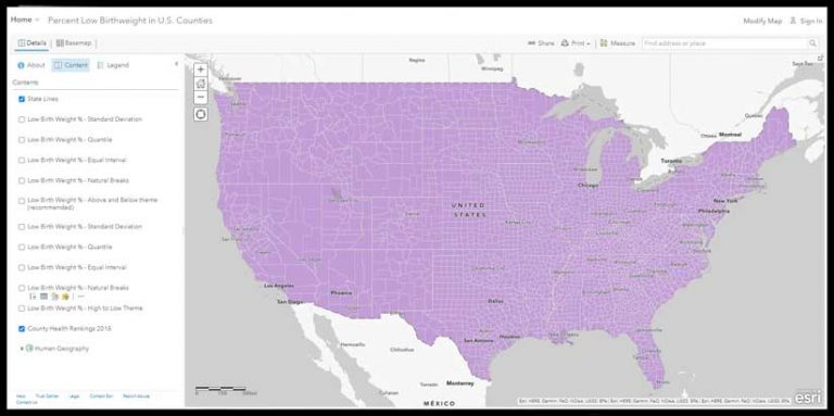
To follow along with this article, open the County Health Rankings 2018 map from the ArcGIS Living Atlas of the World in ArcGIS Online. Click Modify in the top right corner of the map.
- Click Content and uncheck Low Birth Weight %—Above and Below theme (recommended).
- Rename the County Health Rankings 2018 to Low Birth Weight. Choose the Change Style button on the layer and choose Percent Low Birthweight for 1. Choose Percent Low Birth Weight as the attribute to explore.
- Choose the Counts and Amounts (Color) style of map. This style applies a color to each county, based on the value found in the Percent Low Birthweight attribute for that county. Click Options to explore this data a bit using some settings that decide which counties will be shaded what color.
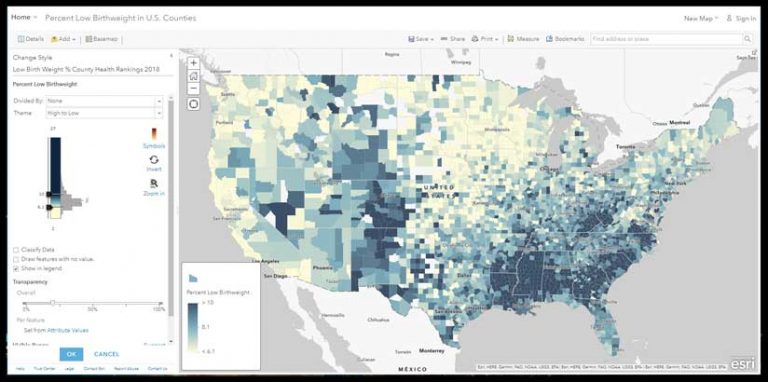
High to Low Theme
This is where ArcGIS Online saves you time and makes you a better mapmaker. All you did was touch an attribute, and the map lights up with a suggested High to Low theme using a yellow-to-dark blue color ramp, with key breaks set at one standard deviation around the mean. It takes fewer than five clicks to get to this very useful first map.
ArcGIS Online shows you the color ramp next to a histogram of the data. For the High to Low theme, the little handles indicate at what values dark blue or yellow is applied. In this case, counties with 10 percent low birth weight or higher will be given a full dark blue color. Counties with 6.1 percent or lower will be given a full yellow color. These extreme values are not the main story in this map style.
Values between 10.0 and 6.1 are shaded a color somewhere between dark blue and yellow, depending on where the value falls. Sometimes referred to as unclassed or continuous color, its value is that you get an overall pattern on the map, and you can see how neighboring counties vary slightly. I’d call this data-aware color or detailed color or data-faithful color.
Where did these values come from? They are 1 standard deviation above the mean (10.0) and below the mean (6.1). From the legend or by hovering the cursor over the x in the histogram, you can see that the mean is 8.1 for this dataset. (Note: This is the average of the data, not necessarily the true national average, because counties vary widely in population, from hundreds to millions.)
At this point, I always search the documentation or online for what the literature has to say about the subject. In this case, the source data did not provide the national average for percent low birth weight, but a broader search found several indications that 8.1 percent is indeed the national average. This is useful information to have as you think about how to style this map.
This default is just a starting point. It is not the one-size-fits-all solution for making maps. It is a great map style for initial exploration of the data, so that you can ask yourself, What part of this data is interesting? From the histogram of the data, we see a pretty normal bell curve with a little skew toward higher values.
A color ramp that has a light color on one end and a dark color on the other end works well. The darker colors are applied to the higher values, but even the middle of the color ramp (near the 8.1 percent national average) is already shading to blue.
If the story needs to focus mainly on areas where low birth weights are a problem, the High to Low theme is a good option. The High to Low theme does not take a national average or mean into account, unless you adjust a break to use such a figure.
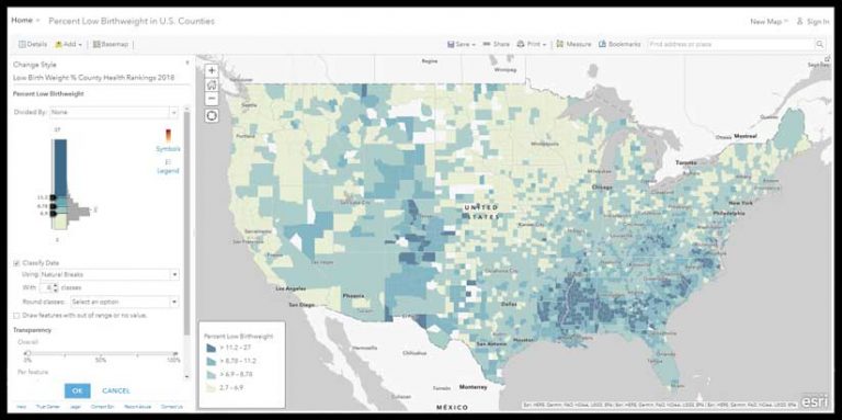
High to Low Using Natural Breaks
Let’s explore the same data using classification to see where it starts the map. With the same layer, turn on Classify Data. This defaults to a Natural Breaks method. The darkest color is assigned to values at or above 11.2, so the effect is that it is harder for a county to earn that darkest color. The values between 8.78 and 11.2 all get the same color, as do all values between 6.9 and 8.78 and all values below 6.9.
These breaks are where the Natural Breaks algorithm found a mathematical reason to divide the data up into the four breaks it was told to use. There are eight different numbers in this map’s legend, with no explanation of their significance. The dark blue color begins at 11.2 percent. Is this to be considered a high rate? Which shade of blue includes the national average of 8.1 percent?
Unless we adjust a break to use 8.1 percent, we can’t really speak to that figure effectively on the map. All this map says is that some places have it worse than others. We have not provided a standard of comparison with which we can leverage the use of color.
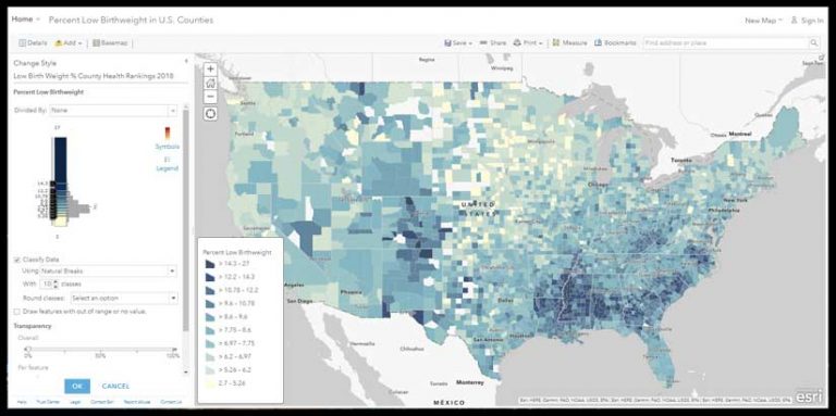
Increase the number of natural breaks to 10. It’s essentially the same map, but now the legend is a little more challenging to read and interpret.
With 10 classes, we can see more detail around those darkest blue counties. But if a legend with 8 numbers for a map author to explain and a map reader to interpret is difficult, a legend with 20 numbers is even more difficult.
In the legend for the map with 10 breaks, can you find which class would contain the national average of 8.1 percent, and then find a sample county at or near that average? There are nine shades of blue to choose from, and this legend infers that you should be able to distinguish among them.
Whether your map has 4 or 10 classes or is not classified, the legend on a web map is a poor way for someone to understand the actual value in any single county. A label or pop-up can provide the specific value as needed. Because we have not assigned any specific meaning to the classes, such as “>14.3 (Eligible for funding),” the legend is there to simply orient the user about what the color means generally.
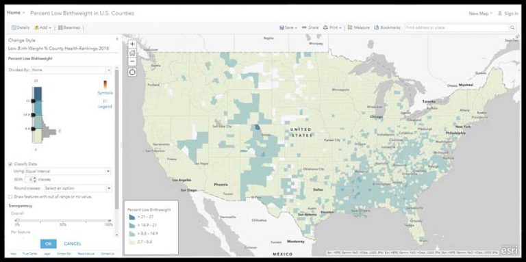
High to Low, Using Equal Interval
With Classify Data turned on and the Equal Interval method selected, the darkest color is assigned to values at or above 21, so the effect is that it is very hard for a county to earn that darkest color. The values between 14.9 and 21 all get the same color, as do all values between 8.8 and 14.9 and all values below 8.8.
The map now looks very soft, and the histogram and color ramp tell us why. Most counties fall within the lowest category. To many people, this map would suggest that low birth weights are not much of a problem anywhere except that one northern Colorado county.
That’s because the Equal Interval method takes the maximum value minus the minimum value in the data, and divides that by the number of classes to set the interval. If the minimum value was 0, the breaks would shift. If the maximum was not 27 but 270, the breaks would shift, dramatically. Outlier values have a big effect on this option. Note that the national average 8.1 percent would fall into the lowest category.
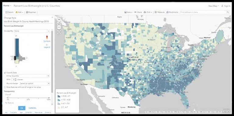
High to Low, Using Quantile
Classify data using the Quantile method, and the map changes noticeably. The Quantile method ensures that each color will have an equal number of features in it when possible. If you have 1,000 features, the Quantile method will stuff 250 into each of the four colors in your ramp. It’s the ice cube tray of thematic mapping, in that each cube (class) will be the same size no matter what is going on with the data.
The darkest color is now assigned to values at or above 9.08; the values between 7.8 and 9.08 all get the same color, as do all values between 6.7 and 7.8 and all values below 6.7. The national average of 8.1 is in the second-darkest blue. The Quantile method ensures you’ll have lots of colors on the map, but they’ll have no intrinsic meaning for this layer.
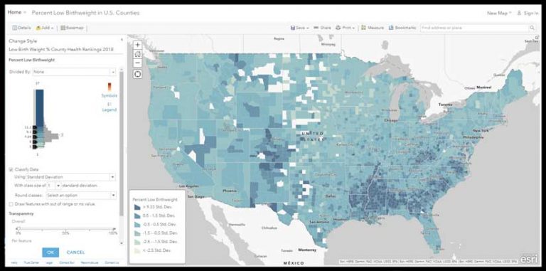
High to Low, Using Standard Deviation
Changing to Classify Data using the Standard Deviation method assigns the darkest color to values at or above 11.1, and other breaks are introduced in 1 standard deviation intervals. This is a useful method when trying to get a more fine-grained understanding of how quickly your data deviates from the mean on the map. However, the legend is unintelligible to most people because it no longer shows the actual percentages. Consider your audience before showing them a thematic map with this legend. You can manually edit the label of each class to be more meaningful (i.e., >11.1% (Very High) .
You can see from the map that this standard deviation method slices the histogram neatly and applies a color ramp to those slices consistently. The High to Low color ramp spreads the blue color progressively across the classes. The map is mainly blue, because the center of the color ramp is itself a medium blue.
Should You Classify?
Does it matter that a county with a value of 15 is symbolized with the same color as a county with a value of 20.9? In effect this map is saying there is no difference between those two counties.
The person making the map should decide if classification is appropriate. It’s not a matter of one being right and another wrong, but it is a matter of knowing how classification tends to eliminate detail, and whether detail is important to the story your map needs to reveal.
All maps in this article take two colors (yellow and blue) and—in effect—smear them across the page based on the breaks you accept or (preferably) set based on your knowledge of the subject. When 4 or 5 or 10 classes let you simplify the world for someone based on a reason they can relate to, then classify! If you can assert why there is no significant difference among features within a given class, that is a reason for that class to exist. It has a meaning, so its use is justified.
Otherwise, give the data a chance to breathe a bit and uncheck that Classify box to let the additional detail drive interest and generate additional questions. Questions raised during the early stages of making a thematic map inevitably lead to better maps.
About the author