Data visualization is an attempt to answer questions about raw data. These questions typically start with words like what; how much; when; and of course, where. In addition to these, people frequently ask questions about how a data variable changes over time. These could be questions such as the following:
- How did population change from 2010 to 2020?
- Over the last 30 years, has the climate been warmer or cooler?
- Where has voter turnout increased or decreased since the last election?
In this article, I demonstrate six ways to visualize change over time using the ArcGIS API for JavaScript with the following approaches:
- Toggle layer visibility
- Swipe widget
- Side-by-side views
- Stacked rings
- Above-and-below theme
- Animations

1 Toggle Layer Visibility
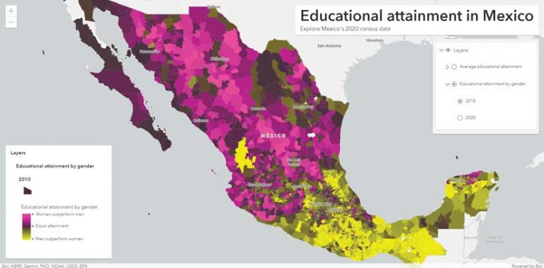
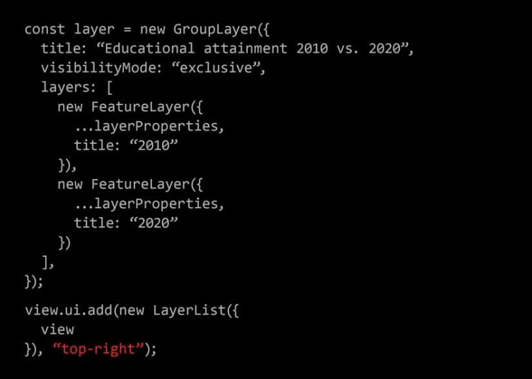
The classic way to compare change is to display the data in separate layers and toggle each layer’s visibility on and off. I created an app that visualizes average educational attainment for Mexico in 2010 and 2020 by adding both layers to a GroupLayer with an exclusive visibility mode property. That makes it easy for the user to toggle layers off and on using the LayerList widget as shown in Listing 1.
This approach works well when two layers differ greatly, and those differences can easily be spotted when layer visibility changes. This is generally true of choropleth maps (maps that use polygons with a fill color). This approach is not as effective when the layers use graduated symbols.
2 Swipe Widget
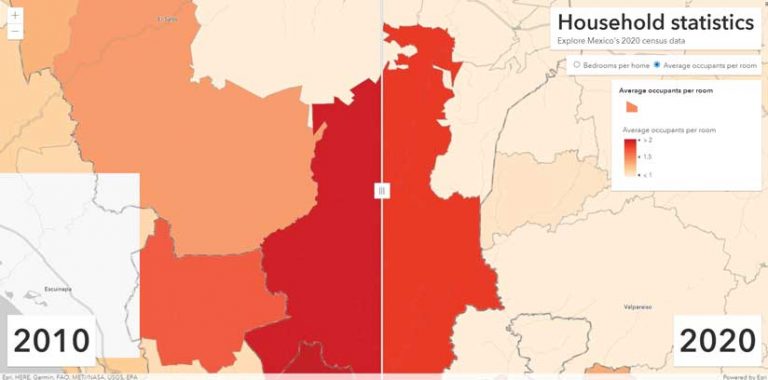
Using the Swipe widget is another way to compare how data changes over time. It is very similar to toggling layer visibility, but instead the Swipe handle is dragged to view the change, like turning the page of a book. View this app, which visualizes household statistics for Mexico, to see how the Swipe widget works.
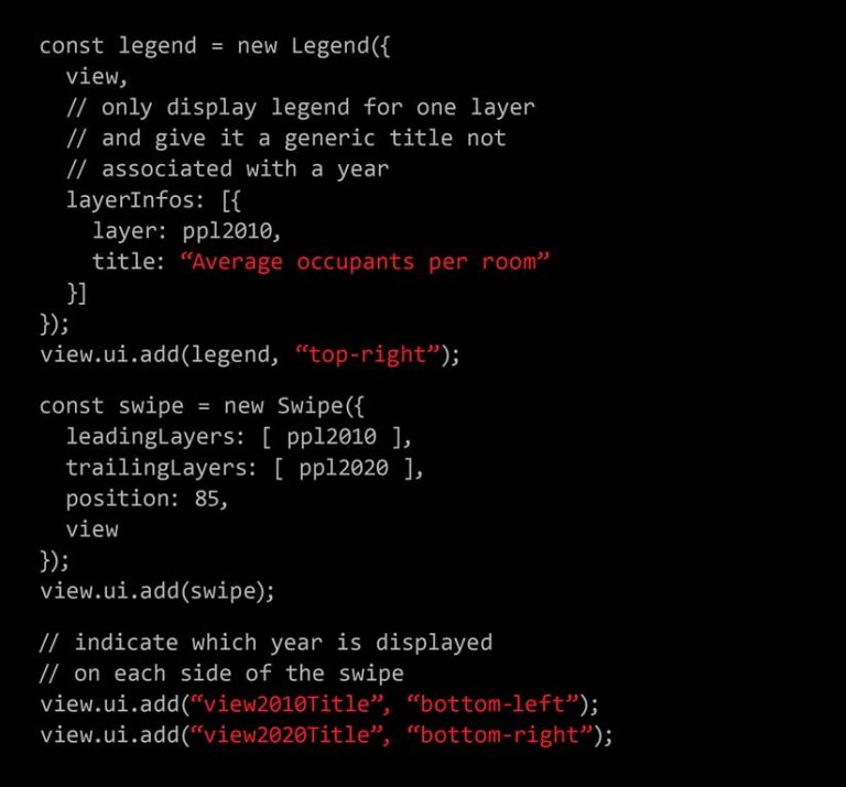
To create this experience, construct a Swipe widget instance as shown in Listing 2. Then reference layers under leadingLayers and the other layer under trailingLayers. Since the color ramps in each layer should match to make a fair comparison, only the style information for one of the layers is displayed in the legend.
Like toggling layer visibility, this technique works well when layers differ significantly, but with the Swipe widget, data from the same feature for both time periods can be compared by straddling the feature with the Swipe handle. The swipe experience can be easily added to ArcGIS StoryMaps apps.
3 Side-by-Side Views
Sometimes viewing data in side-by-side views can be the most effective technique for comparing change over time because it doesn’t require any user interaction. The user can see all the data in one glance and determine which scenario is better or worse over time.
Because this approach requires a lot of visual scanning between two views, it does not work well when the differences between two visualizations are subtle. The side-by-side views approach works best with small-scale phenomena that change significantly over time. In most cases, the toggle or swipe approaches are more effective. Displaying two layers in side-by-side views can be effective for showing the difference between two layers at a single glance.
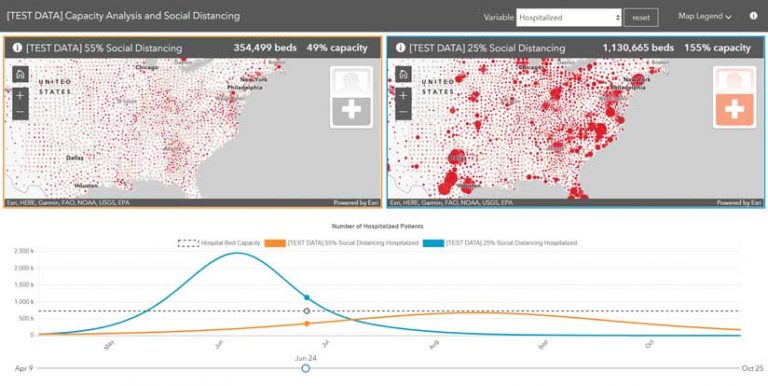
This example, Capacity Analysis, is an ArcGIS Online configurable app template that uses side-by-side views to compare the output of two models predicting the demand for hospital beds as a result of the COVID-19 pandemic.
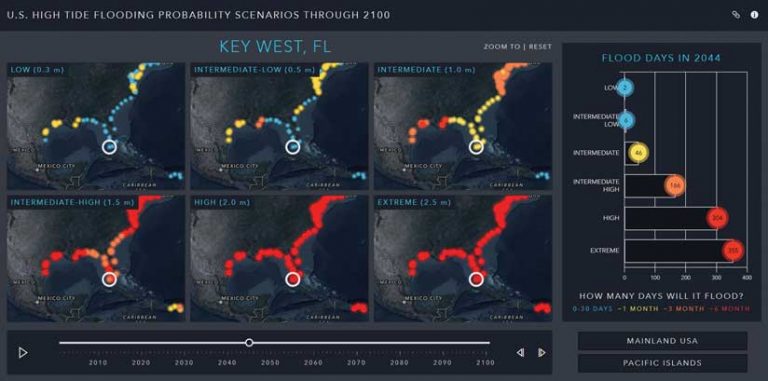
You can also use the side-by-side view technique to show data for more than two time intervals. However, since most browsers support no more than 16 WebGL rendering contexts (one context is required per view), a single app is limited to no more than 16 views. The app, U.S. High Tide Flooding Probability Scenarios through 2100, uses six views to compare data representing the probability of high-tide flooding for the next 100 years.
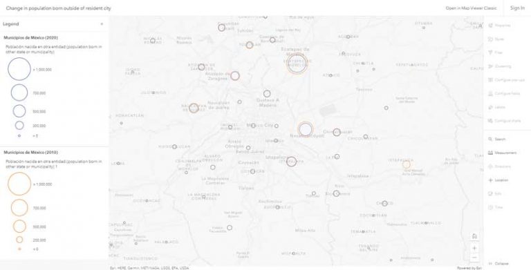
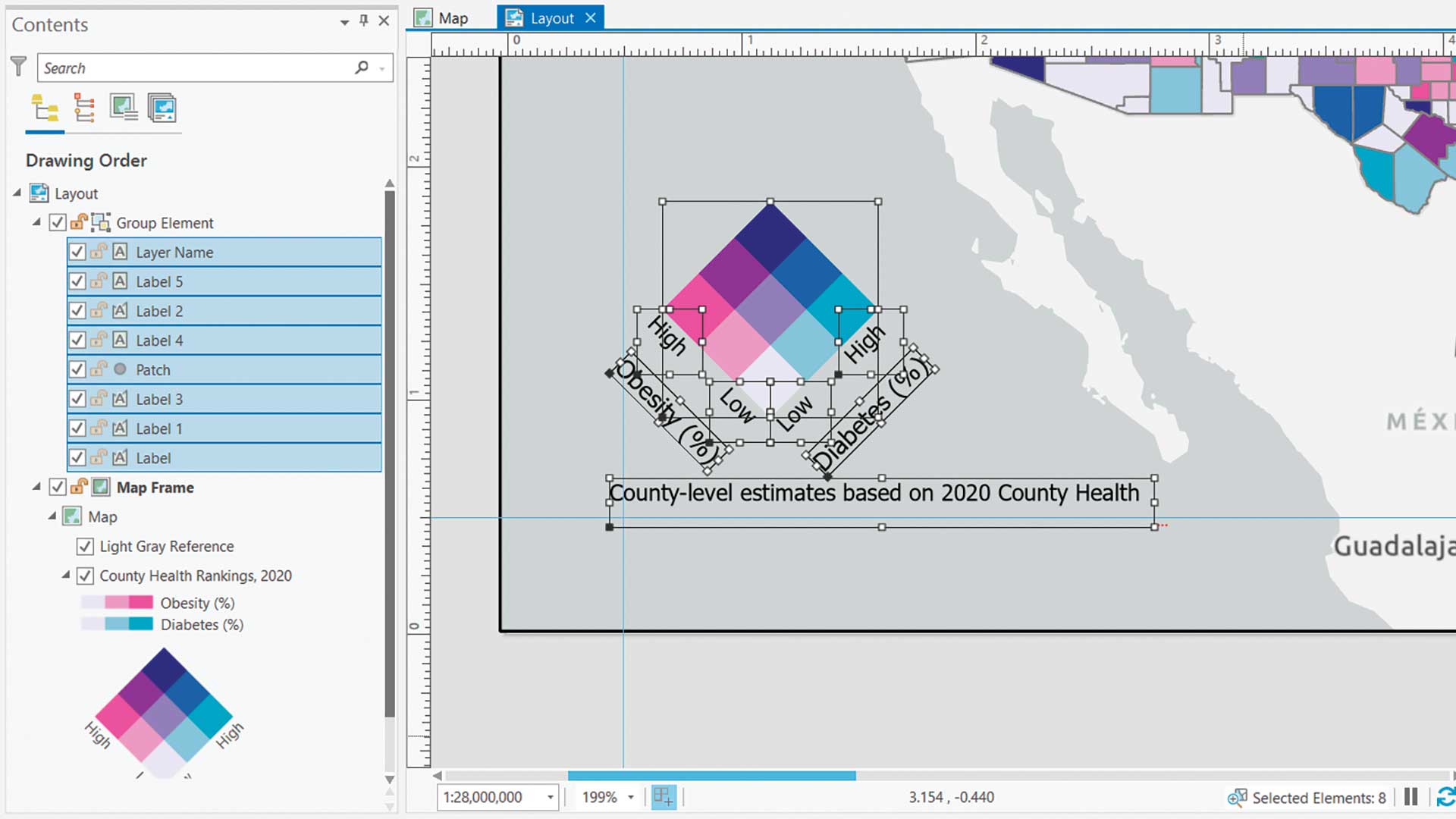
4 Stacked Rings
Stacked rings can be used to show a variable’s value in one year compared to that in another year. Rings of the same size indicate the variable experienced little or no change from the previous year. To implement this technique, set the style for the marker symbol to none and represent each year with different colors. The size variable configuration (i.e., stops) must be identical between the two layers. This technique can be difficult for users to understand, so use it with caution. It works best with small, dispersed datasets and will not be as successful in layers that have dense, overlapping icons.
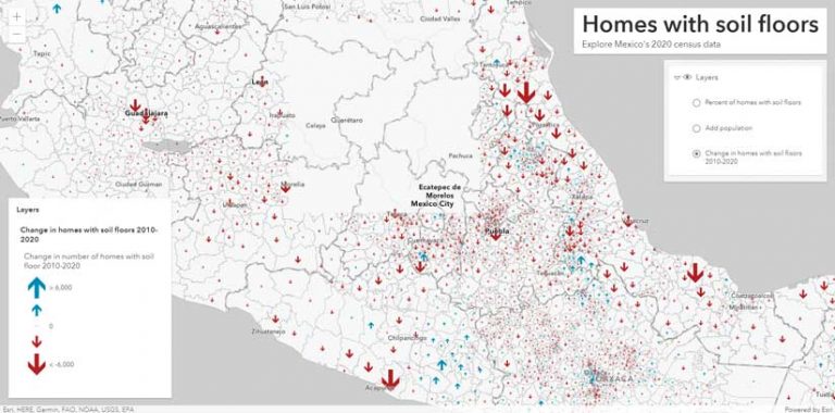
5 Above-and-Below Theme
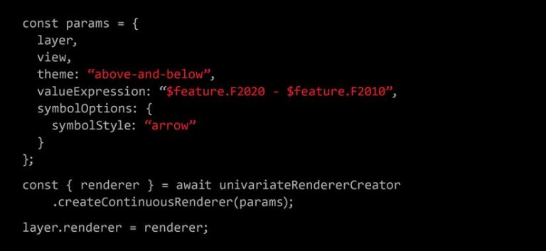
To view growth or decline over time at one glance, use the above-and-below theme for color and/or size. This approach involves calculating the change between the two variables (either as total change or as percent change), and visually indicating that difference with a single renderer.
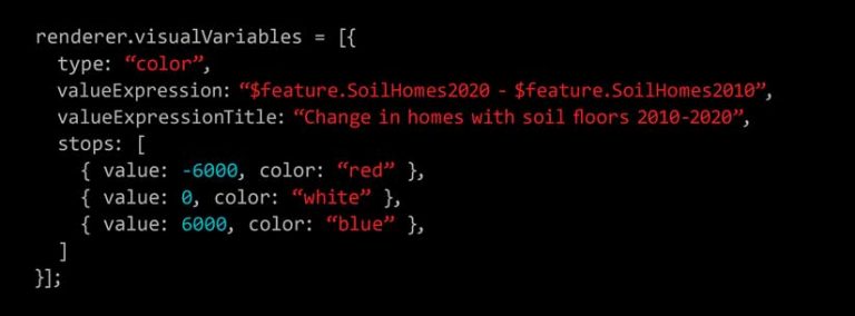
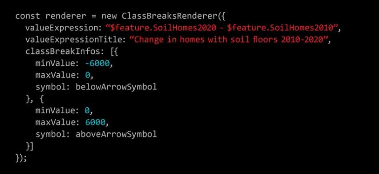
It requires writing an ArcGIS Arcade expression to calculate the difference between two fields in the same layer. Set a midpoint of zero in the renderer break points using a color visual variable (shown in Listing 3) or by using a ClassBreaksRenderer (shown in Listing 4) to give the renderer distinct above-and-below symbols.
Alternatively, use the above-and-below theme in the univariate color and size smart mapping module and let the ArcGIS API for JavaScript pick the color scheme, symbols, and break points as shown in Listing 5. This approach only shows the delta between the two data values, not the totals for each year. If viewing the value of the variable for each year is important, then add an option that allows the user to toggle between both values for the change between years and the totals for each year.
See an example using the above-and-below theme.
6 Animations
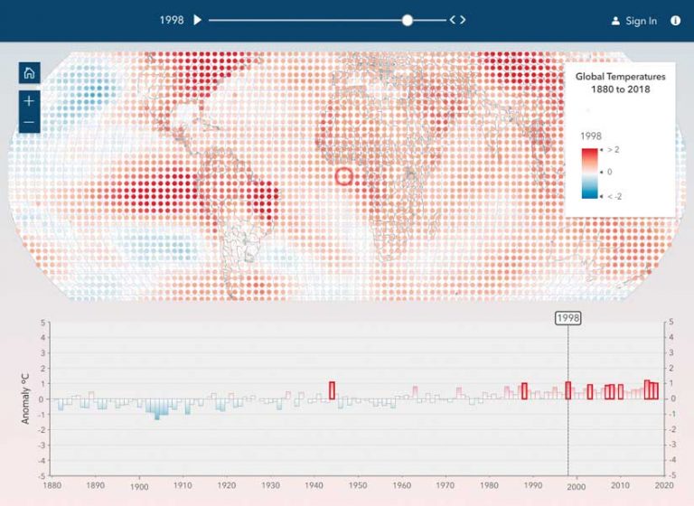
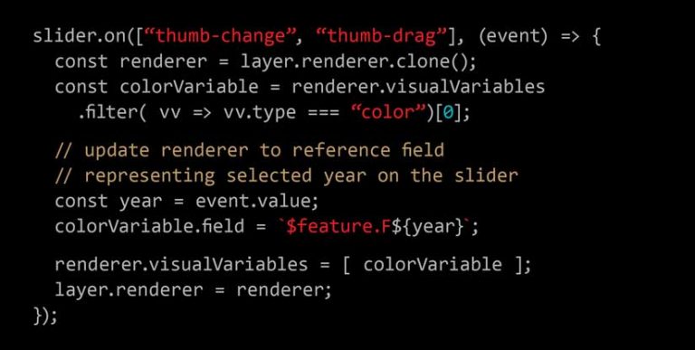
Another way to view change over time is to create a data animation. This is effective for showing subtle, compounding changes over long periods of time. As opposed to the other approaches, which only compare change between two dates, this technique allows the user to view change for many—even hundreds—of time periods.
This example, Global Temperature Anomaly to 1880–2020 doesn’t use TimeSlider for filtering features with a date field. As shown in Listing 6, TimeSlider is used as a tool for updating the layer’s renderer to point to a new attribute field (or Arcade expression) at each slider move. Updating the field name in the renderer to the column containing data for the selected year is the only change—no other renderer changes should be made.
C
Combinations
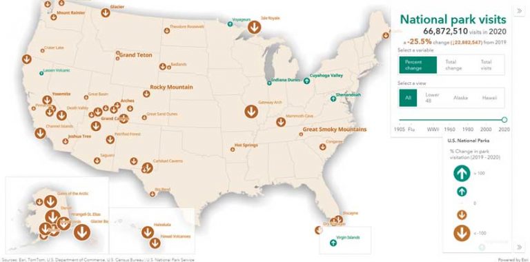
The approaches listed in this article can be combined. For example, a layer that already visualizes change in a smaller time interval using the above-and-below theme can be animated, showing change over time. The National Park map illustrates the use of the above-and-below theme with animation to visualize changes in year to year visits to US national parks.
A Word of Caution
When comparing data that changes over time in two separate layers, the same renderer and visual variable configurations must be used for both layers to ensure that the comparisons make sense. The same stops and break points must be assigned to the same colors and sizes.
Conclusion
The ArcGIS API for JavaScript provides many ways to visualize change over time. All of them are valid. The approach you choose depends on the final user experience you want. The next time you need to map a variable as it changes over time, try several of the approaches listed in this article because the best option may not be the first one you consider.
About the author