The tools in ArcGIS Pro give you great flexibility in presenting the information in your map. To more effectively communicate your message, you may want to modify the text for titles or labels, rearrange graphic elements, or add a caption that identifies the data source.
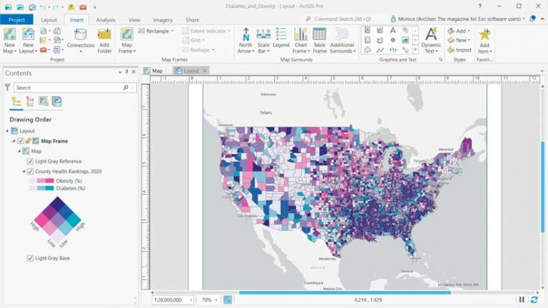
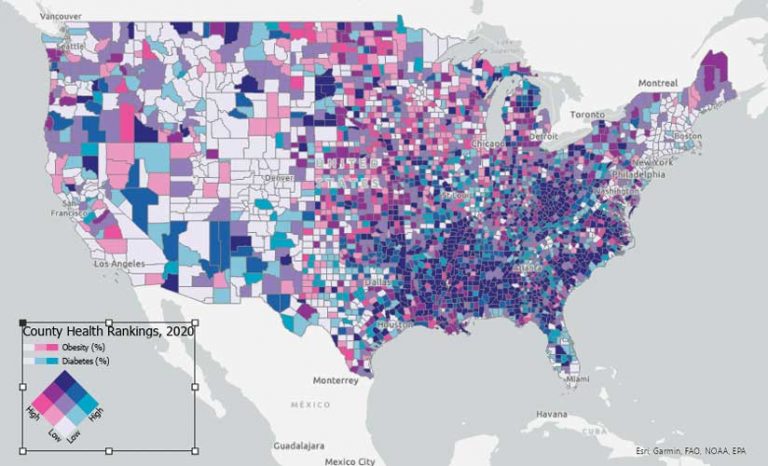
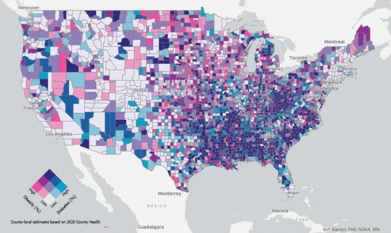
Map marginalia, such as legends, scale bars, and north arrows, help explain or support your map’s message. Effective legends make the symbology used in the map clear and eliminate confusion. This tutorial shows how to make a customized legend in ArcGIS Pro for a map that uses bivariate colors symbology to represent a layer containing data about the prevalence of obesity and diabetes. This data was obtained from the County Health Rankings, 2020 layer, available from the ArcGIS Living Atlas of the World.
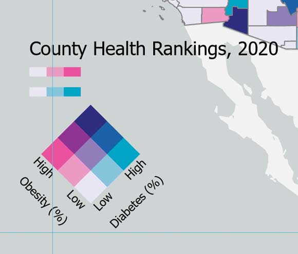
Bivariate colors symbology is used to show the quantitative relationship between two variables in a feature layer to compare, emphasize, or delineate values in a map. Each variable is classified and assigned a color. The bivariate color scheme is the product of those two variables and three classes for each variable, which creates a square grid of nine unique colors. This type of visualization emphasizes the high and low values or the correlations in a dataset.
Add a Legend to the Map
This tutorial requires ArcGIS Pro at any license level and access to an ArcGIS Online organizational account.
- Open a web browser and go to the ArcGIS Online item on diabetes and obesity. Click Open in ArcGIS Pro.
- It is a bivariate colors map showing the relationship between adult diabetes (percentage of adults aged 20 years and above with diagnosed diabetes) and adult obesity (percentage of adults aged 20 years and above with a body mass index of 30 or more), based on County Health Rankings data for 2020, available in ArcGIS Living Atlas of the World.
- In the Contents pane, expand the County Health Rankings, 2020 layer to see the symbology used to display this layer. Click the Layout tab to see the layout that has been created for this map.
- On the Insert tab, in the Map Surrounds group, click Legend. In the empty space at the lower left of the layout, place your cursor where you want to define the upper-left extent of the legend, then click and move the cursor to the location you would like to use to define the lower-right extent and release the mouse button.
- Right-click the legend and then, in the context menu, click Properties. In the Format Legend pane, click the Placement tab and change Width to 3.5 in. This will ensure that it will be scaled to fit the extent you drew in the previous step.
Manipulate Legend Elements as Graphics
- On the Layout tab, in the Navigate group, click the Navigate tool.
- Click near the legend while holding the Shift key to create a rectangle around the legend to zoom in to that area.
- The handles on the rectangle surrounding the legend are visible, showing that it is already selected. Right-click within the rectangle surrounding the legend and, in the context menu, click Convert to Graphics. The legend is no longer linked to the map, and you can modify the individual elements that make up the legend.
- With the rectangle surrounding the legend still selected, right-click inside it again and, in the context menu, click Ungroup. Note that these elements are also displayed in the Contents pane. If layout elements are snapping to guides or existing page elements, you can temporarily disable snapping by pressing the spacebar while you are moving elements.
Modify Text Placement and Size
- On the Layout tab, in the Elements group, click Clear Selection. To select an individual element, click the Select tool in the Elements group of the Layout tab.
- Select the text for Obesity (%). Point near the upper-right handle to see the rotate control, then use the number indicator to rotate the text 315°.
- Perform the same process on the text for Diabetes (%), rotating it 45°.
- Move the Obesity (%) text to the left side of the legend and the Diabetes (%) text to the right side of the legend.
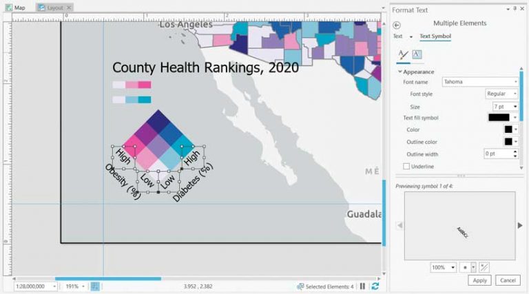
- Hold down the Shift key and select all four pieces of text for High and Low, then right-click and, in the context menu, click Properties. The Format Text pane will open, allowing you to modify the text and its appearance.
- Click the Text Symbol tab, expand the Appearance section, change Size to 7 pt, and click Apply.
- Deselect all text elements and reselect them individually to fine-tune the position of each.
- Select the legend title. In the Format Text pane, on the Text tab, change the text to County-level estimates based on 2020 County Health Rankings data. The full title does not appear because the text is too large to fit into the extent shown by the box around the text. You will take care of this problem in the next step.
- Repeat steps 6 and 7 to change the legend title text size to 7 pt and position the text under the legend.
- Select the pink and blue color ramps and delete them.
- In the Contents pane, hold the Ctrl key and select all the legend elements. Do not select the Map Frame element. If you inadvertently select it while the other elements are selected, hold the Shift key and click the Map Frame element to unselect it.
- In the Layout View, hover over the rectangle for any selected element; right-click; and in the context menu, click Group.
The grouped legend elements can be moved as a single page element. The layout now contains a custom legend for the bivariate colors map with text in different sizes and a descriptive caption.
Try These Techniques and Improve Your Maps
With the tools used in this tutorial as well as additional tools on the Format tab that were not discussed in this article, you have many options for modifying legends and other map elements. Try modifying your maps using all of these options to take your map layouts to an even higher level.