Are you a dashboard user who has struggled to get useful information from a dashboard? Are you a dashboard author suffering from information paralysis who simply doesn’t know where to begin to create your dashboard? Do you have disagreements over how a dashboard should look and work? If any of these questions resonate with you, this article will help you.
Why is there so much debate over what constitutes a good dashboard? For one thing, dashboard is a loose term. Many think that a dashboard is simply a single screen of information or a display with charts on it.
With such a generic term, it is difficult to draw any conclusions and recommendations, but there are some core principles that apply to all dashboards. A good dashboard:
- Communicates important and critical information.
- Draws attention to where it’s needed.
- Conveys the information clearly and at a glance.
Divide and Conquer Dashboard Design
By classifying dashboards into different types, the best practices and design guidelines for each become clearer. Dashboards can be divided into two primary groups: snapshot dashboards and monitoring dashboards.
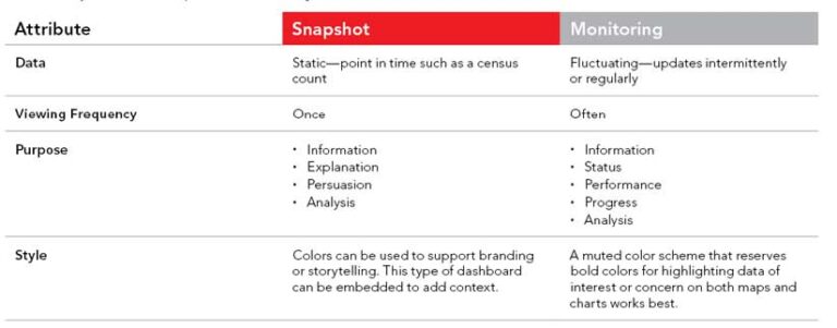
A snapshot dashboard summarizes a dataset that does not change and therefore represents a snapshot in time. This type of dashboard can be used to tell a story or make a claim.
A monitoring dashboard provides updates on data that is dynamic, whether it changes intermittently or regularly. With continually changing data, this type of dashboard has quite a different role. Although it can’t often be used to tell a story, it can be used to draw attention to values of interest or concern through highlighting them. Table 1 summarizes the key attributes of each type of dashboard.
As you can see, these types differ considerably. Knowing your dashboard type can help you make creative design decisions and support those decisions if they are questioned by a user or manager. Let’s dig a bit deeper into each group.
SNAPSHOT DASHBOARDS
A snapshot dashboard summarizes a static dataset to communicate some information such as census data or analysis results. Charts can often complement a map in visualizing data temporally or categorically in addition to spatially. Once the information is communicated and understood, users may be done viewing it.
These dashboards can serve several purposes:
- Inform
- Explain
- Persuade
- Analyze
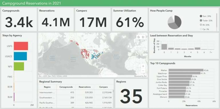
Information Dashboard
Knowing the purpose of and audience for the dashboard is key to making it effective. Let’s look at an example that uses data about camping in national parks in the US. After analyzing camping reservation data, I wanted to show some key results that were discovered. If I simply wanted to provide a general, neutral summary of the information, the dashboard might look like the one in Figure 1.
Note: This analysis was done for demonstration purposes.
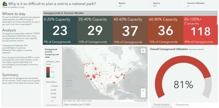
Explanation Dashboard
However, if I want to explain something I found in the data, I may want to design the dashboard differently. Because I had failed to secure camping reservations several times, I wondered how many campgrounds were full all summer. I wanted to explain why it is difficult to plan a summer visit to a national park. In analyzing the data, I discovered that nearly half of National Park Service (NPS) campgrounds were at or over 80 percent occupancy during the summer, which makes it difficult to secure camping reservations for a typical stay.
Showing bits of information on a bunch of metrics isn’t necessary and can be distracting. To explain this finding, I made the dashboard shown in Figure 2 that focuses exclusively on the NPS campground summer occupancy. Since the data is not changing, I can describe the methodology used and provide a written summary too.
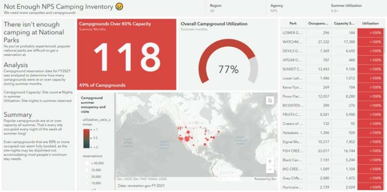
Persuasion Dashboard
This analysis might also inspire me to make a dashboard and a related ArcGIS StoryMaps story to persuade others that there are not enough NPS campsites. The dashboard, shown in Figure 3, could be embedded in the ArcGIS StoryMap story.
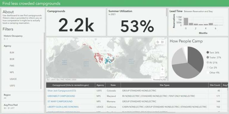
Analysis Dashboard
A related dashboard could help people find less crowded campground options. An interactive analysis dashboard would let people filter the data to find campgrounds with historically lower summer occupancy and provide attribute information and a link to the booking platform. This dashboard is shown in Figure 4.
As you can see, snapshot dashboards can look quite different, depending on what I want to focus viewers’ attention on. Whatever the focus of a dashboard, users should find the important information at a glance and understand what they are seeing.
MONITORING DASHBOARDS
Instead of showing data for a point in time, monitoring dashboards summarize data that is changing. This could be data that changes many times per minute, daily, or even monthly. In each case, the dashboard provides always-current data to viewers.
What information do viewers need to know? Well, that’s for you to decide, but the purpose of a monitoring dashboard will likely fall under one of the following categories:
- Inform
- Provide status
- Evaluate performance
- Convey progress
- Analyze
For example, let’s say I wanted to monitor pothole repair requests. How I designed that dashboard depends on what information I want viewers to see. Sometimes a general, unbiased summary of the data for a recent time frame is what is needed for a public resource or open data site. For this type of dashboard, neutral colors and a variety of summary information, like the dashboard in Figure 5, can work well.
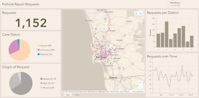
Information Dashboard
This dashboard provides the number of requests for the last 30 days along with the percentage broken down by status and origin (i.e., how it was submitted). On the right, graphs show district-level counts and how daily counts have fluctuated.
Although this approach works for some scenarios, it won’t provide an operations manager with the current data needed to know if there is anything concerning that needs to be investigated. This scenario requires a dashboard designed to provide situational status at a glance, like the one in Figure 6.
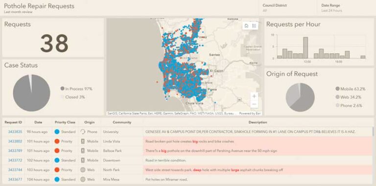
Status Dashboard
The dashboard in Figure 6 distinguishes priority requests that need immediate review based on descriptions containing one or more concerning keywords. Red dots on the map and in the table highlight potentially dangerous road conditions. The right column of the table highlights the keywords for which it was flagged, making review quick and effortless. For details on how the table in this dashboard was made, see the blog post “Arcade tips for tables in ArcGIS Dashboards”.
Now, say in this scenario that the department of transportation has implemented two initiatives that require all requests to be processed within 40 days, and all submissions must be made digitally. Submissions that are called in or emailed will be phased out. To evaluate the key performance indicators (KPIs) associated with these initiatives, I could make the performance dashboard as shown in Figure 7.
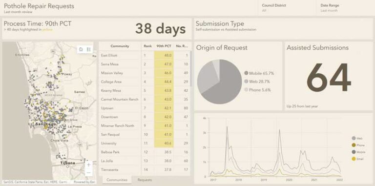
Performance Dashboard
In the dashboard shown in Figure 7, an overall 90th percentile process time is displayed along with this metric for each community. The communities exceeding 40 days are highlighted. The right side of the dashboard provides an overview of submission types. By reviewing the indicator and line chart, viewers can quickly get a picture of how both assisted (nondigital) submissions are trending.
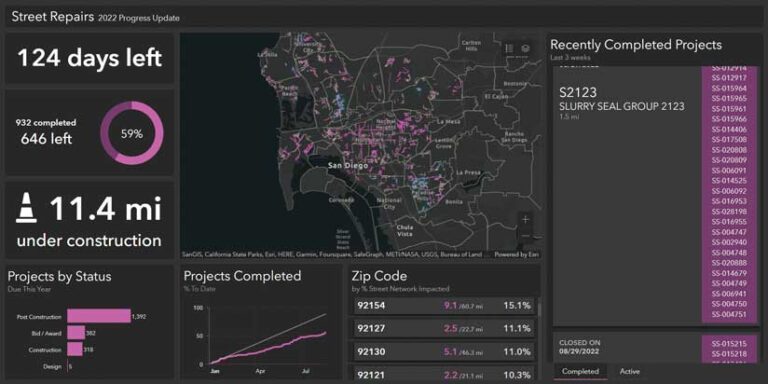
Progress Dashboard
The dashboard in Figure 8 provides information on repair projects to learn what’s being done to fix things. Each year, the department of transportation plans large and small projects. Each project has planned start and end dates to ensure projects stay on schedule.
For projects that have a clearly defined start and end date, a dashboard can be a useful way to communicate progress, or percentage of project completion. To monitor projects, the dashboard shown in Figure 8 summarizes active projects and shows whether things are on schedule to be completed by year-end.
The upper left area of the dashboard shows how many days are left in the period and the percentage of completion. Under that, the number of miles currently under construction for all projects is displayed. The line chart at the bottom shows whether projects are on track.
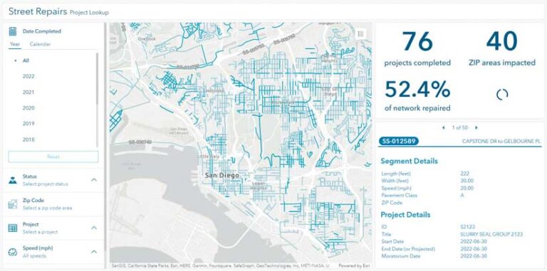
Analysis Dashboard
As project managers review the details in the dashboard, they will almost certainly have questions such as:
- Which projects are currently active?
- Which communities are impacted by extended construction times?
- How does current performance compare with previous years?
To answer these types of questions, I created the analysis dashboard in Figure 9 to filter data by certain criteria. With a series of selectors to look up data for a particular time frame, status, and geographic region, this dashboard can provide quick answers. In addition to visualizations, filtered data can be downloaded in CSV format for easy dissemination or further review.
Dashboards can be used for many different purposes. Knowing the purpose informs design decisions. Each type of monitoring dashboard displays and elevates different information. By having a clear understanding of what you want to communicate, you can design your dashboard to be effective.
If your dashboard contains a lot of data, consider splitting it into multiple dashboards. If you need a single resource from which your dashboards can be accessed, consider embedding them in an app.
Additional Considerations
Here are a few more things you may want to consider: designing for mobile devices, making color choices that account for color-blind individuals and cultural sensitivities, planning modifications to dashboards or charts when data accumulates or the relevancy of metrics change, and making dashboards that can scale.
See the following resources:
- “Strategies & Best Practices for Using Dashboards on Your Smartphone”
- “Choosing the right colors for your dashboard”
- “Build highly scalable dashboards”
About the author