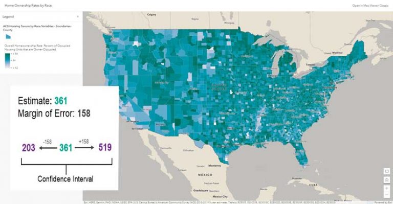
Many data points have some level of uncertainty. The United States Census Bureau publishes margins of error for American Community Survey data. For example, if the number of people within a certain group is estimated for an area to be 361, and the associated margin of error for that estimate is 158, the actual number of people in that group falls somewhere between 203 and 519. [For a detailed discussion of margins of error, see “The Importance of Margins of Error and Mapping” in the summer 2021 issue of ArcUser.]
When mapping this type of data, we are mapping ranges. How can we map ranges? If you use traditional styles—such as graduated colors or graduated symbols, and classification methods, such as natural breaks or quantile—to map ranges, you could run into problems. Ranges can span two (or more) classes. In the example previously cited, the estimate for a given feature is 361, but the range is between 203 and 519. Typical class breaks of 0 to 250, 251 to 500, and more than 500 can pose a problem when mapping this data.
Unclassed Symbology
Unclassed symbology eliminates any worries that a feature could be in more than one class. Unclassed symbology distributes data into incrementally unique symbols. This results in a much more nuanced map, since the data is not constricted. Let’s look at two examples using unclassed symbology—one using color and one using size.
Classed versus Unclassed Color
Look at a map of Home Ownership Rates by Race. The estimate for Modoc County, California, is 74.9 percent, but the range is 74.2 to 77.5. Using the suggested default breaks for natural breaks classification, this puts Modoc County in two different classes. While the resultant map shows Modoc County depicted by the second-darkest blue, based on the estimate of 74.9 percent, part of the range would warrant its being depicted by the darkest blue. Explore the map. How many other counties are similarly misrepresented on this map?
Unclassed color incrementally distributes the darkest and lightest colors in a ramp. One standard deviation above the mean and above is assigned the darkest color. One standard deviation below the mean and below is assigned the lightest color. The majority of the data is assigned a unique color.
As the map author, you can adjust these breakpoints for further fine-tuning. In the example , I did that by extending the two breakpoints to cover more of the distribution.
In the example, Map Viewer varies the colors for values between 86 and 42. Each feature with an estimated value within that range gets a unique color. This minimizes the impact of uncertainty. The darkest color in the color ramp is shared by all values greater than 86, and the lightest color in the color ramp is shared by all values lower than 42.
That range of data will get an appropriate color. The homeownership rate for Modoc County, California is 74.9 percent, but the range is 74.2 to 77.5. In an unclassed map, a hypothetical county with a rate closer to 67.8 (located above the breakpoint between the second and third classes) is assigned a lighter color, whereas in a classified map, it would receive the same color. A lighter color is appropriate because it’s a lower value, and the range of this county won’t span the second and third classes. If its range overlaps the range for Modoc County, that’s okay. An unclassed map better honors these ranges.
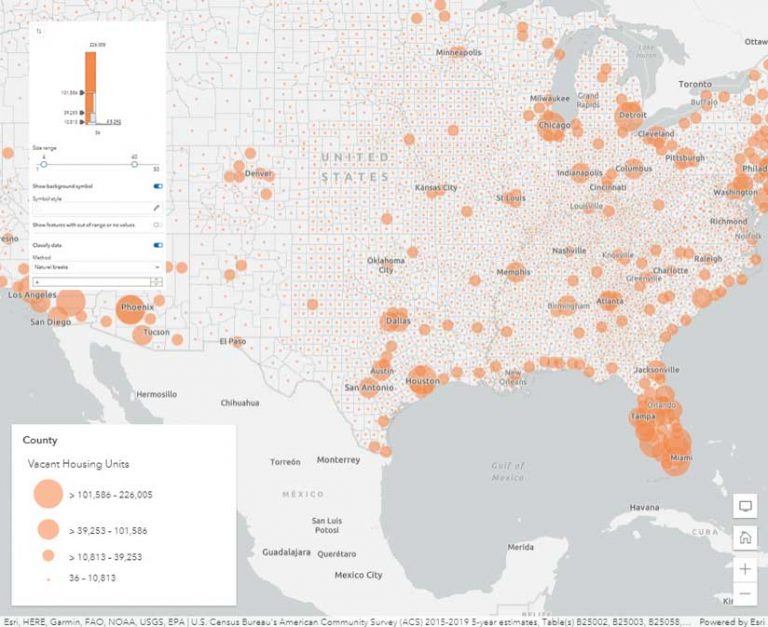
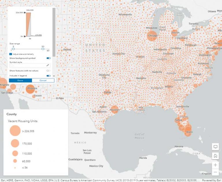
Classed versus Unclassed Size
While color is best for mapping percentages or rates, size is best for mapping counts or amounts. Figure 3 uses vacant housing units as the count attribute. This attribute is notorious for having very large margins of error and consequently very large ranges.
Since this data was classified using natural breaks, it has only a few different sizes of symbols. The variation within classes is not displayed, and there is also the same potential for a range to span two or more classes.
An unclassed version of this data in Figure 4 has symbols of various sizes. Counties in Florida and along the Gulf Coast show lots of variation, displayed by size. The problem of a range spanning multiple classes is diminished because unclassed size ramps allow the data to breathe.
Final Thoughts
When mapping ranges—and if you’re mapping American Community Survey data—unclassed symbology eliminates concerns that features can potentially be in more than one class. This is true when using unclassed color and size symbology. As an additional benefit, you get a more nuanced map. You may have noticed that the American Community Survey layers in ArcGIS Living Atlas of the World use unclassed symbology. If you’re interested in mapping actual margins of error, follow the “Mapping with margins of error” ArcGIS Learn path.
Visit the Esri Community Cartography and Maps space for more ideas about symbolizing overlapping ranges.