Most demographic, economic, health, and education maps start with tabular data of some kind. This article will describe several ways you can turn a flat file of raw data into a feature layer. Feature layers allow you to do spatial analysis and create web maps that can be shared in apps and story maps.
Add a Spreadsheet with Location Data, Geocode, and Create Points
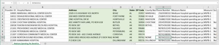
Often, data analysts and GIS specialists need to turn a spreadsheet on a local computer into a feature layer. In this example, I have a local spreadsheet containing information about Medicare spending per patient for various hospitals. The fields that contain location data for each hospital are called Address, City, State, and Zip_Code.
I am signed in to my ArcGIS Online organization account and have a User Type that allows me to publish hosted feature layers (Creator, GIS Professional, or Insights Analyst User Types). I have some analysis credits as these methods will consume credits, based on how many records are contained in my data.
In My Content in ArcGIS Online, I choose Add Item > From my computer and navigate to the CSV file. ArcGIS Online will prompt me to publish this file as a hosted feature layer, will pick up on the fact that the data has address fields in it, and will offer to use those as the location fields.
I check to make sure that Address, City, State, and Zip are matched as desired. In this case, I manually set my field named ZIP_Code as ZIP.
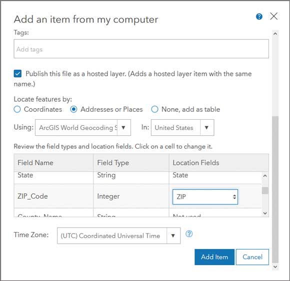
I make sure the title and search tags are what I want, and then click Add Item. Depending on the number of records, it can take a few minutes to publish. Once published, a dialog box appears that tells me how many of my locations matched, and I have a chance to review any unmatched cases.
Once the item has been created, ArcGIS Online automatically brings me to the Item Details page for a new points feature layer. (Note: If your spreadsheet has latitude-longitude coordinate data instead of address fields, the process is very similar.)
When to Join to an Existing Feature Layer
I can also simply bring my data in as a table, then join to an existing feature layer. When would it be better to bring a spreadsheet in as a table instead of geocoding it immediately?
If I have a spreadsheet without addresses or latitude-longitude coordinates but still need to bring this data into a GIS workflow, maybe I can use hospital IDs, campus names, or other specific attribute data that will not be picked up by the geocoder but can be joined by attributes to an existing points layer in My Content on ArcGIS Online.
If I want to work with lines or polygons instead of points, I can find layers to use by looking at the Boundaries category of the ArcGIS Living Atlas of the World for polygon feature layers of countries, states and provinces, telephone area codes, congressional districts, world time zones, counties, watersheds, and more.
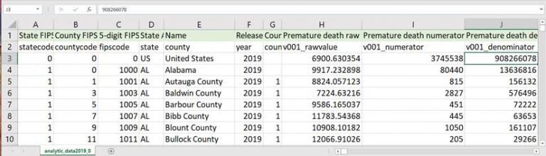
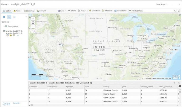
I downloaded a spreadsheet from the County Health Rankings Data and Documentation site that was named analytic_data2019_0.csv during the download. The first row in the CSV holds the descriptive name (such as Premature death raw value) that I will use for aliases. The second row is the short variable name used for coding purposes in statistical packages that corresponds to the data dictionary (such as “v001_rawvalue”) that is recognized by others who use this dataset. If you plan to calculate any new fields or transform the data in any way, it will be much easier to work with these field names in formulas and macros, since they often follow a standard naming convention. I remove the top row of descriptive aliases for now but save them elsewhere.
This table contains records for the United States as a whole, records for each state, and records for each county. This is common for government datasets. Since I am just bringing this in as a basic rectangular dataset (or flat file) as a table into ArcGIS Online, this is okay. Once I’m working with it, I can apply filters.
I’ll click My Content > From Computer, but this time I select None, add as table. Once the item is generated, ArcGIS Online brings me to the Item Details page, where I select Open in Map Viewer > Add to New Map.
Now I can filter out the records that I’m not interested in. With my table added to the Map Viewer, I can verify this table has 3,194 records. Remember, the table has records for the entire country and for each state and each county. Records for the US and the states have a value of 0 in the field called countycode. I can add the filter countycode is not 0 to remove any noncounty records, and this gets me down to 3,142 records.
Subset to an Area of Interest
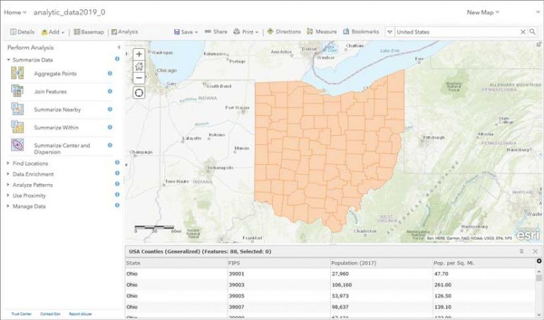
Many health and education policies are set at the state level. Data analysts working in these fields don’t need to work with all the counties in the nation, just the ones in their own state. For example, if I was working at the Ohio Department of Health, I would be interested in the County Health Rankings for all Ohio counties. Having to work with the entire national dataset would be distracting at best. It would likely be overwhelming, slow down processing time, and create file sizes larger than necessary. The best approach would be to apply a filter to only work with the Ohio data.
Back on the Filter tab, I click Add another expression to subset even further and leave the top drop-down option as Display features in the layer that match all the following expressions. The two expressions are countycode is not value and state is OH. This gets my table down to 88 records, which is the number of counties in Ohio.
From there, I’ll click Add > Browse Living Atlas Layers and add the USA Counties (Generalized) layer of county polygons to my map. I apply a filter to the counties layer so that it only shows counties in Ohio, not all counties in the US. This will decrease the running time for the Join and also consume fewer analysis credits.
My next step is to join my table to the county boundaries by clicking Analysis > Summarize Data > Join Features. I select the target layer, USA Counties (Generalize), and the table, analytic data2019 0, to join to the target layer.
I’ll join by FIPS, which stands for Federal Information Processing Standard. FIPS codes are widely recognized codes for states, counties, tracts, congressional districts, school districts, and many other administrative geography levels. I will do an attribute join, so I select Choose the fields to match and match FIPS as the target field to fipscode as the join field.
Next, I choose a name for my new layer, Health Rankings for Ohio Counties 2019. Note: If I were joining all counties in the US, I would have to uncheck Use Current Map Extent so that counties in Alaska, Hawaii, and Puerto Rico would also be included even though they’re not displayed in the map’s current extent.
Joining Tips
Here are some best practices when joining tables to feature layers.
When Joining by a Match ID Such as FIPS
Watch leading zeros for states with single-digit FIPS codes such as Alabama (01), Alaska (02), Arizona (04), Arkansas (05), California (06), Colorado (08), and Connecticut (09). Often these leading zeros get dropped because computers are quick to recognize this field as a numeric rather than string field.
When Joining by Name
When joining on County Name, join by both county and state. Unlike FIPS codes, county names are not unique across states. For example, there are 26 states that have a Franklin County. Also, make sure you’re consistently using state abbreviations or state names in both the target layer and the table.
Beware of Country Names
Some sources list the official country name rather than the commonly understood name (“Russian Federation” vs. “Russia”). Watch for abbreviations such as St. Martin versus. Saint Martin. There are constant changes to country names. Two recent changes were Cape Verde to Cabo Verde and Macedonia to North Macedonia. New countries form all the time. I can remember a time before South Sudan existed.
Running the Join
Next, I click Run Analysis, and wait patiently. A join can take a few minutes depending on how many fields and records are in a table; whether the table is be joined to polygons (most complex), lines, or points (least complex); and where the two datasets being joined are stored. If you’re running a join on a layer that you don’t own, such as a Living Atlas layer, you might see the warning “Performing analysis using Living Atlas layers can result in greater execution times,” since you’re performing a join from multiple data sources.
I now have a new layer in my map that has the tabular data joined to the polygon layer. I can symbolize it and use it to configure pop-ups and create labels. I make sure I fill out the Item Details for my new layer. [Read how and why it is important to fill out the Item Details page in my article “Make Your Work Easy to Find, Understand, and Use by Others” in the Spring 2019 issue of ArcUser.] Part of documenting layers is managing settings such as sharing, enabling delete protection, setting the default extent, marking something as authoritative on behalf of your organization, or allowing others to edit.
Basic Quality Assurance
Once you bring in your data to ArcGIS Online, either by geocoding it to create a point feature layer or by joining a table to an existing feature layer, evaluate your data.
Here is a sample checklist you can use for quickly evaluating the data:
- Are the number of records what you expected?
- Are the data types what you want?
- Is the data sorted as you expected?
- Do the minimum and maximum values look right?
- Is anything out of range?
- If applicable, does the change from year to year look believable?
- Do all the parts add up to the whole?
To learn more about this topic, see the ArcGIS Blog post, “Evaluate and Prep Your Tabular Data in ArcGIS Online.”
Add Aliases
Remember those nice display names I saved earlier? I can now add them as field aliases. There are two major benefits to adding aliases. Aliases make any auto-generated and pop-up legends instantly more meaningful, since the alias is used in legends and pop-ups first; the field name is used only if there are no aliases. Also, aliases help anyone working with the layer (including you) when you are viewing the attribute table, trying to figure out what this data is about, and making decisions for symbolizing the map. Aliases turn spreadsheet data into a shareable dataset.
I have two ways to add aliases. From within the web map, I can go to Configure Pop-up > Configure Attributes and type in the aliases for my fields of interest. I can also go to the Item Details page, choose the Data tab then Fields, and click on the field I want to change. I will be taken to that field’s properties, where I can click on the pencil icon to edit the alias and type in my alias for that field.
You can even batch assign all aliases at once by using this nice AliasAssigner.py tool written by my colleague Lisa Berry.
Take it one step further and add field descriptions in addition to aliases to provide even more details about specific attribute fields such as detailed definitions, sources, and year(s) of data in a given field.
Create Information Products with Your Data
Now it’s time to have fun performing analysis or creating a web map. Smart mapping capabilities and Arcade expressions can help you make a clear and polished web map with purposeful symbology, pop-ups, and labels. [To learn how to use Arcade expressions to be more productive, see the accompanying article, “Arcade-a-Cadabra,” in this issue.]
For more information on getting started with data, see the ArcGIS Online documentation. If you have any questions when turning your raw data into a feature layer, feel free to post them to the ArcGIS Online community on GeoNet.