If your app is linked or embedded in a news or media site, potentially half your audience could be viewing it on a mobile device. SimilarWeb, a company that provides web analytics services to businesses, estimated that mobile devices accounted for more than 50 percent of website visits in 2018 and that people spent more than 40 percent of their time online on mobile devices.
To accommodate the shift in screen size, Esri designs ArcGIS Configurable Apps with a mobile first approach that asks, How will the app look on the smallest screen? ArcGIS Configurable Apps are available when you share a web map and choose CREATE A WEB APP or from the item details page of an ArcGIS Online web map. This article shares some tips for ensuring your app is mobile ready.
Configure the Pop-Up
The pop-up for a feature can provide the most detailed information in a map. Transform the attribute data into an easy-to-read display of the most important information for your audience. In most configurable apps, pop-ups respond to screen size and can be docked at the bottom of the screen for easy reading and scrolling.
Choose Meaningful Symbology
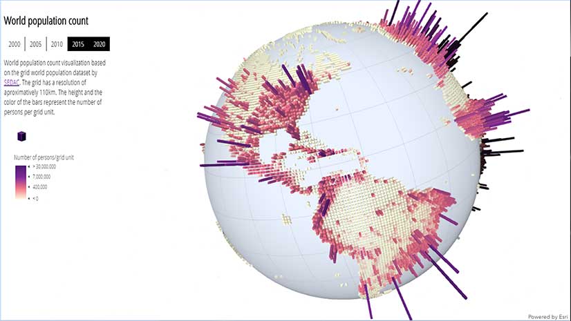
Smart Mapping supplies choices that will highlight one or more attributes. It suggests color ramps that will show the meaning of your data. Explore Smart Mapping options and choose symbology that will emphasize what matters most in your map. Choose a basemap that gives context but doesn’t distract from the map’s main message.
Choose a Suitable Template
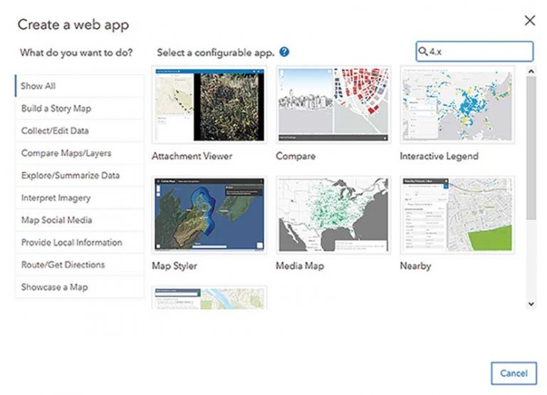
Esri has begun building configurable app templates using the ArcGIS API 4.x for JavaScript. These apps are responsive and provide an optimal viewing experience no matter the device. To explore these configurable app templates in the Create a web app template gallery, type “4.x” into the Search box. For a fuller overview of the newer apps, read the ArcGIS Blog post “Take a tour of Configurable Apps built with the ArcGIS API for JavaScript 4.x.”
Design for the Small Screen
Share information with text options. Title your map succinctly. Use clear supporting text in configurable app options, such as an About text box that steers users through the app. Text panels and boxes respond to the device viewport, but succinct text prevents unnecessary scrolling and interaction.
Enable only necessary tools. A variety of configurable app template tools are provided, but certain ones will support your story best.
Ask yourself these questions:
- Will a legend clarify map content?
- Is a scale bar to measure distance crucial?
- Should users be able to toggle the basemap or layer list?
Put yourself in the shoes of your mobile device user when selecting app tools.
Test Your App Many Times
Test, then test again. After creating your map and configuring your app, simulate your app on a mobile device with your browser’s developer tools. In a Chrome browser, open Chrome’s developer tools by pressing F12 or Ctrl+Shift+I. Then, click Toggle device toolbar (Ctrl+Shift+M) and select a mobile device to emulate. This will change the viewport so you can see how the application behaves and appears on a specific mobile device.
Access Your App on Mobile Devices
While the browser tools provide a quick view into the app’s appearance on a mobile device, the only way to replicate what your users will experience is to view the application on a real mobile device. Don’t just use one device because different mobile devices look and behave differently.
Watch this Esri Developer Summit presentation on configurable apps.
About the author