When creating thumbnails for items in ArcGIS Online, you can go beyond the basics and consistently use a unique style and/or brand. Your style and brand can reflect on your organization or you as an individual.
Thumbnail style can be thought of as a distinctive visual appearance that can provide context for the content behind it.
Branding is a practice in which an organization creates a unique design that is easily identifiable, making one organization’s contributions easily distinguishable from others.
The importance of branding can be seen in search results that make it easy to recognize authoritative content. Each style and branding approach described in this article offers ways to help users find and anticipate content and distinguish your organization from others.
Use Geographic Context
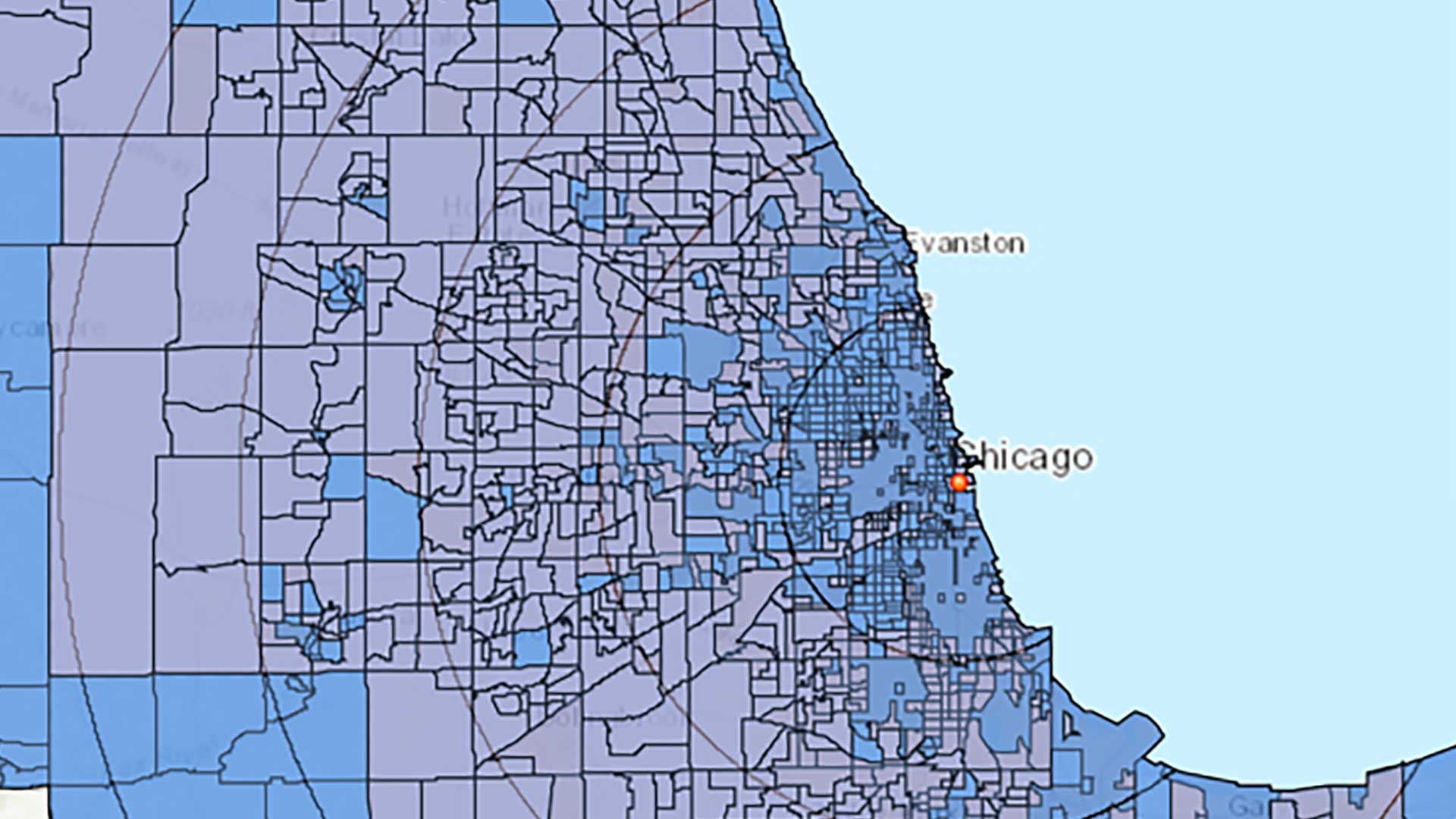
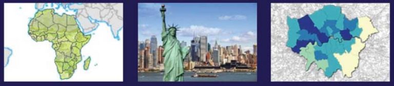
Thumbnails can provide an obvious visual reference to the geographic context of the map, helping users anticipate what they will see when they open the item. While most thumbnails use a map to show that context, in the illustration at right, New York City used an easily recognizable photograph—the Statue of Liberty.
Provide Content Hints
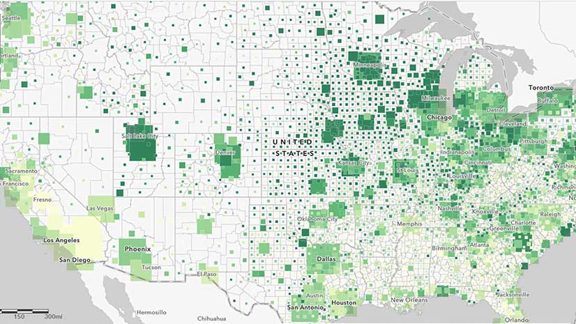
Sometimes thumbnails provide a visual cue to the content with graphics that deliver an expectation of subject matter.
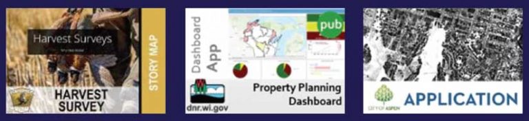
Foreshadow Functionality
Thumbnails for story maps, dashboards, apps, and models can highlight the functionality or tools provided.
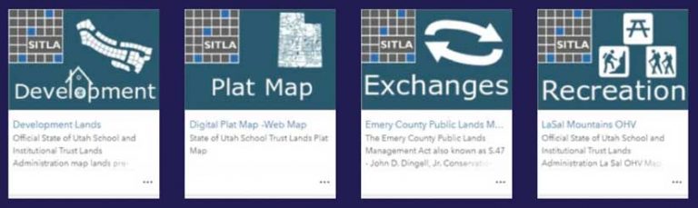
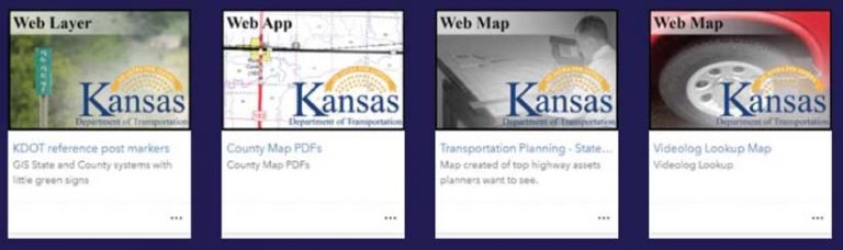
Try Organizational Branding
Applying organizational branding to thumbnails is recommended for top-tier authoritative content that a government agency or other organization shares. Using a visual brand (the organization’s logo, colors, and text) indicates the authoritative source for the map. Many thumbnails also indicate what type of content will be provided using words and maps. Decide if you prefer to see geographic context in the thumbnail or if words and a logo are sufficient.
Be Consistent in Your Branding
An important aspect of branding is consistency. Organization thumbnails don’t need to be identical, but they must carry forward a branding theme, be it color, logos, or other graphic elements. The examples of organizational galleries in the accompanying illustrations show the strength of branding and demonstrate how branding helps viewers to easily recognize the publisher and find authoritative content.
For more information about thumbnails, read “Put Your Best Thumbnail Forward” in ArcWatch.