Let’s start by answering the question, What is a vignette? In cartography, a vignette is a symbol—applied most often to a line feature or the outline of a polygon—to give the impression that the feature fades gradually into the background. You can do this in several ways.
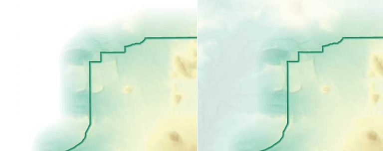
Figure-Ground
Vignettes can be used to enhance an areal feature of importance by drawing attention to it. This can be done by fading the background color surrounding it to the white of a page or computer screen or by fading the background to semitransparency that allows the background to be seen faintly outside the main map area containing the feature.
Used in this way, vignettes promote the cartographic design principle of figure-ground by separating the map image in the foreground from a seemingly amorphous background. This is critical in helping the map reader understand which geographic area to focus on.
De-emphasized Lines or Outlines
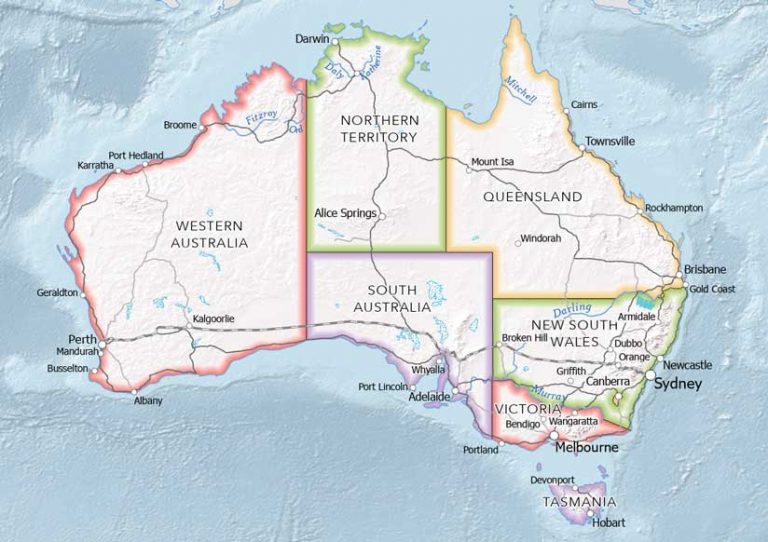
Vignettes can also be used to create a line or polygon outline symbol that has less visual prominence than it would if represented as a solid line. You may have seen this effect in atlases to symbolize world countries or the states and provinces within countries. Borders between administrative areas can be seen clearly, though they do not command the attention of the map reader as the most important feature on the map. This use of a vignette is called a buffalo tint.
This vignette technique is especially helpful when many line features on the map compete for the map reader’s attention. Graded colors separate areas into distinguishable entities, but the lines between the areas do not command visual prominence. This is important for reference and atlas maps that include many types of line features (e.g., boundaries, roads, rivers).
Indeterminate Boundaries
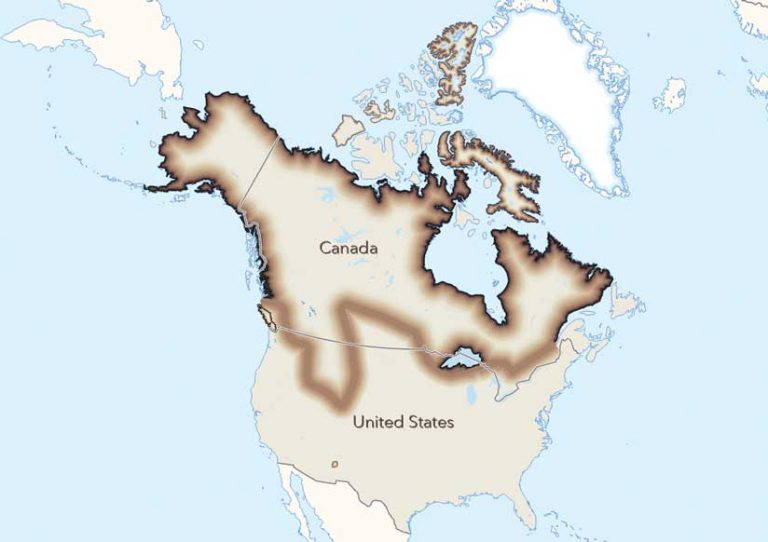
Vignettes are a useful way to show the extent of features with no sharp boundaries, such as animal ranges, soil units, and ecotones (i.e., the transition areas between two adjacent ecological communities). Using a symbol that does not have a sharp edge helps convey the uncertain nature of the feature’s extent. For example, because the gray wolf’s range along coastlines is known, those vignette edges are shown with a darker color. Because the extent of the gray wolf’s range in the middle of the continent is less certain, darker vignette colors are not used.
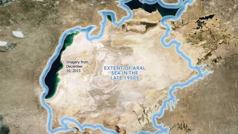
This use of vignettes is also helpful for showing extents that vary over time, such as polar sea ice, a moving oil spill, or the historic extent of the Aral Sea. Using a vignette helps convey the impermanent nature of the extent of these features.
Subtle Visual Distinction
Vignettes are often used to subtly enhance the interface between two different types of features. A vignette used to enhance the land-water interface is often called a coastal or shoreline vignette. The areas closest to the shoreline or coastline are shown with a white color that suggests the white water of breaking waves along beaches. White areas fade into blue areas that gradually become darker as the distance from the shoreline increases, giving the impression of deeper water.
The resultant cartographic effect has the added benefit of providing the illusion of an added dimension to an otherwise flat map. Other types of symbols can be used in coastal or shoreline vignettes, including stipple patterns, broken line patterns, and lines parallel to shore.
Is It a Vignette or Feathering?
While cartographers called this effect a vignette, graphic artists would use the term feathering. In graphic arts, a vignette is a reduction of an image’s brightness or saturation toward the periphery compared to the image center. The word vignette, from the same root as vine, originally referred to a decorative border in a book. This border could be used to frame the map page by appearing as a dark edge that fades transparently toward the interior of the map area, thus drawing attention to the center of the page.
Esri cartographer John Nelson, describes this effect in an ArcGIS Blog post, “Steal These Vignettes, Please,” and illustrates it. [Go to Nelson’s post to download an assortment of textured vignette ArcGIS Pro styles and start using them right away.]
The more appropriate graphic arts term to describe the effect of smoothing or blurring the edges of a feature would be feathering. The softened edge gradually fades until it becomes transparent, using a technique similar to one used for retouching photographs that employs fine feathers. Nonetheless, the acceptance by cartographers of the term vignette has resulted in its standard usage within the profession.
About the author