After “Stealing” George Washington’s Style, a GIS Specialist Creates a Campus Map with a Vintage Look
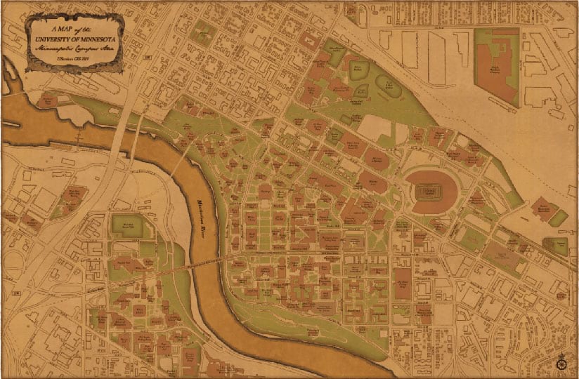
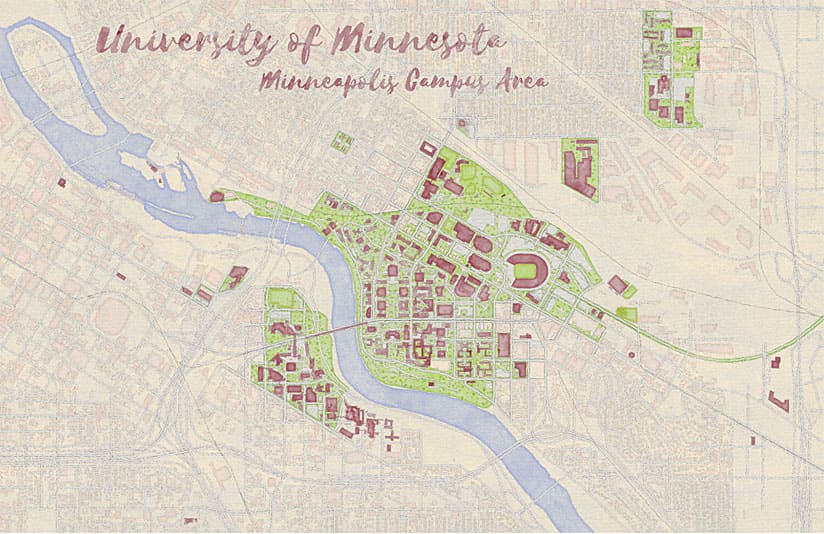
Here is a map I made in ArcGIS Pro of the Minneapolis area of the University of Minnesota (U of M) Twin Cities campus where I work as a GIS specialist. I can’t take credit for the styling of this map because I stole the style from someone else: Esri cartographer John Nelson. Nelson stole the style, too—from George Washington, the first president of the United States, who was also a skilled cartographer.
I learned about the style by reading one of Nelson’s posts on the ArcGIS Blog. Nelson encourages people to steal styles and vignettes that he has created, even compiling some of his distinctive, creative styles—such as the Firefly style and Middle Earth style—in an Esri e-book called Mapping with Style, Vol. 1.
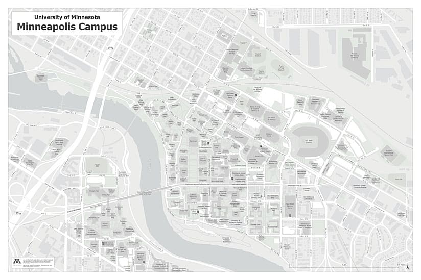
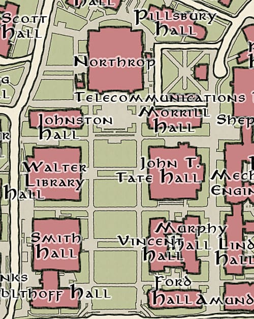
But I digress. I make quite a few maps of our campus as part of my job, but rarely do I make maps that look like the one above. It is different in that the color palette is unusual, diverging from the typical shades the mapmakers at University Services, where I work, commonly use. In addition, the line work looks almost hand drawn, and the map has a decorative and fun look. Most of the maps we make have a more straightforward, businesslike feel to them.
Most of the time I am working on web maps or other maps where cartography does not necessarily play a very big role. Wanting a new creative challenge, I approached my boss Daniel Sward, GIS coordinator for University Services, and told him I wanted to make a pretty map and expand on my map design skills. Eager to help me fulfill my goals, he quickly gave me a suitable task. He told me that the assistant vice president of our department, Brian Swanson, wanted a nice-looking map of the University of Minnesota Twin Cities campus to hang in his office, and that this could be my cartographic project. That was the extent of the instruction: “nice-looking.” I could do whatever I wanted. But there was a problem: I had no idea how to make this campus map look special or different from what we normally do.
Shortly after receiving this assignment, I learned that Esri was planning to offer Cartography, a massive open online course (MOOC). Since I had not taken a cartography course since 2012, when I was in graduate school, I thought this would be a perfect, low-pressure way to become reacquainted with and reinspired by the principles of good map design. I was drawn to the class for two other reasons—perhaps it would give me some ideas for the nice-looking map I was supposed to make and give me experience using ArcGIS Pro, which my office was starting to use and which I had little familiarity with. [Cartography will be offered again by Esri in April 2019. Sign up by April 24, 2019.]
During each week of the MOOC, participants could watch a short video featuring a panel of Esri cartography experts, who would talk informally (but informatively) about cartography. I have to say I was charmed by the cast of characters on the panel. Their personalities and the format of their presentation really helped to add a personal touch to the MOOC. One of the cartographers was Nelson. Through the MOOC I learned that he and the others on the panel, including Kenneth Field, post entries on the ArcGIS Blog and have blogs of their own filled with lots of map inspiration. Not only this, but Nelson had written blog posts where he would design awesome maps and create ArcGIS Pro styles that he wanted everyone—in his words—to “steal.”
Nelson’s call to steal his styles, in combination with the things I learned in the MOOC, were just what I needed to start making my nice-looking map. Nelson had various blog posts and styles available for the taking, so I decided I would try four styles and then pick the one that worked the best. I decided I would allow myself an hour to generate each first draft—a time frame that would have been impossible for me to follow without the ability to apply existing styles. The MOOC had also given me the foundation to more adeptly navigate ArcGIS Pro, including working with the Symbology pane and layouts. On a deeper level, the MOOC also reinforced the idea of not accepting program defaults, which is something I already knew but that was easy to lose sight of when making similar maps all the time.
I first chose the Lord of the Rings-inspired My Precious style from this blog post. I started with this one because I love fantasy novels, and who wouldn’t want to see a Tolkienesque campus map?
Ultimately, I did not select this style because campus maps tend to be label heavy, and upon experimenting with labeling our campus buildings, it looked a bit crazy. Through the blog post, I learned that Nelson used the Aniron typeface on his Lord of the Rings-styled maps, so this is what I tried out. It’s such a cool look but way too intense for labeling buildings.
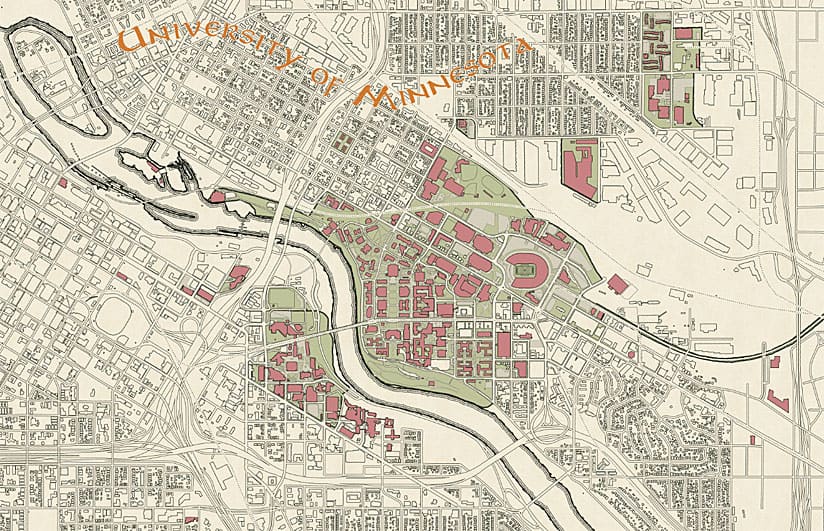
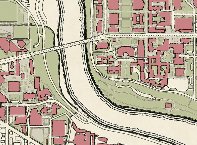
The following week, I made a campus map using Nelson’s New Amsterdam style. I loved the clean lines and colors of this map. But in the end, it didn’t work for me because labeling black buildings against a lighter background was too complicated. Label hardships strike again!

Next, I tried the Watercolor style that I read about in the ArcGIS Blog. I enjoyed experimenting. It was fun to see our campus represented in such distinct styles: fantastic, artistic, and vintage. However, again, the Watercolor style didn’t feel quite right, particularly because the lines of the road and building edges looked too squiggly, and I couldn’t quite picture how the labels would work for this style.
Finally, I stole the George Washington style from this blog post. I thought this style had a great look for a campus map—very classy—and I could imagine it hanging in a university office. I also felt that this style, other than looking nice, worked best with the scale and extent of the data as well as the size of the printed poster. After doing some initial research, I knew I could find an appropriate and complementary typeface for the labels and that they would be readable. These are the reasons why this style was the winner out of the four that I had tried.
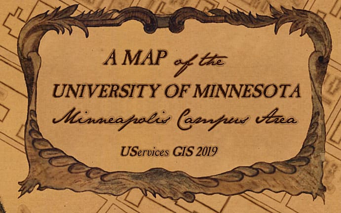
Now that I had selected which style I wanted to use for the final map, it was time to add labels and the finishing touches. On the Library of Congress website, I found the original George Washington map that Nelson used as inspiration for his style. I downloaded high-resolution clips of the north arrow and title area and then used Photoshop to lift those elements and add them as images to my ArcGIS Pro map.

For the labels, I found some old-timey-looking typefaces online, but they still looked too computer generated with a normal fill. I needed some way to soften the edges, and some style hacking did the trick. For example, I took the BoundaryGradientOutlineFill symbology from Nelson’s style, changed the tint of the fill, reversed the order of the symbol layers, saved this reconfigured style, and used it as the polygon fill for my labels and other map text.
By the way, I also stole this font from cartographer Warren Davison, whose work was featured in Nelson’s blog post “Not-So-Historic Survey Plan.” Stealing Nelson’s style paved the way for my new life of crime. I used Davison’s font for the Mississippi River and a few other labels.

My boss and I sent a copy of the map to Swanson, who was thrilled with my vintage-look map. He immediately went to Ikea to buy a frame for it (even though something antique and gilded might have looked better). This was a fun project for me. Next up: learning how to create my own styles from scratch (blog post with tips, please, Mr. Nelson?). I am inspired to take the rest of our campus maps to the next cartographic level, too!