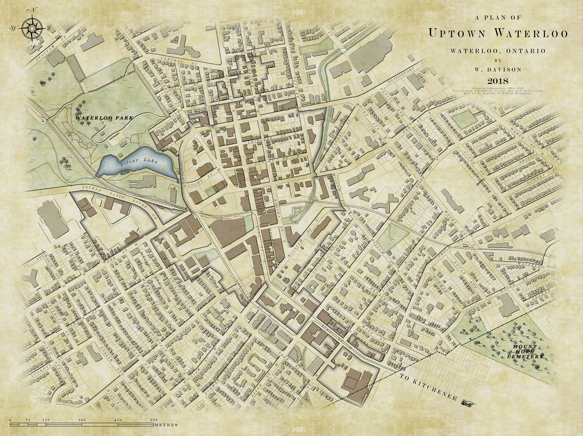
When I first saw this map of Waterloo, Ontario, by cartographer Warren Davison, I was so impressed with his application of texture and composition. Warren does beautiful work, but this map of his community shows specifically that the cartography of local assets can be fun and welcoming. His techniques would be equally well-suited to maps of parks, zoning, planned projects, and a host of other maps that a GIS team may be asked to produce.
Warren didn’t create this map as a mandate, though, but for fun. It’s a great reminder that we operate in an amazing field with a rich visual history and exciting technical future. This map is a wonderful blending of those perspectives and a welcome encouragement to think creatively about the potential of the maps we make.
I asked Warren to write a How-To, in his own words, to share his techniques and process, and he generously agreed.
The following is a guest post from Warren Davison.
. . .
I know it won’t come as a shock, but as a geographer by education and GIS Analyst by occupation there’s a certain fondness that I have for maps. Historic maps specifically, are particularly interesting as they have an allure to them. Maybe it’s because the majority of the maps I make on a daily basis are digital and printed on bright white paper rather than inked on parchment. Maybe it’s because the data is usually at my fingertips, and I never had to survey and illustrate each feature by hand. Whatever the reason, these historic pieces of cartography are captivating, so I decided to try and replicate some of the cartographic techniques using ArcGIS Pro. I was quite pleased with the results overall and I think they managed to achieve the visual effect that I was looking for despite being digital.
Now for how to make it! This map, like all maps, is a series of layers on layers and this is especially true for the symbology I used to create much of the effects for this map. So for simplicity I’m going to break things down by the most notable features and how I achieved the cartographic effect.
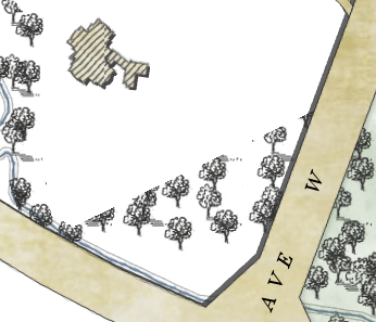
Parks and Forests
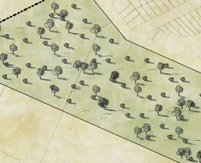
I found through a number of web searches for ‘old maps’ that many of the results had some very prominent tints and textures (like hand drawn mountains, fields, and forests) that set them apart from your standard modern map. So I set about looking for ways to include these symbols in my map.
I settled on a few samples of trees, shrubs, and grass tufts and created separate images of these features and set about filling in my map with my mouse rather than a quill or fountain pen (right, or control, click these images to save and use as textures in your own maps).
![]()
![]()

I started by adding a Marker Layer symbol to my parks layer and set it as a Picture Marker, choosing my grass tufts as the picture.
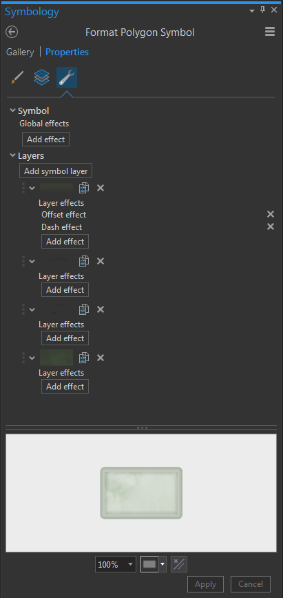
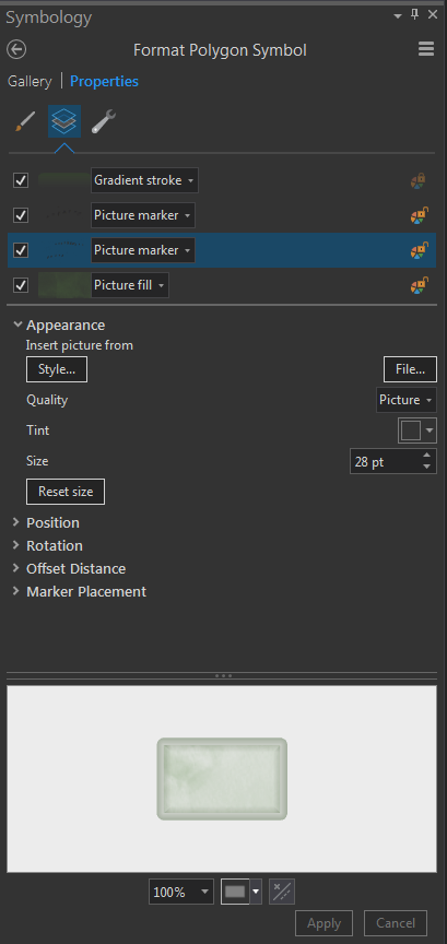
I then played around with the Marker Placement Properties, which I found have been significantly improved over ArcMap. Specifically, the ability to ensure that your image is never clipped by the boundary of the polygon it is supposed to fill, since this would distract from the feel of the map (c’mon no self-respecting old timey cartographer would illustrate a tree clipped by the boundary of the forest).
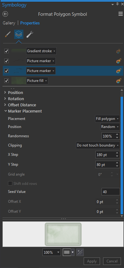
From there it was a matter of repeating the process. I added another marker layer with a slightly different picture of grass tuft, used a random fill with the ‘Do not touch boundary’ clipping option. This time I tweaked the X and Y step of the symbol to create a slightly different pattern offset from the original.
I repeated a very similar process with tree pictures to fill a polygon representing forests until I got something I was happy with. I ended up using 4 layers of trees and 1 layer for shrubs, all picture marker symbols filling a polygon with slightly different offsets and X/Y steps layered on top of each other. I completed the polygons with a mottled watercolour tint from John’s Hand to Digital project.
Water
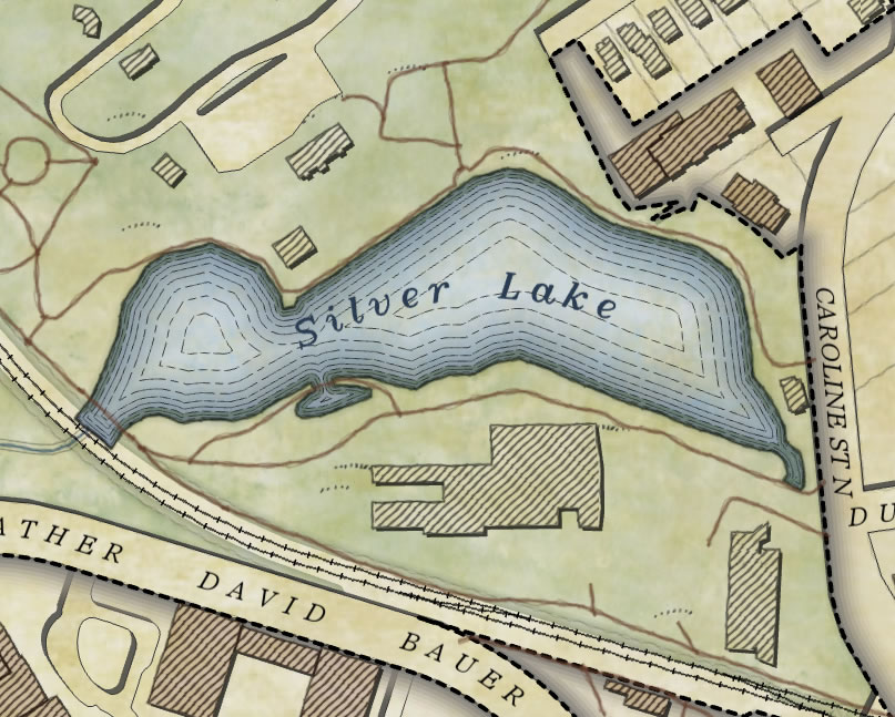
The water line symbology came from John’s adventures with waterlines with the addition of a REALLY faint (I’m pretty picky, it was 90% transparent) buffered gradient fill used to help tint the edges of features. I also completed these polygons with a tinted watercolour texture. Two, in fact, because I was again a little picky.
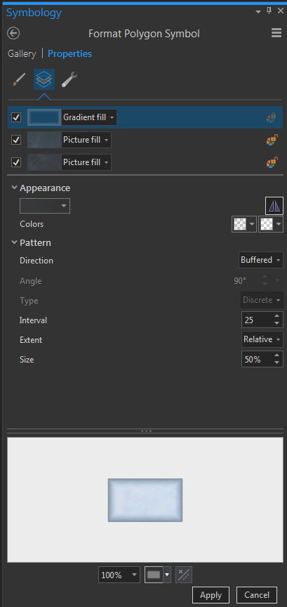
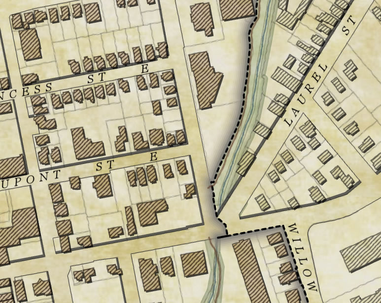
Structures
The last piece of the puzzle was to represent the building footprints. Again referring to my reference maps, many buildings were illustrated with a diagonal hatch pattern fill. I achieved this effect by using the squiggly pen line from the Hand to Digital post to illustrate the footprint itself as well as the hatch pattern within to get a very hand drawn visual effect.
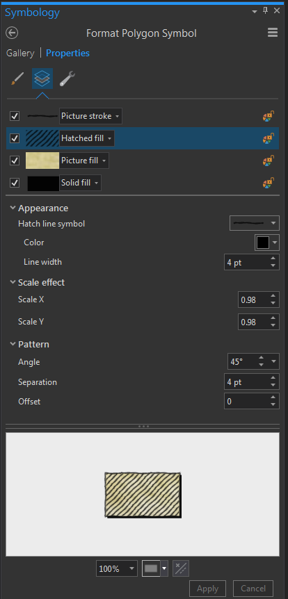
I then applied a drop shadow to bring the structures off the page slightly using the a solid fill layer with a Move Effect applied to it, this is the same thing I did to the road cover polygon in order to visually ‘drop’ it into the map.
The last step was to highlight the structures within the area of interest. I created a layer of those features within the Uptown boundary and symbolized them with yet another watercolour tint to darken the focal area of the map (the top most buildings have a slightly transparent fill to permit this highlight layer to show through).
Overall
Throughout the map I tried to use as as many picture symbols as possible, to soften the crisp lines of the digital data and make things appear hand drawn.
To finish off the layout of the map I added a vignette that I stole. Here’s the vignette without the background, to highlight the visual effect of covering the layout with a perimeter image of the same background texture, to soften the edges.
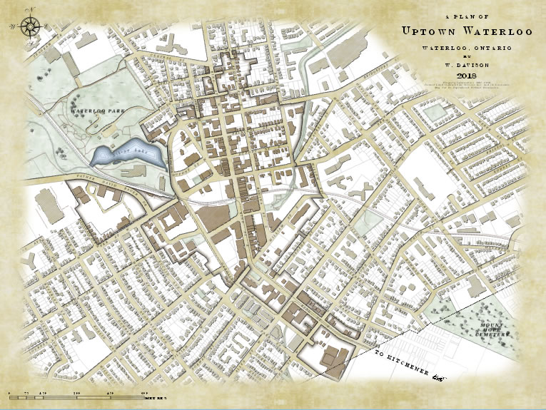
As a final note I’d just like to point out that despite lots of back-and-forth with layer arrangement, transparency, and marker placement this map was fairly straightforward to create. The root of this map is really just a bunch of neat little tricks that were iteratively applied. Through layering symbols, tweaking, and adding more or shifting them it was possible to create something really cool from something that was fairly simple.


Commenting is not enabled for this article.