Make Your ArcGIS Online Maps Pop with Layer Effects
Simple enhancements—whether it’s adding a drop shadow or increasing the intensity of the colors on your map—make your work really stand out. Subtle improvements like these make your maps look polished and professional.
In the September 2021 release of ArcGIS Online, a capability called Effects was added to Map Viewer. The Effects capability adds graphic enhancements, like drop shadows, sepia tones, and color contrast, to the layers in your web map. You can use Effects on all layer types that are supported in Map Viewer, including both basemap and operational layers, and even imagery layers.
You can apply one or more effects to a layer without changing the default settings for each effect, and then customize the effect settings with a few more clicks. When you apply an effect, there is no change to the data, and when you save the map, the effect is saved in the map as well.
Note: Effects are currently only supported with ArcGIS API for JavaScript 4 and later versions. Effects will not appear when printing the map.
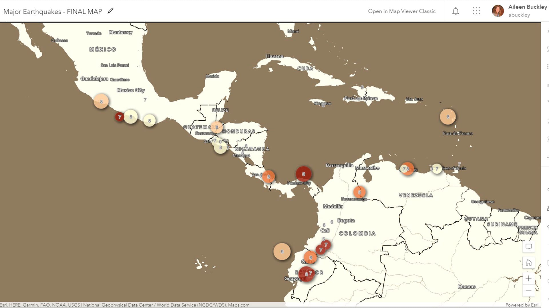
In this tip, you will learn how to use Effects to change this map of major earthquakes into the new version shown in the second image below.
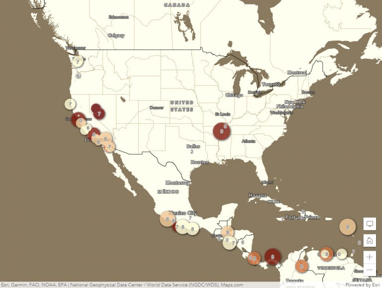
On the modified map, you will notice the following:
- The basemap colors better complement the earthquake layer colors.
- The earthquakes can be distinguished more easily from the basemap and each other.
- The labels stand out better from the basemap.
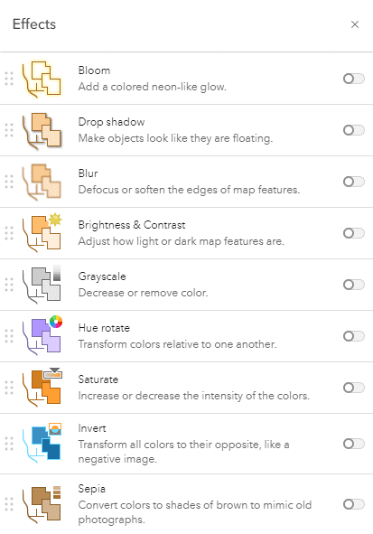
To modify this map, four effects were used: Drop Shadow, Invert, Sepia, and Brightness & Contrast. Below are the steps you can use to make the modifications.
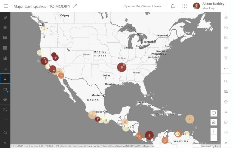
Step 1—Open this map in Map Viewer and sign in to ArcGIS Online. If necessary, zoom to approximately the same scale and extent as shown in the maps above.
Note: Your map may look slightly different if you are not working at a similar map scale and extent. The Effects capability will adjust automatically as you zoom in or out, so the map will look good at any scale.
If the it’s not already open, click Legend in the Contents (dark) toolbar at the left.

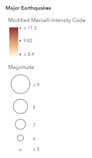
You will see that the intensity of major earthquakes is indicated by color. The magnitude is indicated by the size of the label as well as the number on it.
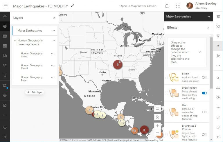
Click Layers on the Contents toolbar.

Click the arrow to the left of the group layer called Human Geography Basemap Layers.
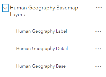
Three layers are used together to display the Human Geography Basemap. Since these have been added to the map as layers, they can be modified using effects.
Step 2—To modify the earthquake symbols, click the Major Earthquakes layer to select it. On the Settings (light) toolbar at the right, click Effects.

Click the toggle switch for the Drop Shadow effect.
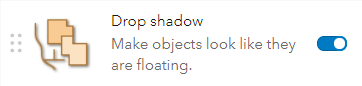
Click the X at the upper right of the Drop shadow window to close it and keep the default settings.

The earthquake symbols will be shown with a gray drop shadow, which is a blurred offset circle the same size as the earthquake symbol.
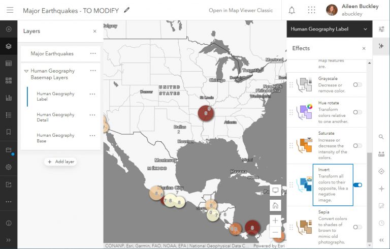
Step 3—To modify the basemap labels, select the Human Geography Label layer on the Contents pane. On the Effects pane, click the toggle switch for the Invert effect.

Close the Invert window to keep the default setting for Strength.
The colors in the labels will be switched, so their previously black interiors will be white, and the previously white halos will be black.
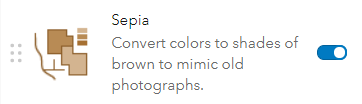
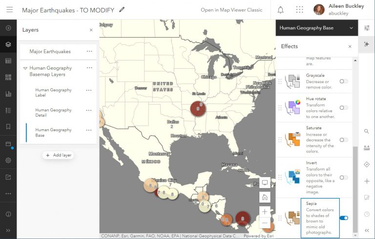
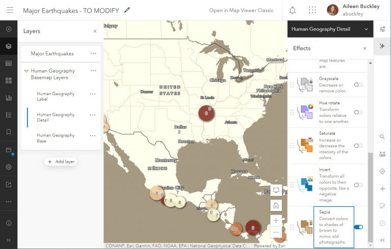
Step 4—To modify the basemap colors, select the Human Geography Base layer on the Contents pane. On the Effects pane, click the toggle switch for the Sepia effect.
In the Sepia window, set Strength to 50 so that the yellow land is slightly lighter than the round yellow symbols.
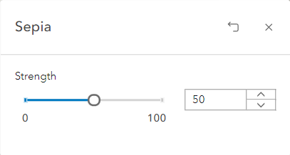
Close the Sepia window.
The layer will be sepia, a reddish-brown color, so that the gray tones are displayed as brown tones.
Step 5—To further modify the basemap colors, select the Human Geography Detail layer on the Contents pane. On the Effects pane, click the toggle switch for the Sepia effect.
Close the Sepia window to keep the default setting for Strength.
This layer will also be shown in sepia.
On the Effects pane, click the toggle switch for the Brightness & Contrast effect.

In the Brightness & Contrast window, set Brightness to 100 and Contrast to 100.
Note: The values will change based on the zoom level. If your map does not look like the one below, adjust the values until they are approximately the same.
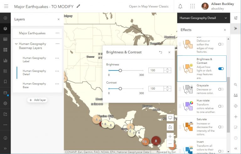
Brightness will cause the land’s color to lighten so that it is not so similar to that of the lightest earthquake symbols. Contrast will make the dark colors darker, which is especially noticeable for the streams and state boundaries.
Close the Brightness & Contrast window.
Step 6—On the Contents toolbar, click Save and open, then click Save to save your changes.

The map now looks polished and eye-catching.
Other effects can be used to create additional enhancements. Take some time to experiment with the effects and their combinations. You can even change the order of effects by dragging them up or down on the Effects pane.
To learn more, see these blog posts:
- Layer Effects in Map Viewer
- Enhancing Imagery Basemaps with Layer Effects
- Effects + Vector Basemaps for the Win
- Highlighting Areas Using Effects and Blending
This ArcGIS Online help topic may also assist you as you experiment with Effects:
