With massive amounts of data at your fingertips, it can be hard to bring focus to the maps you make daily. Resources like ArcGIS Living Atlas of the World bring a wealth of national and local datasets directly into your map with just a few clicks. But often, maps can easily become overwhelmed by data.
Instead of throwing data at your intended audience, make a policy map that emphasizes the most important patterns in your data and clearly shows opportunities to intervene based on those patterns. You can make small changes to your maps that shift the focus to the most important parts of the narrative. In this tip, learn to highlight specific features within your thematic maps in the ArcGIS Online map viewer by narrowing your focus with filtering and drop shadow effects.
Highlight Your Area of Interest
The most fundamental way to focus a map on your area of interest is to filter out data that isn’t as important. Effects like drop shadow can enhance this technique to make specific features on the map stand out in order to create or shape a policy narrative.
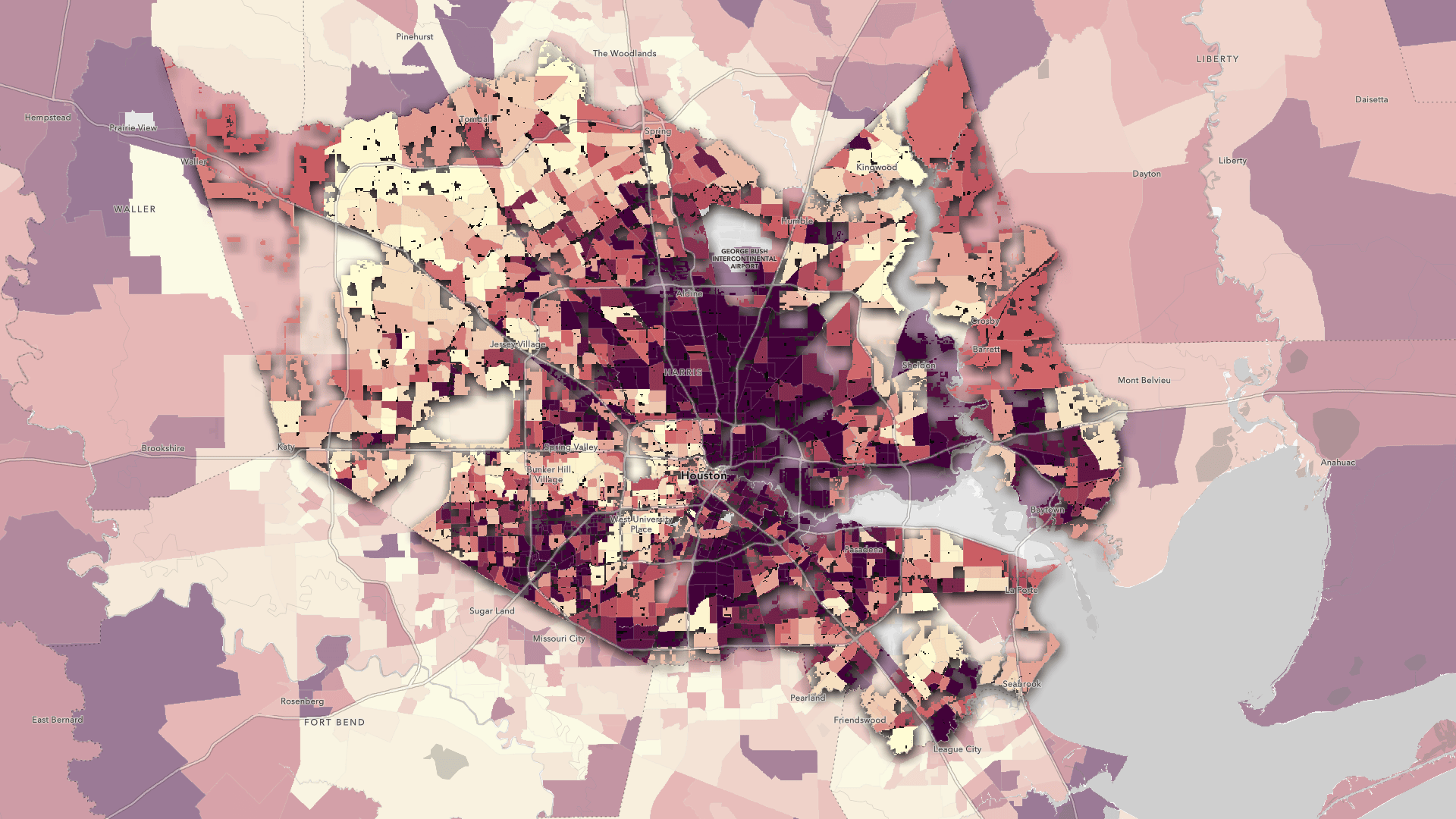
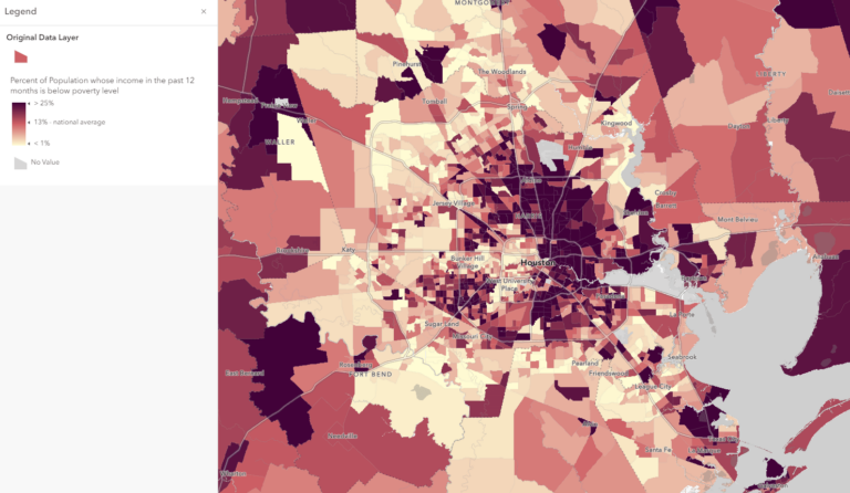
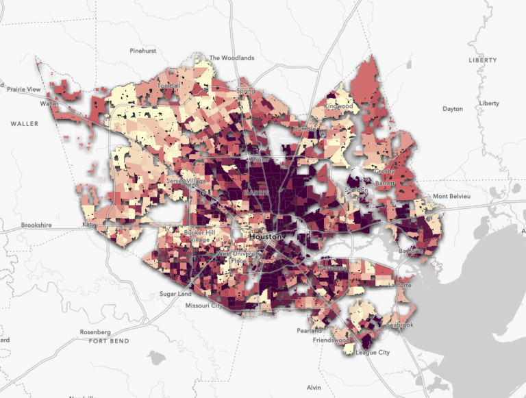
Sign in to your ArcGIS Online account to follow along using this web map. It shows poverty percentages by census tract using American Community Survey (ACS) census data in the ArcGIS Living Atlas layer ACS Poverty Status Variables – Boundaries. The example in this tip will focus on the Houston, Texas area.
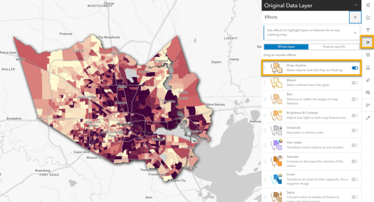
By opening the Layers pane on the left side of the map viewer, you’ll notice that the example map includes both an original data layer and several grouped layers that are hidden by default. The hidden layers demonstrate multiple ways of highlighting specific features to achieve different effects. This tip will teach you to achieve some of the same results by manipulating settings on the original data layer. You can then replicate the results with other Living Atlas layers or your own data, turning your maps into effective policy maps.
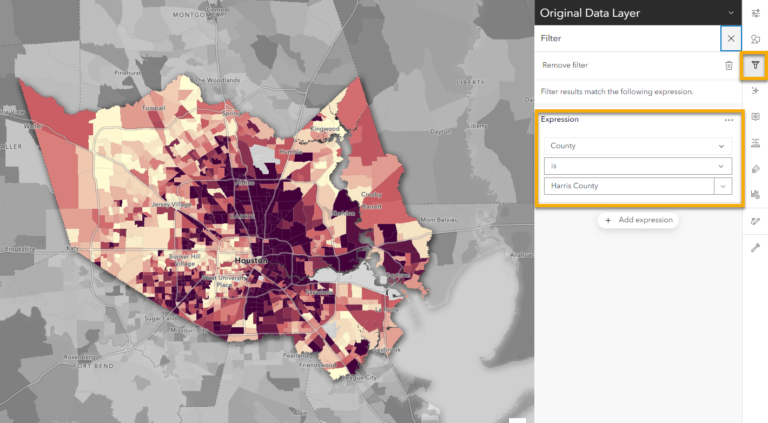
Step 1: With the Original Data Layer selected, open the Filter pane on the right side of the map viewer. Click Add expression, then use the drop-down menus to change the field to County and the value to Harris County. Click Save.
This ArcGIS Living Atlas layer contains built filter expressions that make it simple to emphasize specific areas of interest. If you don’t have a field to filter with, you can bring in an ArcGIS Living Atlas layer from the Boundaries category, and filter that layer to the area you want to show. In this case, it is filtered to Harris County.
See this blog for more about filtering without built-in fields and other information about emphasizing your area of interest.
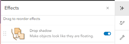
Step 2: Open the Effects pane on the right side of the map viewer.
Step 3: Click Drop shadow. Here, you can alter variables like the color and width of the drop shadow. Close the Drop shadow pane when you’re done.
Your original data layer should now look like the “Filter + Drop Shadow” layer. Here, you can focus exclusively on patterns apparent in Harris County without any background noise from the surrounding areas.
However, you may find context from nearby areas useful when creating a policy map. Understanding neighboring areas can help you compare local policies and patterns and understand how they are similar or different. To accomplish this, first make some small adjustments to the settings you just configured.
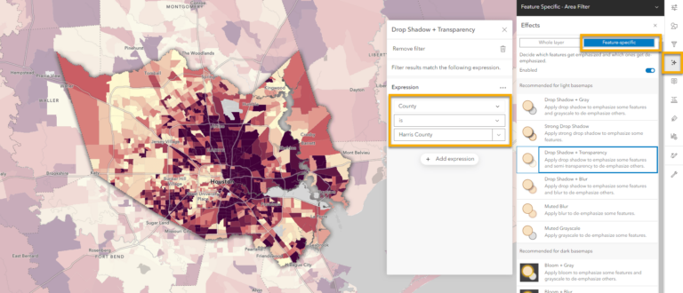
Step 4: On the Filter pane, click the trash can icon next to Remove Filter. Removing the filter will allow you to replicate the drop shadow effect on a specific feature instead of altering the whole layer.
Step 5: On the Effects pane, click Feature-specific, then select Drop Shadow + Transparency.
Step 6: Under Expression, set the field to County and the value to Harris County.
If you don’t have a field to filter with, bring in a layer from ArcGIS Living Atlas and create a group layer with your data layer. With the mask layer on top of the data layer, filter out your area of interest and add transparency to the layer.
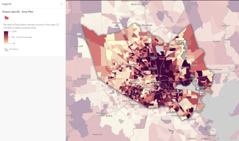
Your original data layer should look like the “Feature Specific – Area Filter” layer. Now, not only can you clearly observe patterns within Harris County, but you can also compare with data from neighboring areas.
Get More Specific with Population Layers
Sometimes you will need to narrow down your emphasis even further by not only focusing on your area of interest, but also showing where thematic patterns exist based on where people actually live.
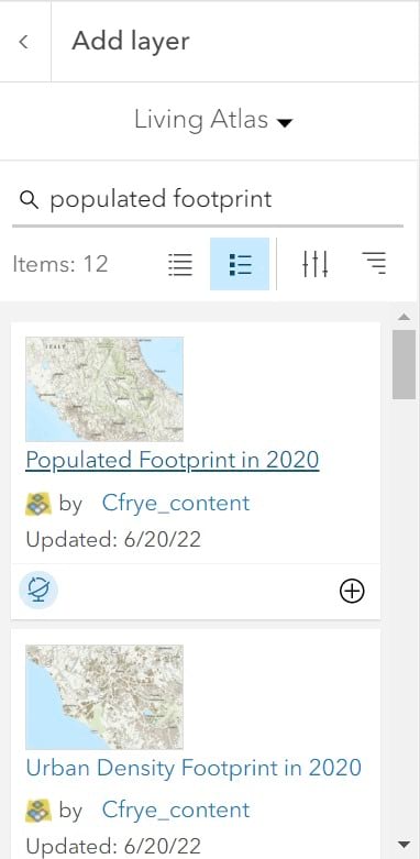
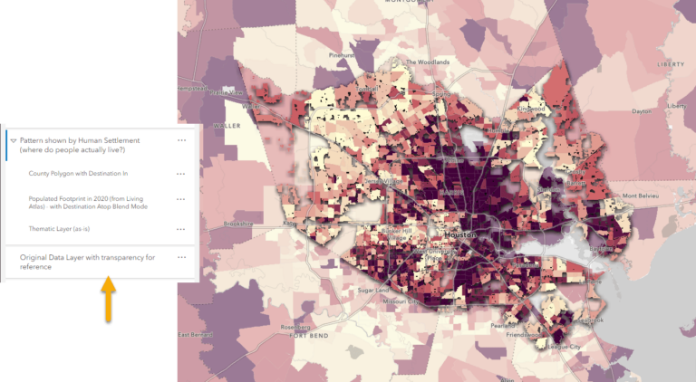
ArcGIS Living Atlas of the World contains a set of population rasters that help visualize populations. The Populated Footprint layer identifies where people live and where there’s no residential population (airports, industrial and forested areas, etc).
To further highlight populated areas within your area of interest, open a fresh version of the Harris County web map.
Step 1: Under Layers, click Add layer. Using the drop-down menu, navigate to ArcGIS Living Atlas, then type “populated footprint” in the search box and select Populated Footprint in 2020.
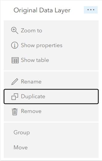
Step 2: Duplicate your original data layer by clicking the three dots beside the layer, then selecting Duplicate.
Step 3: With the duplicate layer selected, repeat steps 1 and 2 under “Highlight Your Area of Interest” to filter the layer to show Harris County.
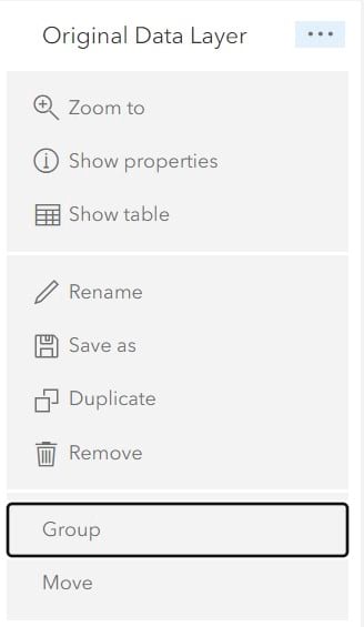
Step 4: Group the original data layer and the duplicate filtered layer with the new Populated Footprint layer by clicking the three dots beside the data layer and selecting Group, then dragging the other two layers into the grouped layer. By grouping the layers, you can add effects and blend modes without distorting your basemap or other layers in the map.
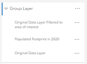
Make sure your layers are grouped in the following order: the area of interest boundary (in this case, the filtered layer showing Harris County), Populated Footprint, and the clean data layer.
Step 5: With the filtered layer selected, on the Properties pane on the right side of the map viewer, click the drop-down menu under Blending and select Destination In.

Step 6: With the Populated Footprint layer selected, navigate back to Blending and click Destination Atop.

Step 7: With the entire group layer selected, go back into the Effects pane, then use Drop shadow to make the pattern pop from the map.
Your original data layer should now look like the “Pattern Shown by Human Settlement” layer. The thematic data shows through, but only for the county you are interested in, and only by where people live. This allows you to observe patterns and draw conclusions based on a more targeted look at the area.
For extra context and detail, you can duplicate your data layer underneath your group layer in the table of contents and add transparency to it. This will reinforce the initial pattern, but still highlight it with human settlement.
Filtering, drop shadow and other effects offer an easy way to bring focus to your maps by highlighting your area of interest, all without any analysis. You don’t even need your own data to do these techniques—and you can always bring in ArcGIS Living Atlas layers to emphasize the areas you want highlighted.
Related resources:
Add emphasis by highlighting your area of interest