Whether we realize it or not, the data we map often contains values of meaning and importance. Sometimes these values are rooted in science, such as 32° F being used to show temperatures where water freezes, or 0 ft being used as the elevation of sea level.
In some cases these values are rooted in policies, laws, or other government mandates. For instance, the United States Department of Housing and Urban Development defined a threshold for housing cost-burden originating from the 1969 Brooke Amendment. If the cost of housing exceeds 30 percent of a household’s income, that household is experiencing burdensome housing costs. This 30 percent can be used as a data-defined threshold to determine if a household is considered cost-burdened
Other times, these values are constructed by criteria or goals set by your own organizations. For example, often times non-profit organizations will use 50% of the Federal Poverty Level as a threshold to focus their resources and services on areas experiencing the deepest levels of poverty.
Lastly, meaningful values can more often than not just be simple statistics, such as using the national average of an attribute as a benchmark, or using the county average when mapping census tracts.
This blog will bring to light a few techniques on how emphasize your thematic maps’ data values in ArcGIS Online’s Map Viewer. There’s also a related blog about bringing focus to your maps by adding emphasis to your area of interest by my teammate Lisa Berry.

A technique commonly discussed on my team at Esri is the idea of making your maps “policy maps” instead of just throwing data at your intended audience. A policy map is a map that emphasizes the most important patterns and areas of need. As described by Steven Goldsmith, Professor of Urban Policy at Government and the Director of Data Smart City Solutions at Harvard’s Kennedy School of Government, a policy map is a map that clearly shows where there are opportunities to intervene.
One of the crucial parts to making a policy map is mapping data values of meaning and importance. These values are generally research-backed, and are determined by collaborating with subject matter experts and stakeholders. By default, the software does a decent job of suggesting values to map based off of numbers generated by a classification algorithm. But by going one step further, and choosing to emphasize values of importance, you are able to make a more focused, and thus impactful map.
You can show all the data all the time if your situation calls for that, but when you want to ensure the audience is not distracted by less important data, you can filter out features that fail to meet a threshold, or you can choose to emphasize those features that do meet a threshold.
By using tools like Filters, Transparency by Attribute, and Feature-Specific Effects, you can emphasis the most crucial areas in your map. There are many other considerations and techniques used to emphasis your maps data values, such as choosing the right classification. My colleague Jim Herries has an excellent blog that goes over how to choose the right classification, and choose better break points to define your thematic map’s purpose.
Filter Tool
Probably the technique most map makers are familiar with, is by simply using a filter expression in Map Viewer to focus on a specific threshold for an attribute of your choice. For example, an education advocacy group might be interested in mapping the high school completion rate to see to see where areas have a high percent of those who haven’t completed high school. In order to focus their resources and grant money, they might be interested in only focusing on areas that are above the national average of 12%.
We can use the ACS Educational Attainment Variables – Boundaries for this example that is found in ArcGIS Living Atlas of the World. This layer as well as many other demographic, boundary, and other layers in Living Atlas can be used to help you map with a purpose.
To start off in Map Viewer, we can add this layer in by selecting Add Layer in the left pane, Living Atlas in the dropdown, and searching for ‘ACS Educational Attainment Variables – Boundaries.’ By default, this layer will be mapping the attribute Percent of Population 25 Years and Over whose Highest Education Completed is Less Than High School, and it even gives us the national average in the legend.
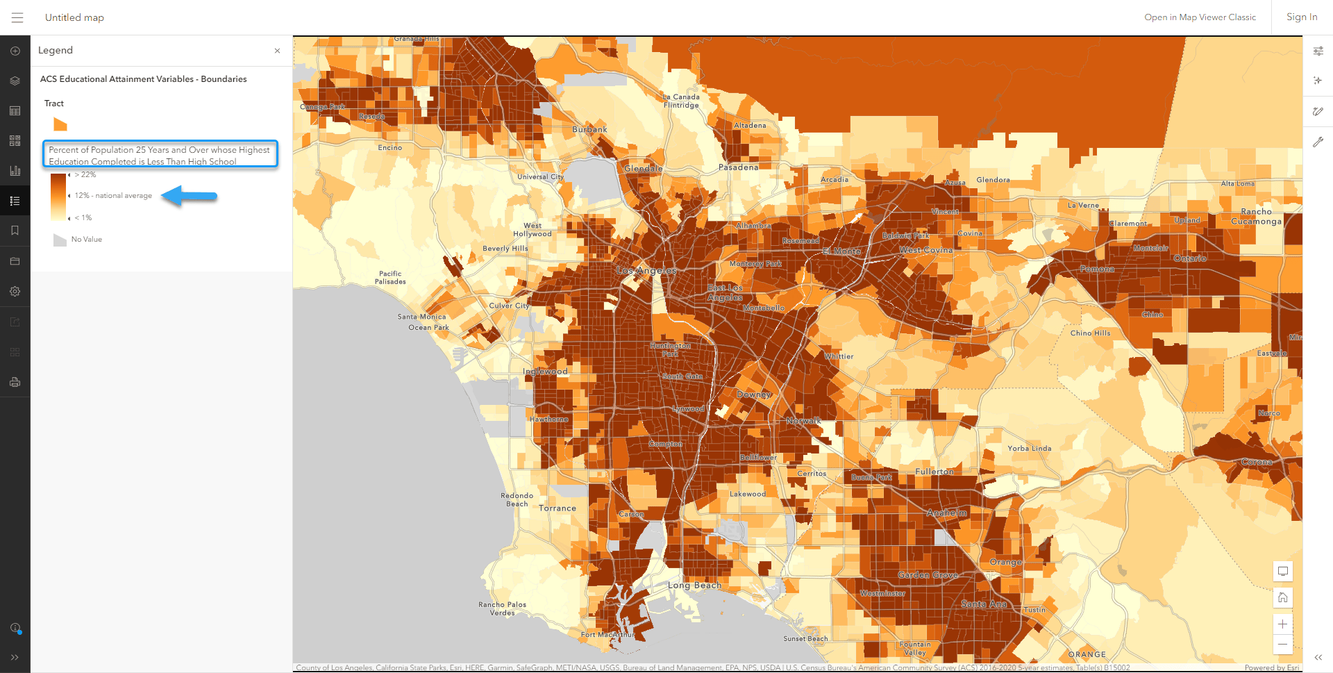
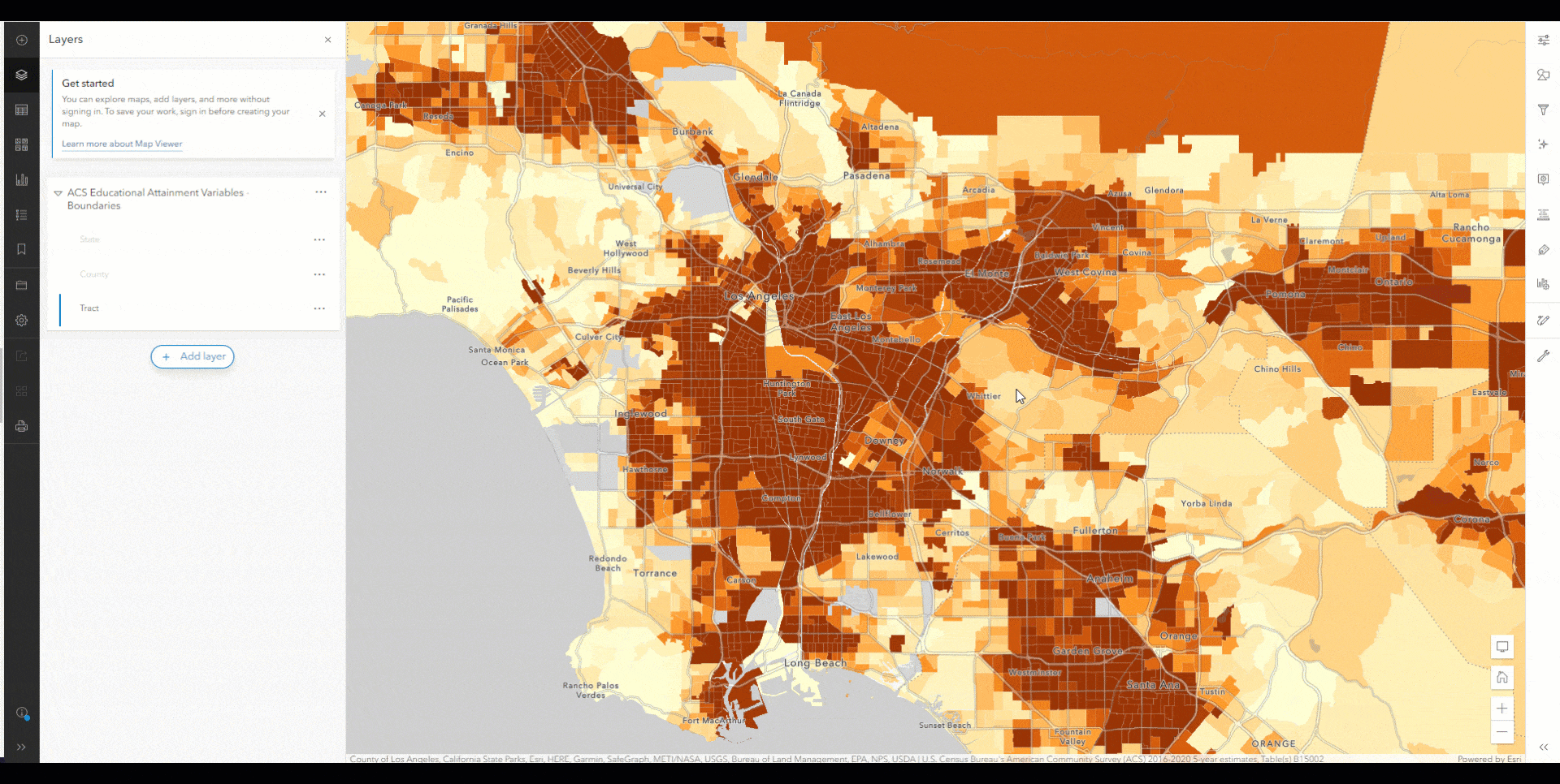
In order to filter, simply select your layer of interest, in this case I’ll use the tracts layer, and select the Filter function found on the right toolbar, shown as a funnel icon. Select ‘Percent of Population 25 Years and Over whose Highest Education Completed is Less Than High School’ as the field, and then we’ll use software’s defaults for the operator and value. The software by default suggests we focus on areas that are at least higher than the national average of 12.1%. In just a few clicks, we’re already in the right direction in emphasizing areas on our map using data values of significance. We’ve removed any census tracts on our map that don’t meet our threshold of 12%, so we can better focus on these areas of interest.
Transparency by Attribute
Using transparency by attribute is great for further emphasizing your data values on your map. Following our previous example of the percent of those who haven’t completed high school, an education advocacy group might want to focus not only on areas with high percent of adults without high school degrees, but also on areas with a large number of adults who haven’t completed high school. In order to focus your limited amount of grant money, you might look at areas with at least 500 adults who haven’t completed high school, but with a focus on areas with more than 1,000 adults who haven’t completed high school.
To do this in Map Viewer, locate the Styles pane in the right toolbar and select Style Options. The bottom option will be the Transparency by attribute function, and then enable ‘Set transparency based on attribute values.’ Choose the ‘Population 25 Years and Over whose Highest Education Completed is Less Than High School’ as the field, and adjust the lower bound bar to 500 , and the upper bound bar to 1,000. Setting the Low values in the Transparency range to 100% will give full transparency to anything below 500, filtering out any tracts that don’t meet this threshold. While anything between 500 and 1,000 will receive some transparency, thus deemphasizing them in the map. Anything above 1,000 people will have zero transparency, creating emphasis on areas with this population threshold.
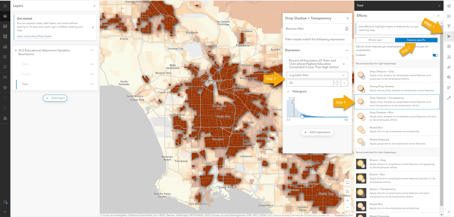
Feature-Specific Effects
The feature-specific effects capability is a technique in Map Viewer that acts like a filter on your data, but instead of removing the other features from the map, it makes them look more subtle or subdued. This is beneficial because it allows your map to still emphasize the features that meet your attribute criteria, while still giving context on the surrounding area by deemphasizing other features through effects.
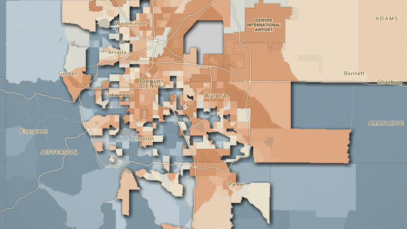
Continuing from our above examples, instead of using the filter function or transparency by attribute, select feature-specific effects in the Effects pane. By default, the software suggests feature-specific effects for the attribute we’re currently mapping, and suggests using the any data values that are greater than the national average as the operator and value. Let’s go one step further and change the data value to 25%, as we might want to focus on areas with at least a quarter of their adult population not having a high school degree.
Lastly, we’ll switch the default Drop Shadow + Gray effect that emphasizes any feature above our 25% threshold, but completely grays out everything else. Switching to the Drop Shadow + Transparency still emphasizes any feature above our 25% threshold, but it subdues the other values with added transparency while still giving us some context from the differing yellow-orange-red colors on the map.
Final Thoughts
These techniques are just a few ways to add emphasis to your data’s values, and by either filtering your data, using transparency by attribute, or feature-specific effects, your maps can quickly transform to data-driven maps that focus on the most crucial areas. Whether these data values were rooted in science, contrived from a policy, an organization’s own goal, or simply a statistic of an area, using meaningful and significant values in our data can help be the difference in turning a good map into a great map.
Related resources:
Blog: Add emphasis by highlighting your area of interest
ArcGIS Living Atlas of the World
Blog: Apply a local focus using blending and effects
Blog: Apply a filter to make Living Atlas layers your own
Blog: Make an ACS map of your community in just a few steps
Blog: Top 10 tips for policy mapping


Article Discussion: