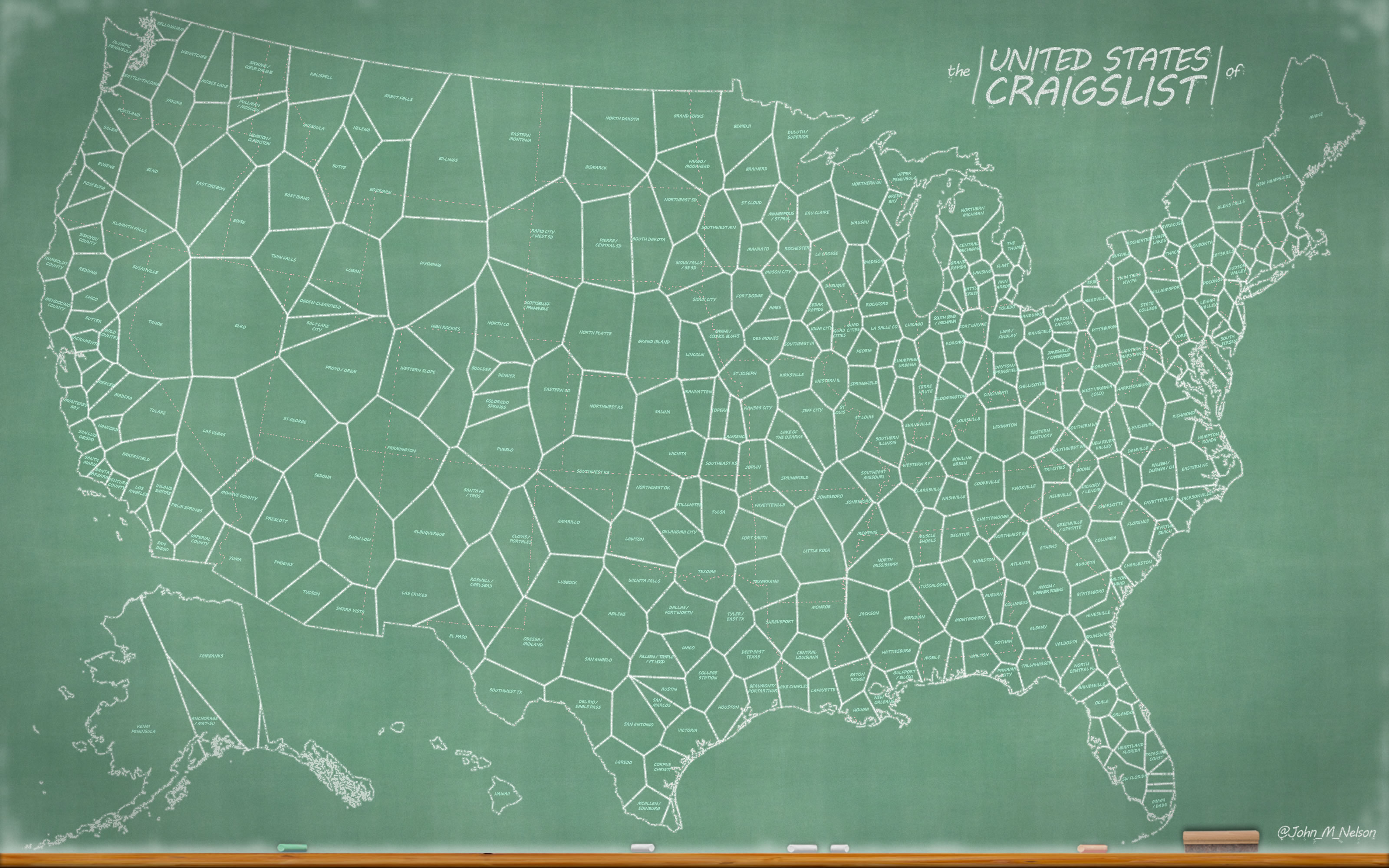
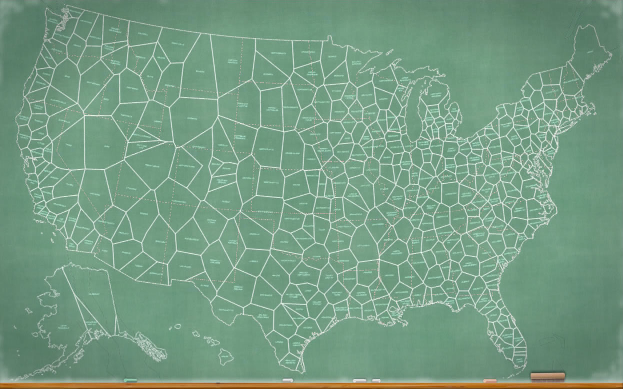
Ah the trusty old, well-worn, United States of [Thiessen Polygon] Map. But at least I was a relatively early adopter (the original version was made in…yikes!…2011). Sure, this post will show you how to make these boundaries, but more interestingly, it will show you how to make a chalkboard-style map! Now pay attention or teacher will rap your knuckles with a ruler.
There are only a couple key tricks to getting the chalkboard style rolling. The first is using a nice seamless chalkboard texture. The second is in hacking that stippled chalky line style. Here are some resources to get us going…
Data & Resources
- The United States of Craigslist (link to polygon shapefile download page)
You are welcome! This represents lots of dissolving (for multi-location sites), and manual crafting (so orphaned peninsulas actually get assigned to the most drive-able site). I’ll show you how it was made, but in the meantime just cheat and download the results. - Chalkboard Image Assets (a zip with two PNG images)
This is the green chalkboard texture used for the background. It’s not easy making a texture image that repeats without obvious edge patterns. This will save you lots of time! Also included is the over-the-top-skeuomorphic image overlay with cute little pieces of chalk and dusty corners, etc. Just adorable.
Ok, time to start dragging our fingernails down this map…
How These States Got Their Shapes
If you’ve ever read this book, or watched this show, you are keenly aware that the United States were carved out in a surprisingly arbitrary, and sometimes accidental, fashion. Let’s take a crack at generating some new states, based on pragmatic economic zones.
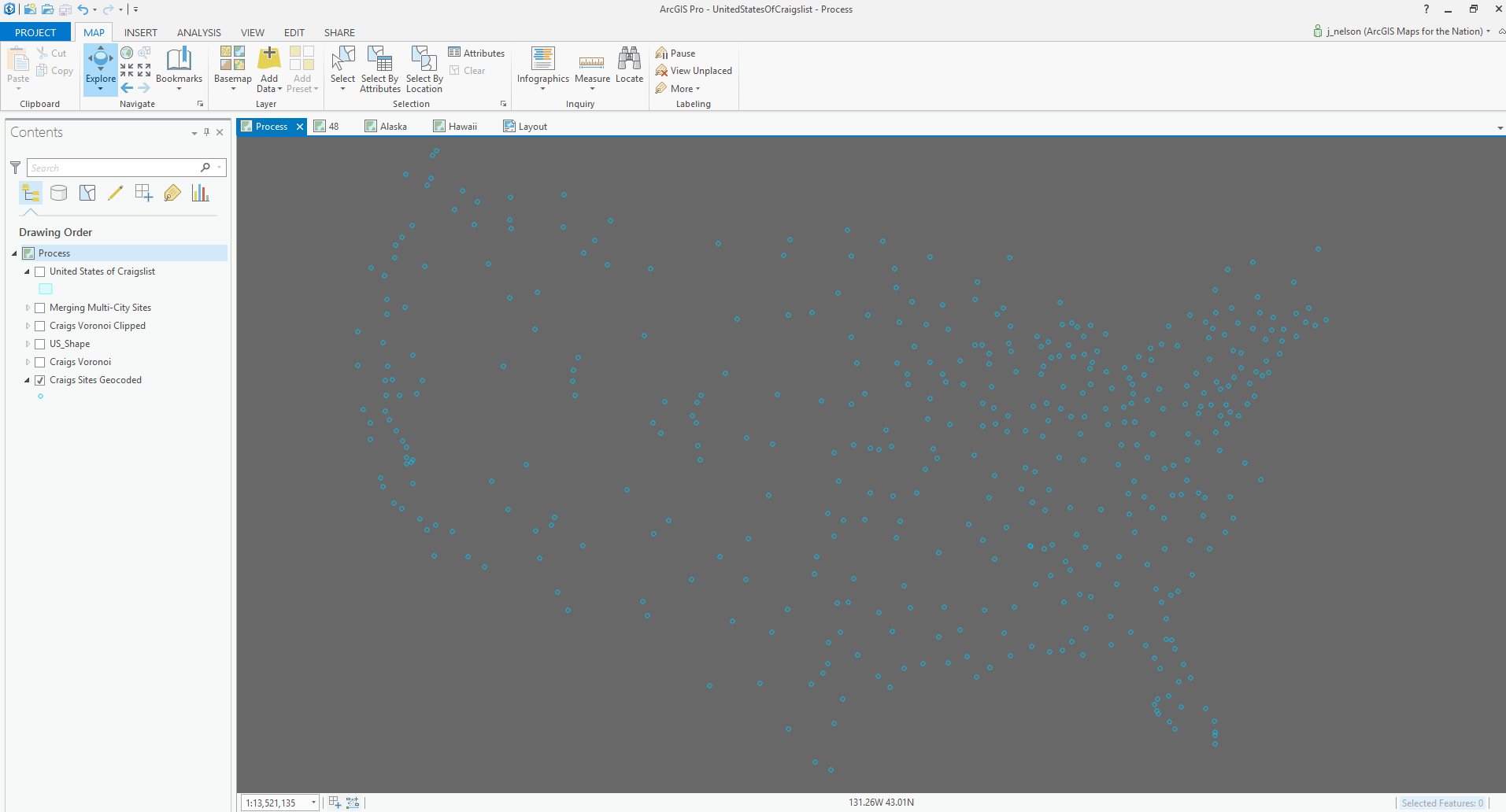
I went to Craigslist’s sites page, and copied all the sites for the United States, dropped them into an Excel table (splitting up all the multi-city sites) and geocoded them. While Craigslist shows their own point-map of sites, we need to be more specific, since we’re turning them into polygons.
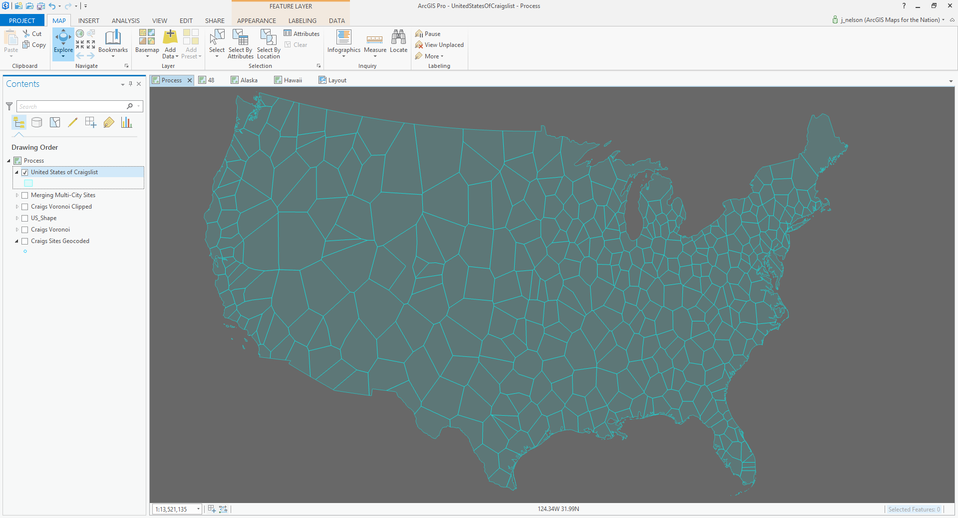
I added them to ArcGIS as XY events. I marvel at the goodness of visualization every time a table is accribitzed into a map. Fortunately for me, a cartographer, this means I marvel a lot.
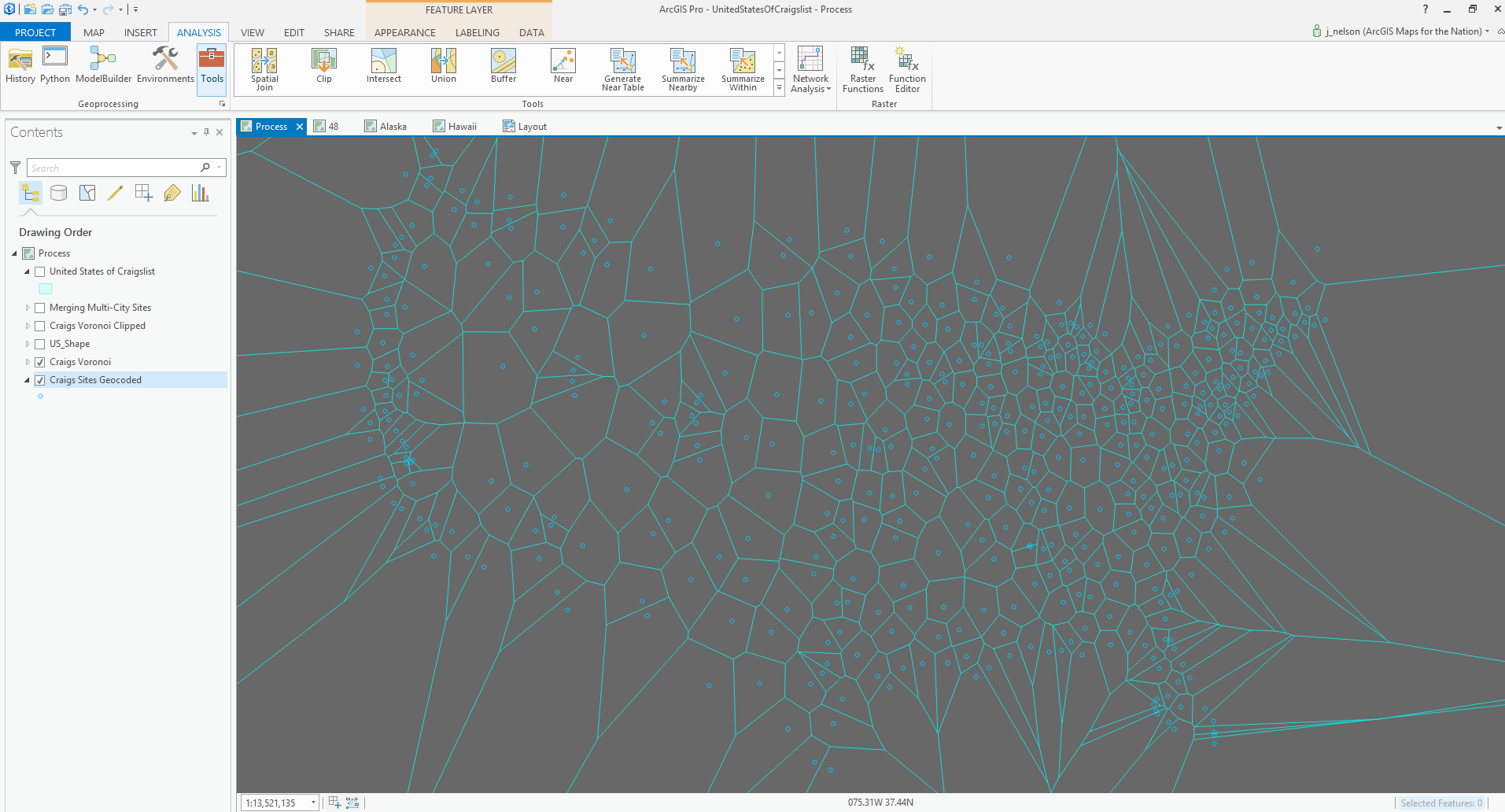
Now for some whiz-bang polygon generation! I used the “generate Thiessen polygons” tool. Thiessen (or “Voronoi” to non-map people) polygons divvy up areas that are considered the closest to a seed point, before getting closer to another seed point. In real life, there are lots of practical conditions that would alter these, like natural barriers or road network conditions, etc. But they’ll do for now.
Speaking of natural barriers, the Thiessen polygons stretch out into the oceans. Let’s pull in a shape of the US land and have a look.
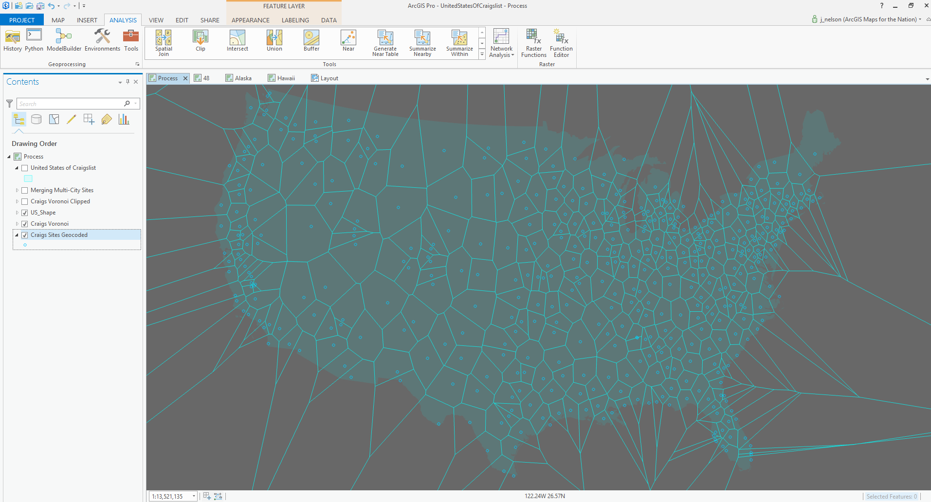
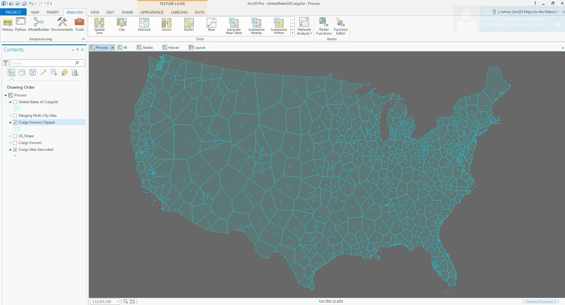
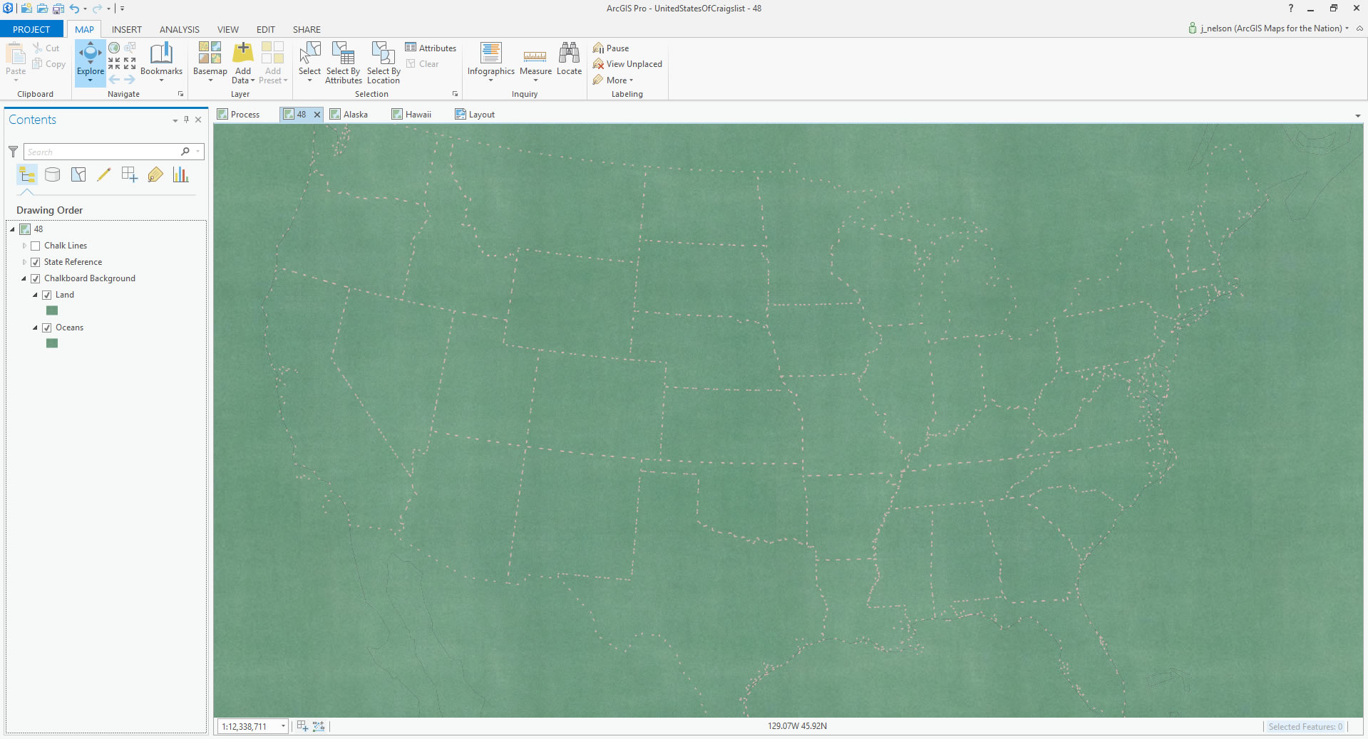
Using a “clip” tool, we can chop off the parts of the polygons that don’t intersect land. Like a cookie cutter. Don’t worry, Alaskans and Hawaiians, I’ve included you too, you just don’t play well for screen-captures.
Remember those pesky sites that had multiple places in their name (akron/canton, dallas/ftworth, etc.)? So far, we have a zone for each named place in a craigslist site. The orange lines represent the within-site divisions that we’ll have to dissolve.
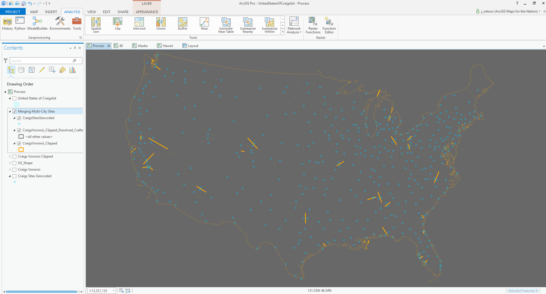
Running a “dissolve by attribute” merges the geometry of same-named sites. Now we have some slightly weird, but more truthy, polygons.
Chalkboard Styling
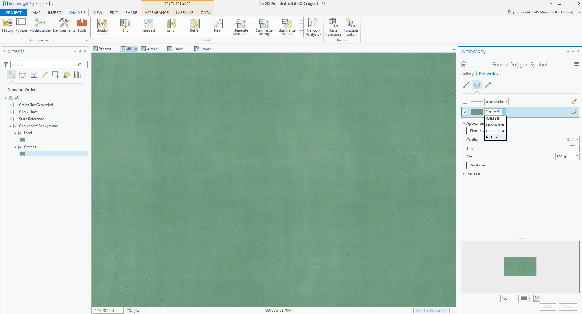
Let’s style this sucker up! Did you know that you don’t have to use a solid color to fill polygons? You can use a hatched pattern (fun), a gradient (use judiciously), or a picture. Since I want the map to look as much like a chalkboard as possible, a simple black or slate colored background won’t cut it. I’ve made a chalkboard texture image to fill my background shapes. Beware, lots of green from here on.
I have a shapefile of continents, and a shapefile of oceans, which happen to combine to fill the screen. You can use whatever file you want, as long as it covers your whole view. Using the chalky image as the picture fill for these polygons gives us a nice chalkboard-looking “basemap.”
In the Layout, you could alternatively just add a rectangle and use this image as a picture fill. Whatever’s easier for you.
Now, to bring in the Craigslist states. But how to make them look like they were drawn with chalk? To me, chalk lines have a chunky, stippled, look from one material being scraped over another material.
If I give the stroke a dashed effect, then randomize the dash-iness (a series of numbers telling the map how many pixels to draw and skip and draw and skip), it has a sort of chalk-like feel. Then if I do the same thing for a second version of the lines, but with a thicker and more transparent stroke, they combine into something that looks pretty good!
Here’s what I used (but, it’s like, random, so feel free to type out your own set of numbers):
Thin Line
2pt, #FFFFFF, 40% transparent
Dash template: 4 3 1 6 1 4 8 1 2 3
Thick line
5pt, #FFFFFF, 80% transparent
Dash template: 3 2 4 5 2 3 2 5 4
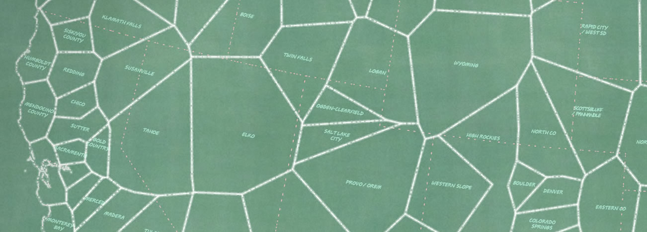
Here’s a closer look at my hack chalk lines…
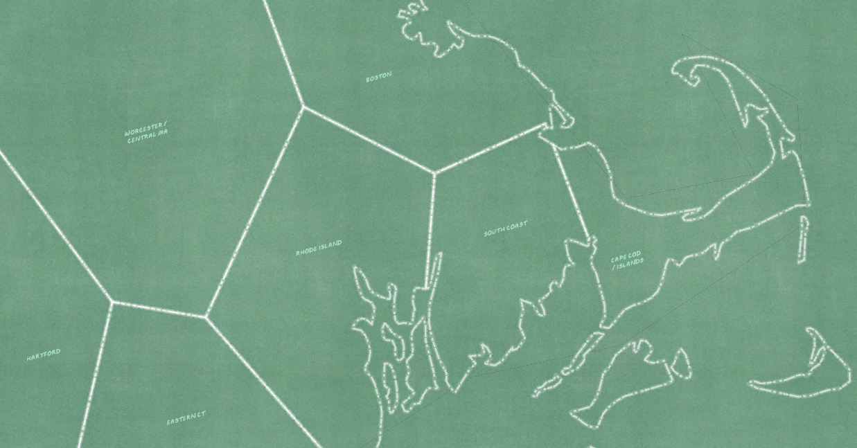
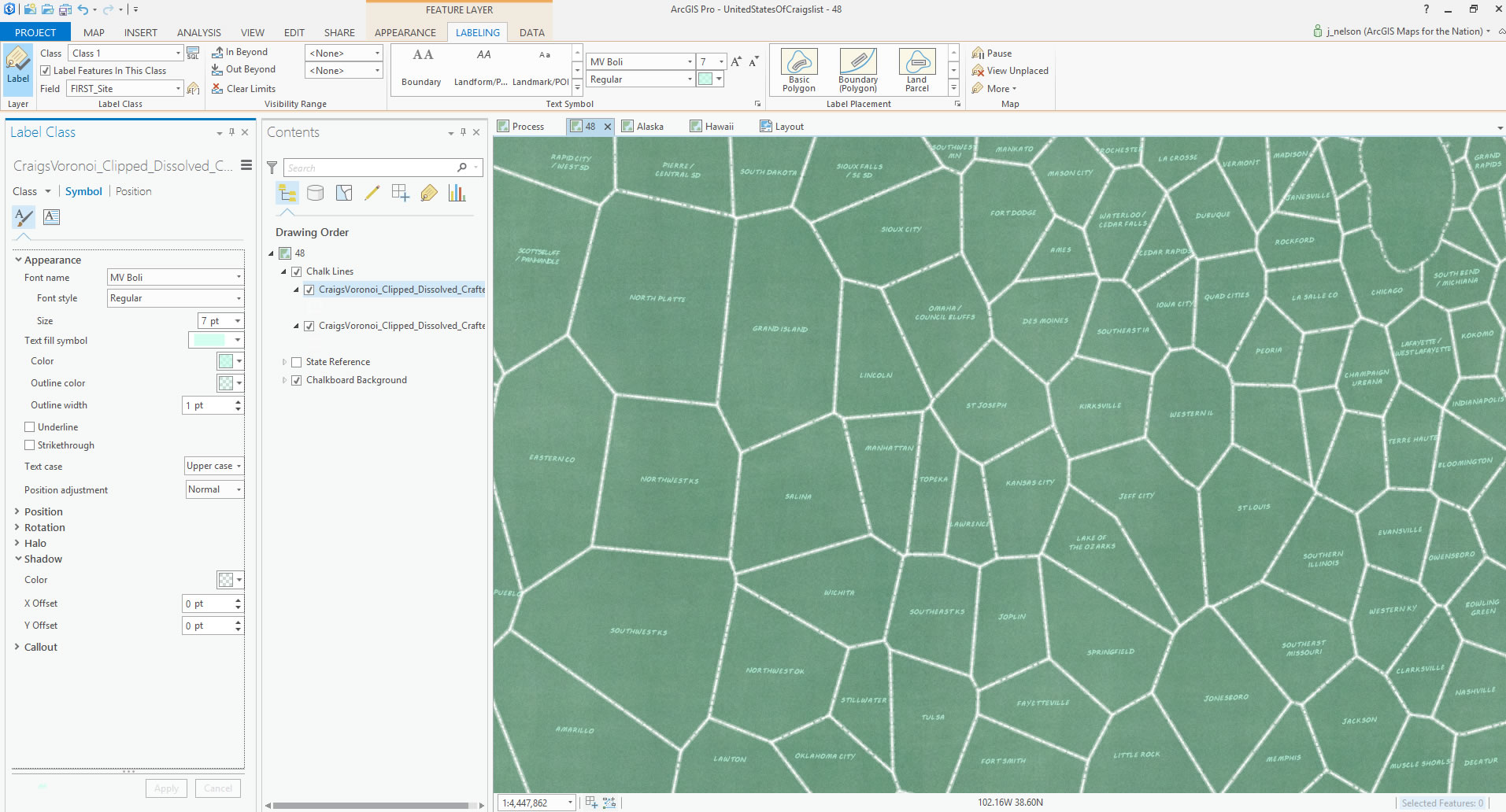
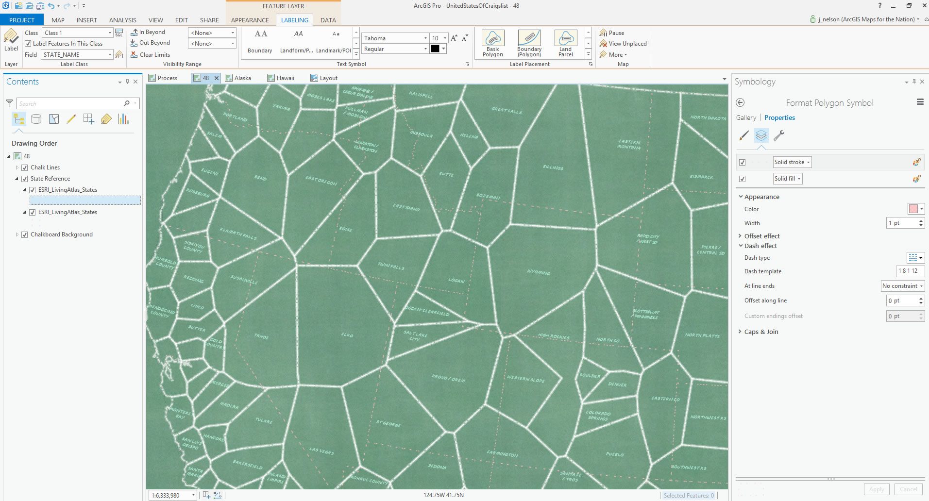
Time for some United States of Craigslist labeling. I’m using the site name. I chose one of the chalky outline layers, and I turned labeling on. You can monkey with specific details like letter spacing, placement properties, arcing along latitudes, etc. But here the chalk-specific things: Font, color, and effect.
I spent about three minutes looking at script-style fonts on my machine and found MV Boli to be fine. It looks an awful lot like Comic Sans, which I find to be cheeky, but it’s not, so I’m shielded from specific scorn by a technicality. Anyway, it looks reasonably hand-scrawled (I pushed it to all caps).
A pastel color (lighter than you may be thinking) helps convey chalk. I used #BEFFE8 with a transparency of 30%. Then I applied the same color as an outline but with a 70% transparency. This helps with that fuzzy irregular edgedness of chalk.
Since I’m proposing a radical, blood-soaked, re-thinking of states and re-drawing of their borders, it is helpful to draw in the current state boundaries for some context. I picked a similarly pastel-ish chalk color of #FFBEBE. Like my other lines, I applied a somewhat random dash pattern and made a version that is thinner and slightly transparent, and a version that is thicker and more transparent. There. States.
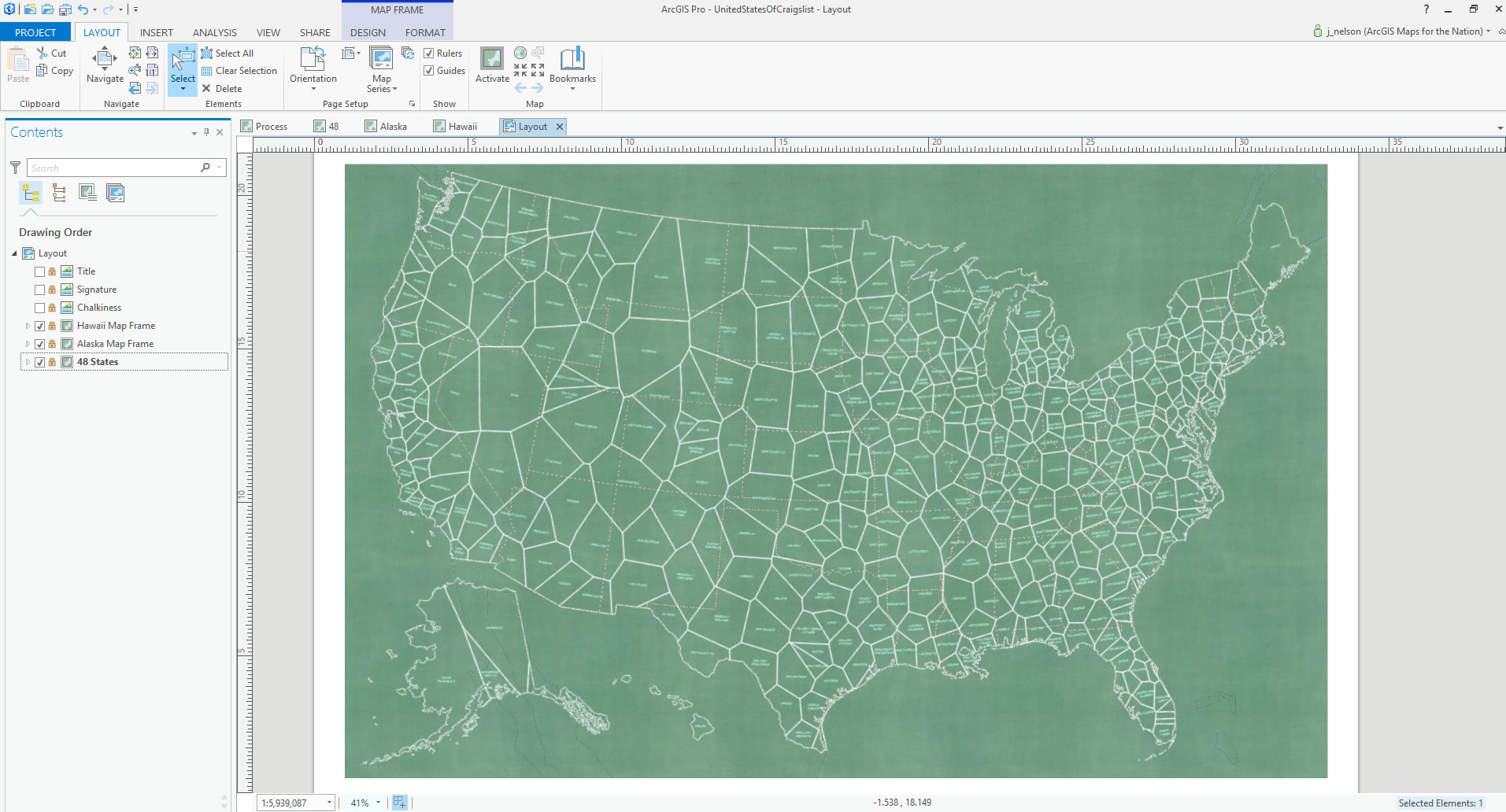
Craigslist states, and real states.
Chalkboard Layout
Ok, time to fine-tune some of the layout and design elements of this thing. I’ve inserted a new layout and added my map. I also made an Alaska version and a Hawaii version in separate map views (just copy/paste the layers) so I can add them to the layout as insets.
Whew. All that geography stuff out of the way. Now it’s time to lob delicious skeuomorphic clutter all over this thing!
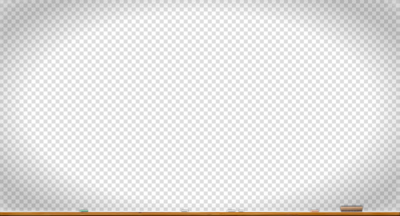
In a graphic design tool, I made an image overlay to fit on top of my layout so that its full chalkboard potential could be realized. It includes some vignetting, leftover chalk dust in the corner that never gets fully erased, and of course a fine wooden tray to hold the chalk and eraser.
Yes!
Always sign your work.
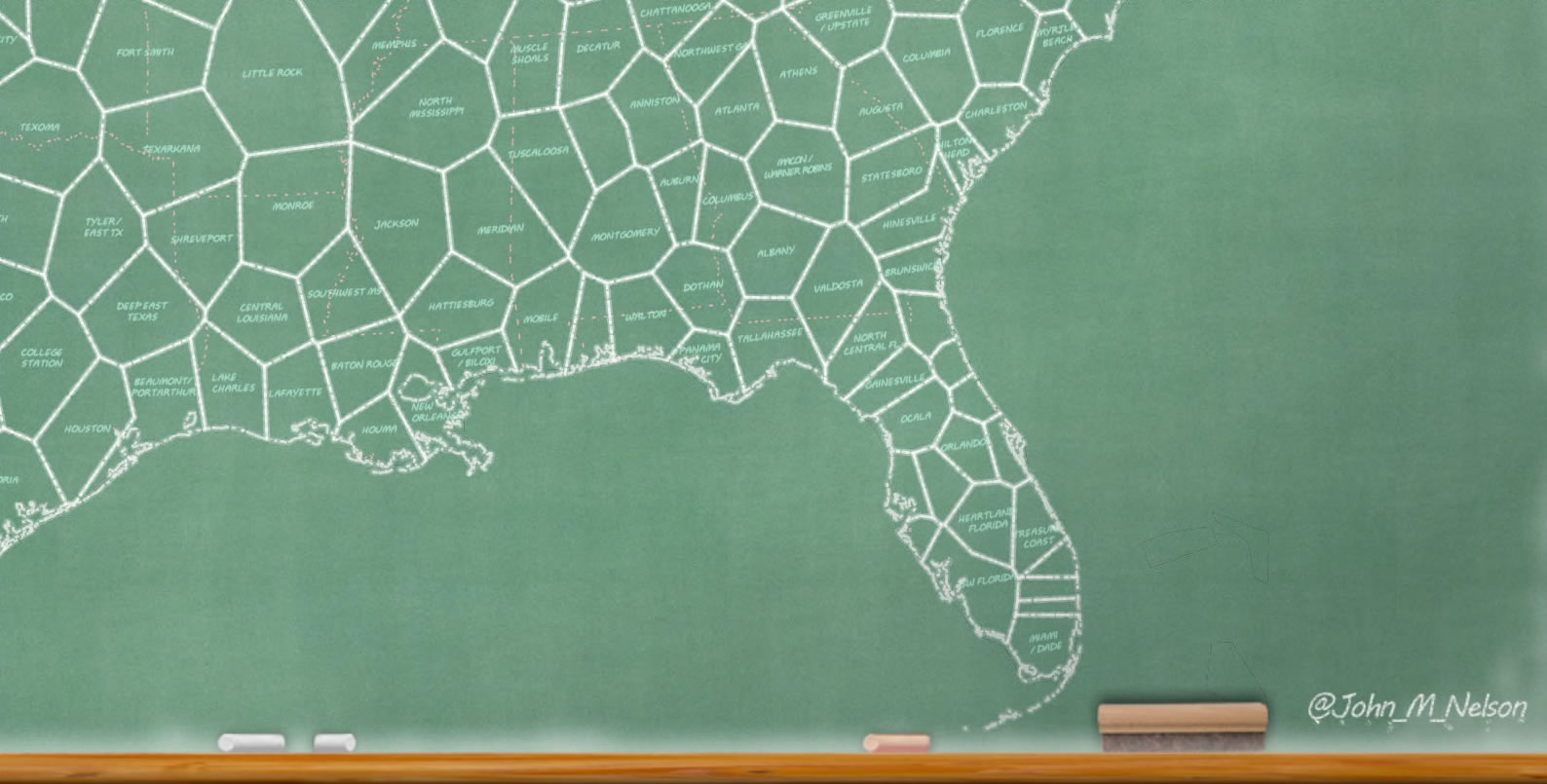
Then I dropped in a title image, and we have it! A chalkboard map of the United States of Craigslist. Good times.
Happy Chalkboard Mapping! John

Article Discussion: