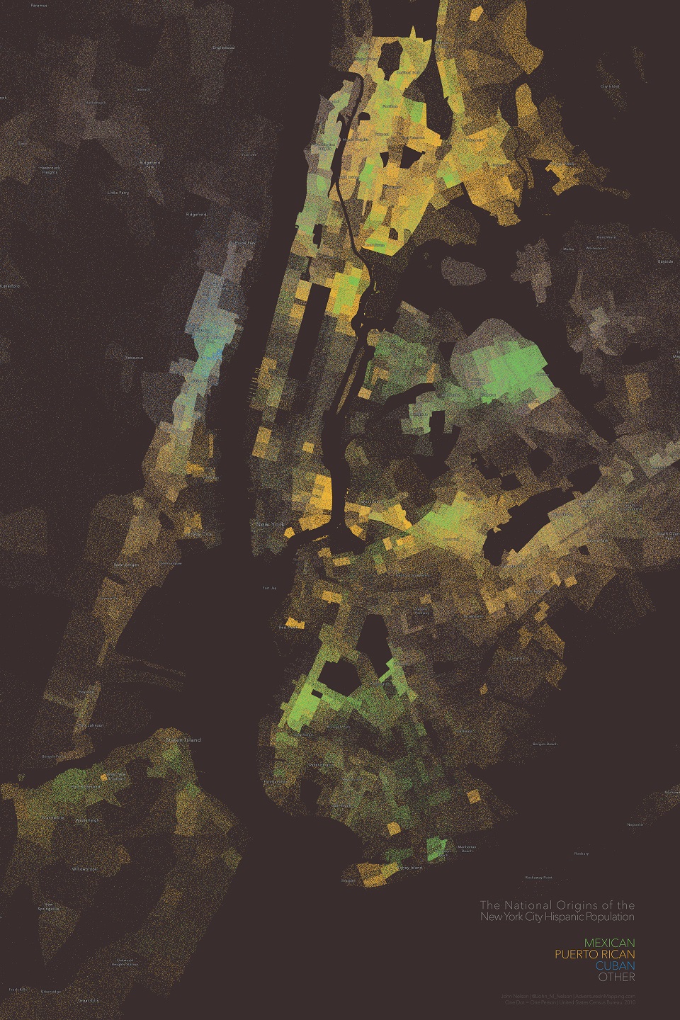
Dot Density maps are an almost-magical way of visualizing the geographic distribution of an overall population, as well as the relative heterogeneity of groups within that overall population.
Here, for example, is a Dot Density map of the Hispanic population of New York City. Each dot represents one person. A one-to-one mapping. The visual impression of the overall density of the dots is the variable terrain of the overall population of Hispanic persons. The hue tied to each point, each person, represents their national origin.
Immediately the map shows a 1st order trend of this population’s distribution. A steadier look provides a nuanced look at the rich and dynamic blending of national origins. This amazing data comes from the also-amazing US Census Bureau. The labels are an extract of the beautiful new Human Geography basemap. The Dot Density mapping was performed in ArcGIS Pro.
Here are three benefits that I see to multivariate Dot Density mapping…
Self-Normalizing
If you’ve spent much time in cartographic circles, you’ll likely have heard “Always normalize your choropleths” echoing down the halls. More likely it was spelled “Always normalise your choropleths” since you probably heard it from the, quite English, Dr. Field, a tireless defender of map normalization. And they/he are right. A choropleth map of a raw count (colors painted in regardless of how large/small the geographic units are) is invariably biased in favor of larger areas at the expense of smaller areas. And in human geography, messy, sometimes arbitrary, political areas can vary wildly in size and population (often in inverse proportions). One way to mitigate that is to divide your raw count by the geographic area, to squash down that externality.
Not so with a Dot Density map. The nature of a representative number of dots distributed within a geographic area is inherent normalization. Given the same number of dots, they will appear thinner in a larger area than a smaller area. Problem solved.
Chromatic Subsets
Creating a bivariate, or multivariate, map in a standard choropleth method is A) a little tricky to do, and B) potentially tricky to interpret. In a Dot Density map with more than one mapped variable, it is, in my opinion, easier to tease out the blending and pockets of more-and-less mixed families of colors.
It’s like looking closely at the threads of a woven plaid tapestry. Some bands are distinct, made up of a single predominant thread color, while other bands are comprised of varying proportions of dyed thread that blend into a meaningful mixed hue at broad scales and resolve to individual proportions when viewed at tighter scales.
It’s hard to approach that sort of visual dynamism with a simple mixed-hue flood-fill. Dot Density is just special.
Emotional Resonance
Ok, now we’re getting right down to it. Dot Density maps have an emotional appeal because they pare back a layer of abstraction. We are wired to understand an individual thing as, of course, and individual thing. When one dot equals one mountain lion, or one voter, or one wage-earner, or one pedestrian, then our cognitive systems have a much easier time of ascribing direct meaning. When more literally looks like more, then there’s no working-memory middle-man perpetually running a fresh color-to-value decoder key between your thinks and your feels. You just get it. I think that’s special.
Parting Shots
It’s no secret that I love Dot Density mapping. Is Dot Density always the best mapping method to use for a data set? No way. There are some inherent weaknesses in Dot Density, like the perceived impossibly-smooth distribution of the pseudo-randomly placed dots in the enumeration area. In real life, phenomena tend to be much more densely packed together. There are tricks, like Dasymetric Mapping, that try to mitigate that effect. In fact, in the map above I clipped out geographic areas of non-population, like rivers, which is a form of dasymetric mapping. But dasymetric has its own weaknesses and can diminish or damage a map’s ability to represent and communicate, in the name of greater precision.
So, like any other area of your life, consider thoughtfully the phenomenon you are trying to reveal, or the message you would like to communicate, and explore the relative merits of the host of techniques that are available to you. That’s where the fun is. No map is perfect. But some can get you closer than others and it’s empowering to know the strengths and weakness of our maps, and ourselves, and be honest about them.
Happy Mapping, John


Article Discussion: