Decision-making in emergency management relies on timely and accurate information. The ArcGIS platform supports various avenues to expeditiously create effective information products. Furthermore, by leveraging automation, these workflows can be completely hands-off. One such example, as outlined in this blog, is the infographic reporting capability found in the ArcGIS Business Analyst web application. These reports can be automatically generated by leveraging the Geoenrichment Service REST API and then subsequently included in automatic alerts.
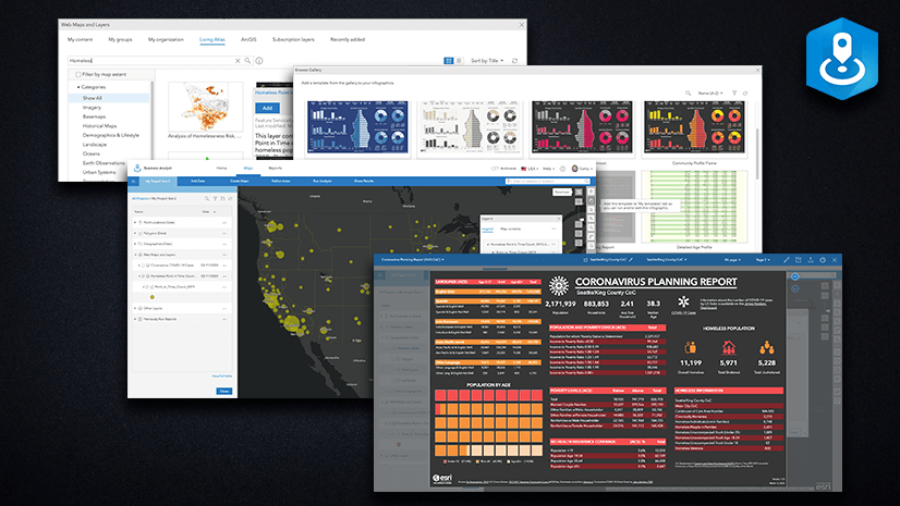
This blog outlines how you can automatically create infographics to visualize and quantify the impact to populations, infrastructure, or any datasets based on the geographic extent of natural hazards. Once created, these reports can be linked to the hazard features and explored for potential impact, like in this dashboard. Below is an example of a custom infographic report automatically generated for a tropical storm in July 2022.

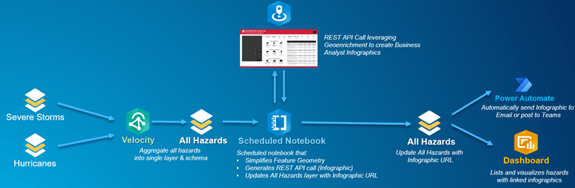
Workflow Components
This workflow leverages multiple tools and operations in ArcGIS to automatically generate infographics. These include:
- ArcGIS Velocity – Ingest natural hazard data layers into a single feature service in real time
- ArcGIS Notebooks – Schedule a Task for an infographic REST API call and update the all-hazards layer with the infographic URL
- ArcGIS Business Analyst – Dynamically create infographic reports from Notebook (Advanced License required for custom reports)
- ArcGIS Dashboards – Visualize the natural hazard geographies with Infographic links
- Microsoft Power Automate – Send alerts with a link to each Infographic
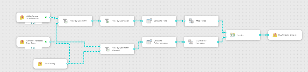
Data Ingest – ArcGIS Velocity
ArcGIS Velocity, Esri’s real-time software as a service (SaaS) application, enables you to ingest data as live feeds. This workflow leverages ArcGIS Velocity’s Real-Time Analytic to constantly monitor severe storms and hurricanes, both NOAA-provided layers in the Living Atlas. The Real-Time Analytic includes several sets of tools, providing capability to filter the input storm and hurricane areas by the United States geometry, map fields, and merge the hazard areas into a single feature service with a common schema. This output then serves as the source data for the the infographic report generation.
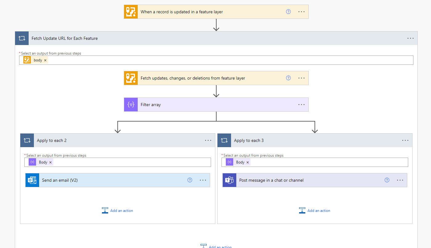
Automation – ArcGIS Notebooks
With ArcGIS Notebooks, you can use Python to create a series of functions to perform various tasks. These include making the Geoenrichment REST API call and updating the all-hazards feature service with the hyperlink to the infographic. Notebooks support scheduling to run automatically as a task, removing any manual intervention in the process.
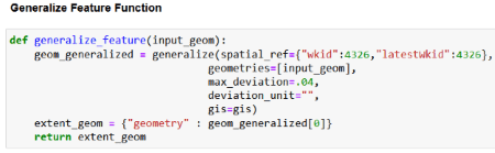
The Infographic REST API call requires specific parameters, including the geometric extent of an area. The hazard polygons must first be generalized to avoid overloading the request to the service.
The request to the Geoenrichment service, specifically leveraging the Create Report operation, supports several key parameters. These parameters allow you to dynamically update values within the infographic report, including the geometric extent, infographic title, infographic format, and even a custom logo. You can also specify the report template, either using a standard infographic template or by creating a custom template in Business Analyst Web application.

Finally, you add the resulting infographic report’s url link to the feature.

Visualization – ArcGIS Dashboards
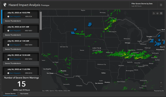
ArcGIS Dashboards allows you to visualize and interact with the features captured in this workflow. For example, the above dashboard highlights the severe storm areas as a list on the left and their spatial locations on the map. Similar tabs are available for other hazards. Each list element includes a hyperlink to the infographic generated for that feature, like the example below:

The data in the above infographic is readily available within Business Analyst. However, you do have the ability to include your own data. For example, to quantify impact to your own infrastructure or personnel.
Alerts – Power Automate
Power Automate allows you to build low-code, drag-and-drop tools for automation. With a seamless integration into the ArcGIS system, you can now perform key functions via ArcGIS connectors. These connectors support various operations, like to send alerts with updates to a feature service, or update a record with new information. This workflow leverages Power Automate to both send an email and log a Microsoft Teams post for each natural hazard event. The alert includes the link the to the infographic, providing quick access to the important information.
Conclusion
This workflow demonstrates how to leverage automation to process and receive pertinent information. And think about this prime use-case: rather than requiring an Emergency Manager to request information products each morning from an analyst, these reports can be automatically generated overnight, provided as links within an email to their inbox. A truly powerful capability. You can visit the dashboard for this workflow here.


Article Discussion: