A supply chain can be a complex network of people, processes, and systems that work together to deliver a high-quality service or goods to the end consumer at low operational costs to the business. As businesses attempt manage effectively through the current era of supply disruptions and bottlenecks – from plant shutdowns, natural disasters, and global conflicts – managers need greater visibility into their supply chain networks to help mitigate their risks and costs.
In this blog, we will illustrate how knowledge graphs in ArcGIS can provide a holistic perspective on a supply chain network. To accomplish this, we will use the following hypothetical scenario: You as the manufacturer, has a Supplier in San Antonio, Texas (“Supplier 88”) experiencing a quality control issue that is delaying their deliveries of steel Parts to the your Plants. You would like to better understand how this disruption will impact the rest of your supply chain network.
Jump to these sections learn more:
- How to visualize and explore a supply chain network with ArcGIS Knowledge
- How to perform a graph query to identify potentially affected entities
- Utilizing graph analytics to better understand disruption to the supply chain network
Introducing ArcGIS Knowledge
One way to proactively manage your supply chain network is to apply graph analytics. With Esri’s new graph analysis capabilities in ArcGIS Knowledge, you will be able to connect many sources of information about your supply chain operations into a single context. Doesn’t matter if your data is coming from different systems or in disparate formats. With ArcGIS knowledge you can:
- Visualize a supply chain as a network of entities with multiple tiers of suppliers, plants, products, managers, and customers
- Explore the relationships that connect them like, “produces” and “supplies” and “purchases,” all within a geospatial context
- Incorporate non-spatial and unstructured data with spatial and structured data
By applying sophisticated graph and geospatial analysis tools together, you will discover and better understand previously unknown relationships and dependencies within your supply chain network. And best of all, gain new insights about your operations.
Visualize and Explore
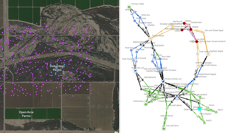
You can first approach this problem from a purely geospatial perspective by employing a map to visualize the locations of all the Plants as well their Suppliers (Tier 1), their Suppliers (Tier 2), and their raw materials suppliers (Tier 3). After that, using a series of joins or even draw origin-destination links on the map, you can connect each Plant or Supplier to their immediate supplier.

However, this is not enough to really understand the dependencies implicit in your supply chain network. A supply chain network is a complicated, many-to-many array of parts and materials. Lines drawn on the map do not adequately capture these dependencies, nor do they allow you to connect more than two points into a multi-tiered network of suppliers.
A digital representation of your supply chain network
After the Plant and Supplier locations have been added into a knowledge graph, along with the non-spatial parts and relationships that connect them, your data becomes informative and interactive. You will select Supplier 88 and expand the view of its’ immediate relationships, one degree (or “hop”) at a time. As a result, you see what Suppliers and Plants are going to be affected by the disruption. Looks like Supplier 88 provides Suppliers 28 and 75, and each supplier also produces a variety of Parts purchased by Plants 24, 25, and 26.
You quickly went from an initial starting entity (Supplier 88) and isolated the subset of the supply chain network that will be affected (Suppliers 28 and 75, Plants 24, 25, and 26). Consequently, approaching your analysis this way, made it easier to recognize the upstream and downstream flow of resources among the entities in your supply chain network. And gave you a holistic view into your supply chain network. You have determined the full impact of the disruption, multiple degrees removed from the origin of the disruption, Supplier 88.

Graph Query
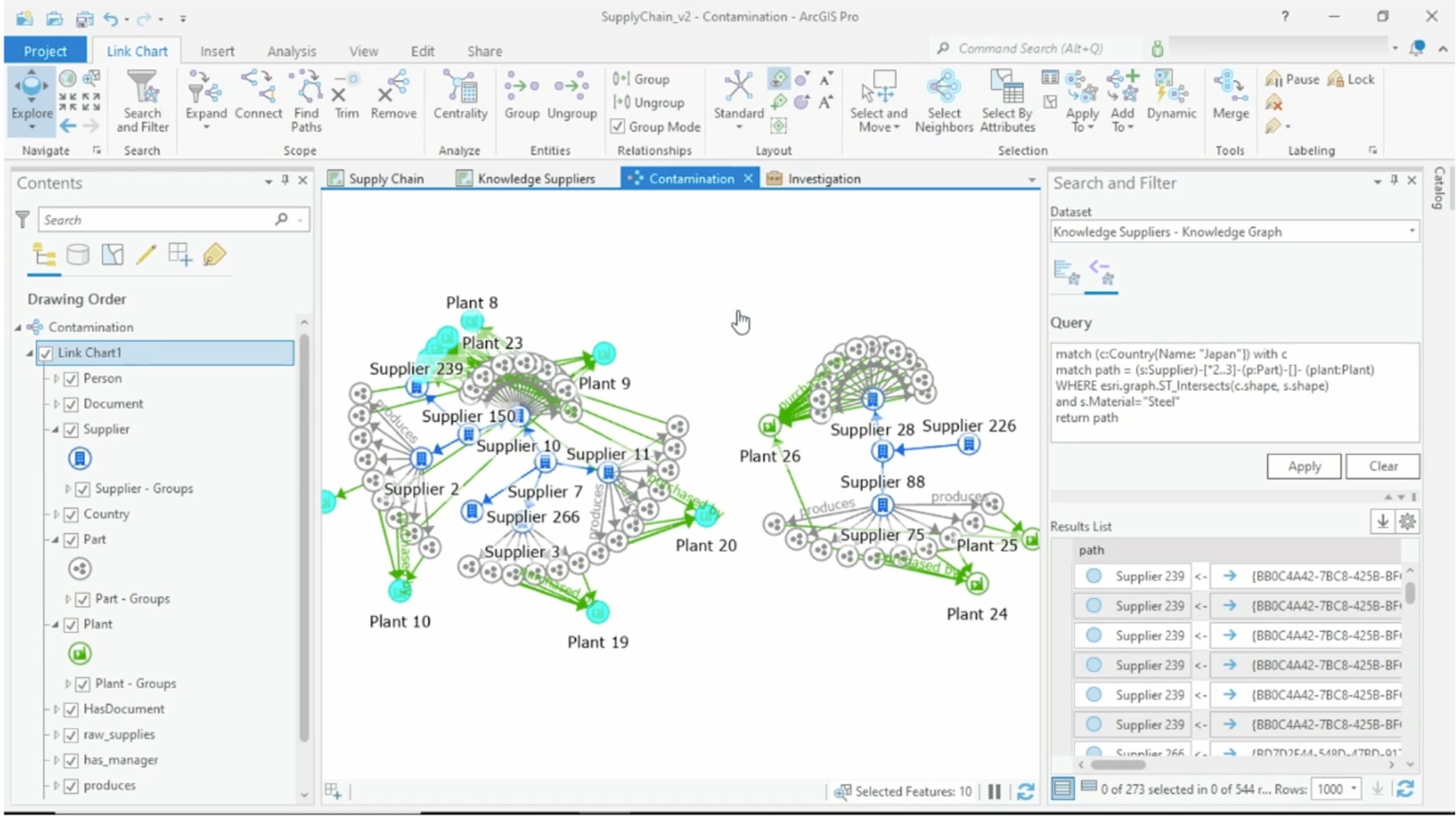
You will next address the notification that Supplier 88 is experiencing a quality issue regarding their steel parts. A regional environmental contamination incident is affecting their primary distributor of steel, Supplier 226. This could end up being a regional event affecting more than just the steel from this one supplier. Therefore, to be certain, you will check your supply chain network to see if it includes any other suppliers in the same region of the world.
Using location with ArcGIS Knowledge graphs
By incorporating the map with the data, you saw that Supplier 226 is located in the middle of Japan. In addition to that, you found out that the manufacturer has several other suppliers in the same region. However, the actionable insight you are really looking for is more complex. In whole, you need to know what the combined impact on your supply chain would be if these nearby suppliers are also contaminated.

Therefore, to do this, you will skip the link chart visualization approach from previous and write a graph query, which is quicker. The graph query automatically searched the possibly contaminated suppliers to find a path that runs through all the raw materials, the network of suppliers, the parts, and the plants they serve.
The query is executed in ArcGIS Enterprise, where the knowledge graph resides. The results are displayed on a new link chart view. A total of 9 more plants are going to be affected by this environmental contamination, along with several more Suppliers.
What is a “path” in graph analytics?
A “path” in graph analytics is a collection of entities and the relationships that connect them, visualized by a straight line drawn between two entities, multiple degrees apart. The graph query is written in openCypher, which is a query language similar to SQL, but Esri has also incorporated spatial analytics into the graph query. So, this lets you specify that at least one of the suppliers in the path must be located in the contaminated region.
Graph Analytics
Time to learn about two other graph analysis capabilities in ArcGIS Knowledge: the Search and Filter tool and the Centrality tool.
Search and filter tool
With the Search and Filter pane you will explore the results from the previous query. Additionally, the tool provides you with a focused summary of any part of the knowledge graph that interests you. For example, sum up the attributes and connections that the entities have in common, and with this histogram-like view of the counts, easily compare to discover commonalities, outliers, and patterns in the data. In conclusion, you saw what Suppliers, Plants and Parts are going to be affected by this contamination, and, therefore, immediately take steps to minimize the disruption.

Centrality tool
Centrality applies several different graph algorithms that each measure how important or influential an entity is relative to other entities. For instance, the Centrality scores in the Knowledge graph in ArcGIS are calculated for the subset of entities that are in the link chart view. The Centrality View is a table showing the results of a variety of different centrality algorithms, including Degree, Eigenvector, PageRank, Betweenness, Closeness and others.
In this scenario, it is important to know that Degree, Eigenvector, and PageRank scores are calculated based on the number of relationships in which an entity participates. And Betweenness, Closeness, and Harmonic scores are calculated based on the length of the path from an entity to all the other entities in the link chart.
You want to see what Suppliers you depend on the most, therefore, you sorted by Page Rank, which yields the result of Supplier 10. Since you are looking at just the subgraph affected by the environmental contamination, this means that Supplier 10 being down will have the biggest impact on your operations, compared to the other affected suppliers.

Thank you for reading this blog. We hope you enjoyed learning a few of the new tools and analytic methods that can be used in ArcGIS Knowledge. In summary, Knowledge graphs in ArcGIS empower you to uncover patterns and anomalies in your connected data through spatial and graph analysis in one context, and graph analytics like centrality and paths can help you discover critical or influential entities in your supply chain network.
When you combine spatial and graph analytics to supply chain networks, you can achieve a more agile and holistic understanding of the impact of disruptions. Additionally, you can make more nuanced predictions about where shortages will occur, and proactively build variety and diversity into your supply chain network to mitigate risk.
Get Started
To learn more about ArcGIS Knowledge, sign up for product announcements. To add ArcGIS Knowledge to your organization’s ArcGIS Enterprise deployment, contact an Esri representative.


Commenting is not enabled for this article.