This is a guest post from Liz De Guzman (Living Atlas Curator at Esri UK)
Over the latter part of the 20th century, the west coast of the Antarctic Peninsula has been one of the most rapidly warming parts of the planet. This unprecedented warming has caused changes to the physical and living landscape of the continent. Accessing authoritative datasets of Antarctica is important to increase our understanding of these changes. We are pleased to welcome the British Antarctic Survey (BAS) who have contributed their coastline and contour datasets from the Antarctic Digital Database (ADD) to ArcGIS Living Atlas of the World. Having these items in Living Atlas means it is now easier than ever to access up-to-date and ready-to-use data on Antarctica to understand its ever-changing landscape.
Contours and coastlines from the Antarctic Digital Database
The ADD is one of the best available sources of Antarctic topographic data. It is currently managed by the BAS’ Mapping and Geographic Information Centre (MAGIC) on behalf of the Scientific Committee on Antarctic Research (SCAR). The layers available in Living Atlas are:
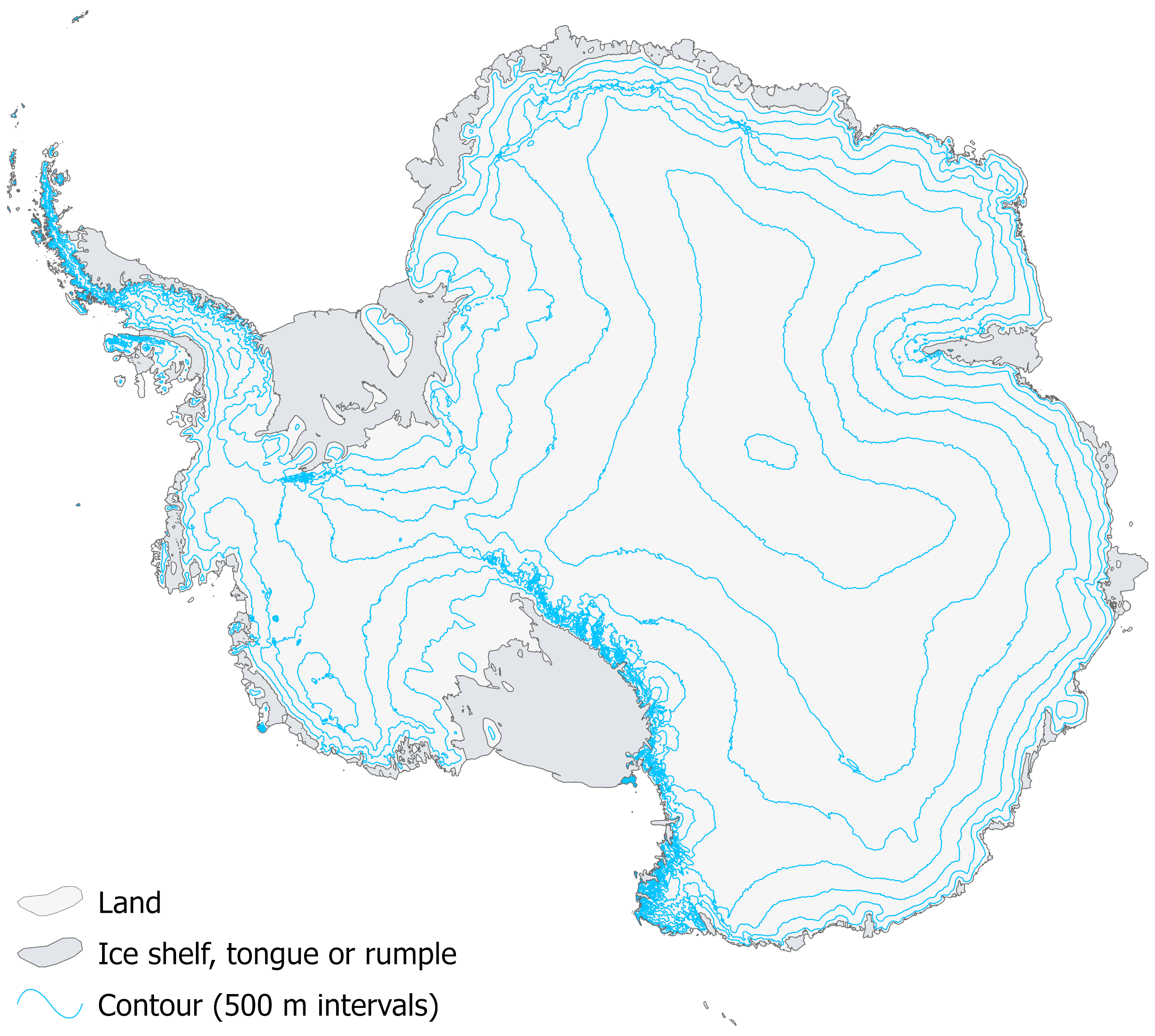
- Antarctic Contours – contains information of contour value (metres), source, source date and revision date at medium and high resolutions.
- Antarctic Coastlines – includes data on coastline type, grounding lines and ice shelf fronts at medium and high resolutions.

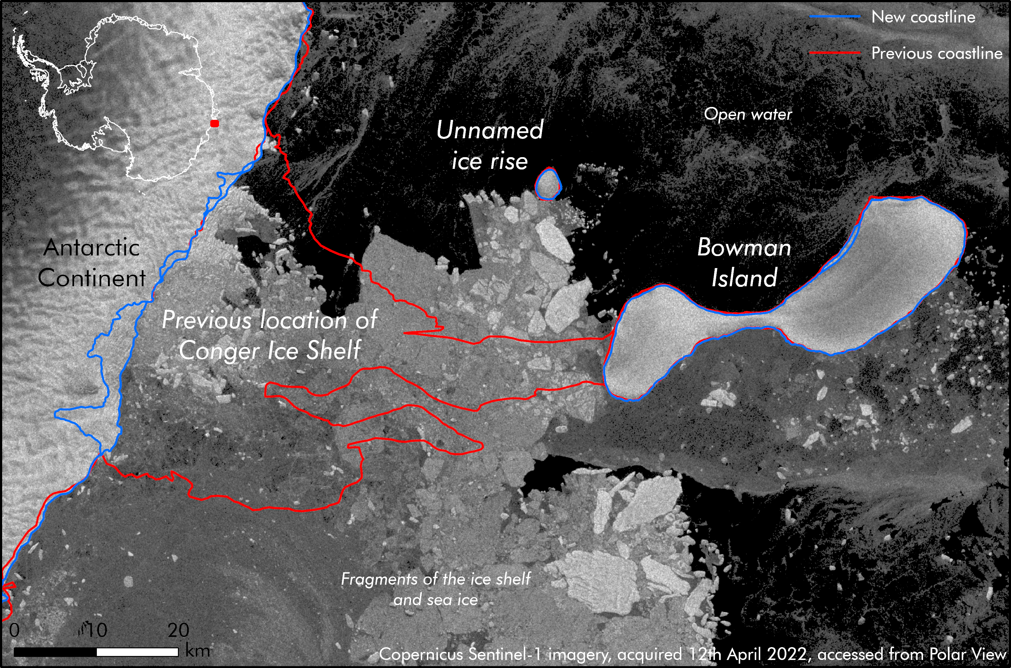
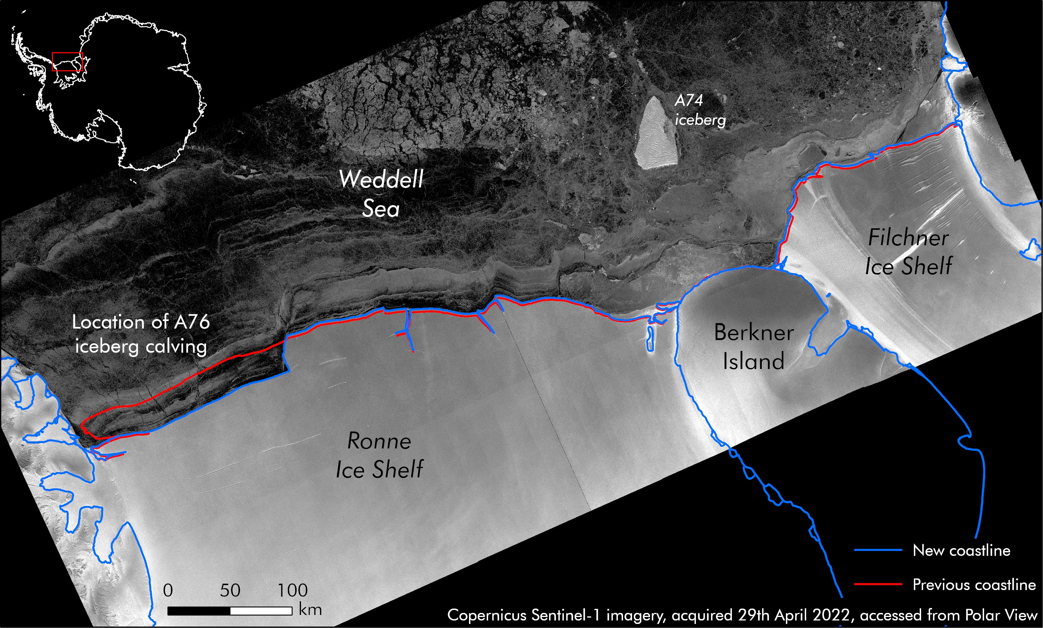
With ice shelves growing, calving, and retreating to reveal features underneath, the ADD is updated every six months (May and November) to ensure that these changes are regularly captured. The data is created from various mapping and remote sensing sources. Many previously unmapped locations are now being recorded to aid the scientific research and operational activities in Antarctica. Some of the most recent changes in 2022 in the ADD layers include updates to the coast of Dronning Maud Land, the Brunt Ice Shelf, the Ronne-Filchner Ice Shelf and the Conger Ice Shelf. Some islands in the Rhyolite Islands group, in George VI Sound have also been recently mapped.


The data in action
Some of the most renowned organisations that use ADD in their mapping products include the US Polar Geospatial Center, LINZ and NZ Antarctic Society and the Australian Antarctic Division.
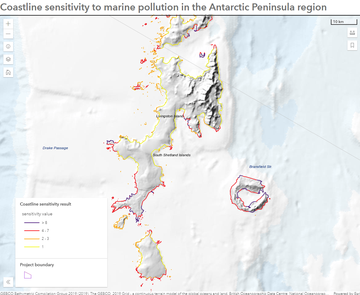
More recently, BAS used the ADD coastline data to assess the sensitivity of different sections of the Antarctic coastline to marine pollution events. To aid this analysis, various parameters such as the location of wildlife nesting sites and scientific research stations were used in the model to calculate the output sensitivity. This work was presented in the Antarctic Treaty Consultative Meeting in May 2022. You can check out the results in this app.

Using the data
This data has been made available under the Creative Commons Attribution 4.0 International (CC BY 4.0) licence. The map projection of these datasets is WGS84 Antarctic Polar Stereographic, EPSG 3031. When you open this layer in the Map Viewer, it will use Web Mercator by default. To display it in its native projection, you can use BAS’s Antarctica and the Southern Ocean basemap.
These latest data additions ensure reliable and up-to-date information is available to the scientific communities to further international polar research efforts. Combine these latest additions with other Antarctic datasets available in Living Atlas to help you gain a better understanding of the changes in the region as a whole.
The British Antarctic Survey welcomes contributions from the Antarctic science and logistics community and invites users of ADD data to be active participants to improve its quality. If you want to get involved, please visit the BAS website for more information and to find out about their science and polar operations.
If you have further questions about this post, please reach out to Liz De Guzman (Esri UK) at DataCurator@esriuk.com


Article Discussion: