This year’s User Conference was special. Not only was it the first ever virtual conference with a record number of attendees, but this year was also the inaugural year for the Equity and Social Justice track for user presentations. The virtual nature of this conference has given me the opportunity to see many user presentations. One topic that came up in many user presentations was redlining because of how valuable GIS-ready historical redlining data can be to help us understand how historical inequities still contribute to inequities today.
A redlining layer of 143 cities is now available in ArcGIS Living Atlas. This ready-to-use layer can provide important context for your work.
What is redlining?
The Home Owners’ Loan Corporation (HOLC) was created in the New Deal Era and trained many home appraisers in the 1930s. The HOLC created a neighborhood ranking system infamously known today as redlining. Local real estate developers and appraisers in over 200 cities assigned grades to residential neighborhoods. These maps and neighborhood ratings set the rules for decades of real estate practices. The grades ranged from A to D. A was traditionally colored in green, B was traditionally colored in blue, C was traditionally colored in yellow, and D was traditionally colored in red.
- A (Best): Always upper- or upper-middle-class White neighborhoods that HOLC defined as posing minimal risk for banks and other mortgage lenders, as they were “ethnically homogeneous” and had room to be further developed.
- B (Still Desirable): Generally nearly or completely White, U.S. -born neighborhoods that HOLC defined as “still desirable” and sound investments for mortgage lenders.
- C (Declining): Areas where the residents were often working-class and/or first or second generation immigrants from Europe. These areas often lacked utilities and were characterized by older building stock.
- D (Hazardous): Areas here often received this grade because they were “infiltrated” with “undesirable populations” such as Jewish, Asian, Mexican, and Black families. These areas were more likely to be close to industrial areas and to have older housing.
The effects are still present today
Use this layer in your work
- Symbolize it such that the only outlines show the color, letting your own data be the main focus.

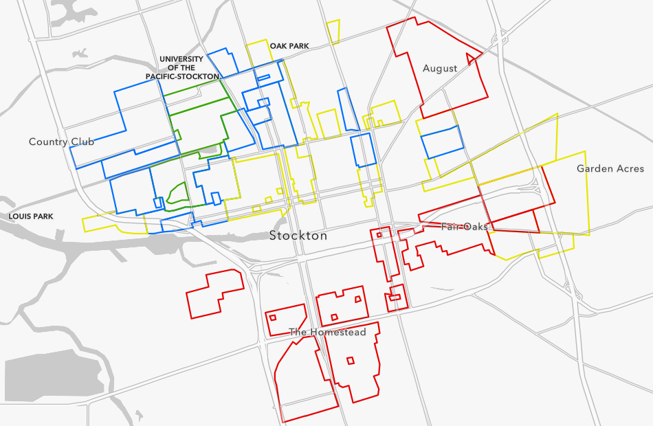
An analyst from California Environmental Protection Agency (CalEPA) used this approach in a map shared in her presentation: “Addressing Environmental Justice Issues in Stockton, CA.” She displayed the intersection of historically redlined areas and present-day pollution indicators including hazardous clean-up sites, emissions, asthma, poverty levels, and others.
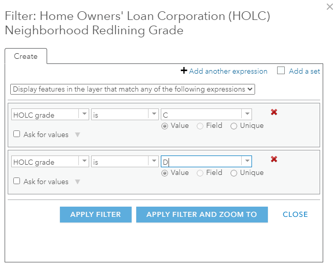
- Apply a filter such that only the neighborhoods that received the lower grades (C and D) are displayed.

This approach is what an analyst at the city of Asheville, NC used and shared in her presentation: “Mapping Racial Equity in Asheville, North Carolina: A collection of maps about History, Displacement, and Neighborhood Change” when also showing recent displacement on the same map.
- Summarize your own data by the four grades. Two analysts from the Seattle area summarized the average number of contaminated sites per square mile by these four grades. In their presentation, “Toward a Just, Green Future: Emerging Approaches for Equitable Public Investment,” they show how neighborhoods with the historical grade of “A” had an average of 17 contaminated sites per square mile in 2017, compared to 38 sites per square mile in neighborhoods that received a grade of “D.” Said another way, historically redlined neighborhoods in Seattle have more than double contaminated sites per square mile today than Seattle neighborhoods historically deemed the “best.”
Many organizations are interested in understanding present-day inequities in their communities. This layer represents a “fingerprint” of inequity from decades ago whose effects are still being felt today, which can help those in positions to advance equity and social justice. Your approach depends on what question you are trying to answer, and the ArcGIS platform provides many different symbology, filtering, and tabular data options to help you answer your research questions. In addition to the layer, an accompanying web map is available or those who just need a map to incorporate into a story map or dashboard. These are just two of the newest resources in ArcGIS Living Alas of the World: a collection of maps, apps, and data layers to support your work. You can also find additional resources and content on the Racial Equity GIS Hub. Share how you are using these resources, or post any questions you may have, on GeoNet’s ArcGIS Living Atlas and GIS for Equity and Social Justice spaces.
Article Discussion:
One response to “Historical redlining data now in ArcGIS Living Atlas”
Leave a Reply
You must be logged in to post a comment.

Diane,
Thank you so much for the historical and Redling infirmation.
I live in City of San Diego, Jamacha, and am looking for all Historical information including maps on the 52 streets within the Jamacha boundary. The San Diego History Musuem, Archives does not have information nor maps covering this area. They only get donated items. The closest historical info i found is it was named for the nearby Mexican Land grant, by Apolonia, per the Hocas Pocas Article. But the only map appears as if the mexican land grant ended before Dictonary Hill, which is a mile East of Jamacha.
As well as the process to getvthe ESRI map to accurately reflect the Jamamacha neighborhood. In the legally binding Skyline- Paradise Hills Community Plan, approved by City of San Diego, in June 30, 1987. Jamacha is one of six separate communities/ Neighborhoods, Jamacha, North Bay Terrace, Paradise Hills, Skyline, South Bay Terrace and Lomita. But maps have inaccurately merged it into Jamacha- Lomita, harming our neighnorhood in numerous ways.
Any help would be greatly appreciated!
The City of San Diego, Mayor, does not care about poorer communities of concern. He has not requested that the MLS system North, Central and South cease these Redlining maps that inaccurately label all homes in 92114 as Encanto. When Jamacha, Skyline and Lomita are not located in Encanto, and are in a completely separate Skyline- Paradise Hills Community Plan, and not in the Encanto Neighborhood Community Plan.
T