This blog post walks through the creation of a story map about age and social vulnerability in the context of coronavirus.
I mean, I just make maps. What do I know. But here’s what I’m reading: Novel Coronavirus infections, and resulting Covid-19 disease, appear to be afflicting older populations much more strongly than younger. Children and adults have done extremely well in terms of recovery, but mortality rates appear to nearly double with each decade of age after 30, posing a disproportionate risk for those older than 60. As such, it may be helpful to identify areas in the United States where a population is home to an especially high proportion of those aged 60 or more. These populations, when coupled with pre-existing social vulnerability ratings, could provide a glimpse of American communities that might experience a punctuated demand for healthcare that outpaces the local medical infrastructure in the Spring of 2020.
Data
I started out in ArcGIS Pro, but all of these data munging and smooshing steps can just as readily be done in ArcGIS Online. The age data I’ll use comes from Esri Demographics 2019 estimates (but you can also use American Community Survey estimates available in a host of formats in the ArcGIS Living Atlas of the World). I also downloaded the Centers for Disease Control and Prevention’s Social Vulnerability Index. The CDC shares a wealth of geographic resources via the Living Atlas and this county-level data was easy to find (and the resolutions available go all the way to the census tract).
In Pro, I joined the age data and the vulnerability data into a single layer of county centroids (I like using county centroids for a lot of maps because they are lightweight in online applications and there are lots of great visualization options for point data).
Then I uploaded the layer to ArcGIS Online as hosted features.
Visualization
In ArcGIS Online I can start on some visualization strategies for creating a series of map conditions that can be used to tell this story in a StoryMap.
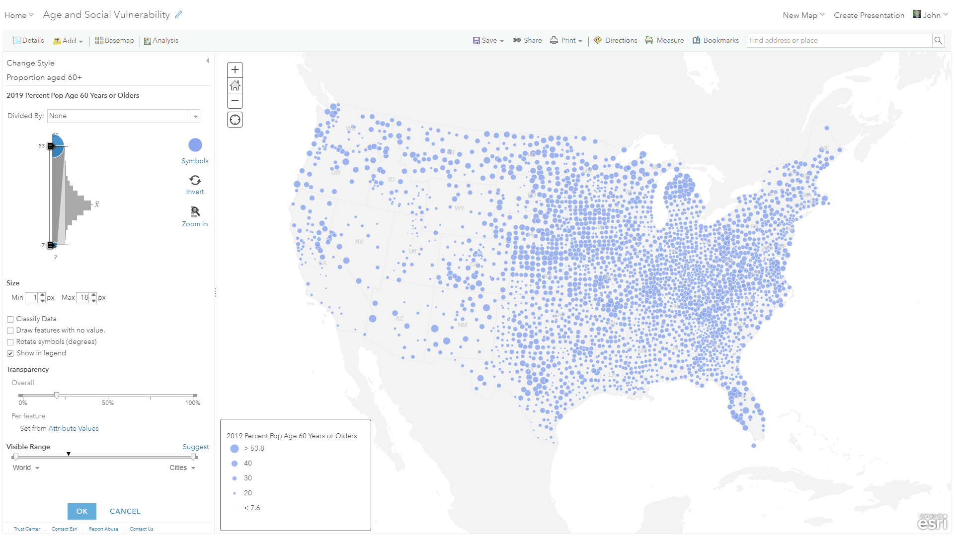
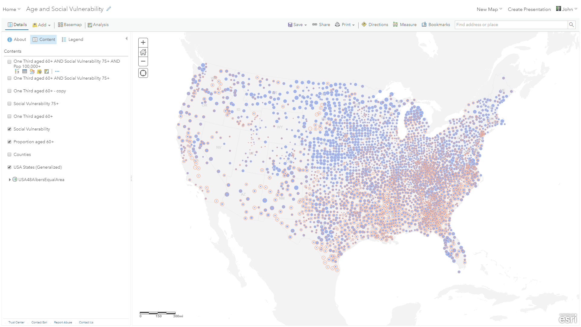
I’ll be mapping with an equal area basemap, because that’s an important consideration for thematic mapping. I made this simple Albers Equal Area basemap; feel free to use it too if it suits your needs. The first map I’ll make is a simple visualization of the proportion of those aged 60 and over. Larger circles call out counties with an especially high population of older folks.
I duplicated the layer and gave it a similar symbology, though outline-only, showing the CDC’s Social Vulnerability Index. Bigger circles show higher vulnerability in times of hazard.
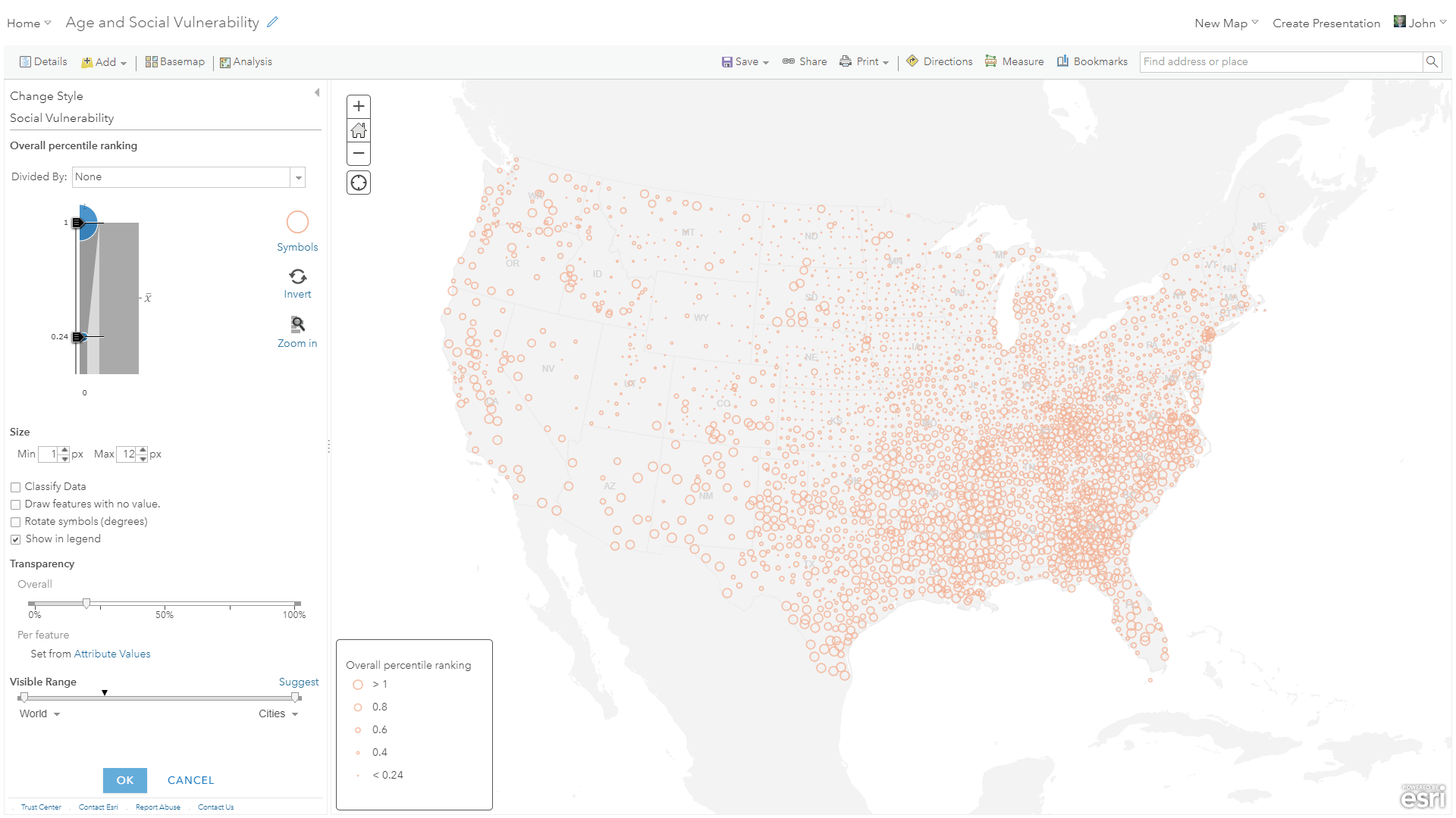
Seeing both of these factors at the same time gives a really basic bivariate look at older populations and social vulnerability.
Clarity
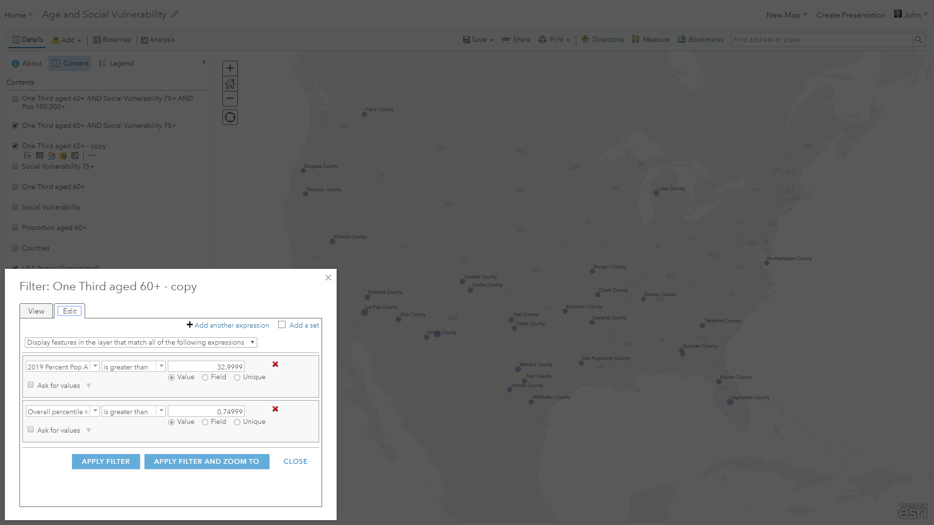
But showing the full set of counties is visually overwhelming. We can simplify the map by filtering the age layer for only counties that have more than a third of the population aged 60+…
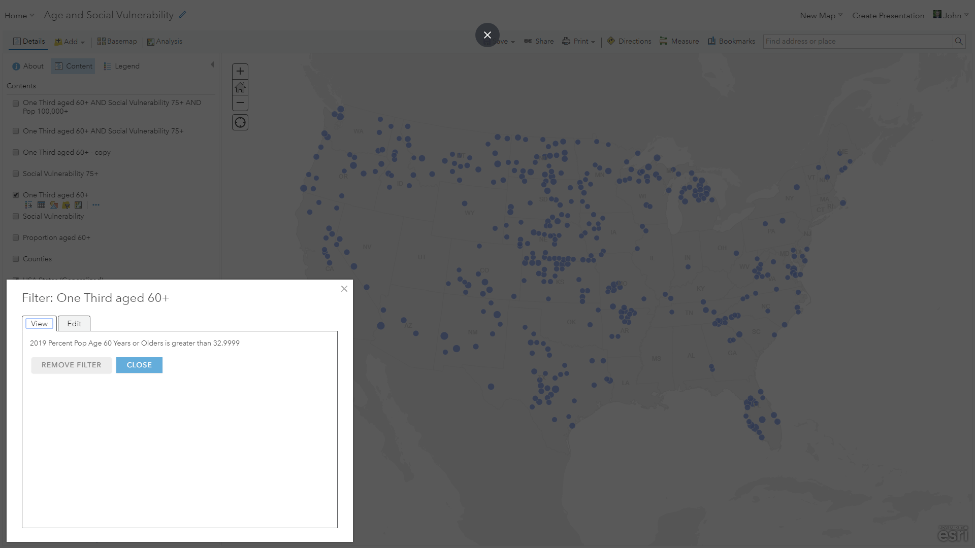
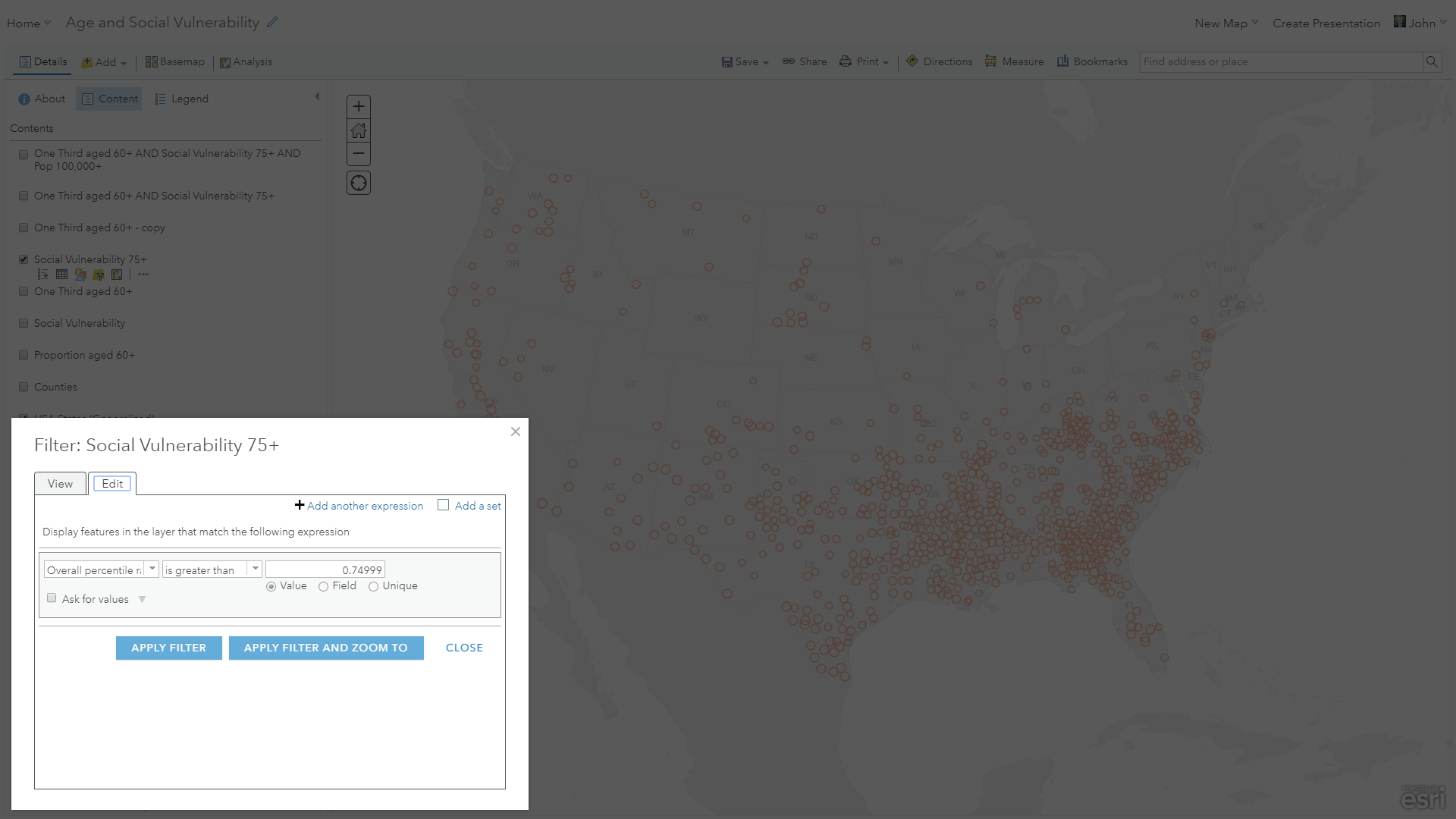
…and filtering the vulnerability layer for counties having an extremely high vulnerability index of 0.75 or more (on a scale of 0 for fully secure and 1 for incredibly vulnerable).
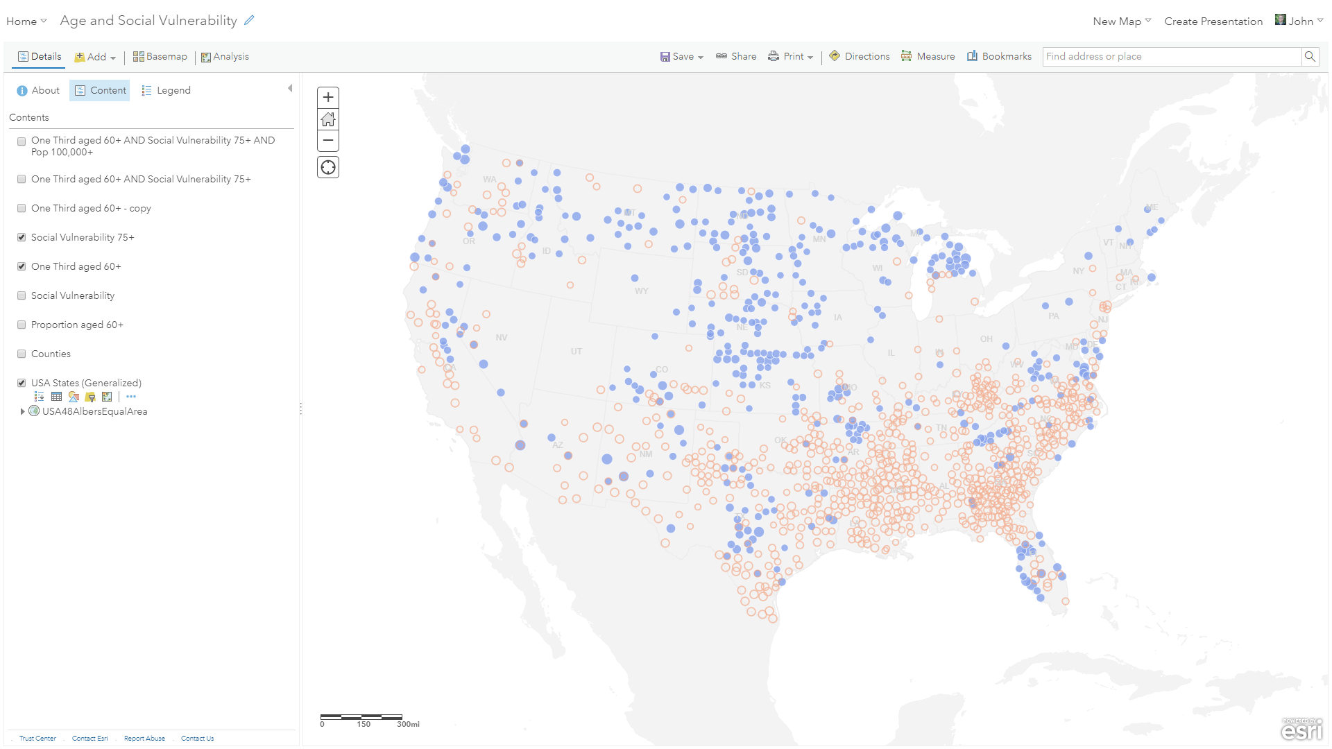
This clears up the picture considerably, and helps us focus on areas of potential need.
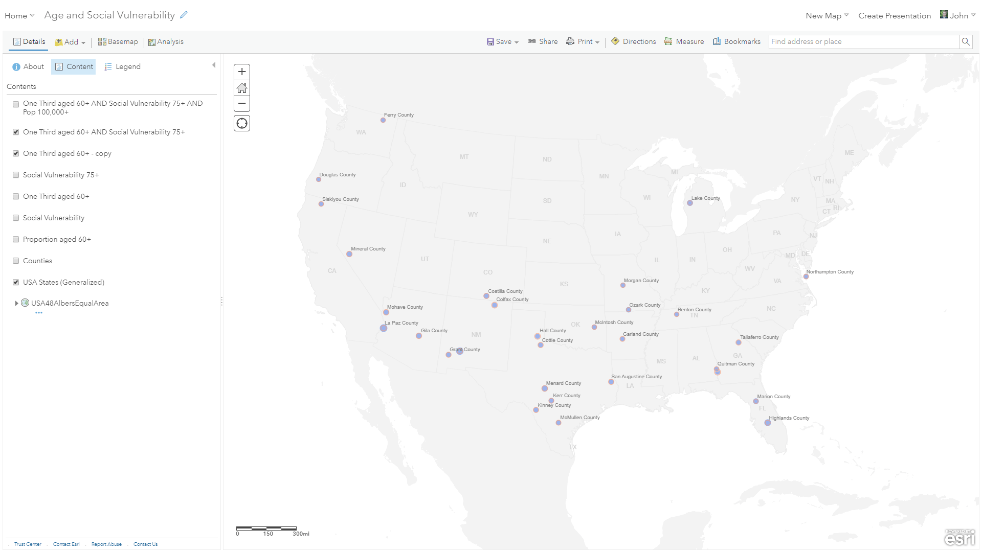
But it can be hard to spot the intersection of these two risk layers. By applying both filters to each of the layers (they are just copies of each other so the have the same attributes), only the counties that have a high proportion of elderly residents AND a high vulnerability are retained.
The result is a somewhat more manageable look at where this outbreak might be especially burdensome.
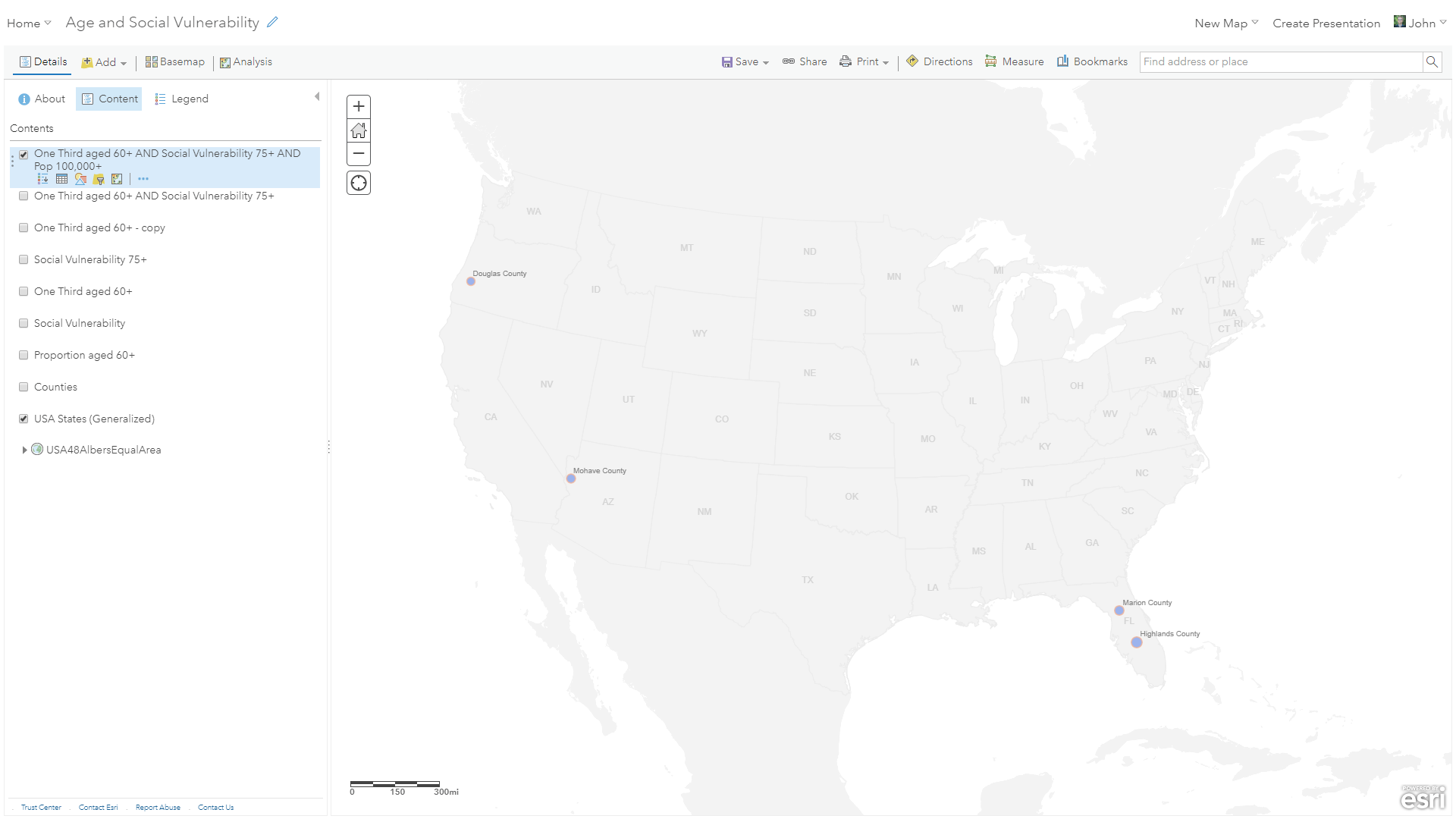
But this gives us only a sense of proportion. Many of these counties are quite small in total population. To consider also a sense of magnitude, we can further filter for populations greater than 100,000:
StoryMap
To explore this narrative, and interact with the counties to see their counts and locations, please visit this StoryMap.

I’m not an epidemiologist or a microbiologist. But I can look around and find data and try to sweep away enough of it to identify a common structure that might be somewhat helpful in planning for the days ahead. We all do what we can. In the meantime, I’m going to talk to my dad, make sure he has what he needs, and do my best to follow the recommendations of those who actually do know what they’re doing.
In these days of planning and contingencies, it is especially important to consider the most vulnerable among us. Visit the Centers for Disease Control and Prevention’s resources regarding Coronavirus disease, and consider what you can do for your family, neighbors, and community. In many cases this may be avoiding physical contact, but it certainly does not exclude emotional or communicative support. Ensure that those you love, and maybe even those you don’t, who are at particular risk have adequate resources and access to potential medical support.
If you are interested in learning more about the CDC’s Social Vulnerability Index, visit this resource for background information and access it in a geographic format at many levels of detail, here, at the ArcGIS Living Atlas of the World. Additionally, find resources for mapping and understanding the geography of this outbreak at this dedicated ArcGIS Hub.
Be well and do good, John

Very good article!
Thank you Mark! I hope you and your team find it helpful in some way. The USDA is a critical part of keeping our agricultural supply chain strong, particularly as the economy revives post lock-down. Thanks for your good work and do stay safe.