ArcGIS Living Atlas

Improve Your COVID-19 Cases Map

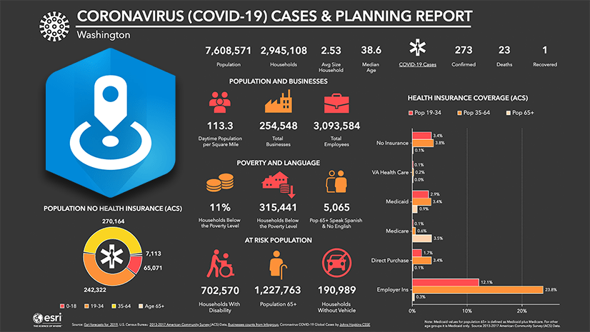
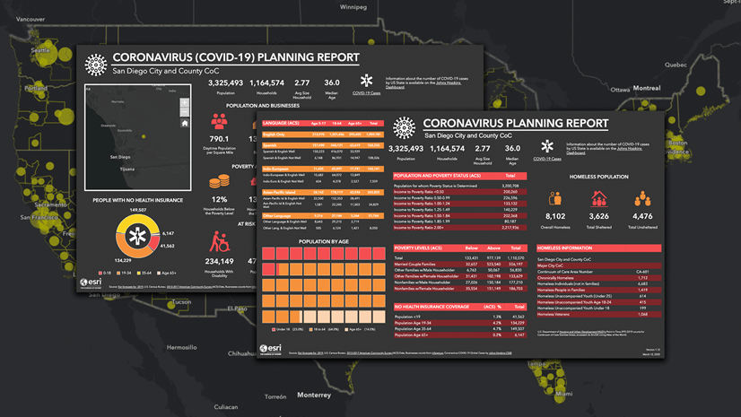
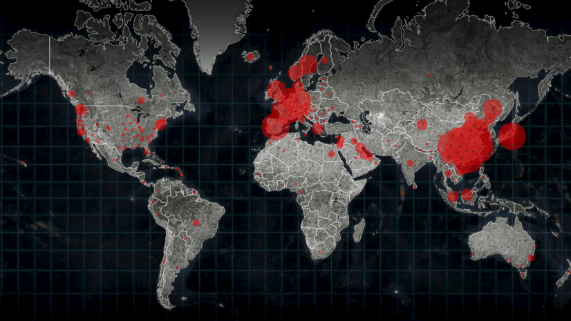
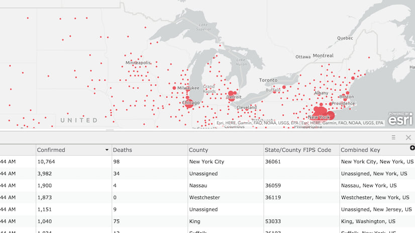
When you make a thematic map of COVID-19 Coronavirus cases in your community, there are a few challenges you will encounter along the way. In addition to these useful items already in ArcGIS Living Atlas, where can you obtain data for your maps? How do you make sure the map shows the areas with bigger numbers of cases, while also showing areas that just got their first case? How do you keep the map’s symbols current and useful when the numbers are changing rapidly?

We have been wrestling with the same challenges, and thought it might be useful to share an approach that seems to work well in the web GIS environment. So, I wrote a short storymap to share a method we’ve found useful, and hope you will find it useful as well.

About the author

Jim Herries is a geographer with Esri in Redlands, California. He serves as Senior Principal Product Engineer and Product Engineering Lead, Cartography on the team responsible for ArcGIS Living Atlas of the World. Jim works with teams on thematic mapping and map visualizations, reflecting a drive to help GIS users bring their data to life on the map and stimulate insights. He constantly looks for ways to create clear, focused map information products that incorporate meaningful spatial analysis and evocative visualizations. When he started in GIS at Ohio State, he walked over to the campus library to transcribe census data by hand to paper so that he could hand-enter it into spreadsheets for upload into Arc/INFO for mapping and analysis. Today, he appreciates how web GIS brings everyone access to good data in useful layers and maps as a starting point for great work.

Connect:

Next Article

Harnessing the Power of Imagery: A Programmatic Approach

Read this article