
My colleague Helen Thompson wrote a blog last week that illustrated how to create an interactive infographic report to allow communities and businesses to examine the impact of the coronavirus disease 2019 (COVID-19).
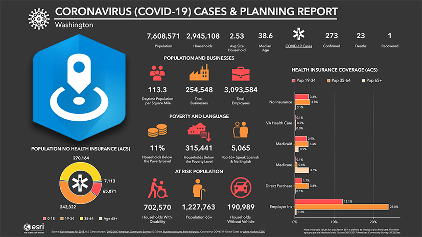
In particular, this infographic highlighted populations that are more at risk, including the elderly and households that do not have health insurance.
We received a lot of feedback on this template and one key question we received was, “Is there a way that we can also examine the impact on the homeless population?” I customized Helen’s initial infographic by swapping in data sources about homeless populations in the United States, then presented this template in a Web AppBuilder for ArcGIS demo that you can explore.
Try the Coronavirus Vulnerable Population Infographic Demo
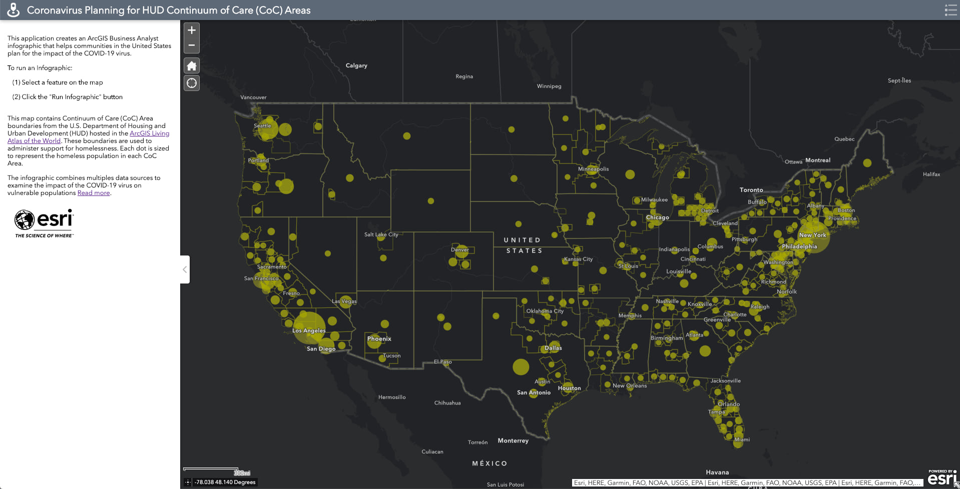
The web map used in this demo app contains Continuum of Care (CoC) Area boundaries from the U.S. Department of Housing and Urban Development (HUD) hosted in the ArcGIS Living Atlas of the World. These boundaries are used by HUD to administer support for homelessness. Each dot is sized to represent the homeless population in each CoC Area.
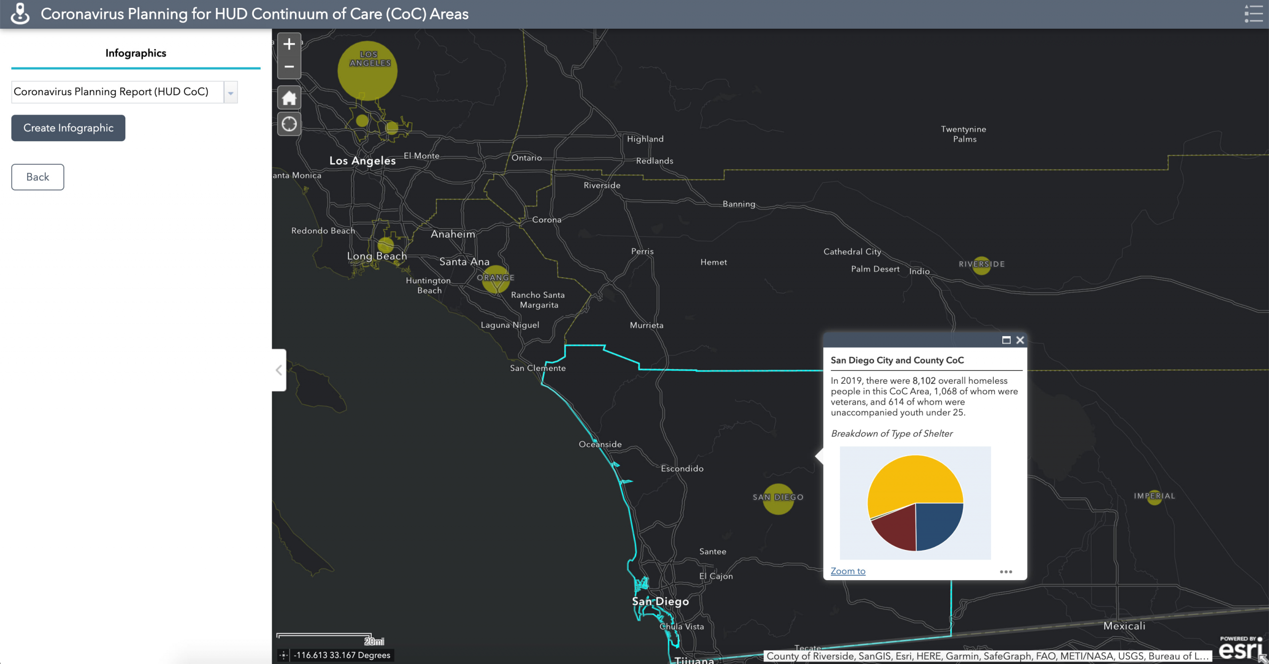
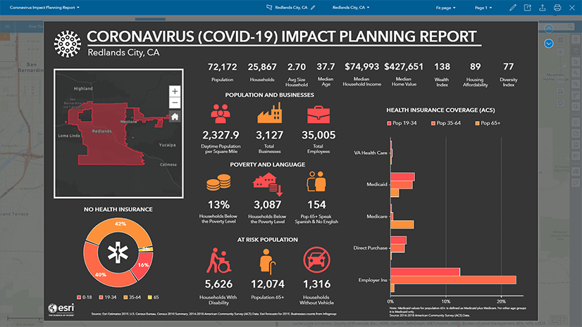
You can pan and zoom to your area of interest and click on one of the CoC areas to run an infographic for that area. For example, I can select San Diego County and click “Create Infographic”:
The infographic is generated and charts, tables, and key indicators are populated with specific insights for the selected area that allow you to explore what the underlying demographics are like for a given area. Planners can use these key indicators to identify areas that need additional monitoring, which areas need access to mobile testing clinics, where to target outreach and how to modify operations. You can click on many of the icons on the first page to explore the immersive experience and get more details on the topic summarized in the infographic. For example, you can select the “Median Age” to get a view a detailed chart that you can use to understand the age distribution of the area.
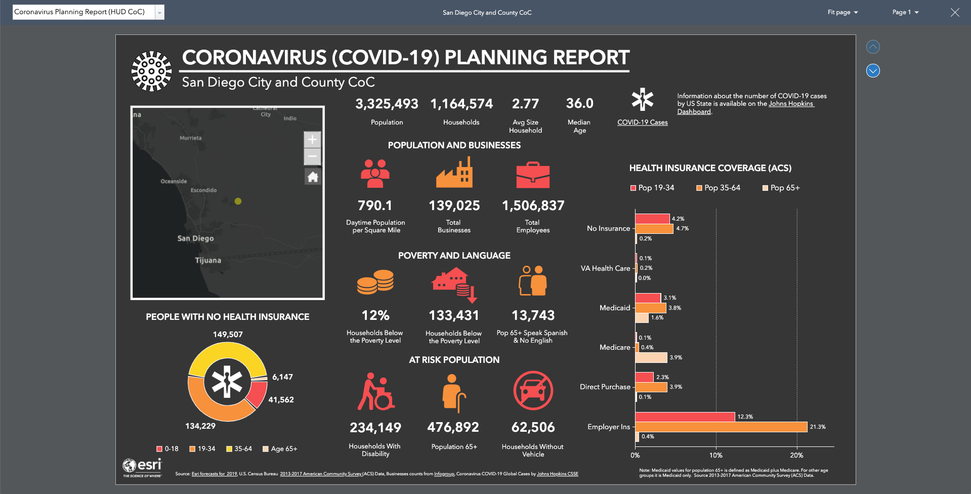
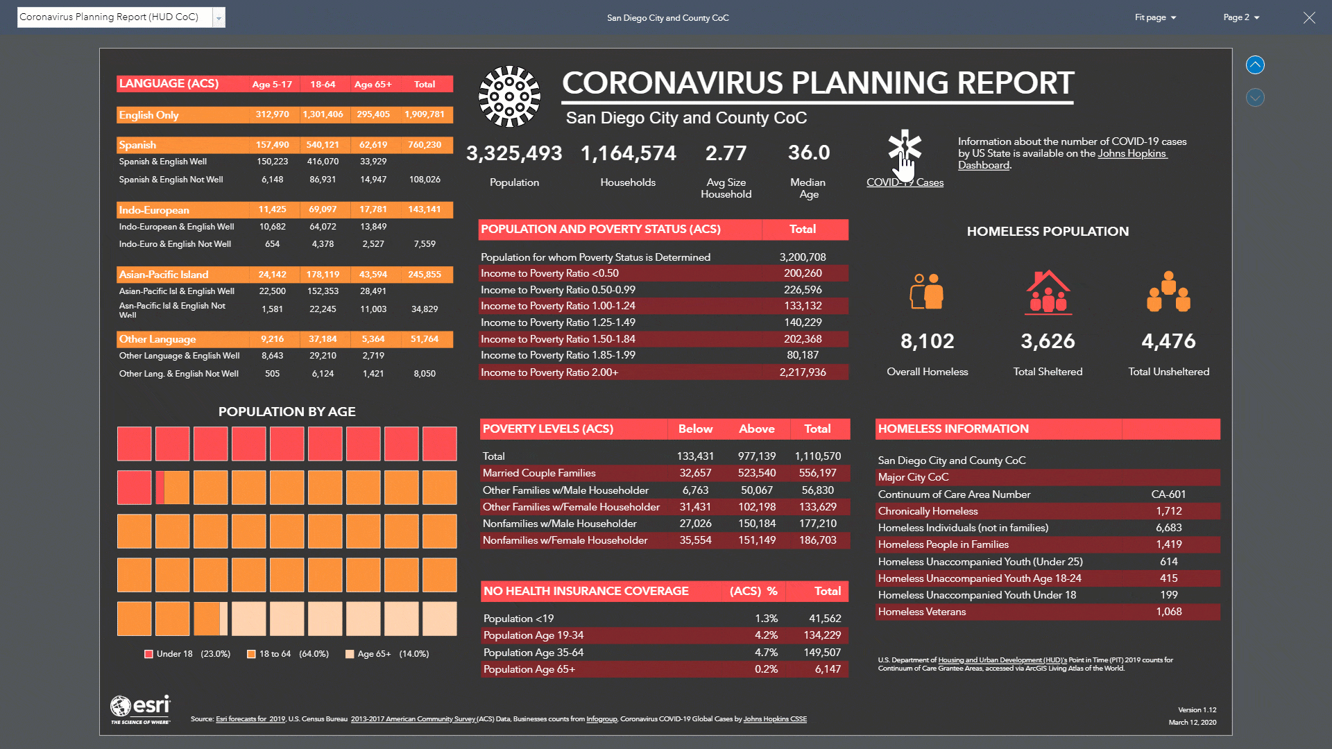
The infographic has two pages – to jump between pages, simply use the buttons in the upper-right corner of the infographic view.
The first page contains key demographic information and the second page includes more detailed information, including a summary of the homeless population. For example, in San Diego there are 3,626 people that were living in shelters when this information was last tabulated. You can further break down this sheltered population to understand the number of homeless people in families and their age distribution. Information like this can be used by planners to understand how many additional beds will be needed to improve “social distancing” for these communities.
Datasources Used in this Infographic
Unfortunately, information about homeless populations in the Unites States is sparse and counts are not tabulated nationally for well known statistical areas likes Census Tracts or Counties. I used the information about the homeless population that is publicly available in the ArcGIS Living Atlas of the World. This layer is derived from the Continuum of Care (CoC) Program. Information about this program can be found on HUD Exchange. The homelessness information is based on a Point-in-Time count that summarizes sheltered and unsheltered homeless persons on a single night in January in 2019 and joined to the CoC boundaries available from HUD’s Open Data site. HUD requires that each CoC conduct an annual count of homeless persons who are sheltered in emergency shelter, transitional housing, and Safe Havens on a single night. Each CoC also must conduct a count of unsheltered homeless persons every other year (odd numbered years). All of theses counts are planned, coordinated, and carried out locally.
The infographic combines multiples data sources to examine the impact of the COVID-19 virus on vulnerable populations. Additionally, there is information about current year population estimates from Esri, information from the 2013-2017 American Community Survey (ACS), and Businesses counts from Infogroup.
Because this infographic is based on CoC areas and related content, this infographic report can only be created in the United States and will not work in other countries.
What’s Next
In my next blog, I will demonstrate how I combined all these data sources in the ArcGIS Business Analyst Web App to build this infographic template. This will provide an example of how any organization can use existing infographic templates and supplement them with additional information from other authoritative sources.
Additional Resources
For additional COVID-19 resources, please view the following:
• How GIS departments can respond to COVID-19
• ArcGIS Hub sites for COVID-19
• Coronavirus Impact Planning infographics template
If you have any questions, please reach out to our team by emailing businessanalyst@esri.com.

I see our county in Florida is not able to create a CoC report, what do we need to do to get us included. Thanks for all the great work!
Thanks for letting us know about this, Bill. Four CoC areas were missing in Florida in the Living Atlas layer with 2019 data. This was addressed yesterday. These are the areas that were added:
– FL-510: Jacksonville-Duval, Clay Counties CoC
– FL-514: Ocala/Marion County CoC
– FL-518: Columbia, Hamilton, Lafayette, Suwannee Counties CoC
– FL-604: Monroe County CoC
This is amazing!!! Great work!!!! Is this even possible for me to figure out if I haven’t used Business Analyst? I am familiar with Building Web Apps. Bravo!!!!
Hi Michelle. Regarding your feedback about how to do this yourself, I wrote a follow-up blog that provides step-by-step instructions on how to do this yourself in Business Analyst: https://www.esri.com/arcgis-blog/products/bus-analyst/health/arcgis-business-analyst-building-your-own-vulnerable-population-infographic/