
One way to manage the unknown around the emerging threat of coronavirus (COVID-19) is having access to authoritative data. That data is currently being provided by Johns Hopkins University’s Center for Systems Science and Engineering through the ArcGIS Living Atlas.
In this blog, we will show you how to create a state-wide infographic that shows the daily status of confirmed cases, deaths, and recovery from COVID-19. Additionally, the infographic shows summary statistics of the most vulnerable populations in your state to help you prepare for mitigation efforts. Enabling the infographic within your organization takes roughly one minute and when you’re done, you’ll have an infographic that clearly and concisely shares the impact that COVID-19 has had on your communities.
Add the COVID-19 Infographic to your Gallery
1. Login to bao.arcgis.com and select a project.
2. Go to the main menu Reports > Build Reports > Build Infographics.
3. On the top right, click + Add template and select Browse gallery.
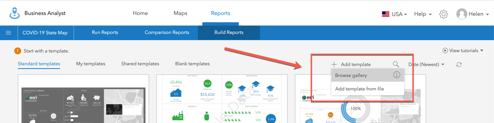
4. In the Browse Gallery window, search for Coronavirus Impact Planning Report for US States.
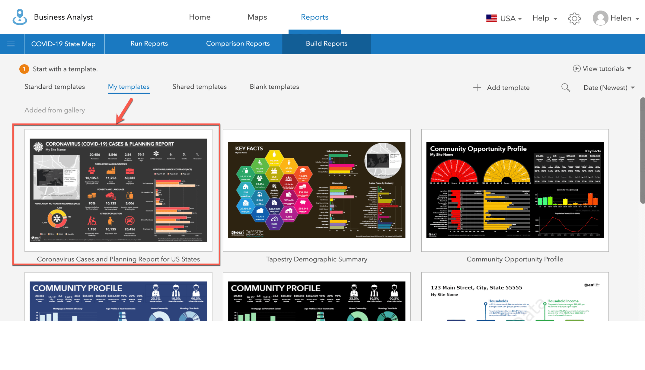
5. Click Add. This infographic template is now saved under the My templates tab and is available in the app.
Run Your State’s COVID-19 Infographic
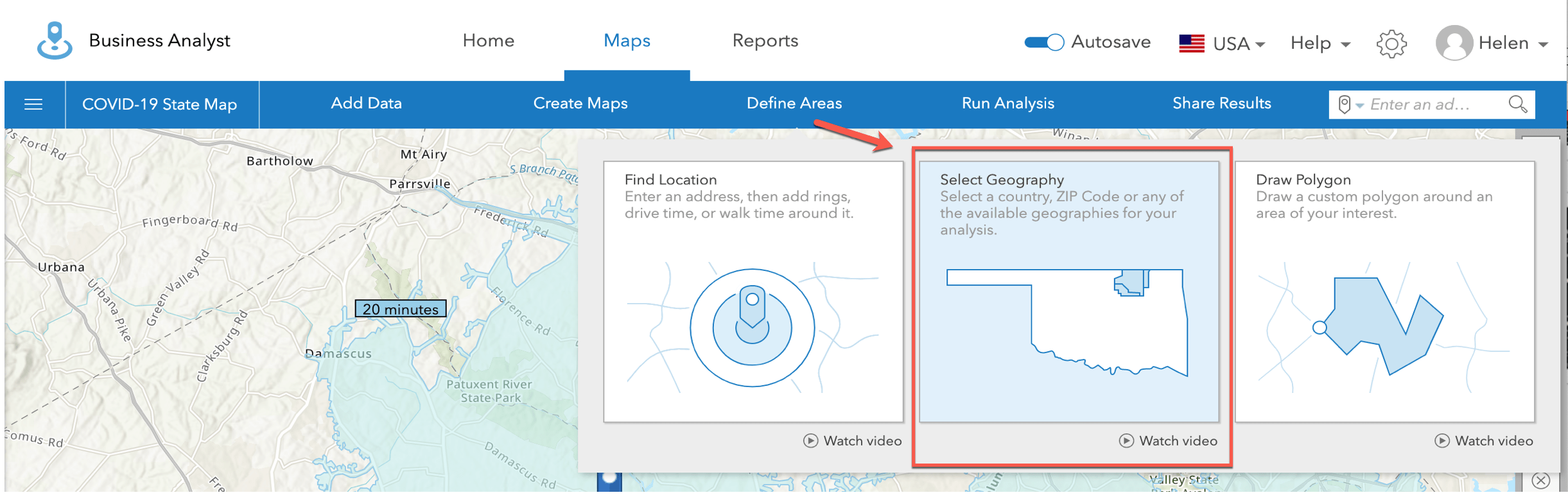
In the Maps view, select the state you want to analyze by going to Maps > Define Areas > Select Geography.
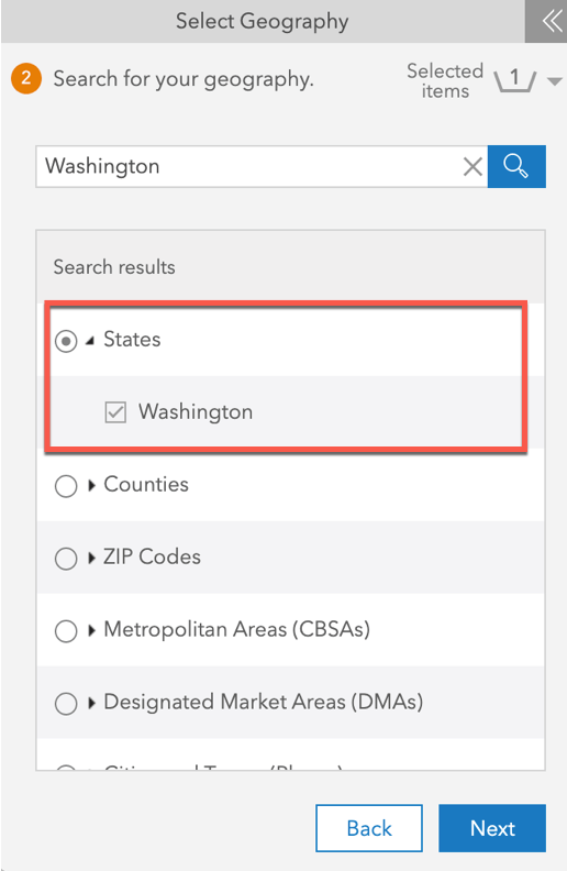
Under the Select Geography panel (left), click Search. Type in the state you want to analyze. For this example, I will use the state of Washington.
Click Next and select to Run Infographics in the next screen. Under the list of infographics, find My Infographics and select Coronavirus Cases and Planning Report for US States.
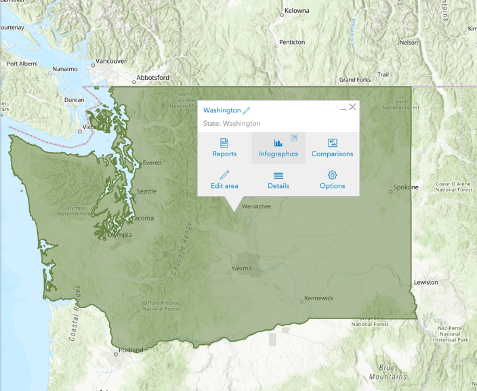
Alternatively, you can also select any state on your map and run an infographics from the contextual popup as shown below.
Once you have run your infographic, you should now see the interactive infographic shown below.
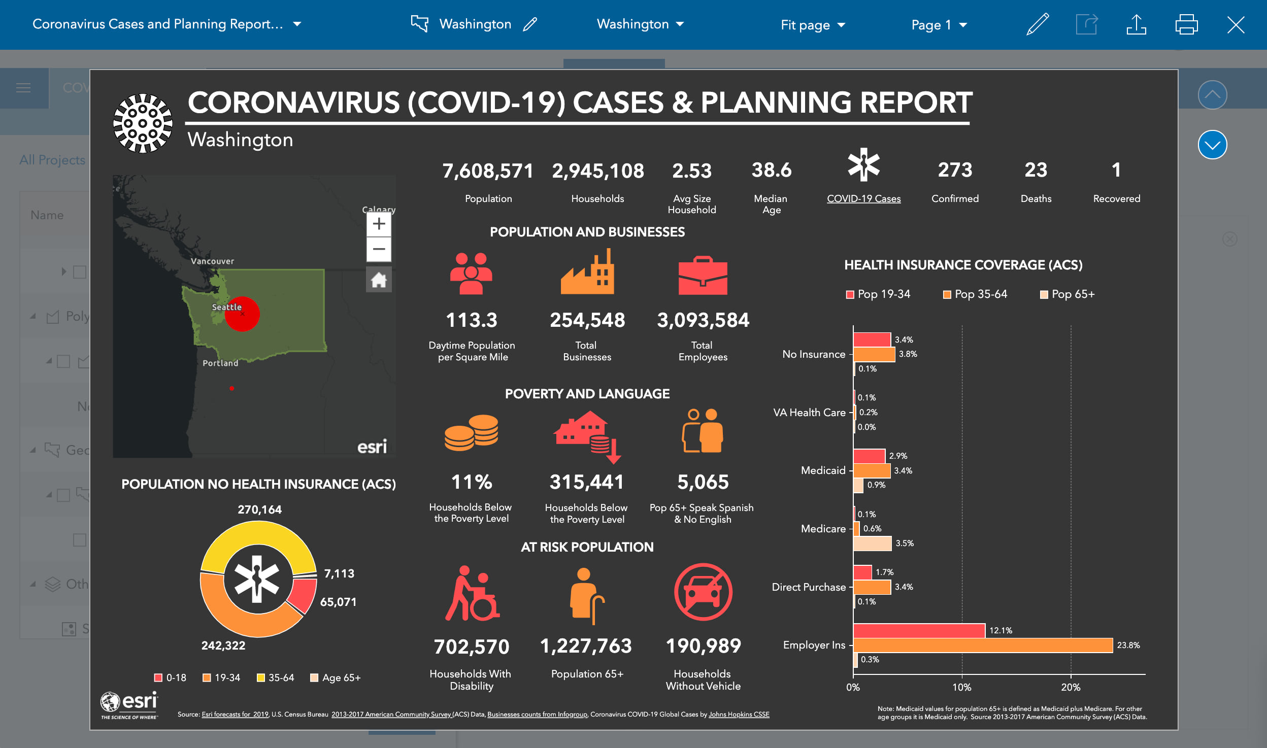
Here is a summary of the infographic shown above:
- It shows an interactive map of the selected area (in this example: Washington state)
- It uses a variety of socio-demographic data to aid in response and mitigation. These data sources are pulled from Esri’s demographic data, US Census and ACS, and Infogroup.
- The Johns Hopkins University’s COVID-19 data is shown on the top right of the infographic. This presents (1) the confirmed patients (2) deaths resulting from COVID-19, and (3) recovered patients.
- You can drill in for additional details by hovering over any chart or panel.
You can export the infographic as a PDF or image, or dynamic HTML file. You can also publish as part of a Story Map via the Maps tab > Share Results > Story Map.
We hope this helps you understand and communicate real-time, authoritative COVID-19 data in your state.
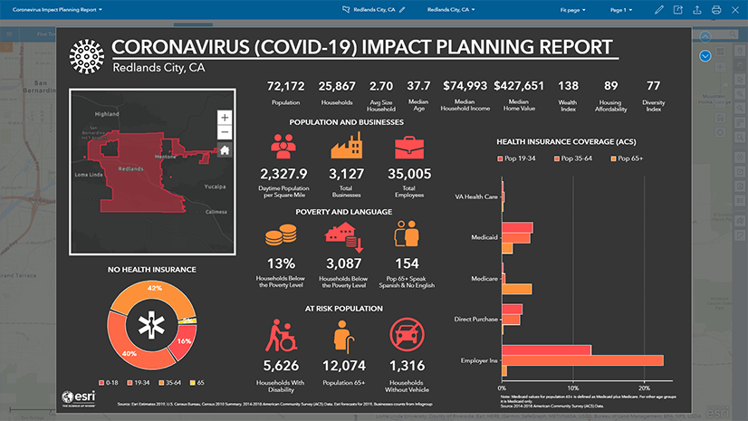
This blog was based on this video by Helen Thompson that illustrates how you can add other data feeds and layers into an infographic template. Since the creation of the video, Johns Hopkins University has limited its COVID-19 mapping service to state level geographies. You can also access Helen Thompson’s tutorial video directly here.
For additional COVID-19 resources, please view the following:
• How GIS departments can respond to COVID-19
• ArcGIS Hub sites for COVID-19
• Coronavirus Impact Planning infographics template
If you’re interested in creating an infographic like the one we’ve shared here but you don’t currently have a subscription to ArcGIS Business Analyst, you can sign up for a 21-day free trial at go.esri.com/ba/trial.
If you have any questions, please reach out to our team by emailing businessanalyst@esri.com.


The COVID-19 hubsite link isn’t working
Thanks David. I think we’ve got that link working now!
This is awesome! I’m doing it today!!!
Thanks for providing this example. My organization does not have the Business Analyst extension. I have been able to recreate a Dashboard with most of the information shown in this example for my region. I can’t figure out how to make the bar graph with health insurance statistics with the ACS Health Insurance layer in the Living Atlas. A detailed post with instructions for making bar graphs in Dashboard would be great!