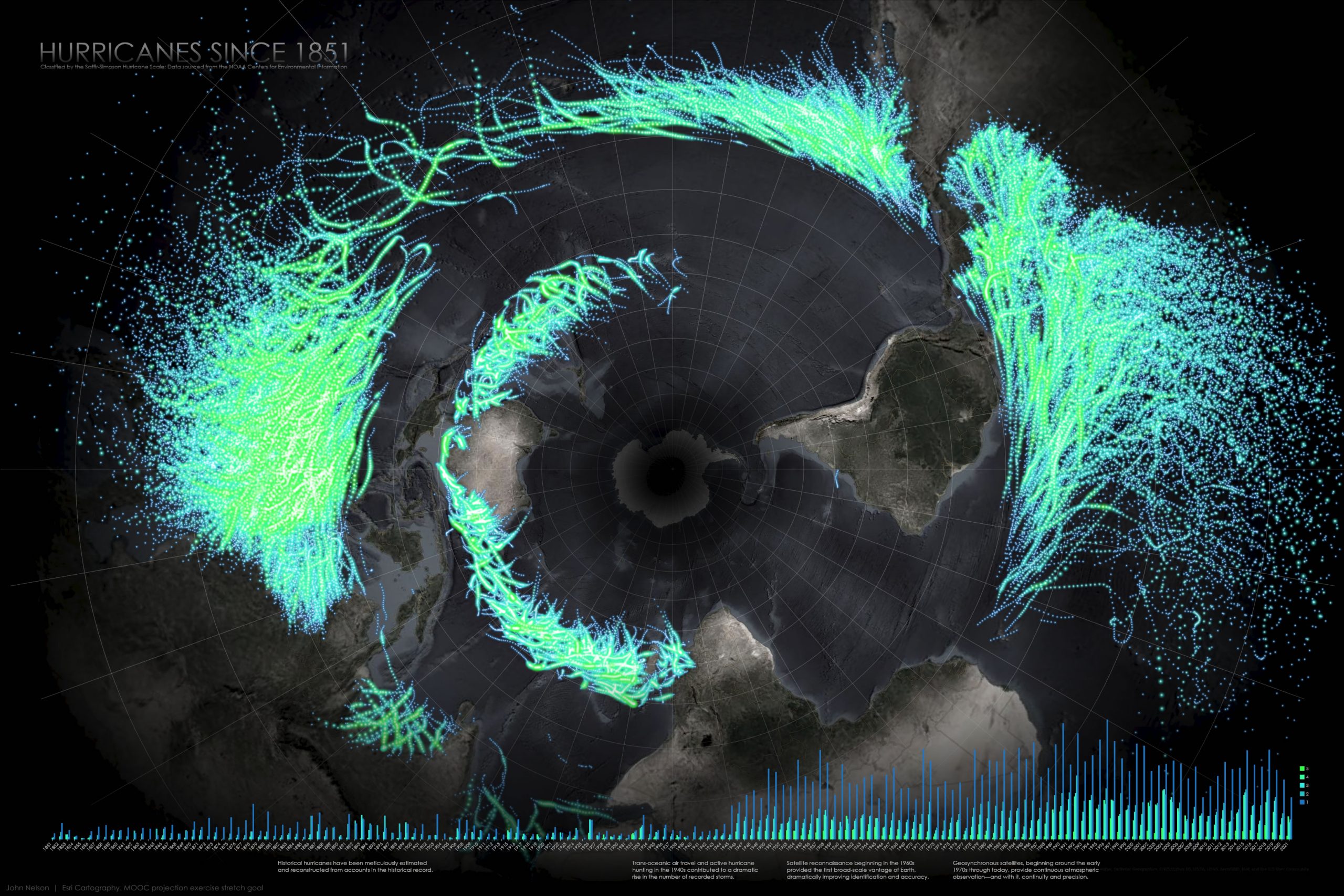
Ah, the map that keeps on giving. I made the first version of this thing nine years ago now. Nine years? It shows hurricanes since 1851, in an atypical projection so that historical hurricanes coalesce into one big storm of storms.

This map has served as a “stretch goal” for students taking the Cartography mooc, so maybe there’s a chance you’ve had a go at making this map yourself? But I have to admit to being a bit coy about providing specific instructions, focusing instead on the reasons for of this map’s design choices rather than revealing the nitty gritty of its making.
Here is the nitty gritty:
0:00 Run of the mill intro. Stuffy nose narration? Yes.
0:50 Download these resources (hurricane data, ArcGIS Pro style, etc) to work along with me.
1:33 Adding the HurricanesMap.stylx to the project.
2:15 Adding the historical hurricanes geodatabase.
2:30 Pulling in the Firefly basemap from Living Atlas.
3:00 Changing projection to South Pole Stereographic.
3:30 Giving the hurricane points some glowy Firefly symbology.
4:38 Changing the rendering order so biggest storms render on top.
5:32 Creating a layout and inserting the map into it.
6:30 Activating the map frame to fine-tune the position of the map within.
6:50 Rotating the map so the composition of the data best fits the layout.
7:35 Changing the map frame’s background color to black.
7:59 Adding countries from Living Atlas and styling them.
8:47 Giving the world a nice faded vignette by adding the Global Background layer from Living Atlas. And styling it.
9:50 Adding a layout grid because it makes it look all technical and sciencey!
10:55 Drawing a circle over the basemap gap at the south pole and giving it a gradient to disguise it. Total hack.
12:57 Creating a split bar chart to show hurricanes over time, and styling it up (mainly giving it a transparent background).
15:00 Inserting this time chart into the layout.
15:30 Tweaking chart label appearance.
16:07 Drawing a gradient rectangle behind the chart to make it look awesome.
17:22 Hacking a patch to cover up some of the chart labels. We do what we must.
18:07 Adding in some helpful annotation text to the timeline.
19:26 Title and subtitle.
…
An Anecdote
I mentioned that I originally made this map nine years ago, when I was rather new to the make-a-map-and-share-it-out game. This map generated a lot of attention; a feeling that was completely new to me. National Geographic reached out to ask if I would consider making a version of it for print in an upcoming issue. After I picked myself up off the floor I eagerly agreed. The lead time for magazines can be quite long, and this one was several months.
2013 had been an especially dark and difficult time for me and my family as we had tended to my mother through her final winter and spring that year.
We planned a memorial service for mid-summer, when friends and family would be more able to make the trip to the relatively remote Mackinaw City in northern Michigan. My father is a quiet man, and bore the sorrow stoically, but a gathering like this, for this occasion, must have been cloaked in acute dread. I tentatively held to an adolescent fantasy scenario of making my father proud in a moment of need. A full wall of his home is lined with issues of National Geographic magazine, a collection begun by his father in the 1930s. It seemed impossibly perfect, but maybe showing him a map his son had made had landed in National Geographic might provide a welcome distraction and push some wind in his sails.
I thought there was a decent chance that my map would be cut from the final print and I was braced for disappointment—it had the palpable sense of being very much too good to be true. The morning of Mom’s memorial, I walked with Dad up to the mailbox. By a wonderful coincidence, Dad’s issue of National Geographic had been delivered that day. We opened it up together right there in the driveway, flipping through the pages until we found it. It was there; it made it in. We stood for some time talking about it. I don’t know what we said but I remember the feeling.
Dad showed every visitor to the memorial the map that day, surely a welcome deviation from the standard condolent conversations. It was a good thing in the midst of a difficult thing. I am thankful for it.
Happy Mapping, John

Article Discussion: