When you are a global Geographic Information Technology company with a globe in your logo, you don’t shy away from the opportunity to have a great big glorious 8.5-foot diameter illuminated rotating globe in your new office building. But what sort of globe cartography do you design? How should this gigantic model of our lovely home planet appear? A pale blue dot? A vectory cartographic physical representation? A straight-shot cloud-free satellite mosaic? A texture-rich topographic take?
Or some sort of weird vibrant hybrid of these things? Yes!
Fun Considerations
When it comes to a physical installation, timelessness is quick to come to mind. National borders tend to wander, so including cultural boundaries just courts outdatedness. Another idea might be a themed map with some rich data illustrating a global phenomenon. Temperature? Currents? Tectonic plates? Hmmmm, that might be a good fit for a thematically narrow instance, but Esri makes tools and provides data for anything that can and should be mapped. A topical thematic map would be too specific and maybe not age quite as well as a purely physical representation.
So it was decided to go with some version of a physical globe. But there is still a ton of room to maneuver in that space. Here are some of the prototypes made in ArcGIS Pro that we kicked around…
Choosing
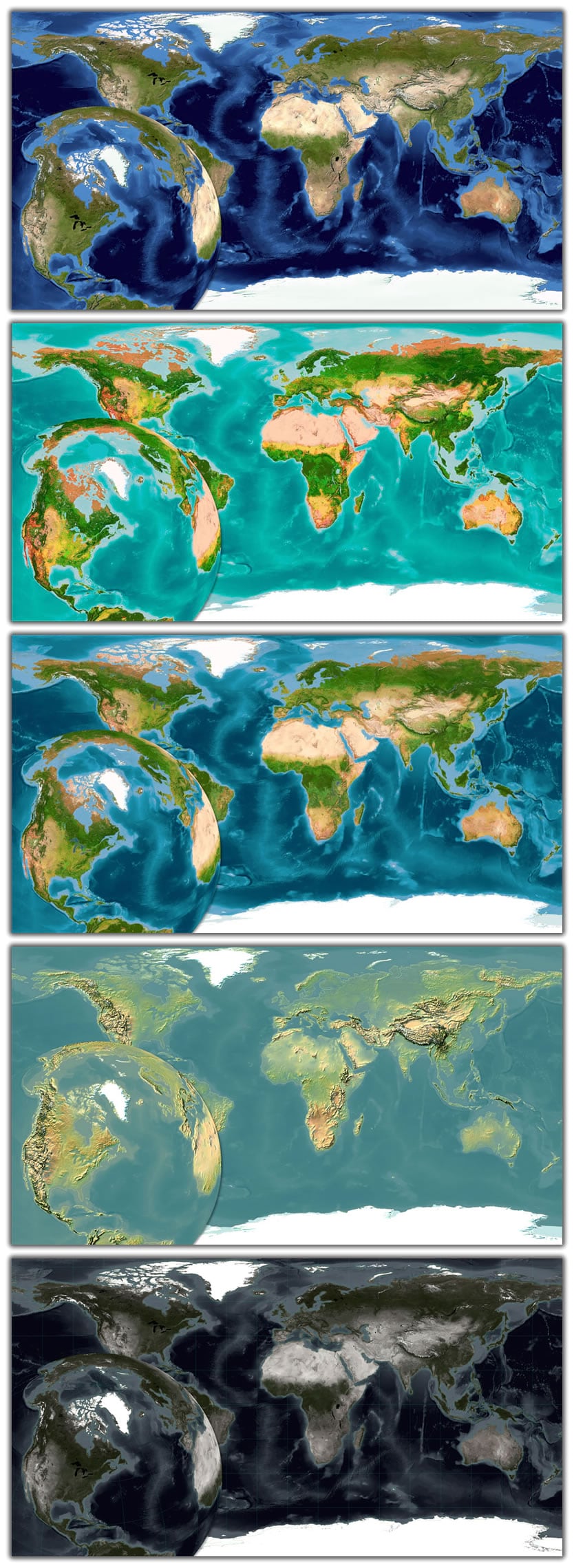
These five were whittled down to two pretty quickly. Firefly is a nice basemap, but it exists to visually recede and showcase thematic data. By itself it makes a pretty drab globe. The Imhof-inspired physical map is interesting but perhaps a bit too muted to have the sort of wow-factor that smacks you in the eyeballs when you walk into an atrium. The vibrant map, a fun collaboration with Estefanía Casal of Vizzuality for the Half-Earth Project, is fun and eye-catching but probably a bit too much for this scale and space. I didn’t make the call, so I’m assuming all of this. As one does.
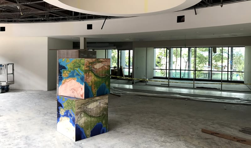
The bumpified imagery (a brightened and hillshade-enhanced imagery mosaic—what would end up being a sort of proto-version of the new World Imagery basemap’s smaller scales) and the bold imagery (a sort of hybrid of saturation-boosted imagery and the Vibrant map; more on that later) were the finalists. To get a rough sense for how the tones looked in situ, a couple of test cubes were printed up.
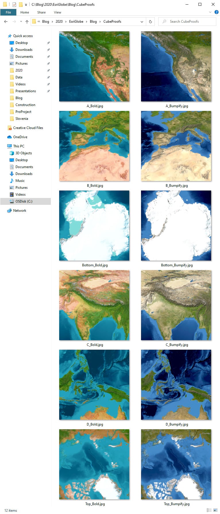
For what it’s worth, the layout and export options of Pro made this test iteration quite fast and easy. Here’s how the test cubes looked in the future-globe-space.
Bold!
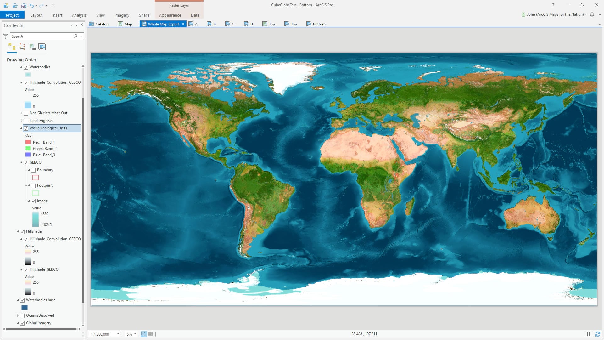
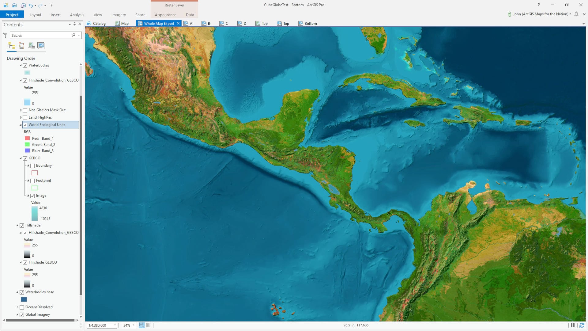
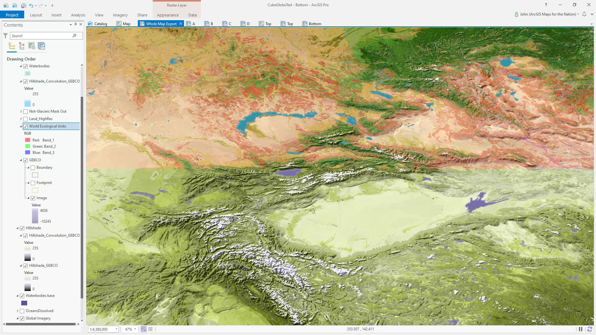
Ultimately the bold imagery option was chosen. What makes it bold? Well it’s actually the World Ecological Land Units doing the heavy cartographic lifting. This global scientifically-derived segmentation of land cover was created by colleagues here at Esri in collaboration with the USGS, academic experts, and conservation foundations. It was given a color-boosting saturation push and overlain atop world imagery. GEBCO bathymetric data provided oceanic areas (come on, that’s 70% of the globe!) a sense of layered depth. Over all this was a bumpification layer to draw up a sense of relief texture with warm sunlit slopes in terrestrial areas, cool icy shadows in glaciated areas, and aqua-drenched bathymetric shading.
This is a hybrid of the vibrant basemap used for the Half-Earth Project (you’ll also notice its cousin on the cover of GIS for Science Volume 3) and terrain-boosted imagery.
Here is a look under the GIS covers at the ArcGIS Pro project wherein the cartography was cartographized. If you look closely you can tease out some of these layers and spot the sneaky land/water and ice/not-ice hillshade masking inputs.
Collaborating with Makers
Oh gosh, nerding out on projections and gores and resolution specs? Come on, what could be better for a geographer?
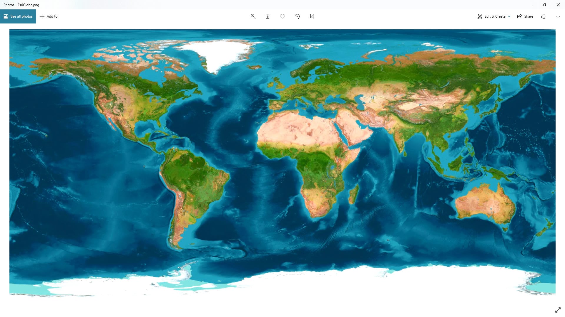
The globe’s manufacturer, Orbis World Globes, required a WGS 84 (aka equirectangular, aka plate carrée, aka equidistant cylindrical, aka 2:1 aspect ratio) image at 43,200 px wide by 21,600 px high image export. That’s a lot of pixels. Here is a snapshot of the resulting image which weighed in at close to a gigabyte:
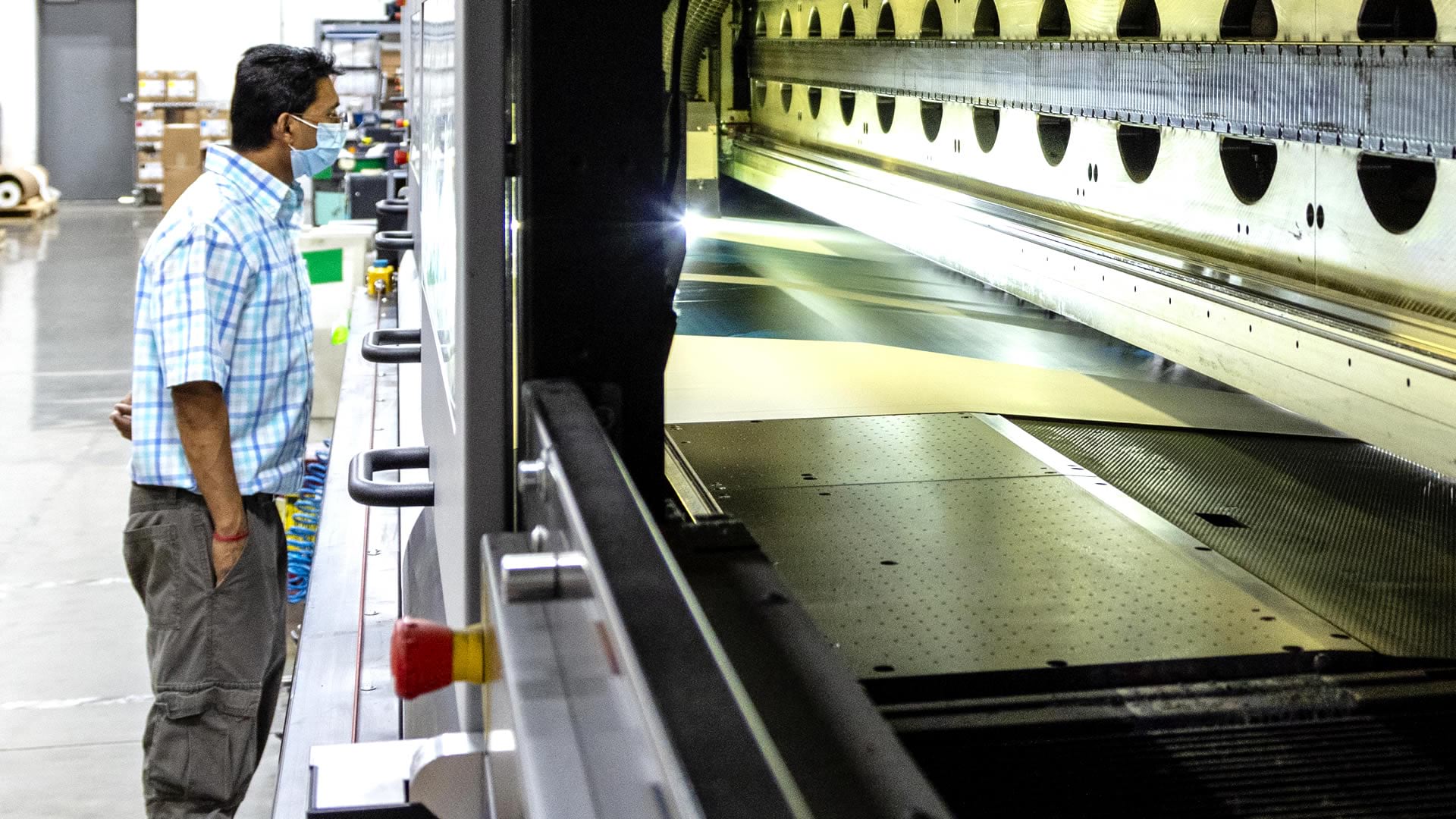
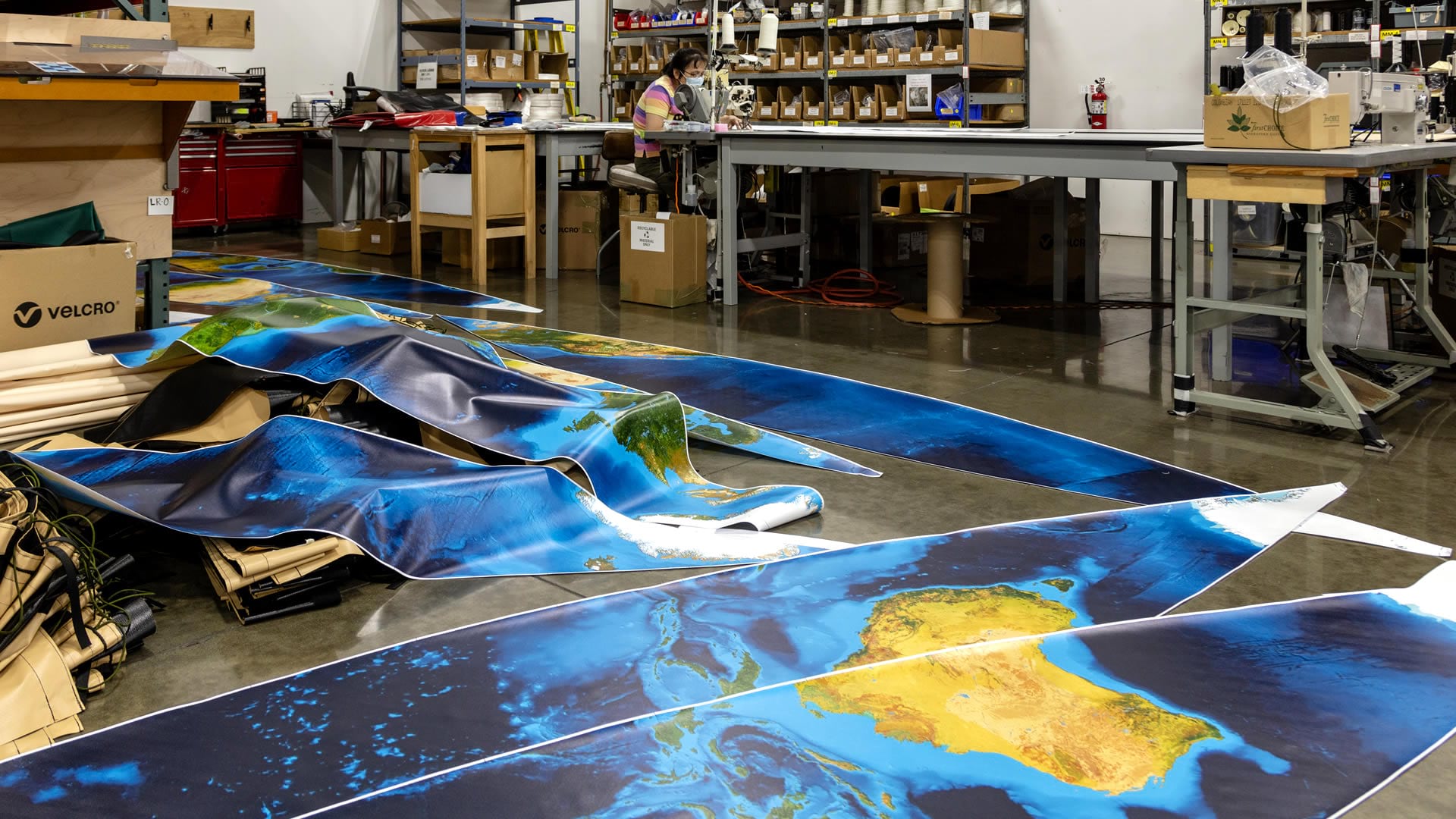
The manufacturer did the en-gore-ification to turn our rectangular deliverable into a series of canoe-shaped slices which would be printed and stitched into a sphere. Just like a little globe. Only huge. Speaking of huge, look at this printer!
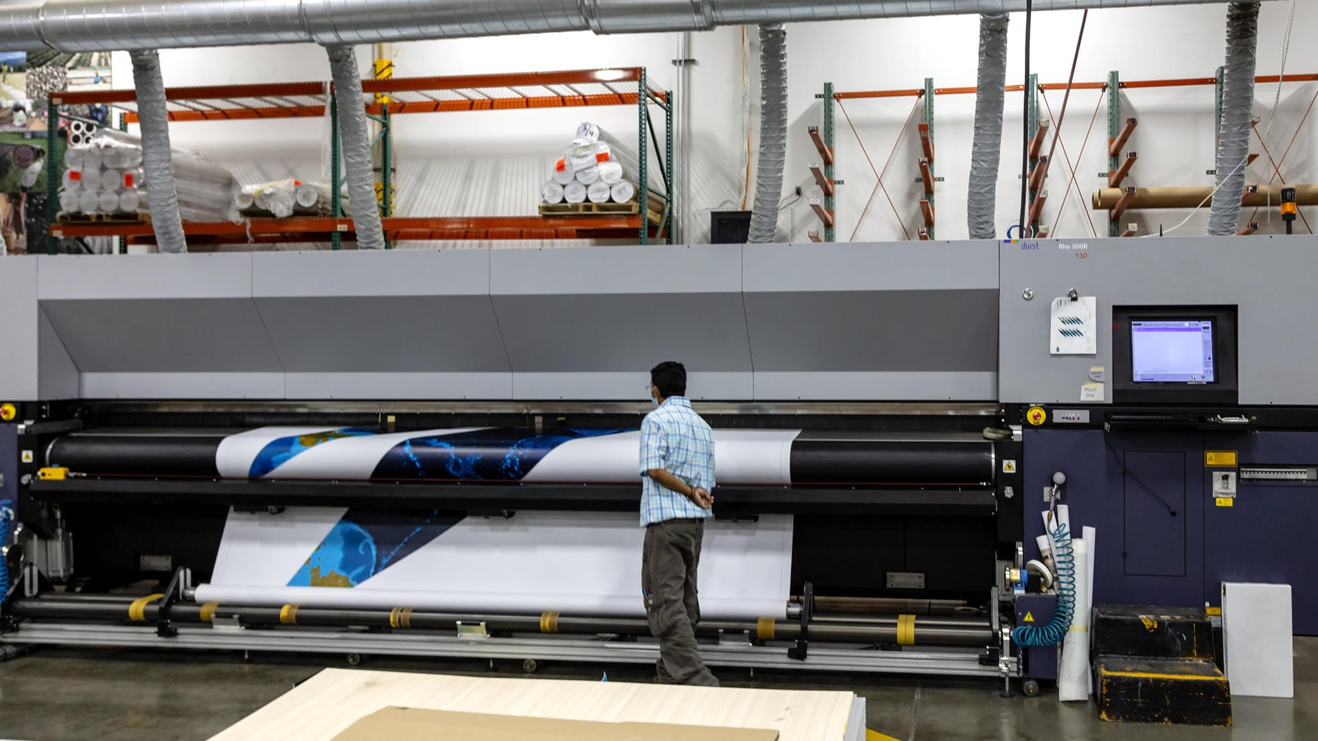
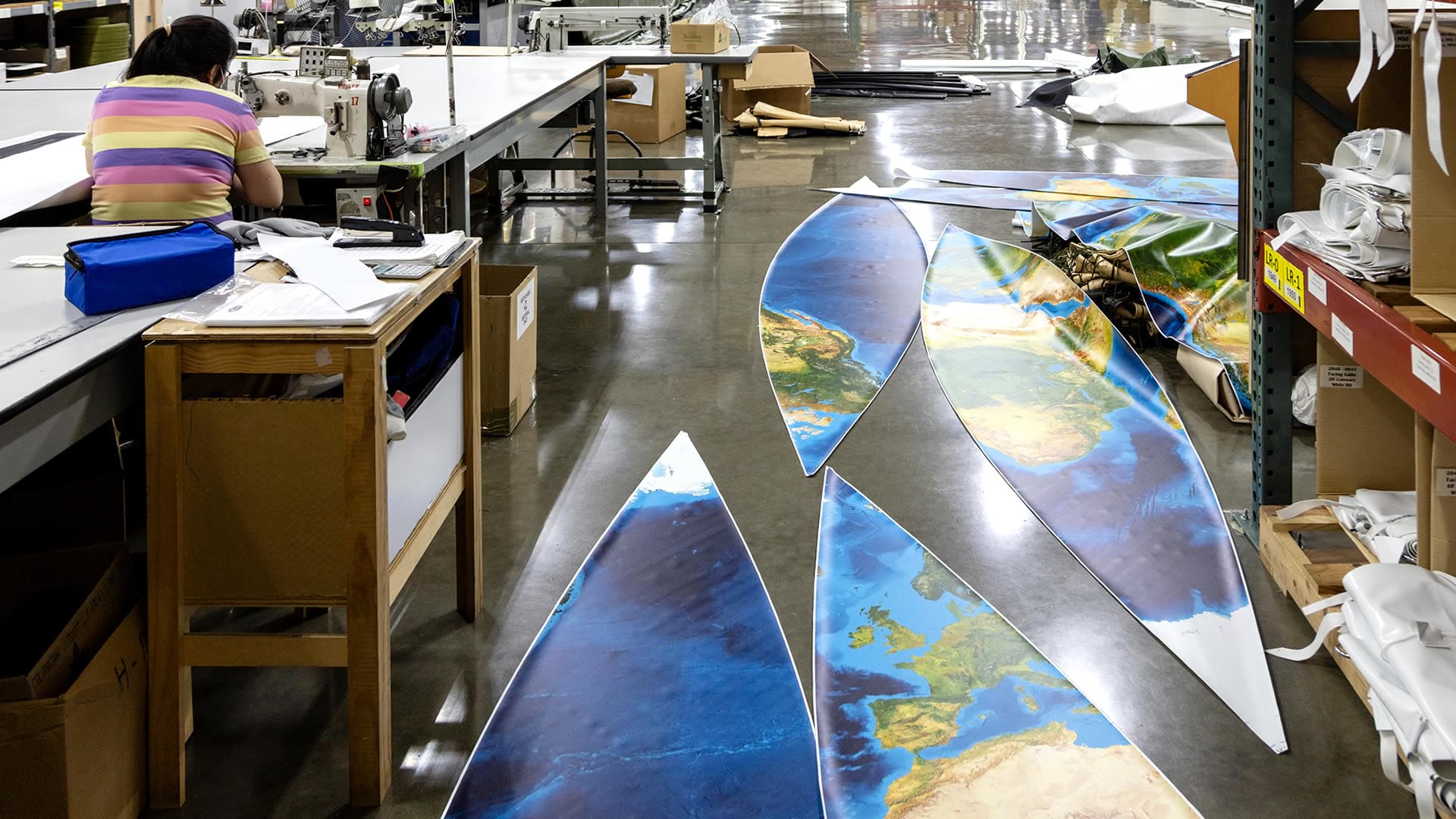
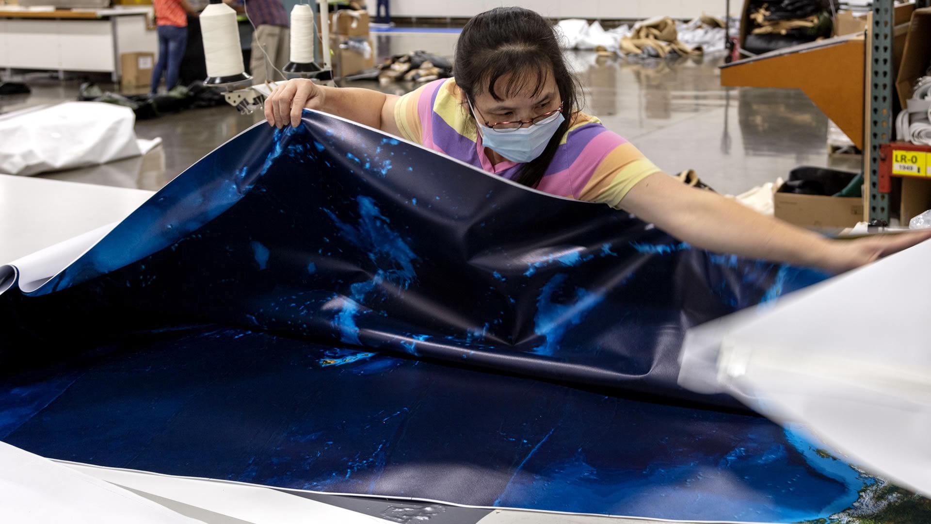
All of these gores were printed and trimmed and prepped for…assembly. Assembly? Well, like any creative process, there is the wonderful application of care and craft and adept and practiced hands. Look at these lovely flat elements being expertly stitched together into something with form and depth…

This assembled skin was then given its structure, illumination, and rotation mechanism.
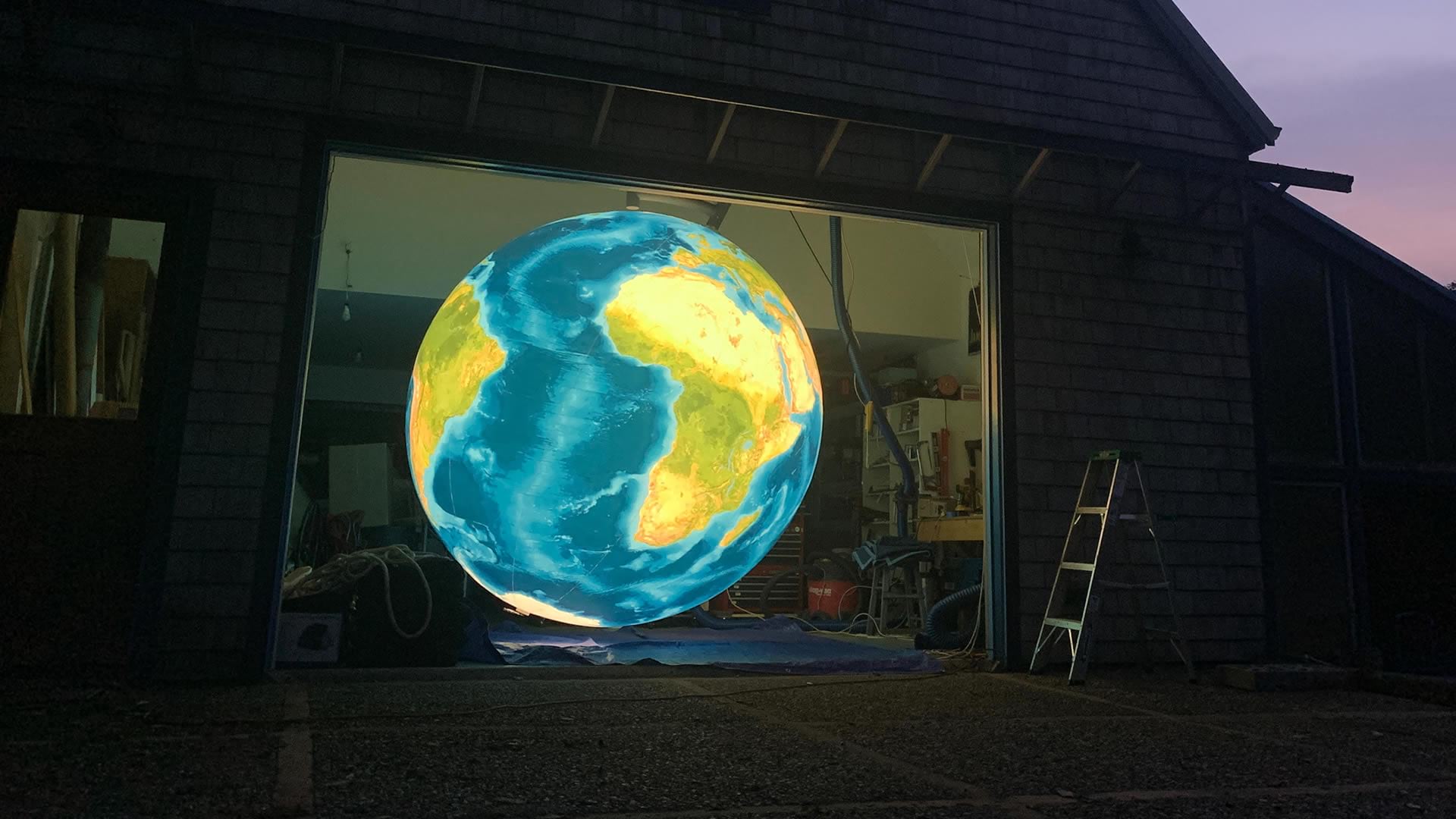
And ultimately installed at its home on the Esri campus within a shared space of a new office building…
Say, here it is making an appearance in the UC Central Live kickoff!

Some Globe-Inspired Thinking
What does it mean to invest in, appreciate, and prize a globe? A globe is something tactile an true. It has dimension and gravity. We work so often in the digital environment where our work starts and finishes as bits and bytes of memory represented visually as illuminated pixels on a screen. There is tremendous empowerment and communication potential in the virtual representation of our world, but sometimes there comes the opportunity to use our spatial thinking and map tools to create a material thing. That is an exciting prospect to any geographically minded person. How fun is it to see something virtual, something imbibed with the cumulative imagination, pains, and efforts of researchers and engineers that we can so quickly and conveniently describe as “data” or “content,” as a physical object? What a joy to see all of those contributions represented as something tangible.
One day, when we can safely visit each other and travel here and there on the surface of our beautiful shared home, we hope you have the opportunity to stop in and see us, and enjoy this globe for yourself. Until then, be well and thank you for your exciting and excellent work in this field.
If Earth Were the Size of this Globe…
Check out this follow-up post, describing some of the sizes and distances of things if Earth were actually the size of this 8-foot globe. Get ready to live.


Article Discussion: