Sometimes when you are working with a hillshade layer (or any layer, but let’s focus on hillshade for the sake of my delicate sanity) in your map, you want to style different parts individually. Like maybe you want to make undersea terrain exaggerated or a different color scheme, or you only want hillshade in your area of interest to help visually differentiate is, or you want Greenland and Antarctica to have an icy-colored hillshade, or you want glacier areas to have an icy hillshade. Gasp. You know, perfectly reasonable stuff like that; lots of reasons. Masking is going to help.
A masking layer is like masking tape. Wherever you put it, there won’t be any paint. I’ll let Bob illustrate this…
Any day with a little instruction from Bob Ross is already going to be a bit better. Thanks Bob!
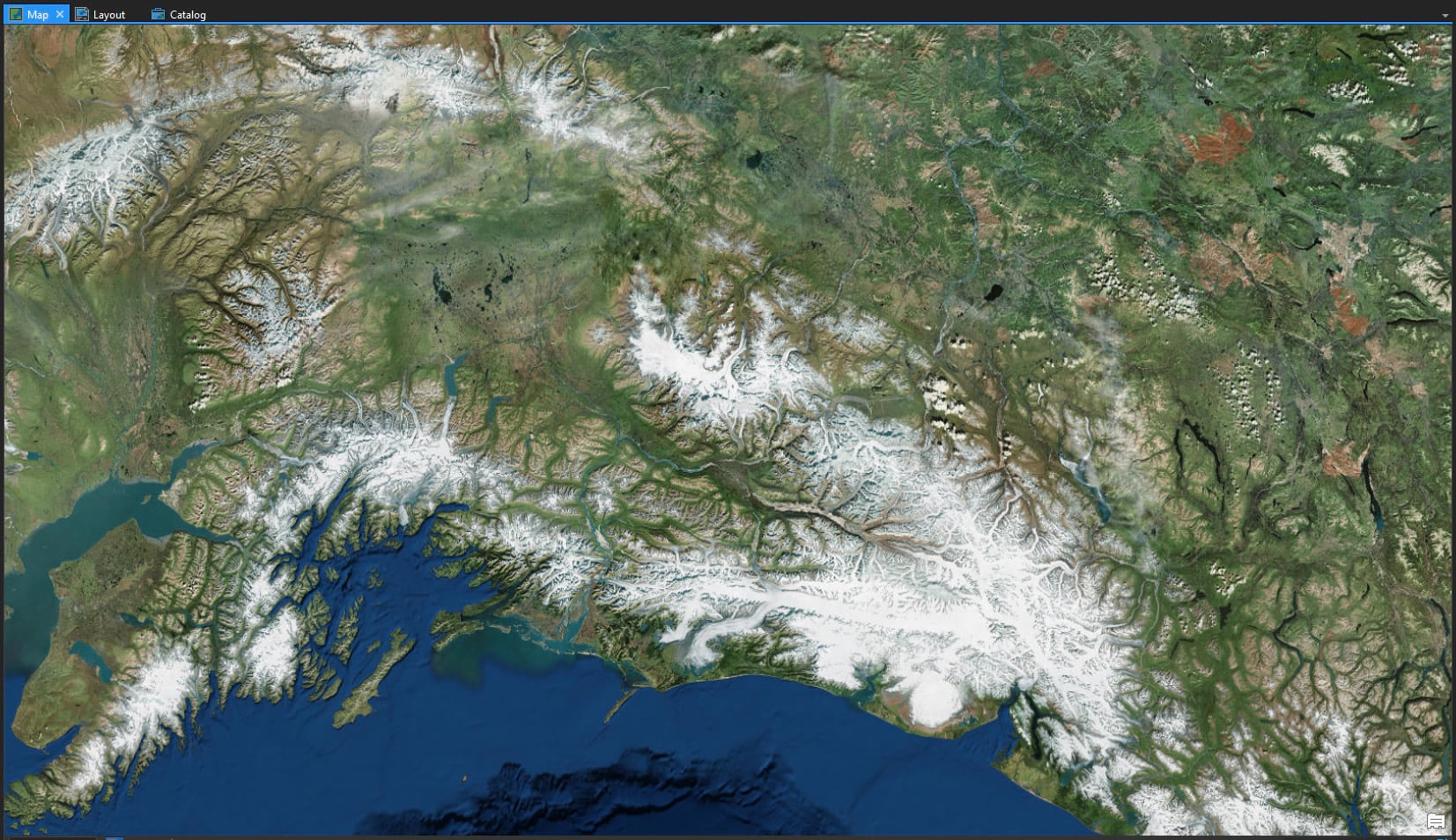
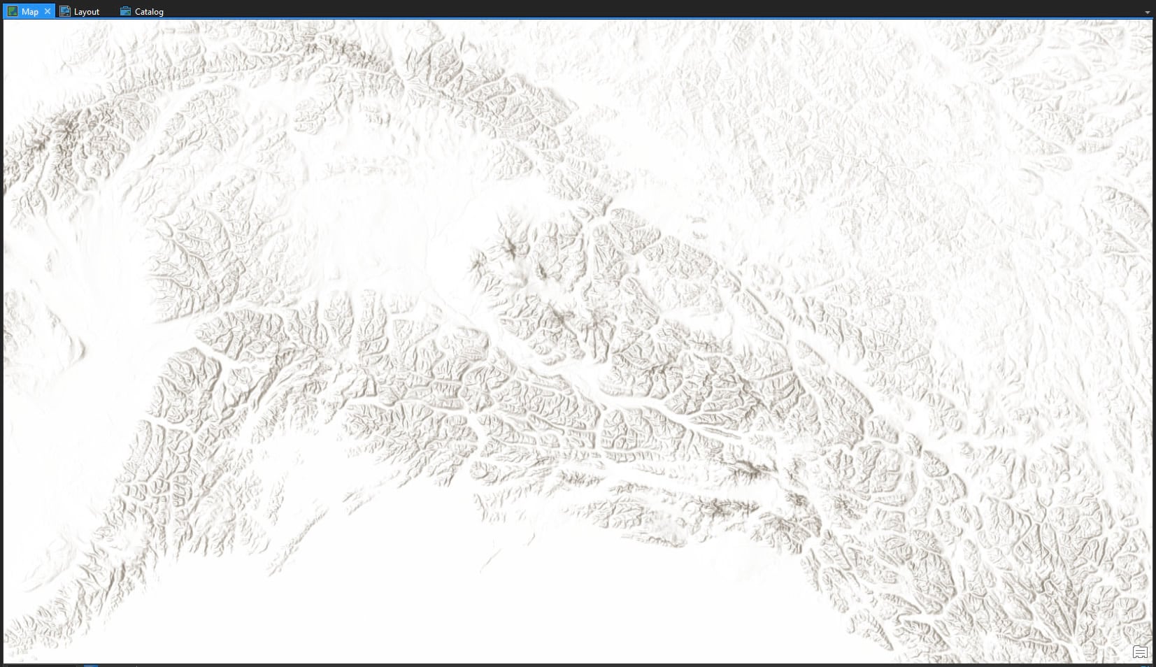
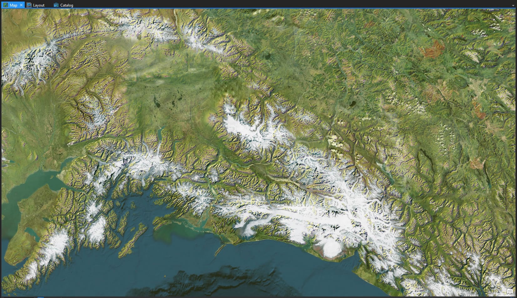
Here is a look at southern Alaska in ArcGIS Pro, two of my favorite places in the world.
Getting My Masking Tape Ready
I want to apply some hillshading on top of this imagery, but I want the glaciated areas to look different than the non-glaciated areas. I found a fantastic polygon reference for global glaciers at NaturalEarth.
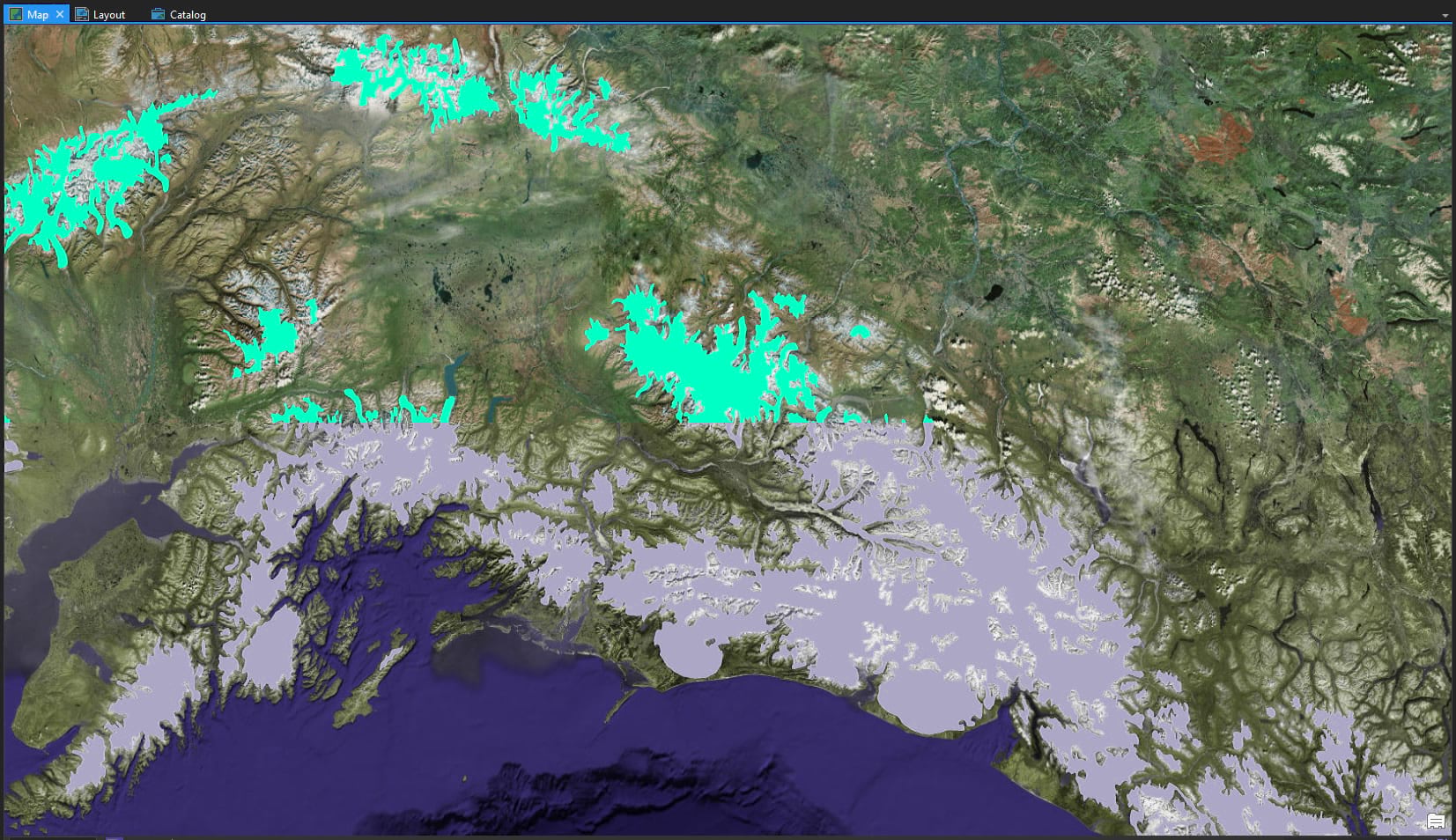
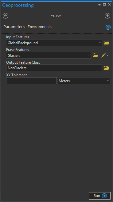
I’ll use this to exclude my earthy land styled hillshade layer a bit later. But first I need to make the inverse of this thing. A “not glaciers” layer. I added a Global Background vector rectangle from the Living Atlas, which is just a big rectangle that covers the whole world and is insanely useful for stuff like this. Then I used the Erase tool to chop out the glaciers, like a cookie cutter.
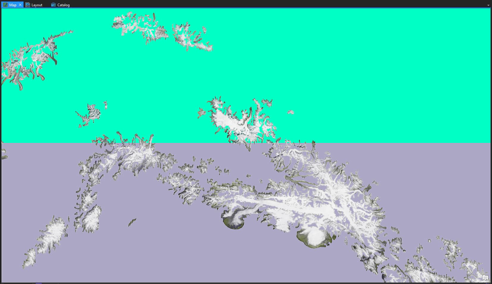
So now I have a layer of glaciers and a layer of not glaciers.
As anyone who’s painted before will know, the masking tape bit is the hardest part. And this wasn’t hard. So according to the transitive property we can conclude that creating hillshades and assigning them only to portions of our map is also easy. We proceed…
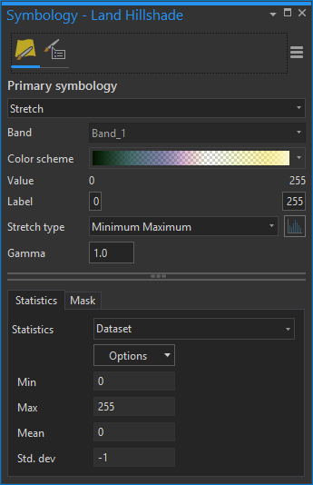
Hillshade
I added the “Terrain: Hillshade” image service from the Living Atlas, like so.
Of course job #1 is to cast off the tyrannical bonds of the default color scheme for one of my own crafting.
I’ve chosen to paint the shaded sides of the terrain with some sap green, then transition into a nearly transparent alizarin crimson in the mid-tones, then brush in some cadmium yellow on the sunlit slopes and finally some touches of titanium white.
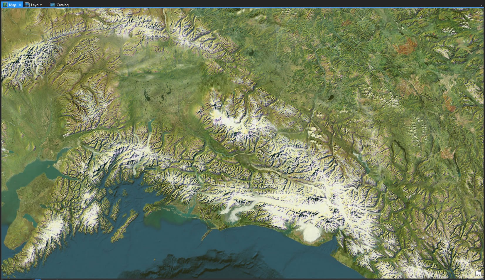
I like it! But I don’t like those colors on top of the ice fields. It’s just not right.
Masking
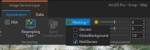
So now we invoke the magic of masking. With this hillshade layer selected, I open the “Appearance” tab and choose to mask by the Glaciers layer.
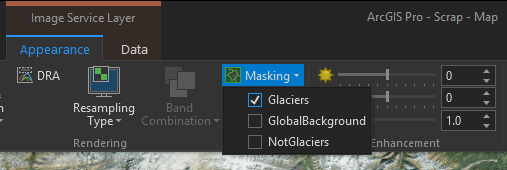
This will erase hillshading wherever there is a glacier.
My sensibilities are no longer offended.
I added that hillshade layer once again to my map (or just copy/paste the existing hillshade layer) and this time styled it to look like ice. I remember once standing on the Matanuska Glacier and feeling almost disoriented by the hues and light that I was surrounded by. Smooth rounded channels of gushing cyan melt-water wrapping around a curve and diving into an impossibly blue crevice which seemed to have its own light source below? Insane.
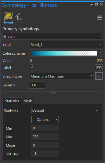
Tell you what, I’ll represent this sort of landscape with a generously applied daub of prussian blue, transitioning into fully transparent phthalo green mid-tones, ending in bold titanium white.
Here is that icy hillshade over all of Alaska.
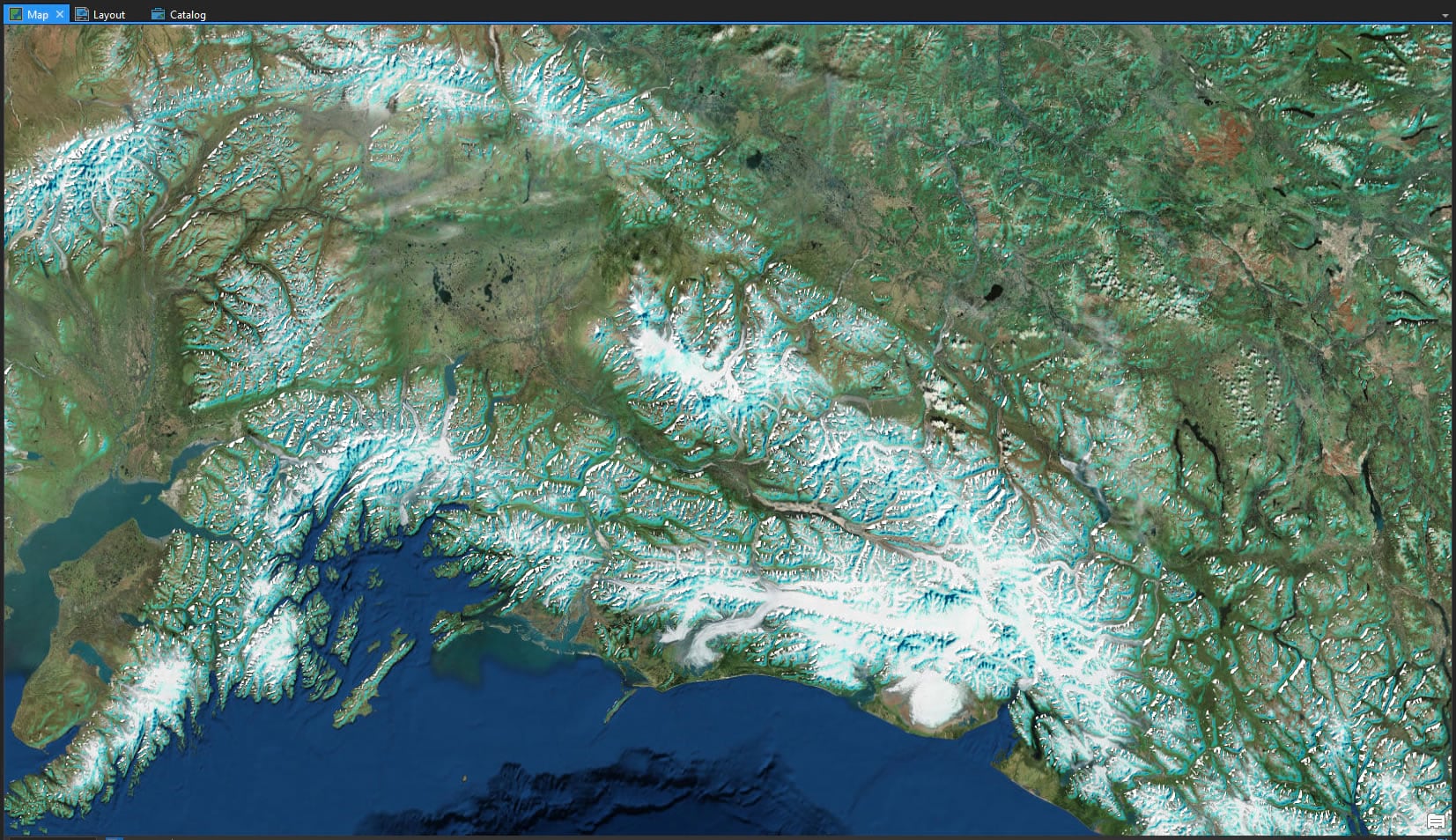
Which, when masked by the not glacer layer…
…looks like this.
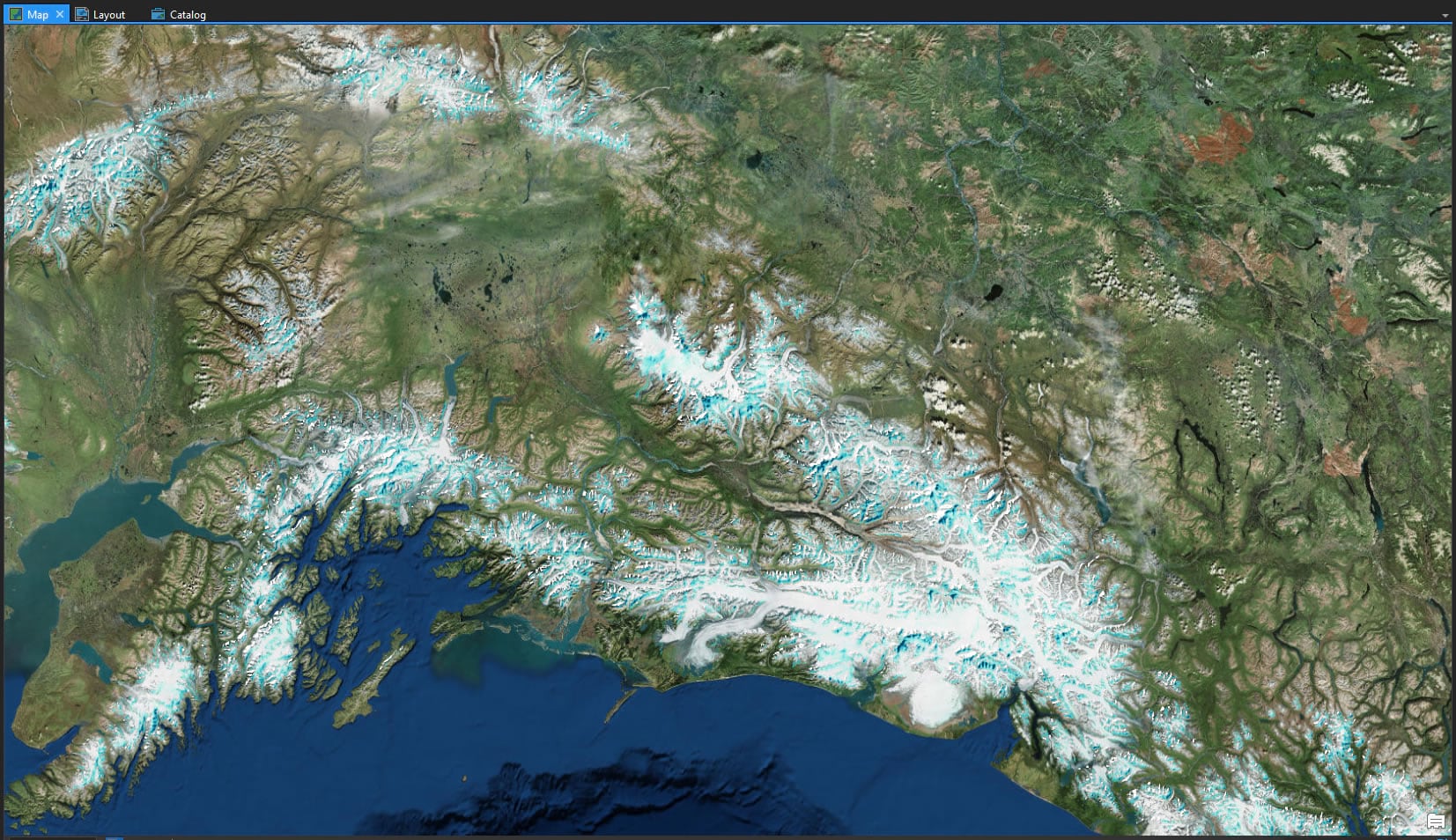
And when I turn the glacier hillshade and not glacier hillshade on at the same time, I get two distinct color hillshade schemes, informed by where there are glaciers and where there aren’t.
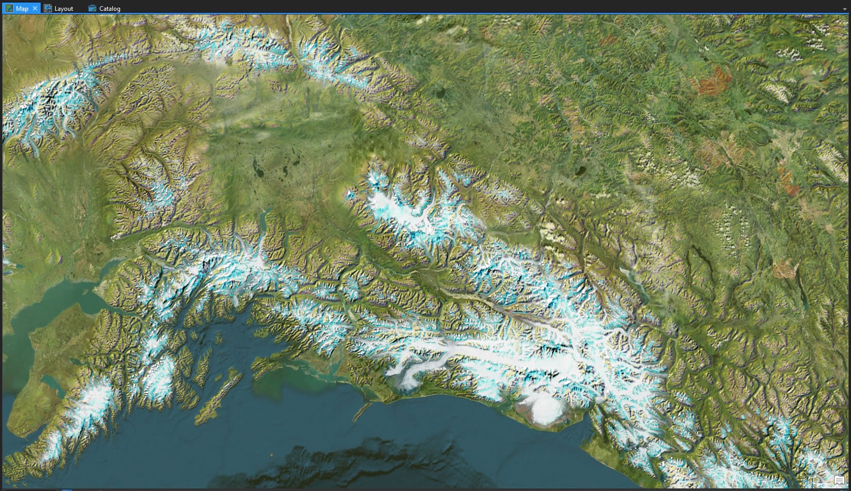
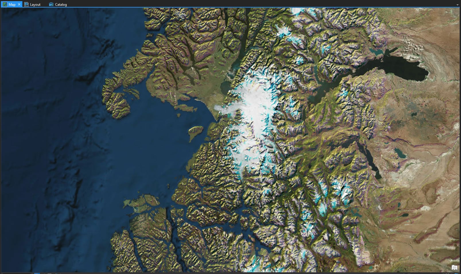
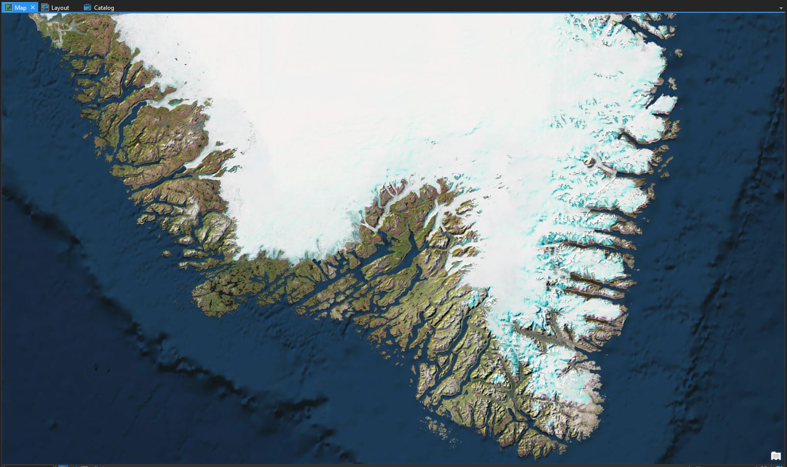
Fun, right? No more dirty ice. No more icy dirt. That sort of thing. Here are some more examples, since I had the layers all set…
Southern Andes…
Southern Greenland…
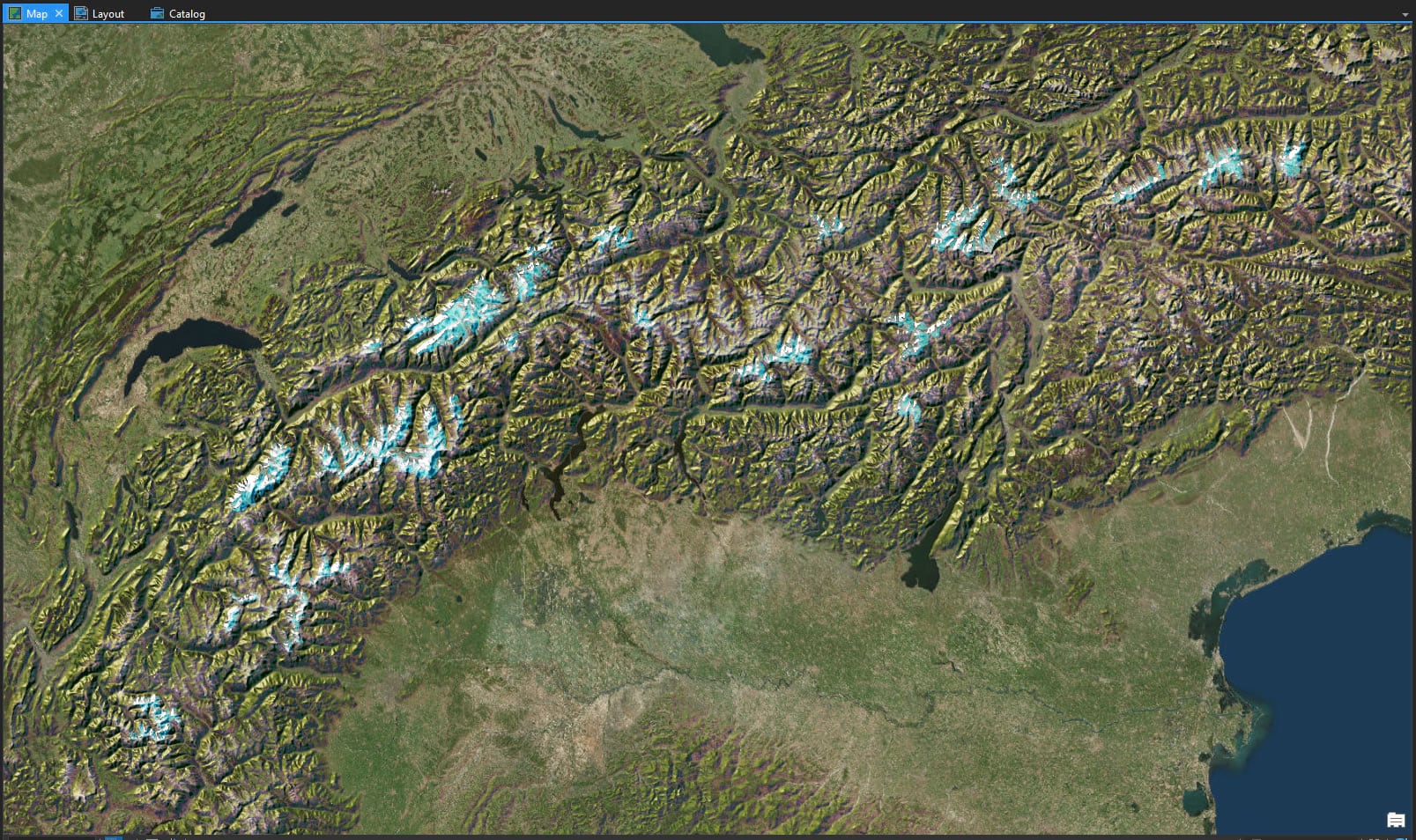
Alps…
Caucuses…
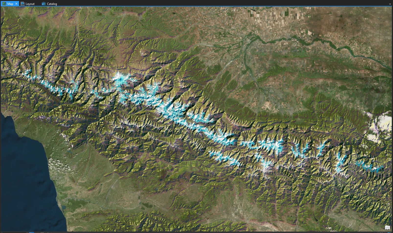
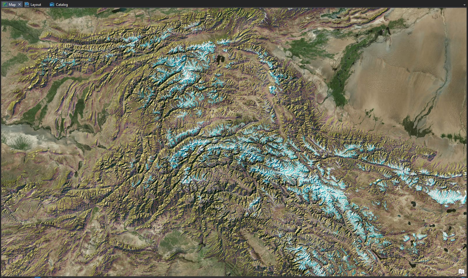
Western Himalayas…
Anyway, you get the point. Have fun masking. There’s no telling what sorts of Boolean adventures you’ll get into!
Happy Masking, John

Commenting is not enabled for this article.