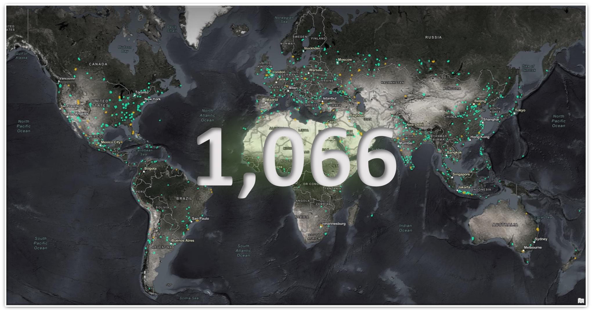
I thought it might be mildly entertaining to start off this post with a quick challenge. Have you ever tried to guess how many Jellybeans are in a jar? Well, I don’t actually have any Jellybeans, nor do I have a jar, but I do have a bunch of polygons depicting all of the Metro updates published to World Imagery over the past year. Have a look at the graphic below and see if you can guesstimate the number of Metro area updates. Clicking the graphic will reveal the answer.
That is a lot of updates to metropolitan and high-interest areas across the globe! Let’s find out more about all of the updates the ArcGIS Living Atlas of the World team has been busy working on this past year.
World Imagery Updates from Top to Bottom
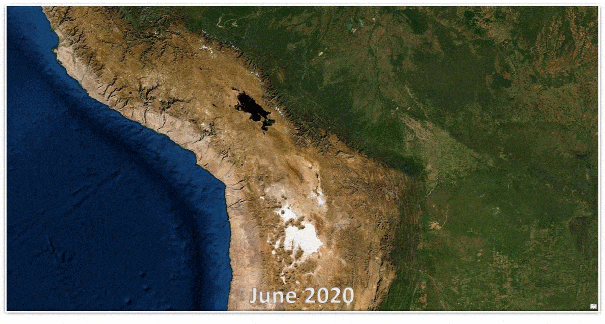
Bump Mapping + World Imagery = Awesome!
In June 2019 we announced the publication of TerraColor NextGen, a virtually cloud free and seamless, low to medium resolution, imagery mosaic of the world. This year, we injected that imagery with a dose of bumps and brightness.
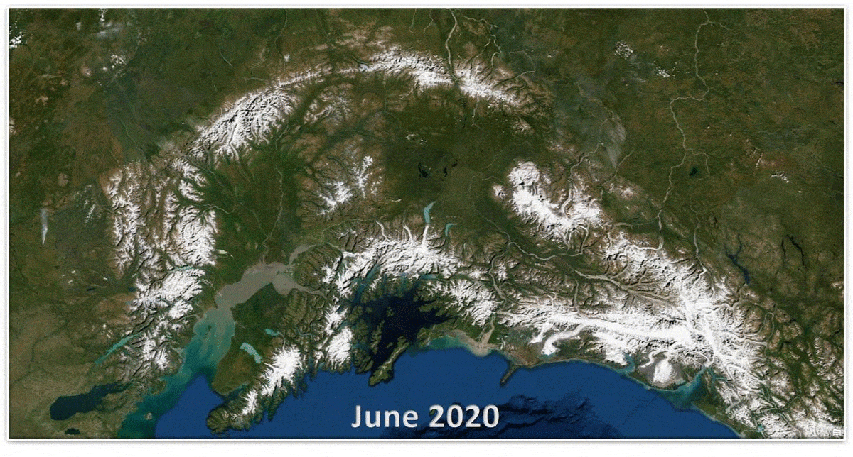
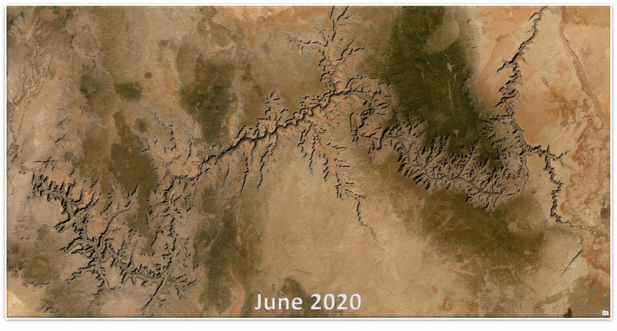
Bump mapping is a technique in computer graphics to make a rendered surface look more realistic by simulating small displacements of the surface. – Wikipedia. Perhaps the most common form of bump mapping involves using a height map for simulating surface displacement, which is just what we conjured up. We took our surface (World Imagery) and made it look more realistic by simulating displacement (hillshading) derived from a global height map (Terrain). Call it bump mapping, call it terrain augmentation, or if you are akin to my friend and colleague John Nelson, call it Bumpification. No matter what you call it, the result is the same, it’s awesome! See below for some quick before and after examples. You can also use this swipe map to browse and compare at the locations and scales of your choice.
-
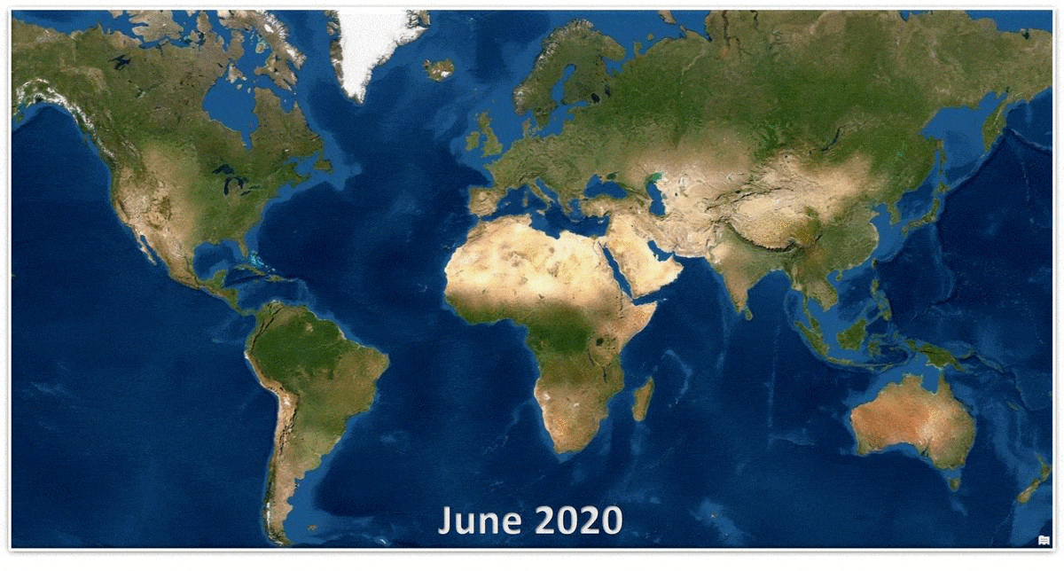
World Imagery global view before and after bump mapping.
It was a pleasure collaborating with John on this effort, he has been talking Bumpification for years. Be sure to check out his Bump-ified Imagery post which provides much of the context and inspiration for bringing these enhancements to World Imagery.
Global Vivid Imagery Updates
Maxar’s Vivid product provides a visually consistent and continuous image layer over large areas through advanced image mosaic techniques, including tonal balancing and seamline blending across thousands of individual image strips. World Imagery incorporates this product at 1 m resolution globally and at 50 cm resolution for the continental United States and Western Europe. Last year, Maxar delivered CONUS with an improved spatial accuracy, improving from 10 meters to <5 meters CE90. This set the stage for what is to become the standard in the Vivid product. CONUS will receive its second update of this higher accuracy product in the next month (prior to UC 2020). All of Europe will follow soon after, with continued expansion to the rest of the world.
The snapshot below shows all the areas around the world where Vivid updates have been published, or are scheduled to be published, between Q3 2019 and Q3 2020. On average, annual Vivid area updates include 60% coverage refresh.
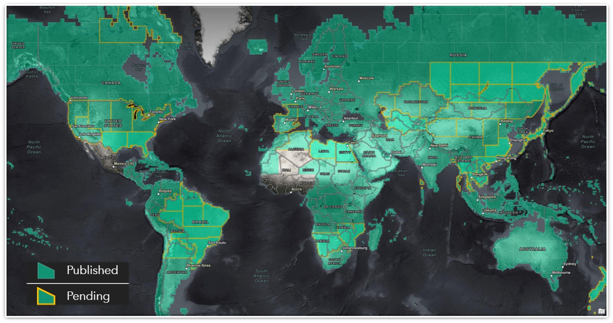
If you are interested in learning more about the history and evolution of global imagery basemaps, check out this really cool timeline from Maxar.
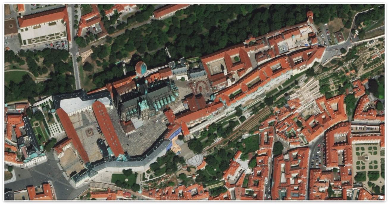
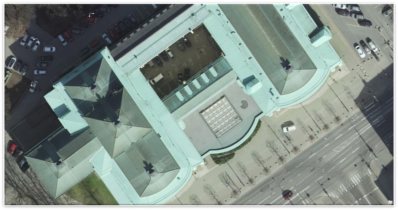
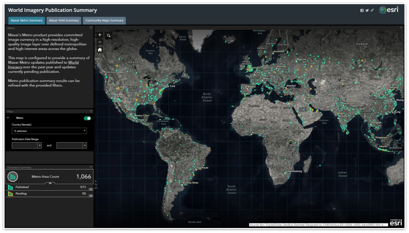
1,066 Metro Updates
Maxar’s Metro product provides committed image currency in a high-resolution, high-quality image layer over defined metropolitan and high-interest areas across the globe. Maxar is committed to providing Esri 1,000+ Metro updates annually. Between Q3 2019 and Q3 2020, we will have published 1,066 updates (as depicted in the opening of this post). The majority of Metro products have historically been provided at a spatial resolution of 50 cm, with a smaller percentage of them at 30 cm. This past year the ratio flipped. Now, all Metro areas are provided at 30 cm resolution.
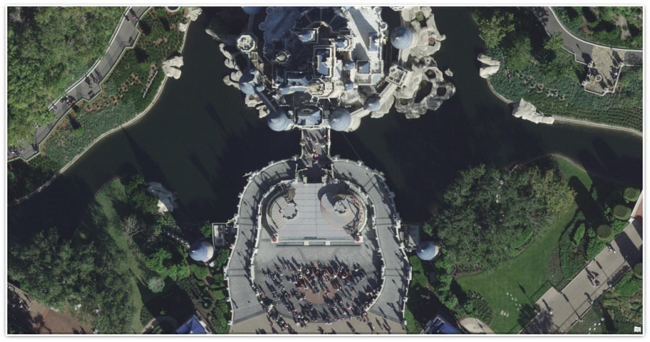
Below is just a handful of examples of these detailed Metro updates.
-
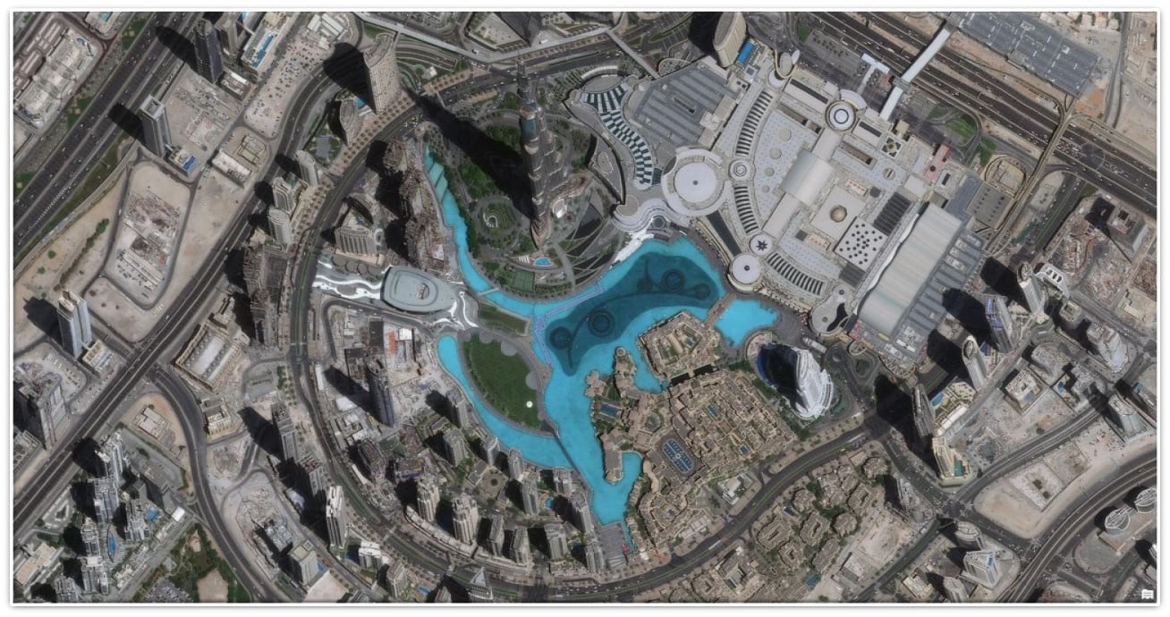
World Imagery view of Dubai Fountain, Dubai. Satellite image © 2020 Maxar Technologies
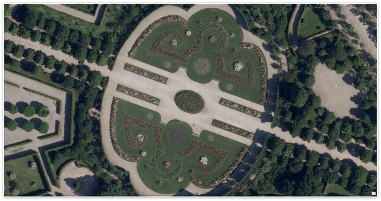
Community Maps Contributions
The GIS community, including various mapping agencies around the world, enhances the ArcGIS World Imagery map by contributing recent, high-resolution aerial imagery through the ArcGIS Living Atlas of the World Community Maps Program. While the spatial resolution of contributions varies, the average across all Community contributions is under 15 cm.
Contributing imagery to the Living Atlas is a great way for organizations to increase accessibility for users. It also helps to reduce, or even remove, the overhead of having to host and manage the imagery themselves because Esri takes care of the hosting and management.
Here are a few samples of Community Maps imagery contributions published over the past year.
-
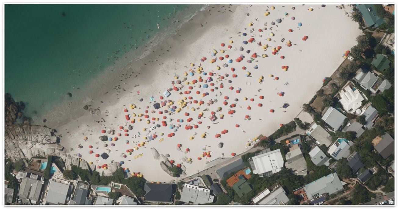
World Imagery view of Clifton Beach, Cape Town, South Africa. Imagery contributed by the City of Cape Town.
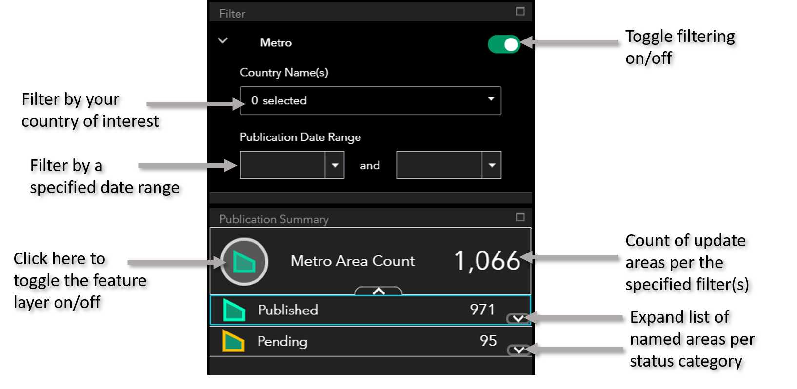
Self-Serve Publication Summary
For anyone looking for an on-demand summary of recent or pending updates to World Imagery, there is now an app for that. Now you can check in any time you like to get a summary of Metro, Vivid, and Community areas published over the past 12 months, including areas soon to be published.
Important Note: This item is in beta and is not intended for use in production applications.
Here is a quick start guide to the app.
You made it! I hope you enjoyed the post, but most of all, I hope you found it useful and informative.
Huge thanks to the Living Atlas Dev, QA, and Production teams for all the fantastic work!

According to the World Imagery Publication Summary map, my area of Kansas should have received an update on May 5, 2021 but the imagery I see in the World Imagery layer is still from 2018. Any idea when I could expect to see an update?
Hi Josh, glad you are using the app. I assume you are referring to the “Global Imagery” tab. When we receive updates for those large blocks (global subdivisions) we don’t get 100% coverage refresh each time. We have not received it yet, but we hope to be publishing the next round of updates across Kansas in Q1 2022. Hopefully your area will get a refresh at that time. Once the imagery has been delivered to us, you should see the block(s) covering your area light up as “Pending” and you can track status from there.