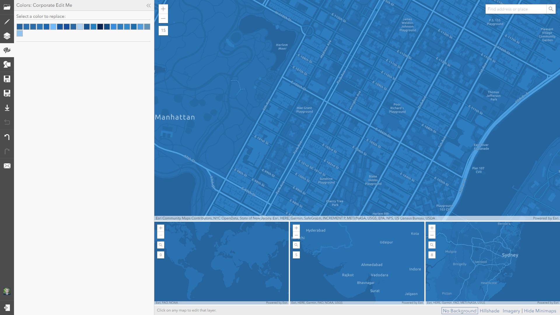
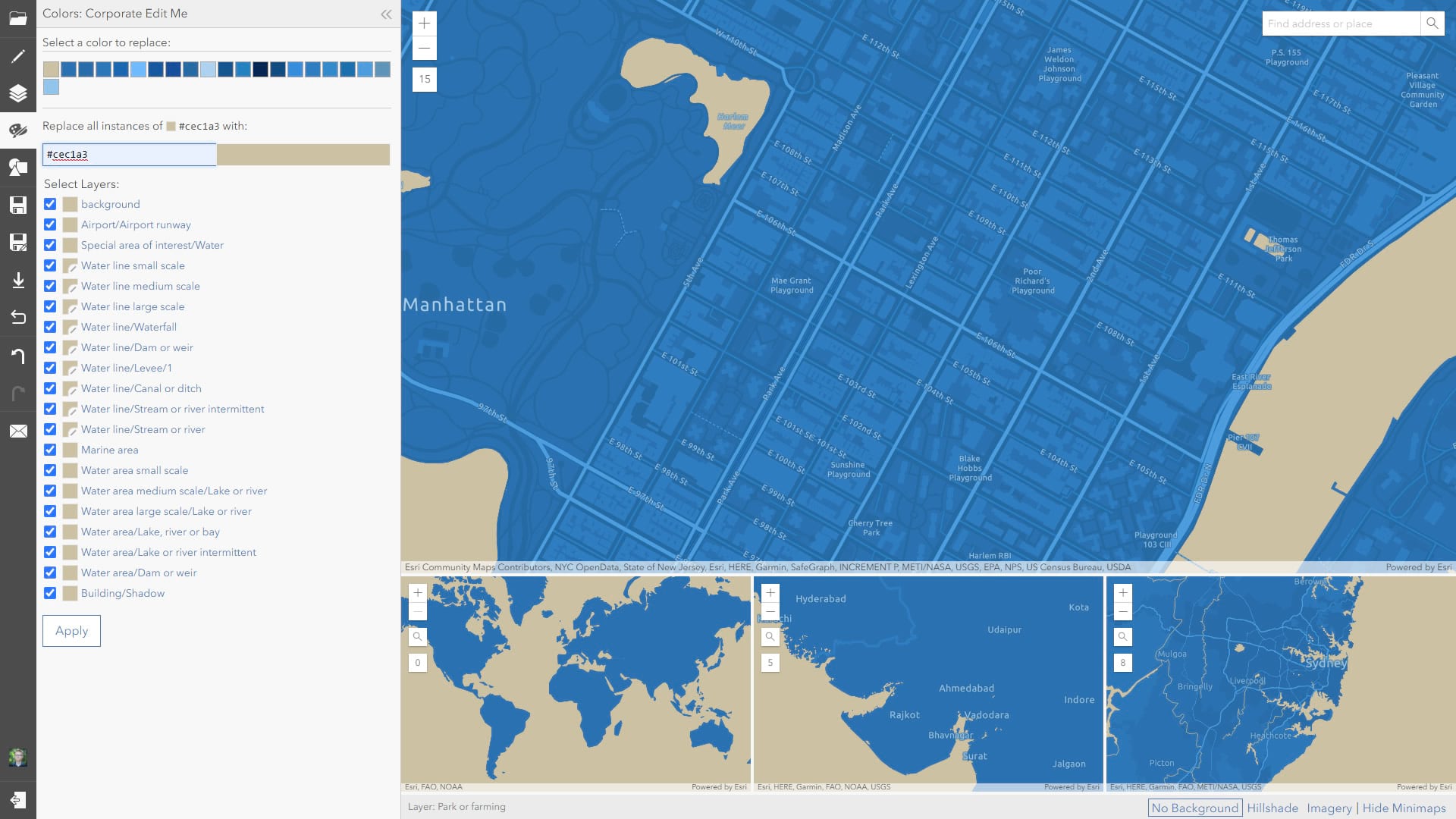
The ArcGIS Vector Tile Style Editor is a super easy way to modify and author styles for your own flavor of vector basemap. It makes editing all manner of cartographic aesthetics a snap. My favorite feature is the “Colors” tab which lays out a palette of all the colors used in the basemap. Here is the Corporate basemap, which is a monochromatic blue riff on the elegant Light Gray Canvas.
See that lovely stack of color chips, just waiting to be changed to a different stack of colors? Editing each of these individually into a family of colors that works for your goals can be a bit like surgery. Takes a steady hand and it’s amazing how little of a difference is needed between colors to maintain a pleasing map. I like the tonal contrast in this family of colors, but would like to play with the colors of the palette as a whole, rather than individually. What’s a map nerd to do?
Ok, here’s the hack. Ready? I take a screenshot of the browser, and paste it into Photoshop (would also work in whatever your favorite image editing tool is, there’s nothing complex here).
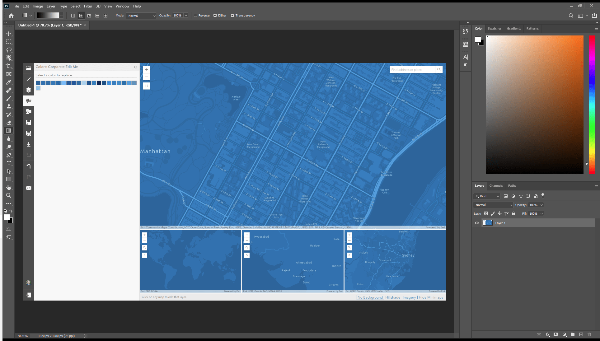
Then I apply some image adjustment filters, wholesale. Let’s say my goal is to make a khaki-colored map. Here are a few adjustments I can make; each step of the way I can push and pull color adjustment sliders for safe exploration of the whole color palette, without the worry of applying the colors individually in the actual map.
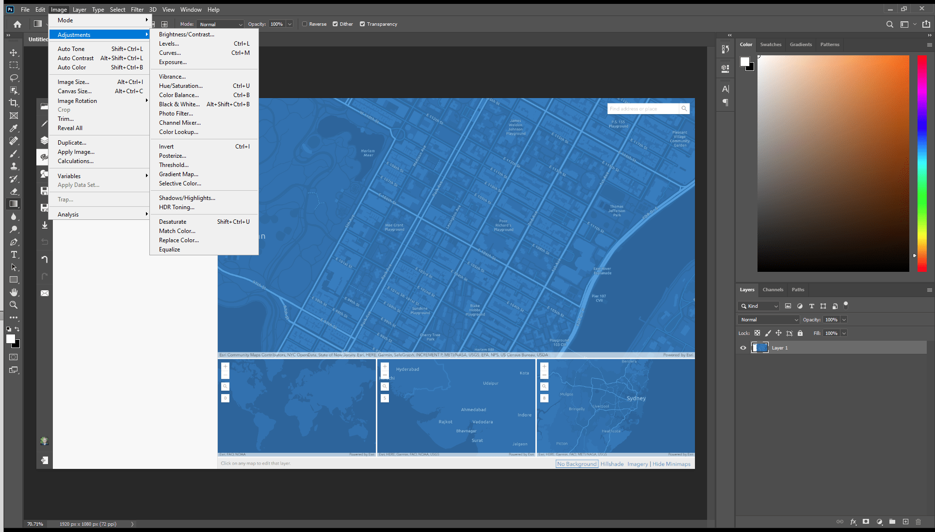
So, for example, here is the screenshot, in Photoshop, with an “invert” adjustment.
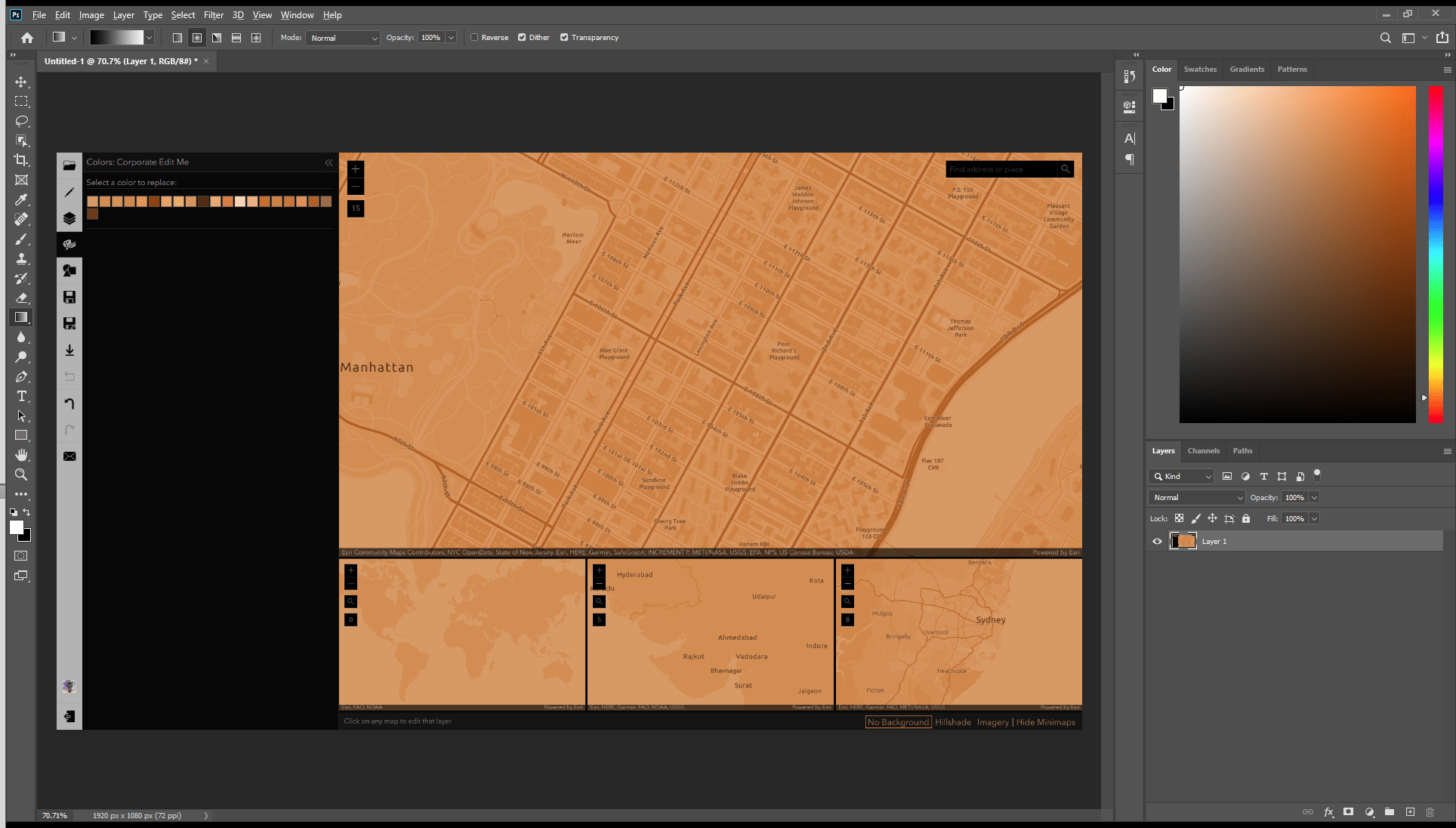
That’s a pretty cool map, already! Reminds me of the George Washington style. But for a khaki appearance I’ll have to play with the hue and the saturation.
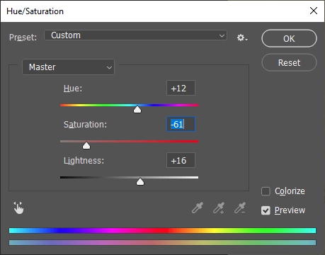
Now my screenshot map, desaturated and hue-shifted a bit, is getting pretty close to where I want it.

It’s looking a bit dull, though. So I’ll bump up the contrast.
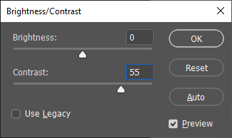
That’s better. And, again, I’m working with a net because I’m just fiddling with image adjustments to a screenshot in Photoshop.
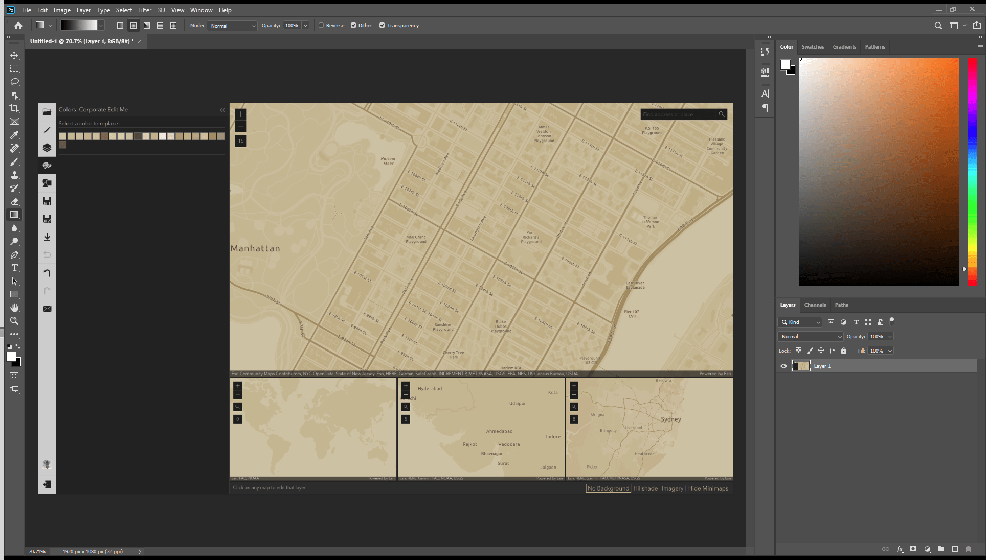
Ok, now is when things get REAL! With the eyedropper tool in Photoshop, I can grab the hex color value…
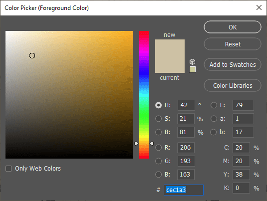
…and paste it into the corresponding color chip in the actual Vector Tile Style Editor.
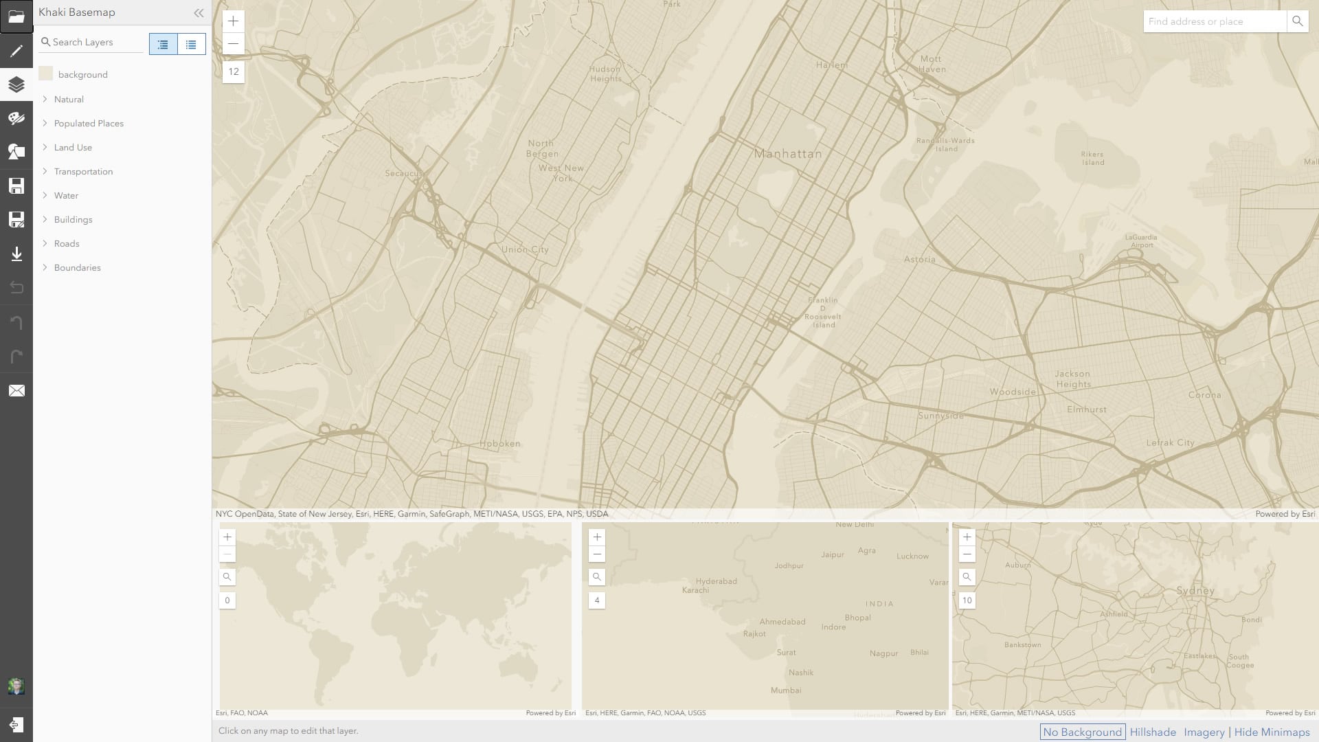
I just work my way through the colors, sampling them in the adjusted Photoshop image, and pasting the adjusted values into the actual colors in the editor. The whole process takes about 10 minutes or so, depending on how much fun you are having with sliding colors around, and you have a new vector basemap with a tonally balanced, but new, color palette. Here’s my Khaki map (which you can find here, and use/edit with abandon), after I fine-tuned some colors and tweaked some line widths and fonts and stuff a bit more in the editor. All told, about 15 minutes of work (if you can call it work).
Lovely! You get to retain the benefit of all the efforts taken to maintain tonal clarity and differentiation of map content, but you can quickly explore variations of the palette to find something you like. Then it’s some copy-pasting into the real deal.
Give it a shot! John

Article Discussion: