2019 was a great year for ArcGIS Living Atlas of the World. As we watch the ball drop and ring in a new year, let’s pop some Champagne as we toast some federal agencies who have contributed useful layers, maps, and other resources to ArcGIS Living Atlas this year.
Centers for Disease Control and Prevention (CDC)
New to ArcGIS Living Atlas this year were four feature layers containing data from CDC’s 500 Cities Project. This rich dataset provides model-based tract-level estimates for the top 500 U.S. cities for 27 measures of chronic disease related to unhealthy behaviors, health outcomes, and use of prevention services. Some example fields are dental visits, pap tests, colorectal cancer screening, and obesity prevalence, just to name a few! If you do any GIS work that involves health data, you have access to this treasure trove of attributes, straight from the authoritative source.

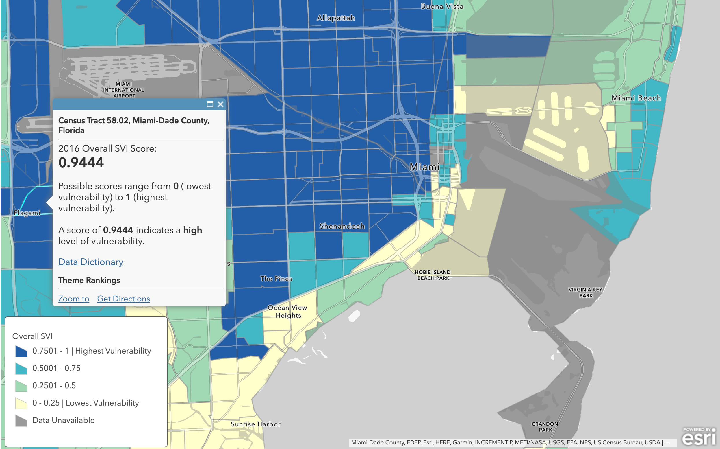
Also check out CDC’s Social Vulnerability Index layers, a Living Atlas favorite of many who work in the areas of emergency response. These layers’ pop-ups do a great job providing context for interpretation, as well as a link to more documentation for those interested.
National Center for Education Statistics (NCES)
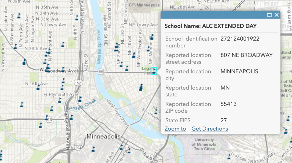
Have you ever wanted to add the locations of schools to your map? Or wanted to see where the school district boundaries lie with your area of interest? With this year’s new map image layer contributions from NCES, these questions can be answered quickly and easily with the official national source. With multiple school years available, you can choose the most appropriate vintage for your needs.

The layers’ authors at NCES ensured that these layers had beautiful field aliases, which makes the layer more usable by external GIS analysts who want to incorporate school location data into their work.
National Cancer Institute (NCI)
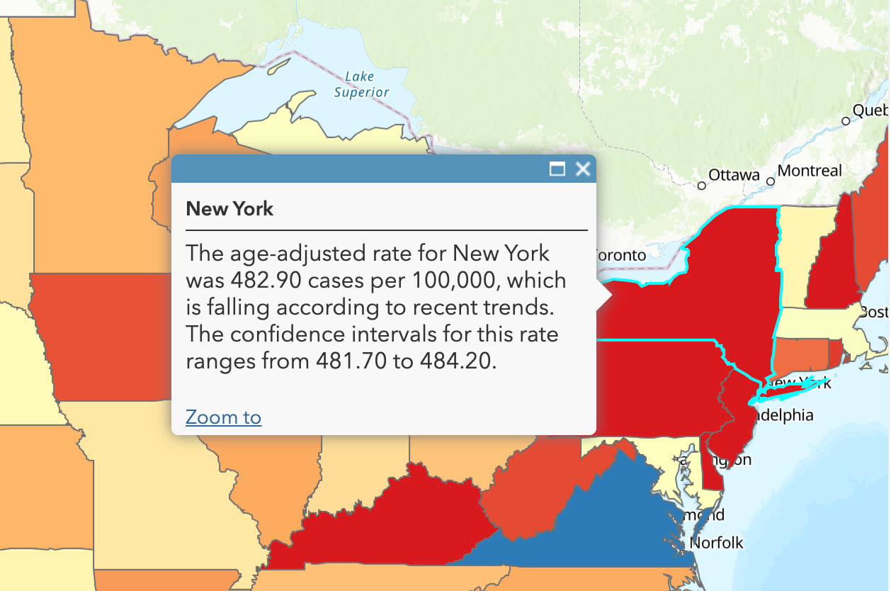
Our newest federal contributor is the National Cancer Institute. NCI nominated a feature layer of state-level age-adjusted cancer incidence rates across five years – 144 attribute fields straight from National Cancer Institute for your data analysis needs. Because these rates are age-adjusted, you can compare rates across geographies with the age structure being held constant. For example, compare rates in Utah (the state with the youngest population) to rates in Maine (the state with the oldest population), and know that the differences you’re seeing aren’t simply because people in Maine are older. With this layer, you can find cancer rates and trends for your state, and even for specific populations such as females under age 50, or males over age 65.
National Oceanic and Atmospheric Agency (NOAA)
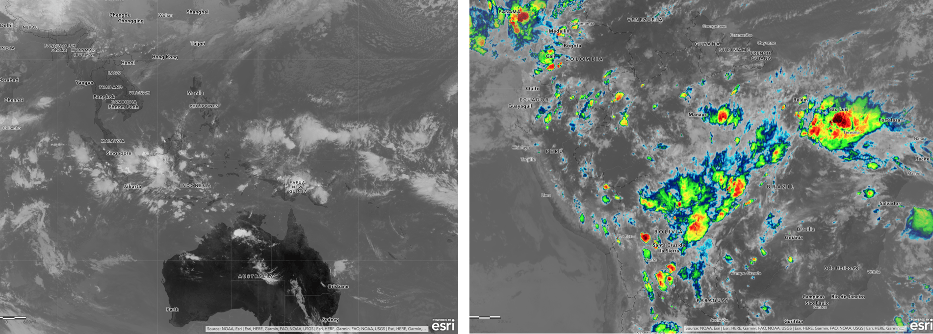
Protecting lives and property is NOAA’s mission, and their environmental satellites are our first line of defense from many natural disasters. NOAA contributed two new layers – NOAA Infrared Satellite Imagery and Colorized Infrared Satellite Imagery – that update in near real-time and provide nearly global coverage of satellite cloud imagery every 10 minutes! With these layers, you’ll always have the latest imagery data straight from NOAA’s satellites in your maps.
U.S. Forest Service (USFS)
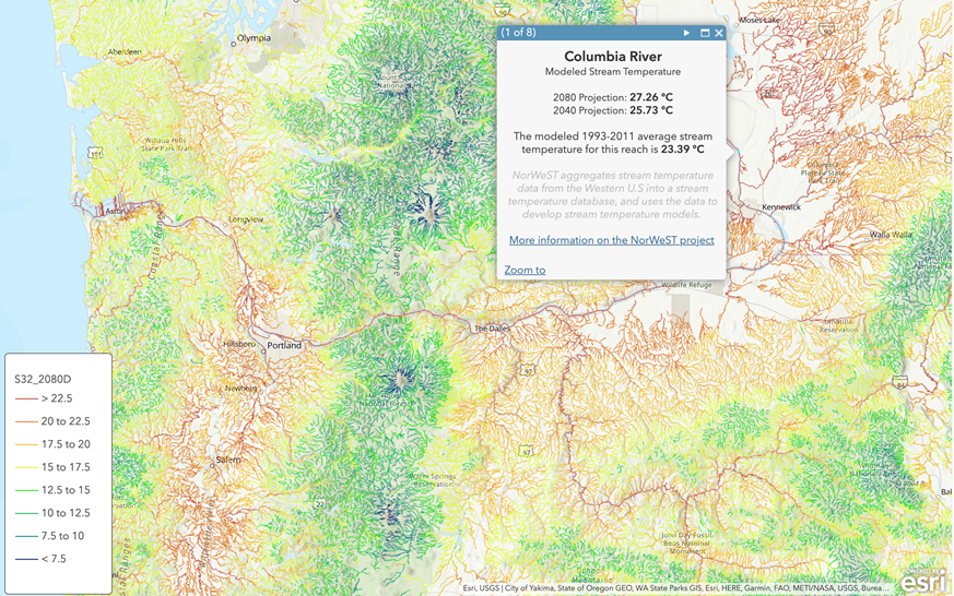
We often hear of the warming of global air and temperatures, but have you heard much about rivers and streams? It turns out that global climate change can be measured right in your back yard. The USFS contributed a series of layers describing how river and stream temperatures are predicted to change over the next several decades in the Northwest U.S. Some of our most important commercial and recreation fisheries spend some part of their lives in these streams, so the impacts could be significant. You have access to this important data to incorporate into your work simply by connecting to ArcGIS Living Atlas.
Thank You!
We thank all contributors to ArcGIS Living Atlas in 2019, especially our federal agency contributors! Thanks for sharing these resources with the community of GIS analysts worldwide. Like all layers and maps in ArcGIS Living Atlas, these contributions have been brought to life by their creators, in their symbology, field aliases, pop-ups, and other characteristics. Can’t wait to see what 2020 will bring!
Now everyone can access each other’s geographic information as URLs on the web. Their results are being shared using maps and apps on the web and smartphones. The ArcGIS Living Atlas of the World reflects these data-sharing trends, enabling users to build on each other’s good work and to share their most creative ideas with others.
I’m interested in contributing to ArcGIS Living Atlas in 2020. Where do I start?

This StoryMap walks through the three steps to contributing: 1) prepare your top-tier content, 2) nominate, 3) finalize & maintain. We have tools that we are happy to share with you such as a bulk alias updater to help you put aliases on your attribute fields, and feed routines to help you update real-time data. This blog post discusses some organizational branding considerations for your thumbnails. Many organizations like to have a dedicated publishing account for their items that are shared publicly. Others have their organization verified by Esri so that items shared publicly display as authored by the organization rather than a named user. For more tips, see our official help doc on Best Practices for Sharing ArcGIS Online Content. Above all, make your hard work easy to find, understand, and use by others.
ArcGIS Living Atlas of the World is the foremost collection of geographic information from around the globe. It includes maps, apps, and data layers to support your GIS work. Connect with fellow GIS analysts on the ArcGIS Living Atlas GeoNet site.
Commenting is not enabled for this article.