The Federal Communications Commission (FCC) is currently in the process of updating its broadband maps with more detailed and precise information on the availability of fixed and mobile broadband services, and expected to be released late this year. Called the Broadband Data Collection (BDC) program, these maps will ultimately determine the amount of money each state gets through federal broadband grant programs, like the $42.5 billion Broadband Equity, Access and Deployment (BEAD) program, which is a part of the Infrastructure Investment and Jobs Act (IIJA) passed into law in the fall of 2021. Although every state is guaranteed to receive $100 million, the remaining $35+ billion will be allocated based on the unserved population in each.
While the BDC aims to give the FCC, industry, state, local and Tribal government entities, and consumers, the tools they need to improve the accuracy of existing maps, it is imperative that each state and locality be prepared to contest the maps where they overstate broadband availability and/or understate the population in the unserved areas. ArcGIS Living Atlas of the World can help communities assess broadband availability, identify locations limited by transmission technology, calculate the total number of unserved households, and ultimately address digital inequalities. To be certain, Living Atlas can help communities get prepared for the upcoming BDC challenge process and ensure they receive their fair share of BEAD grant funding.
This blog will showcase how communities can leverage existing FCC broadband availability data to map their unserved areas and populations. Internet service providers (ISP) are required to file data with the FCC twice a year (Form 477) on where they offer Internet service at speeds exceeding 0.2 megabits per second (Mbps) in at least one direction. Providers of fixed broadband internet file lists of census blocks in which they can or do offer service to at least one location, with additional information about the transmission technology used and the speeds available.
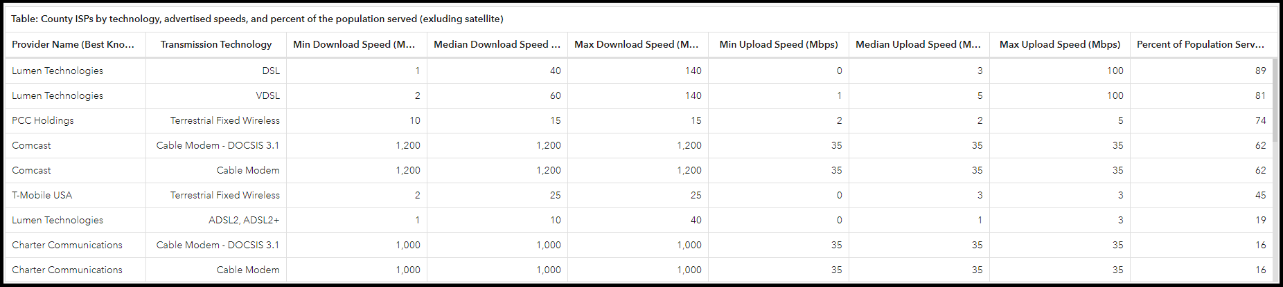
ArcGIS Living Atlas now has the latest June 2021 release updated in the layer FCC Form 477 Fixed Broadband Deployment Summary by Census Block with Provider Data. This hosted layer contains the summarized Block level data, as well as four additional geographies from Block Groups to States. Each level of geography has a related table with provider information showing the percent of population served and at what speeds, for a unique combination of service provider and transmission technology. The image below shows the Form477CountyProviders related table filtered for Doña Ana County, New Mexico.
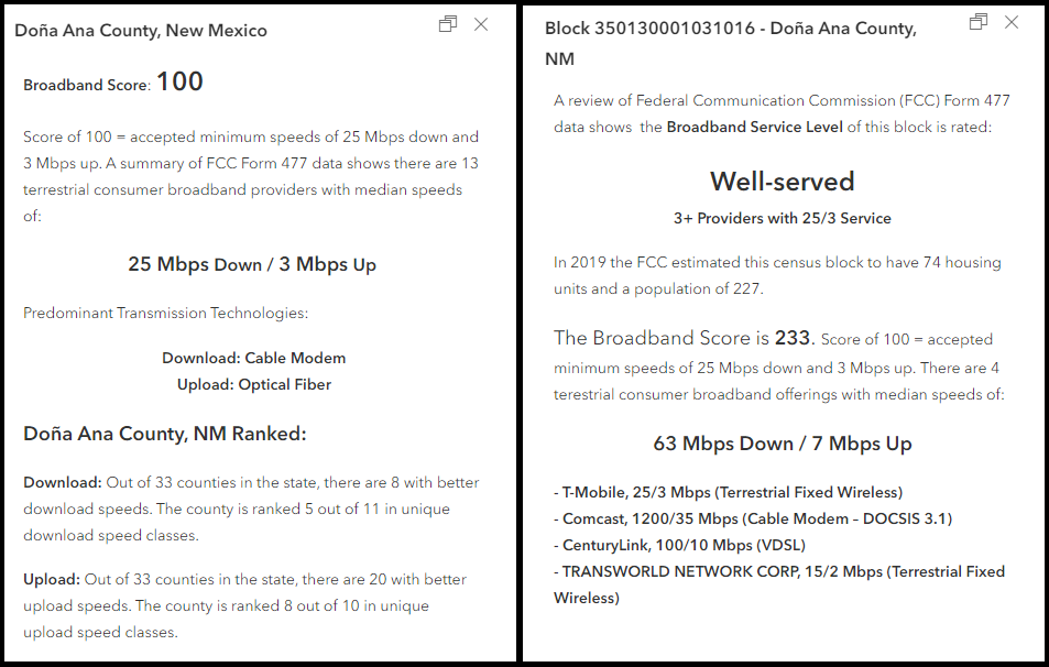
By default, the layer leverages Arcade to calculate the ‘Broadband Score’, a bivariate index that mirrors the current FCC standard of 25 Mbps download and 3 Mbps upload (25/3 Mbps). The Broadband Score awards an area a score of 100 if median download and upload speeds for that geography equal 25/3 Mbps.
The pop-up is pre-configured to provide immediately useful information such as how the score ranks compared to its peers, the predominant transmission technologies, and at the Census Block, all of the providers who report service in that area are listed by speed and transmission technology.
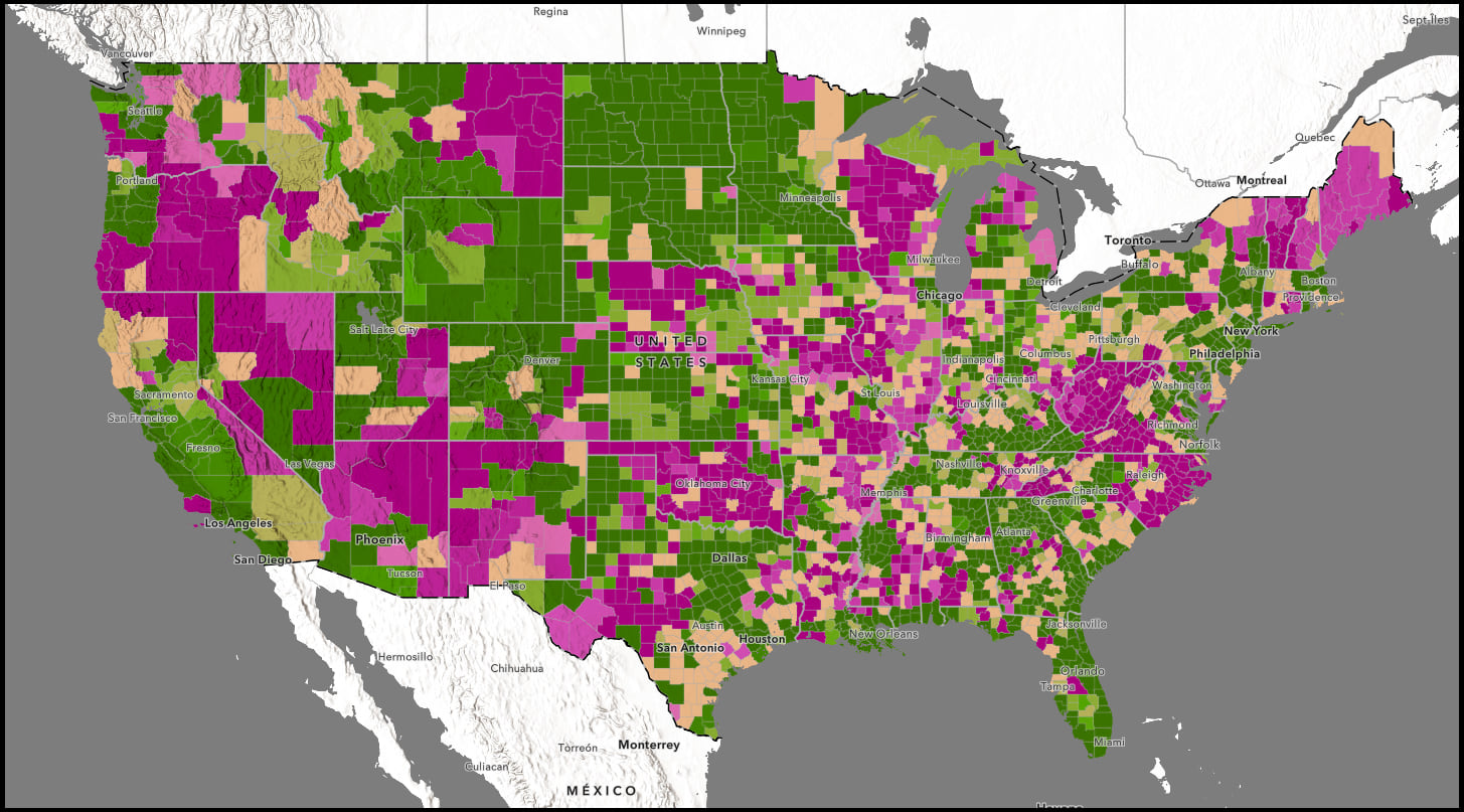
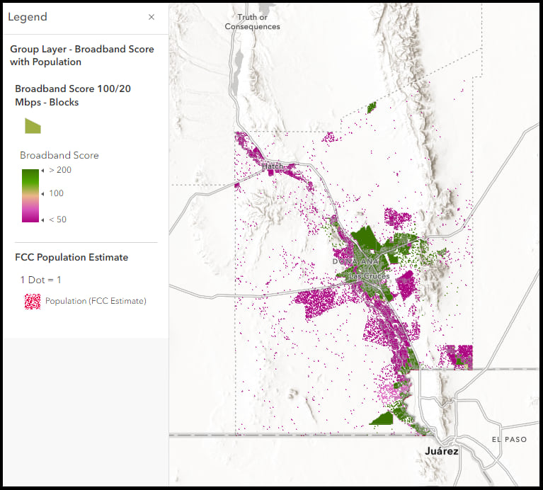
The broadband score can easily be adapted to look at maximum advertised speeds rather than median, and reference any definition of broadband, like 100/20 Mbps. Leveraging the Census Block layer we can apply a filter to an area of interest, a county, for example, and change the visible range to view the data at a smaller scale. In the map below, we have filtered the data by County Geographic Identifier (35013) and changed our visualization to look at maximum advertised speeds with the Broadband Score set to reflect a standard of 100/20 Mbps. The map shows those areas of Doña Ana County, New Mexico that have maximum advertised speeds greater than 100/20 Mbps in green, and those less than in fuchsia.
But the map can be a little misleading, as it paints all areas equally with color, when not all of those areas are equally populated. In addition to summarizing the broadband availability data, the layer also includes other important information, like is it an American Indian/Alaska Native/Native Hawaiian area, the name of the AIANNH if it is, the name and GEOID for all of the parent geographies, Urban/Rural and Water Only designations, and the 2020 FCC Estimate for Households, Housing Units, and Population. Leveraging Blend Modes in Map Viewer, we can duplicate the block layer, visualize it by population with a Dot Density Smart Mapping style, group the broadband availability data over the population data and apply the Source Atop blending.
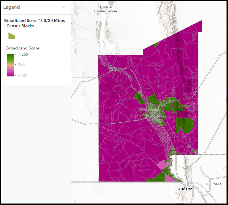
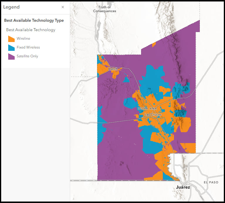
While download and upload speeds are the most commonly used standards to measure broadband, transmission technology is another useful metric. The layer contains summary statistics of the number of broadband offerings by transmission technology for each geography. In the visualization below, a predominance map is used to showcase the best available transmission technology. It highlights the fact that many parts of the county do not have access to a terrestrial service option, they are limited to satellite internet only.
This blog highlighted just a few examples of how this layer can be utilized, there are undoubtedly many more. We look forward to seeing how you leverage the data in your work. A web map with the above visualizations can be found here. A subsequent blog will highlight how additional data sources, including crowdsourced speed test data, can be leveraged to validate what the ISP reported data shows.
What does this update mean for your maps?
Any existing maps or applications that are using the most up to date layer, previously the December 2020 vintage, will automatically see the June 2021 data update reflected in their content. We encourage you to revisit your maps to see if there are new patterns in the data or if symbology and pop-ups need updating due to change in values.
I see two layers when I search in Living Atlas. What is the difference?
There is a second FCC Form 477 layer containing the June 2020 vintage. This layer is being retired so it is encouraged to switch any existing maps, apps, or other projects to the updated version. The most current version will be updated going forward.
Check out these resources for more FCC Form 477 Broadband content:
- Broadband Access within your Community – A Geographic Approach
- Broadband Availability and Adoption
- Leveraging Living Atlas to help bridge the Digital Divide
- Broadband Access in your City


Article Discussion: