Broadband access has become increasingly important as more of our everyday activities move online, especially within the last several years. Schools, health care systems, businesses, government services, first responders, and more all rely on high-speed internet access to communicate and operate effectively. Imagine shifting to remote work or home school without fast enough internet to load or download the necessary tools and resources needed to be successful. That may be hard to imagine as going online is part of 85% of American’s daily activities according to Pew Research.
There are areas that still do not meet the FCC minimum standard for broadband access – i.e., 25 megabits per second download speed and 3 megabits per second upload speed, or 25/3 Mbps for short. While there have been significant improvements to broadband access, decreasing the digital divide in our communities, there is still work to be done. How can communities leverage GIS to identify the areas in the most need? Using FCC Form 477 broadband availability and provider data from ArcGIS Living Atlas, we can visualize where communities are unserved or underserved to better understand how impactful improvements can be made.
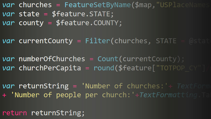
Use Arcade for lightweight spatial analysis
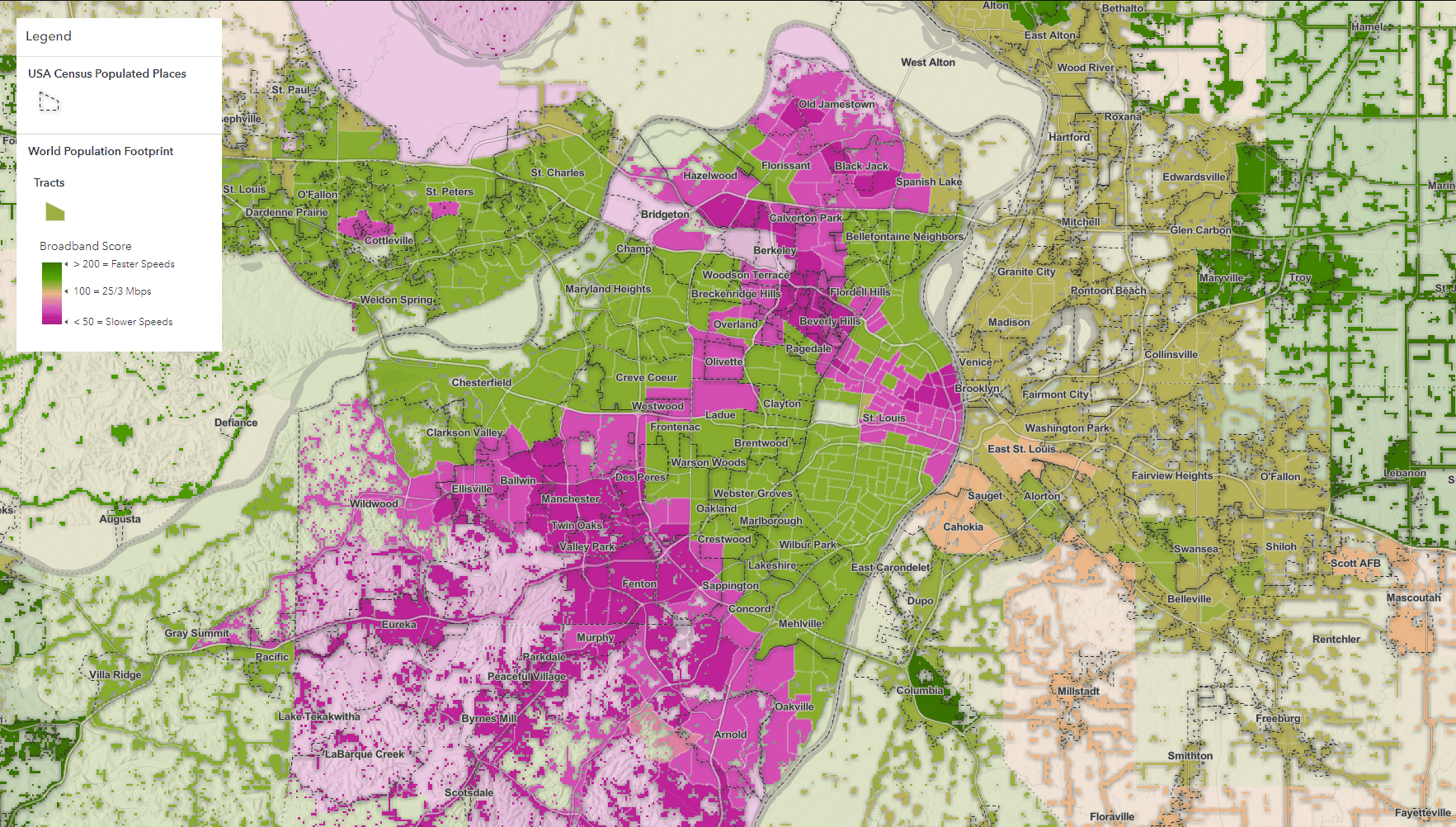
This app uses the December 2020 FCC layer, symbolized by the ‘broadband score’. The broadband score is higher for areas with faster speeds and lower for slower speeds. A score of 100 represents the standard of 25/3 Mbps, shown in beige. Areas with faster speeds are colored green while areas with slower speeds are shown in magenta. The world population footprint is overlayed using blending to highlight where people live.
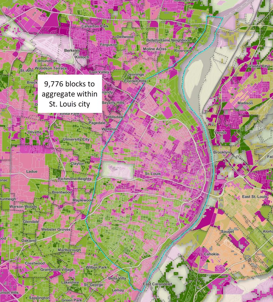
While this rich data is available for the entire U.S. down to the Census block level, how can this be translated into a geographic area that more accurately reflects our communities? Most people don’t think of what Census block or tract they live in, but what city, village, or town they are a part of.
We need a way to summarize the blocks within a given city, village, or town that accurately accounts for the broadband speeds experienced by people in the larger geographies. With this geographic approach in mind, the pop-up for this map takes the analysis a few steps further. Start with exploring St. Louis, Missouri. In order to understand broadband access for St. Louis, we need to summarize the intersecting blocks within the city boundary.
This can be accomplished in Arcade with some minor adjustments to the existing broadband score calculation (explore the expressions in the map within the pop-up configuration for the population places layer). The result is a useful broadband score based on the aggregation of average speeds of all blocks within St. Louis, giving an estimated picture of how good or bad broadband access is. It is tempting to take a straight average of all the blocks within a given city boundary, but how does this accurately reflect our cities, villages, or towns when the population is not considered in the analysis?
Weight using Population
Instead, we can make an even more useful and powerful pop-up by weighting the broadband score by the population. With a couple of minor tweaks to the expression, the aggregated block population sum is used in conjunction with the download and upload speeds to calculate the score. The result is a more accurate broadband score, shifting the focus to areas with more people who need broadband instead of blocks with low to no population, highlighting where the most impact can be made. The expression is fast and does the analysis on-the-fly for nearly ten thousand blocks within a matter of seconds.
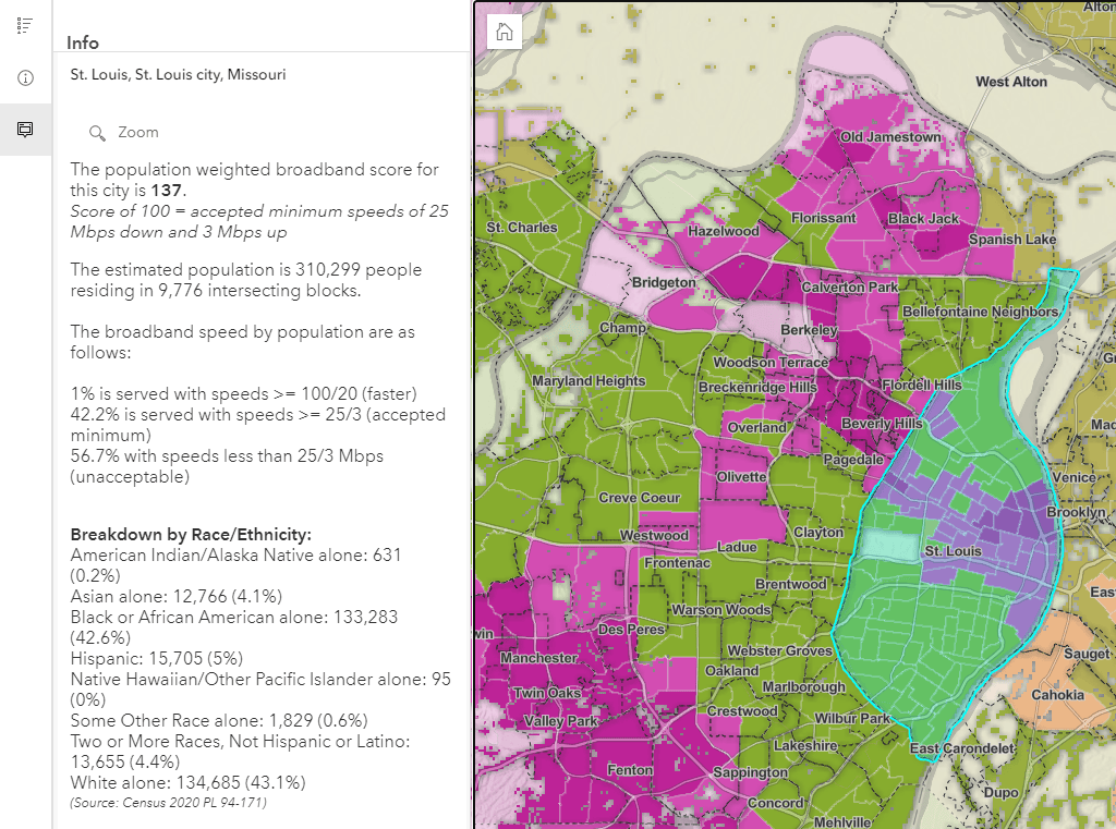
For additional community context, demographics are included in the pop-up using the same method from Census 2020 Block layer in Living Atlas.
The most powerful aspect of this workflow is the versatility of Arcade and web GIS. Want to include income information? No problem. Simply duplicate the expression and swap in an income layer. Would you prefer congressional districts over city boundaries? Simply add a new boundary layer to the map and copy the Arcade expression over. Arcade’s lightweight, quick analysis is possible with any combination of layers and areas of interest. This repeatable approach turns a map of data into a policy-driven product with a community perspective.
Try it out in your pop-ups
Dive into the expressions used in this example in the City Broadband Access in the US map. Think about your city, town, or community. What questions can a powerful analysis-driven pop-up answer for you? Explore the multitude of available data in ArcGIS Living Atlas. Once your map is completed, share with one of the many Instant Apps such as Sidebar to streamline the pop-up experience for your viewers.
Check out the below resources to learn more.
- Blog: Enhance your pop-ups using Arcade + Living Atlas
- Blog: Pump up your pop-ups with Arcade + Living Atlas
- Blog: Pump up Your Pop-ups With Arcade FeatureSets and Living Atlas (Part 2)
- Documentation: Getting Started with Arcade
- City Broadband Access in the US Sidebar App


Article Discussion: