This blog shows how to utilize Charts in Map Viewer to perform exploratory data analysis to help you find patterns in your data.
We have a dataset from the United States Department of Education showcasing return of investment at Colleges/Universities. On this map, each point represents one College or University.
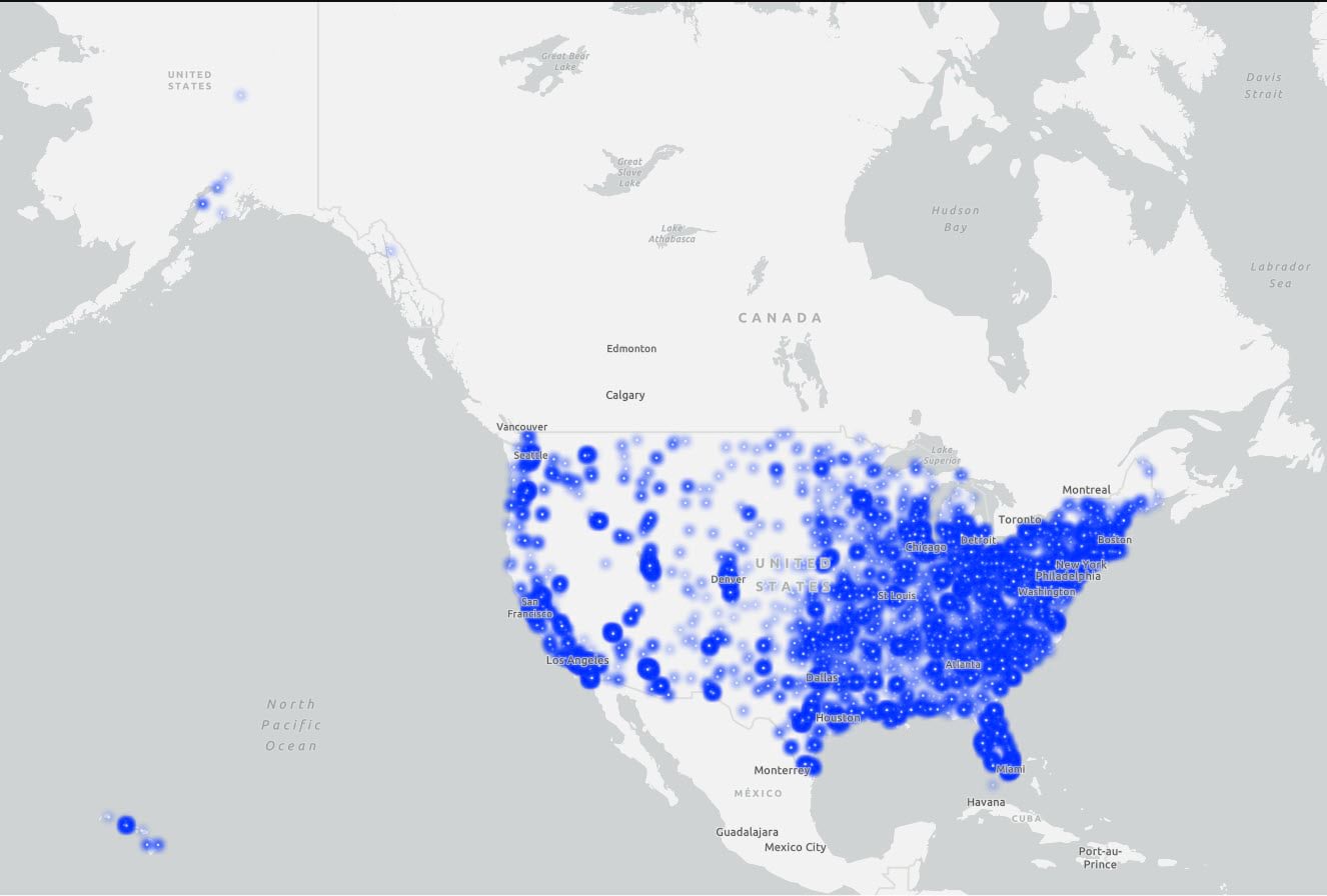
By looking at the points on the map, we can understand the placement of colleges across the country but as such, it is difficult to see any immediate patterns. So, let’s explore this further by utilizing Charts.
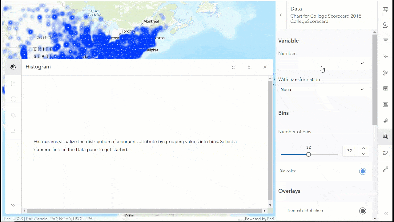
The first thing we will do is create a histogram and see how the SAT score average is distributed (SAT_AVG). We will scroll down to see the statistics table, where we can see the mean, median, maximum, minimum, null value etc., for this variable.
Let us select the bin for the lowest SAT score average and we can see corresponding points are highlighted on the map.
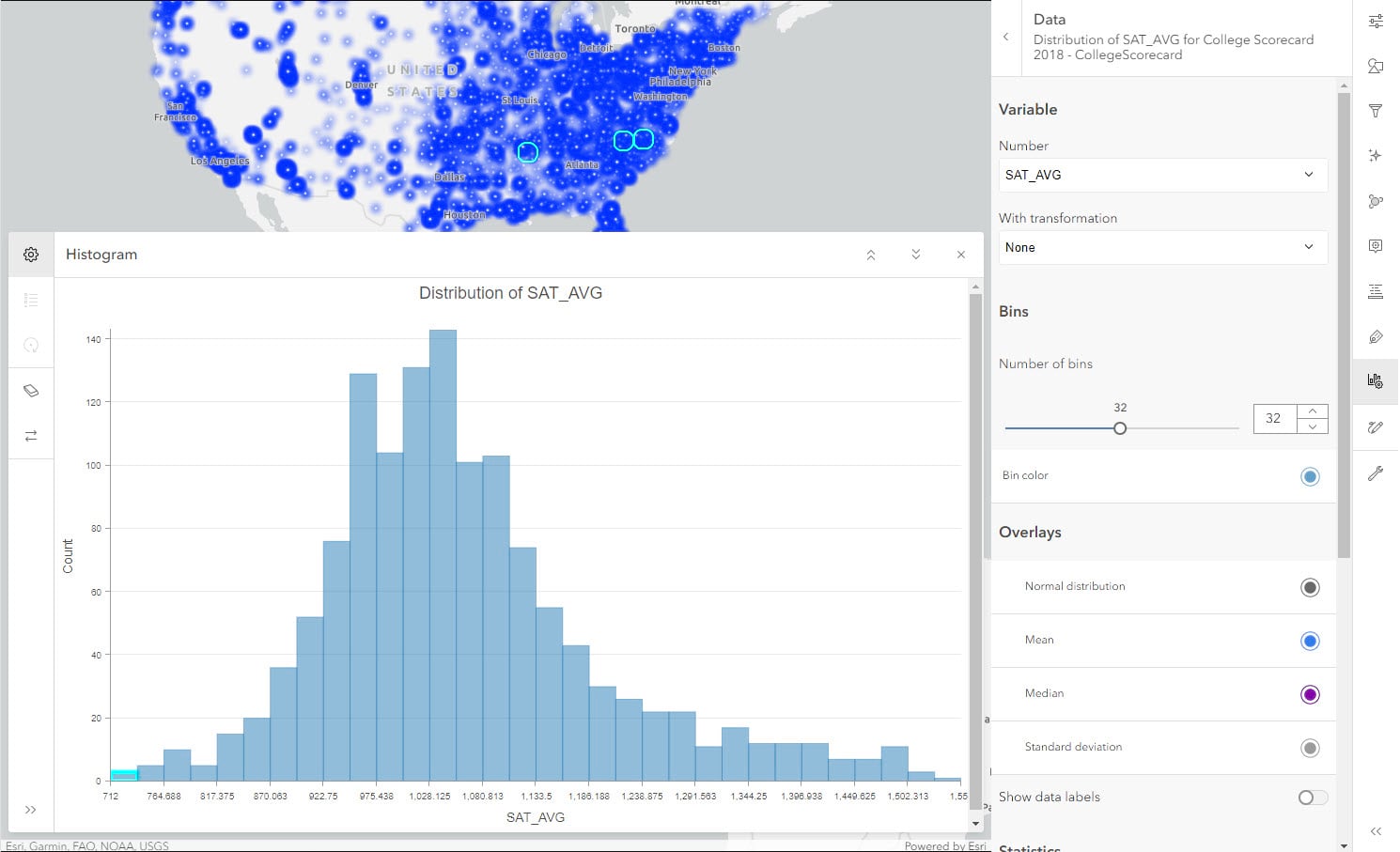
Let’s say we are interested in knowing if lower SAT scores have any influence on the cost of education (COST). We will change the number field from SAT score average to cost of education while keeping the selection.
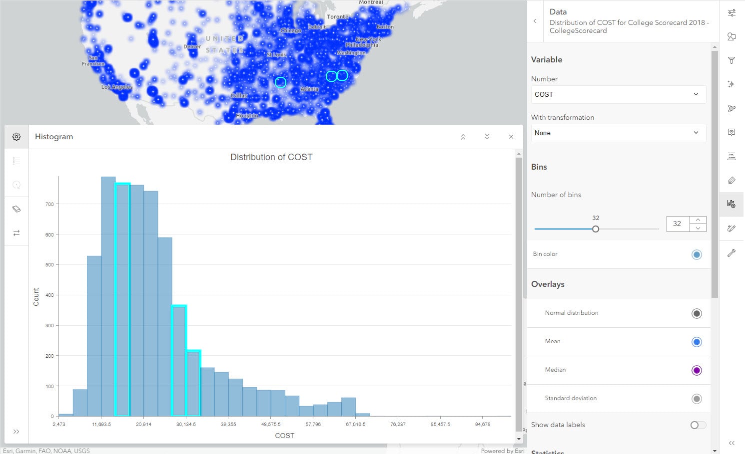
Interestingly, the associated cost of the lowest SAT score average schools doesn’t fall on the lower end of the spectrum. To explore this relationship further, let’s use a scatter plot.
We will create a scatter plot between SAT average score (SAT_AVG) and cost of education (COST) and turn on the toggle for Show linear trend.
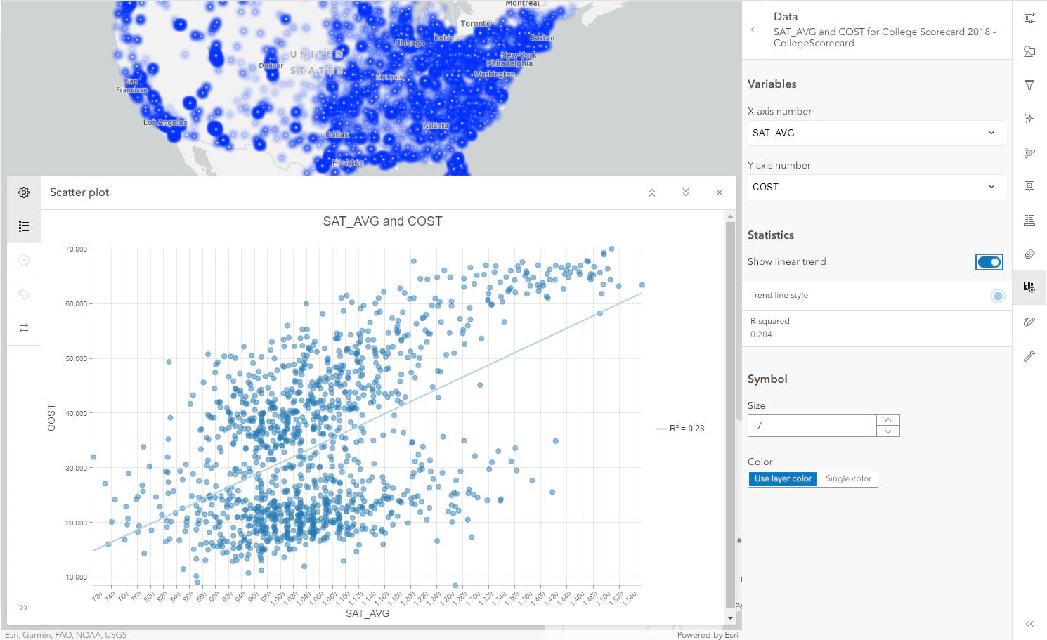
We see that the correlation coefficient (R-squared) value is low and there is a slight positive relationship but it’s not strong; however, it does look like there are two clusters in this plot. We have a variable named TYPE in our dataset, which has information about the type of college: Private For-Profit, Public and Private Nonprofit . Let us see if applying symbology will help us understand these clusters better.
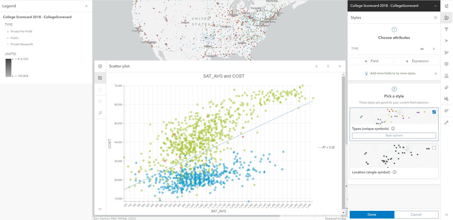
By quickly clicking on Legend in dark pane, we can understand which color stands for which category (Red is for private for profit, Blue is for public and Green is for Private non-profit). In the scatter plot, we can clearly see two distinct groups. The correlation coefficient value of the combined groups is 0.28. Let’s see how it changes when we isolate one cluster. We will use Filters from light pane to show data by Private non-profit.
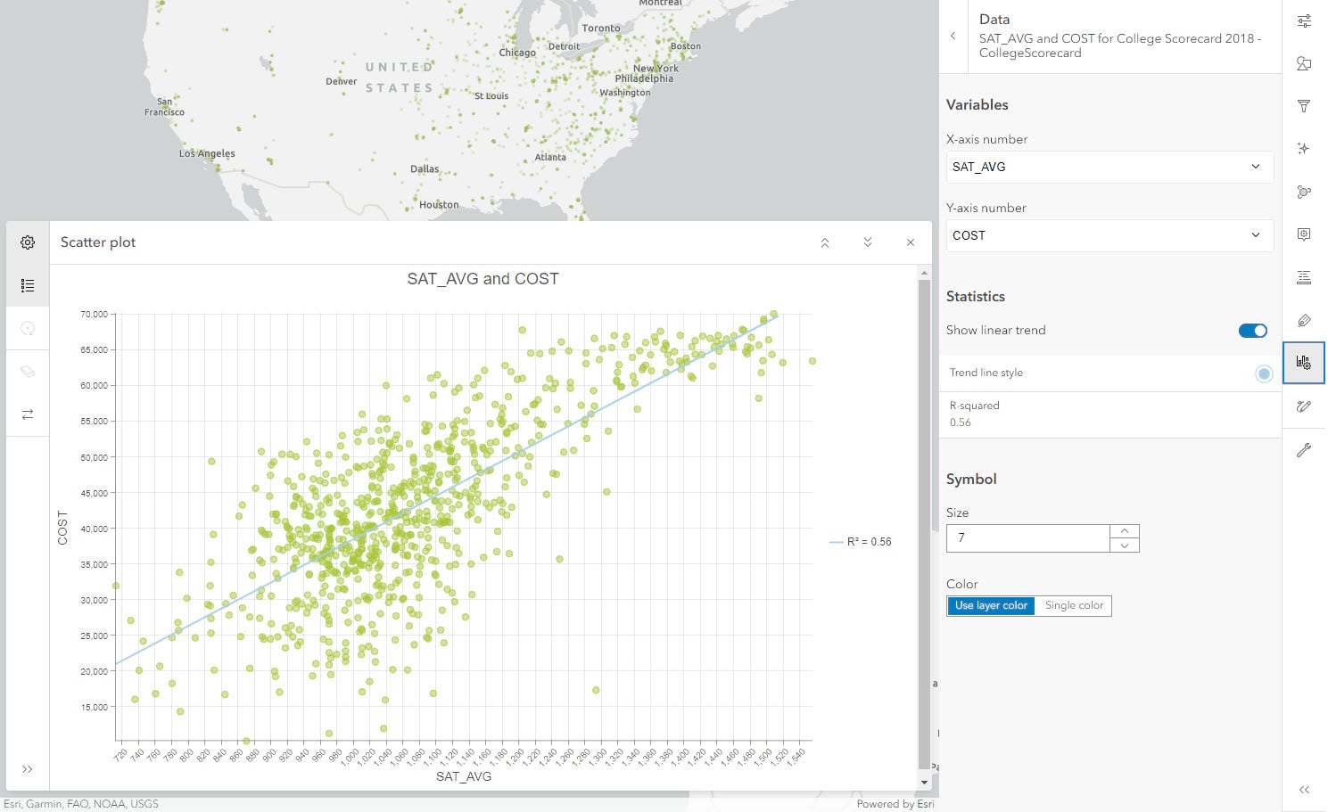
The new R-squared value is twice the amount i.e. 0.56. This shows how subgroups within a category can impact our analysis when they are plotted and grouped together. This effect is known as Simpson’s paradox.
By utilizing scatter plots, we can also look at the relationship between cost of education (COST) and earnings after graduation (EARNINGS). Remove the Filter before creating this new chart.
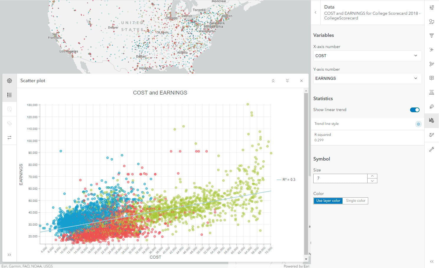
If we look at all the points in the right half of the plot, we can see that the high cost of education has a wide range of earnings. The R-squared value is also low. Thus, indicating that cost does not have a strong effect on earnings after graduation as per this dataset.
Exploring further, we can see whether across different regions of the country, the cost of education varies significantly or not. For a problem like this where we want to compare an amount across categories, we can utilize a bar chart. Let us create a bar chart with following configurations – Category: REGION, Aggregation: Median, Numeric field: COST. Let us sort the order by Y-axis descending to increase the effectiveness of this chart.
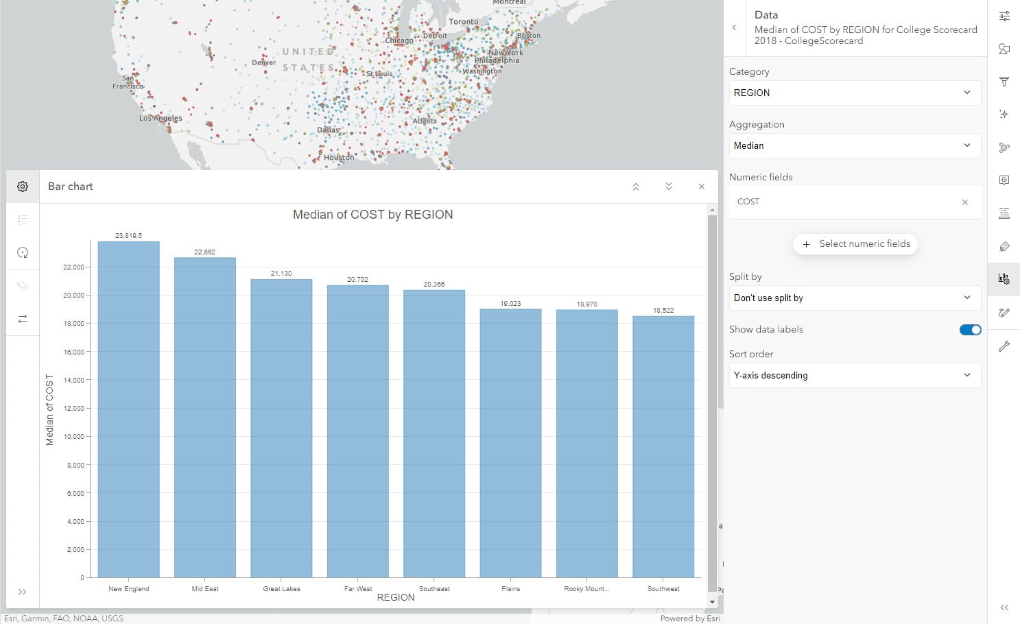
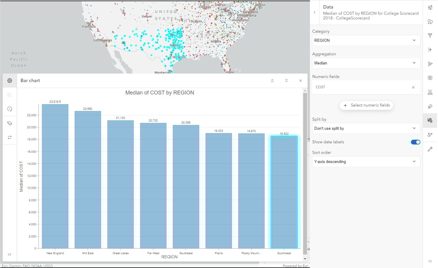
Looking at the median of cost by region, we see that the chart doesn’t show significant variation and expected cost of education in different regions of the county are comparable. We can select the Southwest region to see the lowest median cost region. This selection will highlight those institutions on the map.
At this point, we have a good amount of insight from our data. Let’s save this web map using Save and Open control in the dark pane. To conclude, through this short blog we were able to identify the best suited chart for various scenarios and create them using Map Viewer.
To learn about utilizing charts to create a template using instant apps, check out this blog.


Article Discussion: