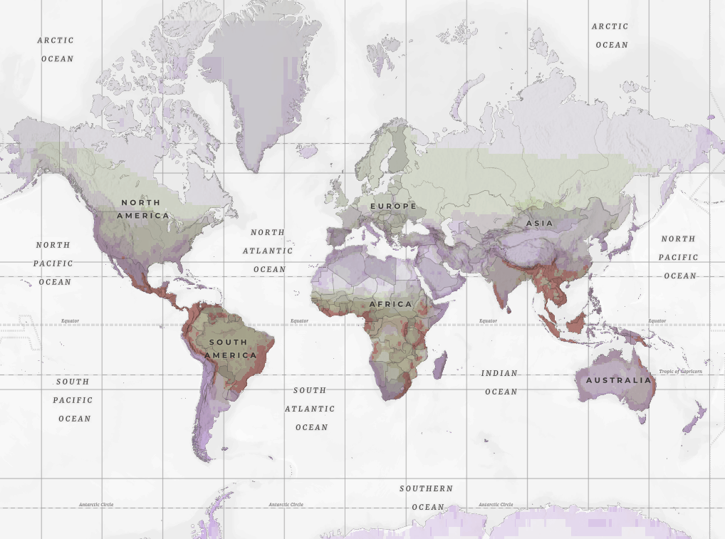
Recently the Half-Earth Project contributed a new layer to ArcGIS Living Atlas that maps both the richness and rarity of six groups of animals and plants across the globe. While I’ve always been interested in biogeography, I really like how this layer uses the rich set of attributes to squeeze as much as possible into the map without overloading it.
This well-designed layer can be used as-is to explore the distribution of biodiversity or quickly reconfigured to expose a different view of the information. This combination of ready-to-use but still freely available to modify and create derived products with is a key part of the new pattern of web GIS.
Here is a basic view of the layer using relationship symbology, a pop-up that uses HTML tags to create a simple table, and the Human Geography basemap with the World Hillshade layer added.
Click here to open a larger version of the application.
Relationship Symbology
Relationship symbology is a great way to explore two related variables. In this map we have attributes for species richness and species rarity. These two values are both important considerations for things like conservation planning.
In this case we might consider areas with high richness (green areas) or high rarity (purple areas) important for conservation, with areas that are both high in richness and in rarity (red-brown areas) being the most important of all. Using diverging symbology allows us to explore these patterns.
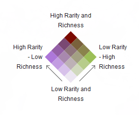
To learn more about how to use relationship symbology see this great blog by Lisa Berry: How to Make a Relationship Map in ArcGIS Online.
Blend Modes and the Beta Map Viewer
As soon as I saw this layer I knew it would be a good candidate to experiment with in the new Map Viewer Beta application in ArcGIS Online. One of the most exciting new features of the beta map viewer are Blend Modes which allow you to combine layers in some really interesting ways.
If you haven’t checked out the new Map Viewer Beta application in ArcGIS Online, I highly recommend it. This Arc News article provides a good introduction to get you started.
There have been a bunch of recent blogs by some serious cartographic superstars detailing Blend Modes so I won’t go into too much detail but have provided links at the end if you want to see some great examples that you can use in your own work.
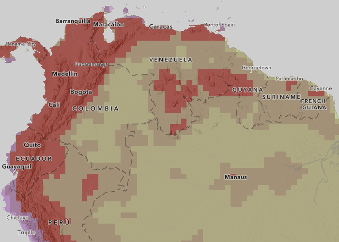
The mountains of the world have a huge influence on patterns of climate and weather which in turn influence patterns of biodiversity so I really wanted to bring out the terrain in the map. Because the richness and rarity layer has global coverage it can be difficult to combine with other layers. In the past we used transparency in situations like this where we want to overlay a polygon layer like this one over a hillshade. This works well enough but reduces saturation and gives the map and washed out look.
To bring out the terrain, I simply opened my map (the one displayed in the application above) in the Map Viewer Beta and applied a Multiply blend to the richness and rarity layer. This combines the biodiversity symbology with the hillshade underneath. You can see from the two screen shots below that while the effect is subtle, the multiply blend mode helps bring out the mountains.
This version of the map has no blending applied and uses transparency to reveal the hillshade underneath:
This version of the map uses a multiply blend to combine the hillshade and the biodiversity layer:
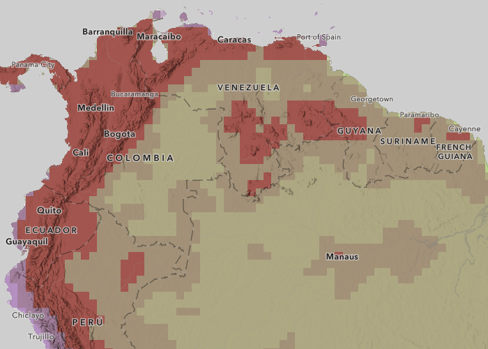
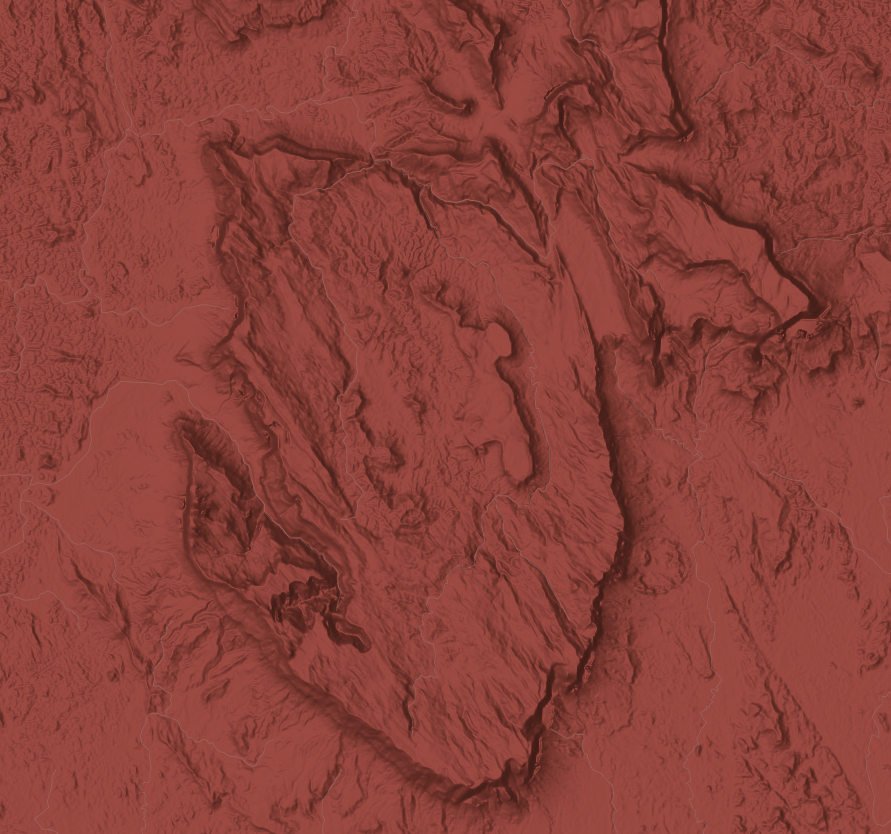
The method does a great job of bringing out other features such as the Tepuis of the Guiana Shield of southern Venzuela and western Guyana where the extreme topography of the landscape supports an amazing diversity of species.
At this point I got distracted by the map and really started exploring. All the serious map people out there understand what happened. Its hard to get work done when you have a really interesting map in front of you and any sensation of time passing disappears as you pan and zoom around the world. But to my defense I did find some really cool stuff. Here is some of what I saw.
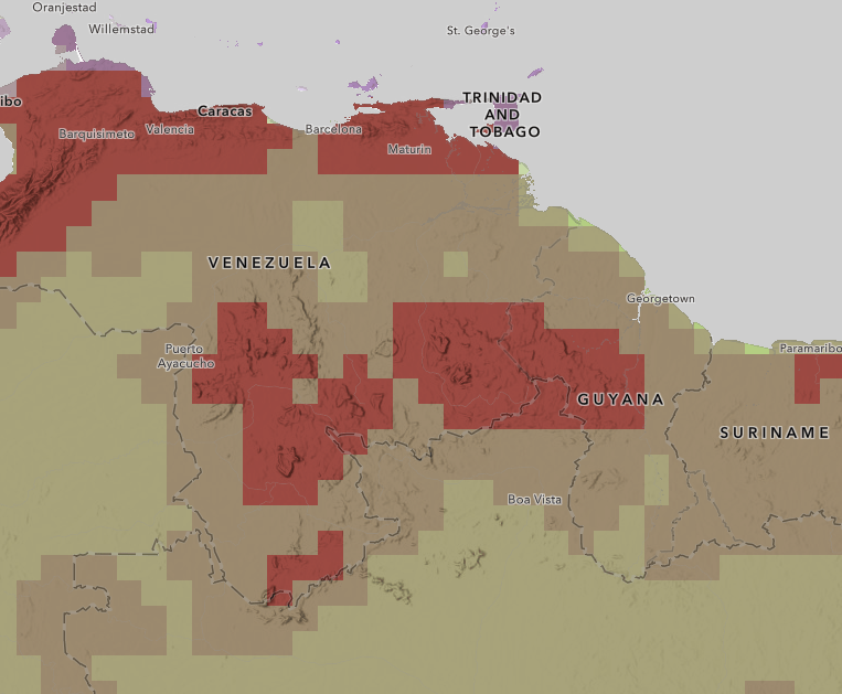
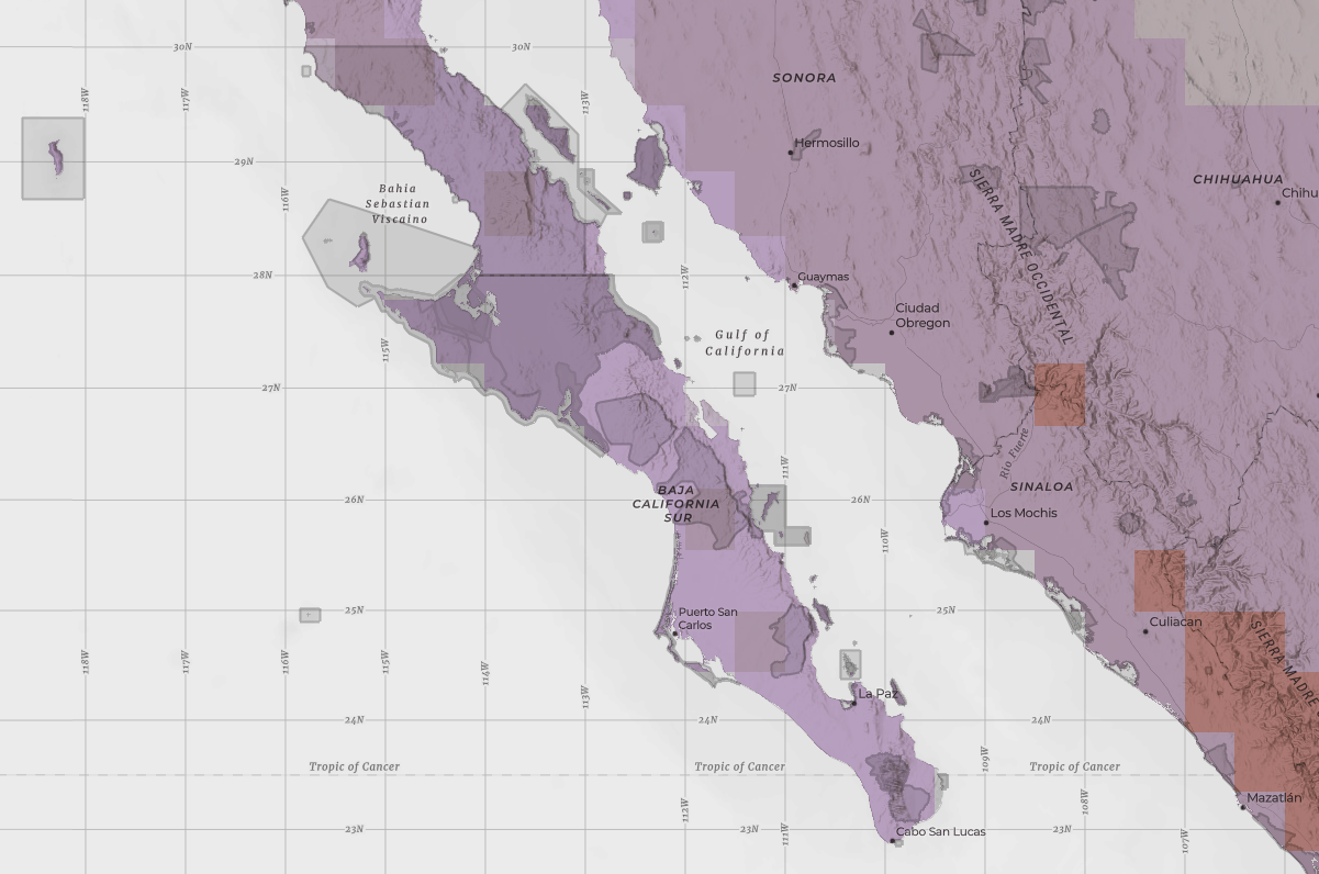
Zooming in to southern Venezuela I found this interesting spot where the blend effect really shows up well:
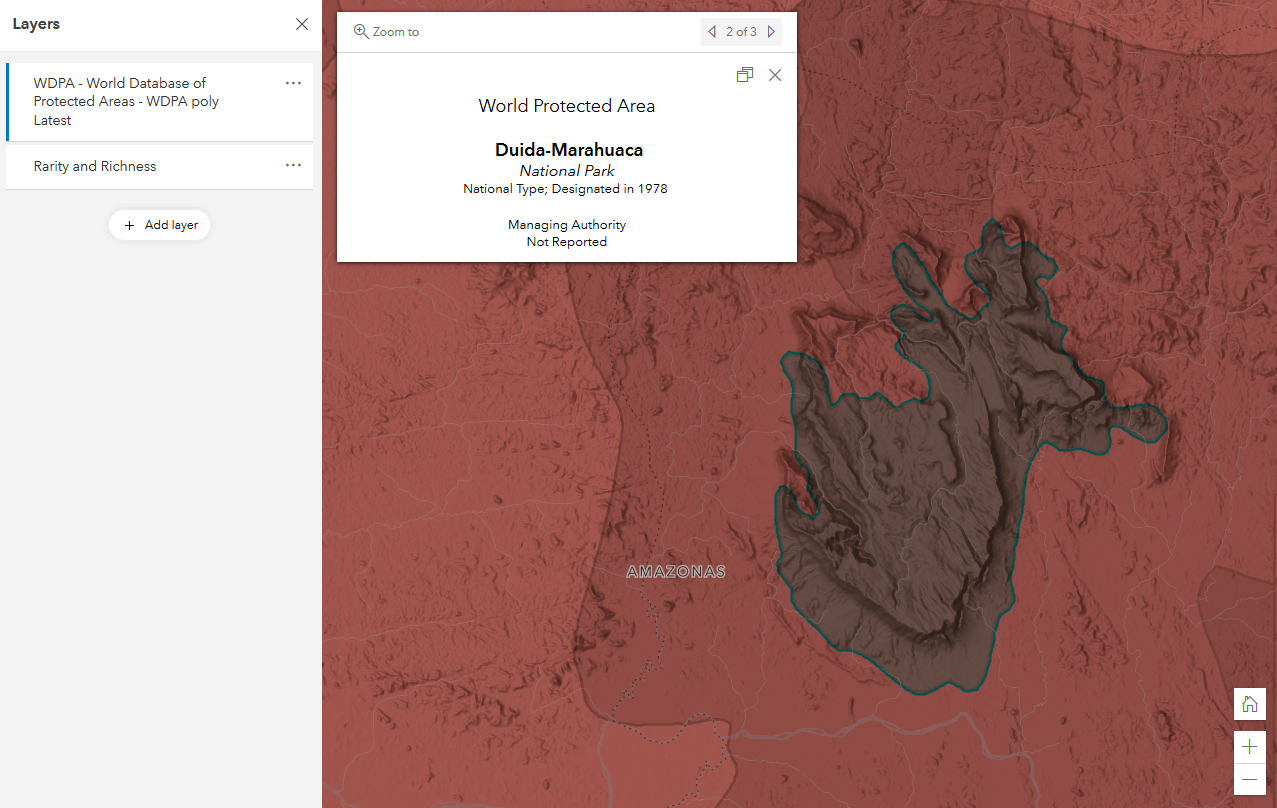
The interesting topography and super high biodiversity made me curious about this place, but the Human Geography basemap doesn’t have many labels in areas without many people. So I added the World Database of Protected Areas layer from Living Atlas, changed the symbology to gray and added a Multiply blend.
With the combined hillshade and protected areas layer I was able to figure out this area is part of Duida–Marahuaca National Park and from there that the feature is Cerro Duida an area known for its biodiversity:
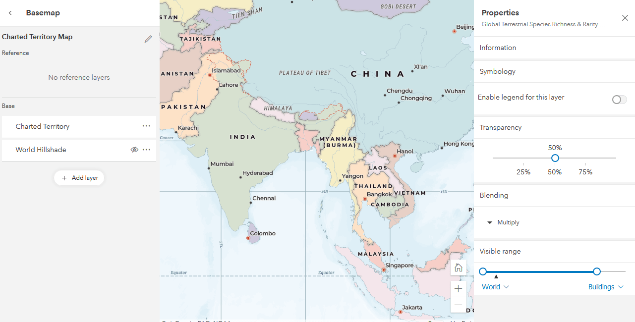
After that digression I got back to the map I was trying to make. I wanted more detail in the reference layer so I switched to the Charted Territory base. The detailed labels of the Charted Territory map looked good with this map but the strong colors didn’t combine well with the layer.
As an experiment I tried combining the Charted Territory base map, the World Hillshade, and the richness and rarity layer using the blend modes. It took a couple of tries but the new pattern of web GIS allowed me to quickly iterate through a bunch of ideas and come up with a great looking map.
Here is how I did it:
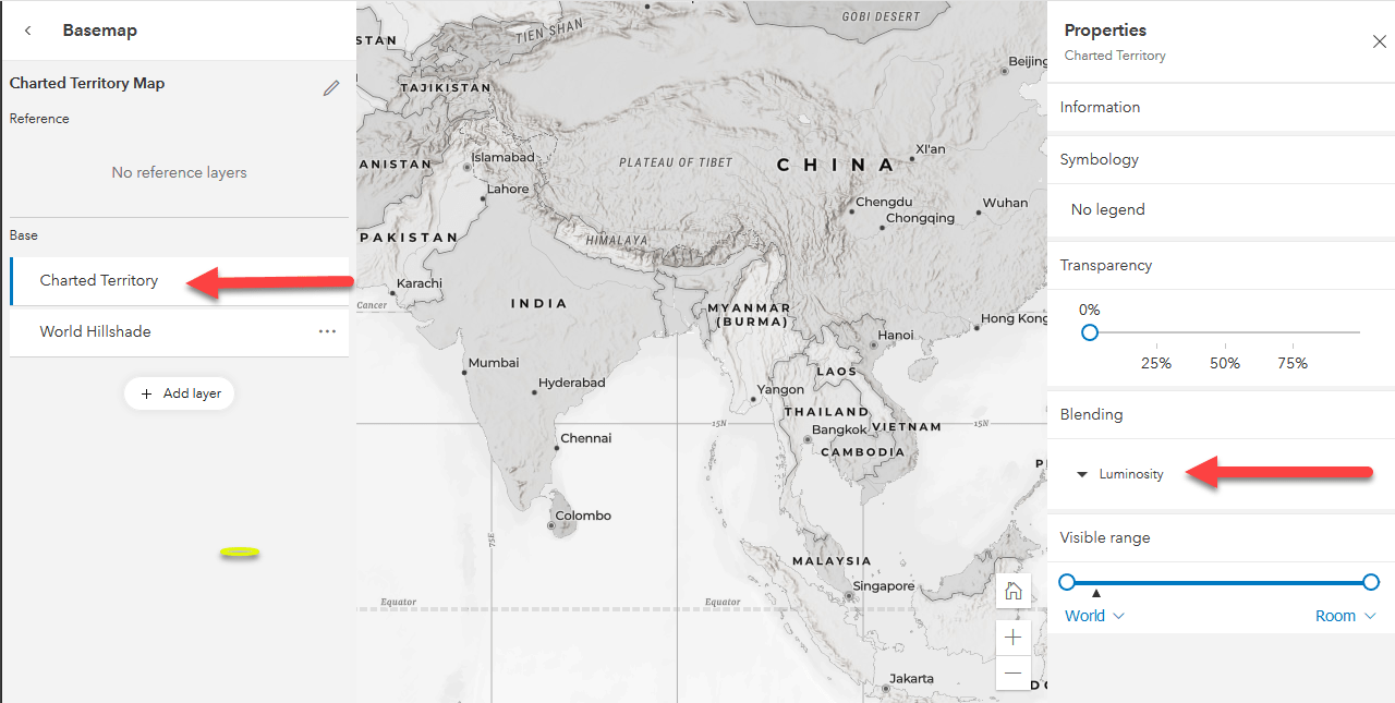
I opened a map in the Beta Map Viewer and switched to the Charted Territory basemap.
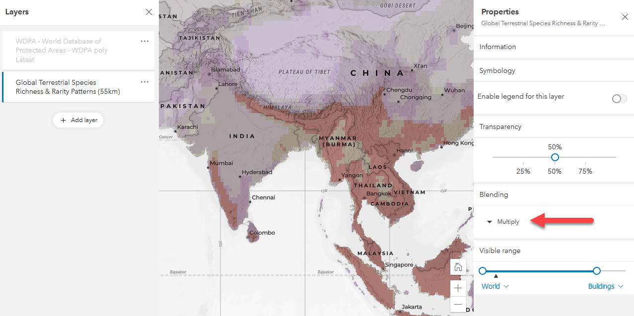
I added the World Hillshade and moved it to the basemap layer underneath the Charted Territory layer. I selected the Charted Territory layer. The blue bar on the left in the table of contents indicates that Charted Territory is the active layer. In the layer’s properties on the right I set the blending mode to Luminosity. This gives me a gray-scale version of the basemap to overlay our layer on:
I added the richness and rarity layer to the map and set the blend mode to Multiply:
In a few minutes I was able to take a layer contributed to ArcGIS Living Atlas by the Half Earth Project and combine it with other layers and create a new map that really makes the layer shine.
In the end I was having so much fun that I couldn’t resist one more map and added the World Database of Protected Areas with the Multiply blend to the Charted Territory map and got this nice effect:
So what are you waiting for?
Take your cartography to the next level and try out Blend Modes!
Special thanks to the Half-Earth Project and Wendy Dorman for creating this layer and sharing it with the GIS community

Article Discussion: