Introduction
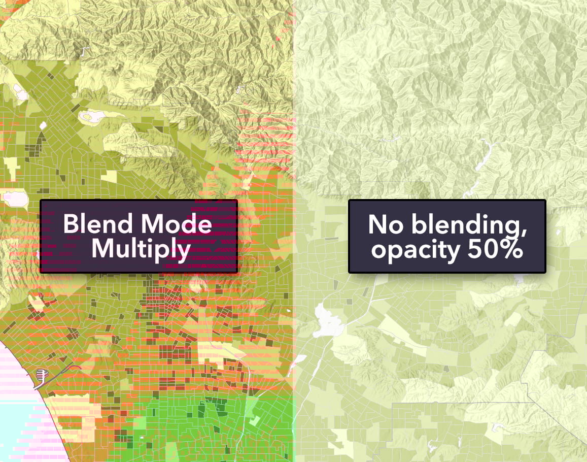
Most of us have used layer transparency, but it suffers from two big drawbacks: it affects the entire layer equally and it tends to wash everything out into a dull average, as if a fog has obscured the once bright color schemes. Think of blend modes as “transparency all grown up”. Blend modes allow far greater control over what shows through and how colors and textures between layers appear. Using blend modes is also a lot of fun and we’ve been using them a lot in our own work.
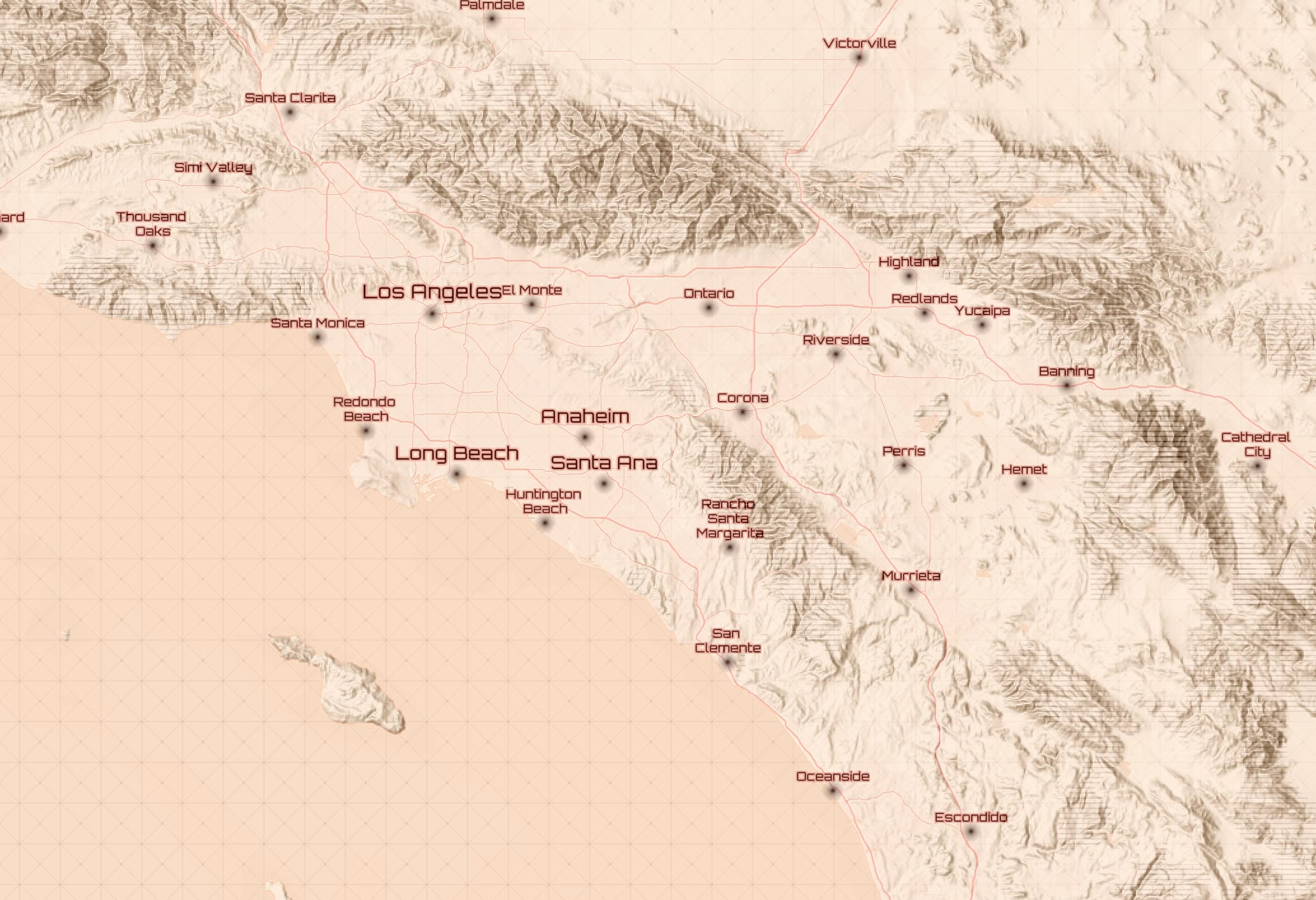
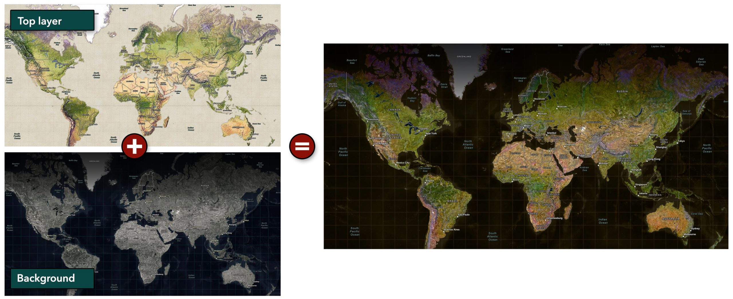
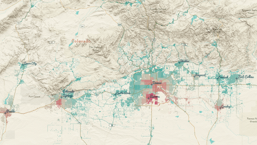
I fell in love with blend modes (also known as ink effects) working in Photoshop. I used them almost daily whenever I need to merge, blend, or multiply two or more layers. Blend modes need two map layers to work their magic. In the example below, a population density choropleth map layer and a grayscale hill-shaded terrain layer have been multiplied. As the name implies, it’s about blending two or more things.
Not sure how this is better than simply dropping the opacity of a layer?
Multiply is just 1 of 32 kinds of blend modes available now in the Map Viewer Beta.
Using various blend modes, you can do things such as target changes to just the lighter pixels but keep the dark pixels unaffected, or shift the colors using a tonal wash or tint but keep the text labels unaffected, or blend the textures from one layer into the fills for another. That’s much more powerful than simple transparency.
Best of all, the layers remain independent map layers. This is all nondestructive. In other words, we’re not changing the underlying data or the original colors of the layers. And I can remove the blend effects with a single click at any time.
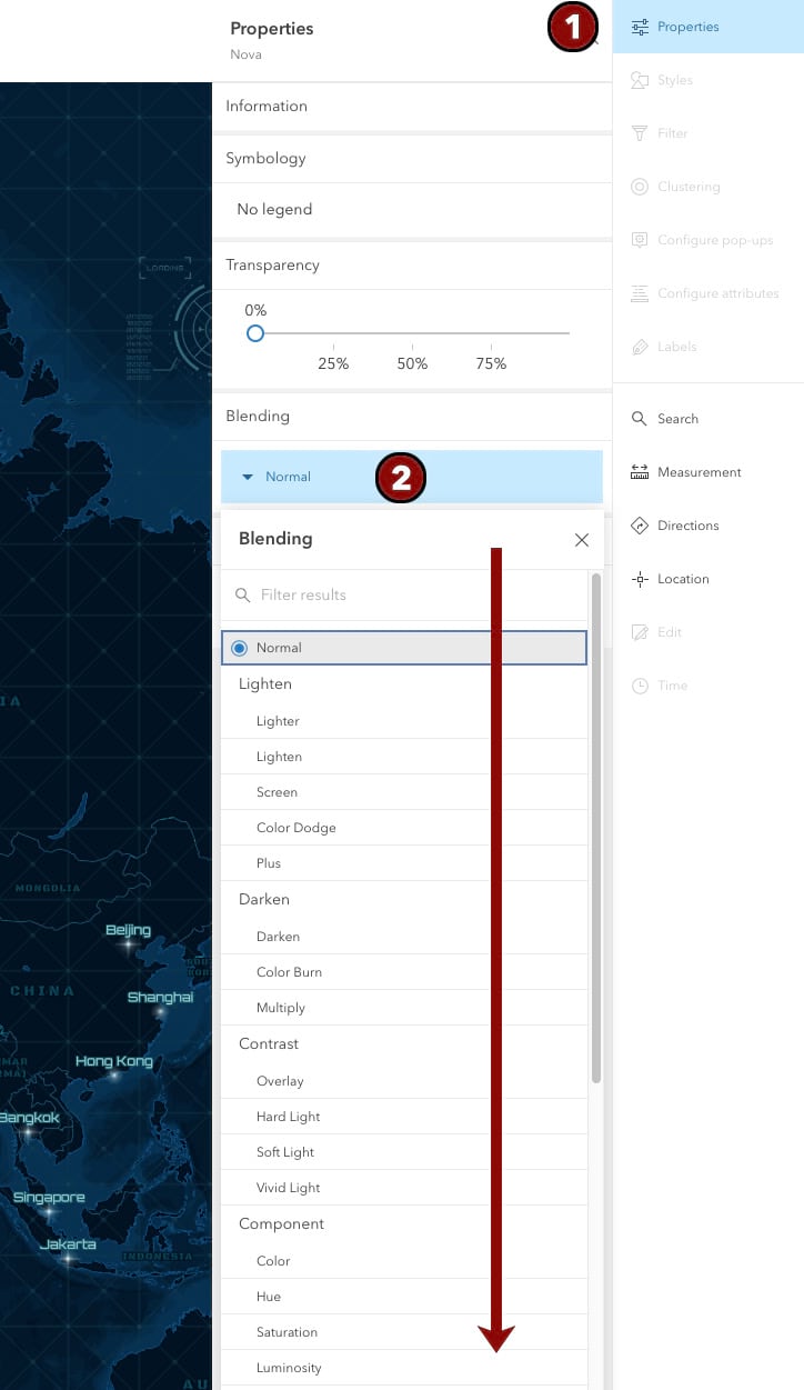
I won’t get into it here but the math of what occurs is pretty interesting. The blend mode rabbit hole can be deep if you use multiple blend modes on multiple layers at once. All of those effects compound and work in concert creating some really unique outcomes (some good, some not so useful). I don’t recommend starting there but instead want to cover the simpler 80 percent of use cases.
My four favorite ways to use blend modes
Here are four quick and easy techniques I’ve been using recently. These cover a spectrum from purely decorative and fun, to a kind of visual analytics in which one layer can be used to condition, or modify, another. Let’s start simple.
Use case 1: Multiply
If I could use only one blend mode, Multiply would be it. The classic is to take a grayscale hillshade layer and multiply it into a basemap without terrain, like Human Geography, or a smart map layer such as population density. It’s one-click simple, so give it a try. See this map in action here.
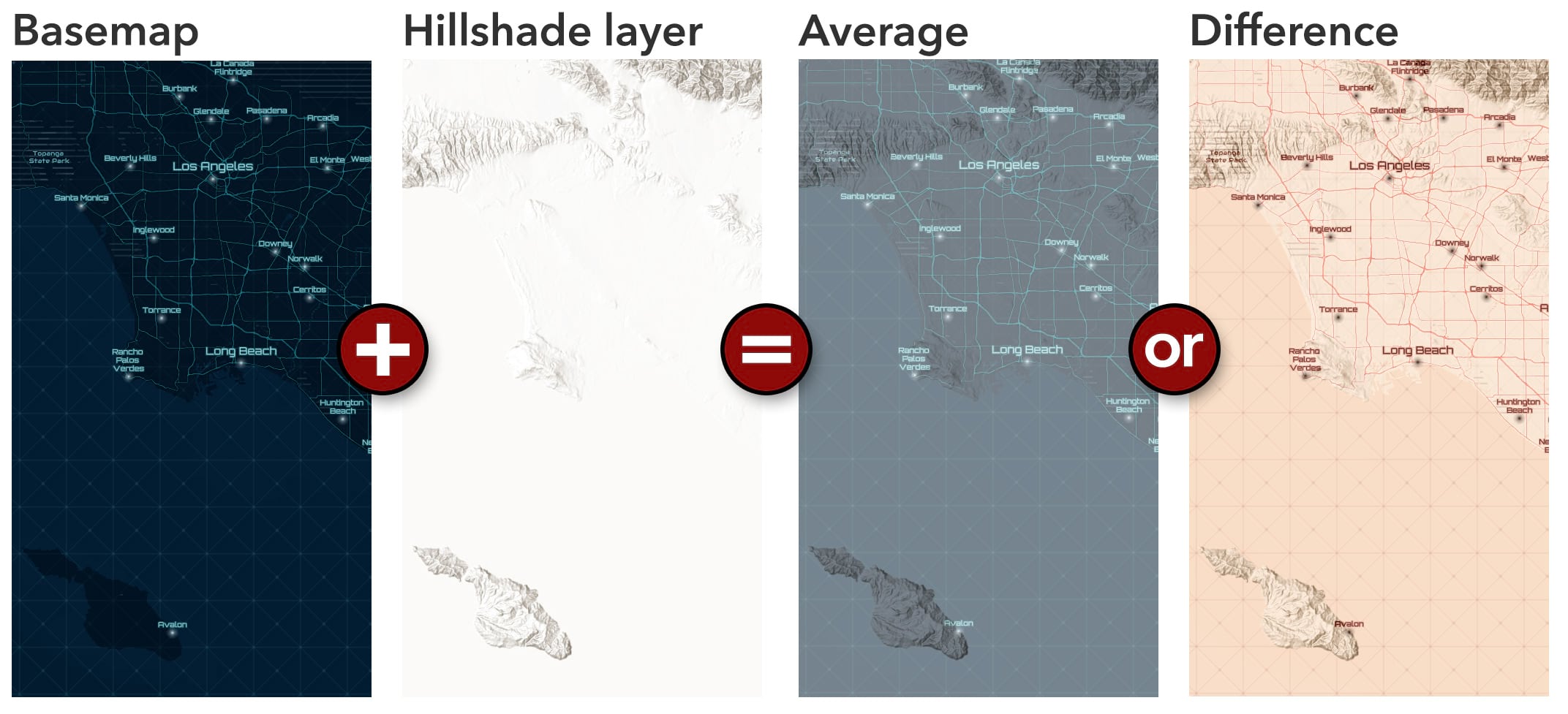
Use case 2: Average and Difference
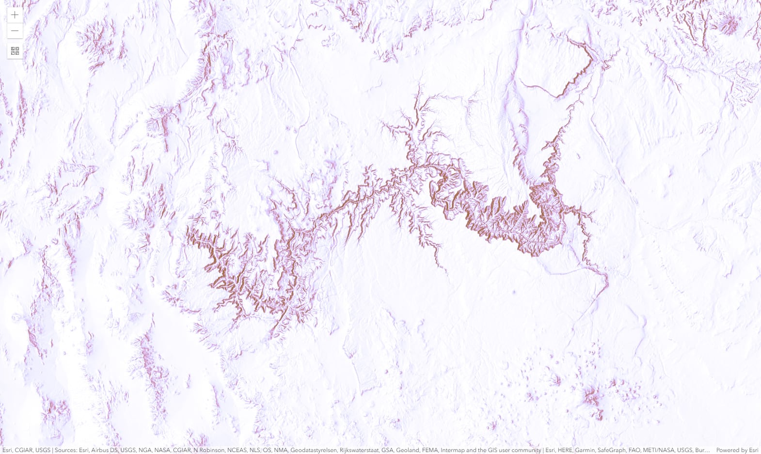
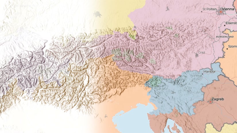
I love the Nova basemap, but it’s dark and trying to inject hillshading into it with the Multiply blend mode doesn’t work. Dark things x dark things = really dark things. In this case, I use the Average or the Difference blend mode with hillshading on top of the Nova basemap.
I like how the text looks in both outcomes. It shifts into a new family of colors, befitting the new map palette. In other words, the blend mode is not simply keeping the old text and changing what’s behind it—though you can do that too—rather, it shifts everything into a new, coordinated palette that looks deliberately designed. It looks like I created two new custom vector tile basemaps, but it was really just one click (don’t tell anyone). Test drive the map here.
Applying “last mile effects” to standard Esri maps and datasets means you don’t have to maintain multiple versions of everything. Popular maps can be restyled and repurposed on the fly without affecting the source item.
Use case 3: Color
My colleague Undral Batsukh shows how powerful blending can be when you selectively control how color, luminosity (brightness), and saturation interact. Here, the vintage shaded relief layer has the Color blend mode applied to it, over the firefly world imagery layer. It creates an effect using the hue and saturation of the top layer and the luminosity of the background layer. This keeps the dark ocean from the firefly but preserves the bright colors of the vintage hillshade for the land areas. The land also shows a nice blended texture from both; see the Amazon basin. See the web map.
Use Case 4: Tint
One of the more peculiar items in ArcGIS Living Atlas of the World was submitted by master cartographer John Nelson: he made a map with just one giant polygon on it. The size of the entire earth and nothing else. A rectangle as big as the world; how does this help us? As seen below, by tinting this polygon, you can add a uniform and subtle color to the entire scene. Even better, using the Color Dodge or Color Burn blend mode (familiar to photographers and Photoshop users), you can selectively add those tints to just the highlights or the shadows.
Want to go one step further? Bring in more than one giant world polygon and give each a unique color. In this example, Esri’s hillshade expert Rajinder Nagi mixes four layers (why not?) using World Hillshade (Luminosity), World Brown Polygon (Lighten), World Purple Poly (Color Dodge), and World Hillshade (Dark). The result is a light, subtle map that keeps its details and is perfect as a new basemap with labels, map symbols, and other features on top. Have a look at an example here.
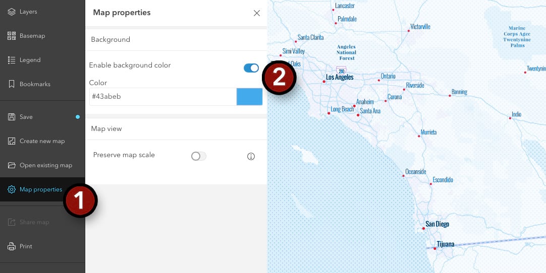
There is an even faster way to add tinting to your work: Use the new “background color” option to set a background color other than white. Look for it in the Map Properties panel. It doesn’t offer quite the same flexibility as the one giant polygon method, but it also takes three seconds to activate and works well in a pinch.
What’s next?
Have fun, experiment, start with Multiply and Lighten and a few of the standard Esri basemaps and hillshade layers. Manipulate the look of basemaps and thematic map layers from Living Atlas or from your own collection. You don’t need to use blend modes on every map, but if you’ve ever thought, I wish I could show both X and Y at the same time without one covering the other, you’re going to love this new feature in Map Viewer Beta.
Want even more? Be sure to check out Part 2 on Blend Modes by Jim Herries who takes us even further into their capabilities.
Happy mapping!

Wow, this might be my favorite ArcGIS Online addition yet! That opens up so many new options for making a good looking map. Surprised to see it in ArcGIS Online before ArcGIS Pro.
so nice to see. I still struggle to bring this blended map into an app. No way of seeing the shaded relief. Any thoughts?
Hi Marco – Does the blending on the web map look fine when viewed in the Map Viewer Beta, but doesn’t look ok in the other app? It could be they’re not yet using the latest 4.x JS API to power that app, so it might just be time before it catches up. For example, if you open a web map with blending in the classic Map Viewer it won’t show the blending.
Wow! Anyone know when it will be available on ArcGIS Pro?
Simon, good news! They’re coming soon to Pro. They’re listed as “near term” here on their roadmap https://community.esri.com/docs/DOC-15230-arcgis-pro-roadmap-july-2020