Understanding when events happen can be just as important as knowing where. With the introduction of calendar heat charts in ArcGIS Online Map Viewer, it’s now easier than ever to uncover temporal patterns hidden within large datasets.
In this blog article, we’ll explore how to use calendar heat charts to analyze fatal vehicle crashes across the United States using the Fatality Analysis Reporting System (FARS) from the National Highway Traffic Safety Administration and provided by Esri in ArcGIS Living Atlas.
Why calendar heat charts?
Calendar heat charts are designed specifically for temporal analysis. They aggregate incidents into a grid based on calendar units—revealing patterns that might otherwise go unnoticed.
For example:
- A yearly view shows patterns by month and day
- A weekly view reveals trends by day of week and hour of day
Each cell represents an aggregation (like count or sum), allowing you to quickly identify spikes, cycles, and anomalies in time-based data.
This makes them ideal for analyzing crash data, where timing—weekends, holidays, late nights/early mornings—plays a critical role.
Bringing in FARS data from Living Atlas
ArcGIS Living Atlas is a curated collection of authoritative geographic content, including ready-to-use layers for analysis and visualization.
For this workflow, you can use the FARS Fatal Motor Vehicle Crashes 2019 to 2023 feature layer, which contains detailed records of fatal motor vehicle crashes across the U.S.
Typical attributes in FARS data include:
- Date and time of crash
- Location
- Contributing factors
- Fatality counts
Building the calendar heat chart
- Open the layer in Map Viewer
- Click Charts → Add chart → Calendar heat chart
- Set the Date field (e.g., crash date/time)
- Choose a calendar type:
- Week by day of week and hour of day for behavioral patterns
- Year by month and day of month for seasonal trends
- Use Count as the aggregation (number of fatal crashes)
What patterns can we uncover?
Using FARS data with a calendar heat chart can reveal powerful insights:
Weekly and hourly trends
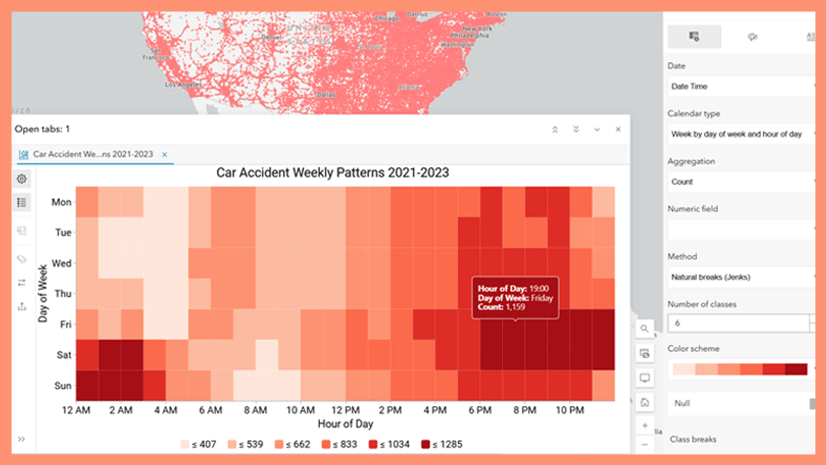
A week view often highlights:
- Higher crash frequencies on weekends
- Peaks during late-night hours
- Morning and evening commute patterns
These patterns align with known behavioral risks such as impaired driving and fatigue.

From this chart, we can see in dark purple, that late-night hours and especially weekends have a highest number of fatal motor vehicle crashes.
Seasonal trends
A year view can show:
- Increased crashes during summer travel months
- Spikes around major holidays
- Variations tied to weather or daylight
Because the chart aggregates across years, it reveals typical patterns rather than one-off events.

From this chart, we can see in dark purple, that summer and autumn months have a higher number of fatal motor vehicle crashes on average than winter and spring months. We also see holidays, such as New Year’s Day (01/01), Independence Day (07/04), Labor Day (07/01-07/07), and Memorial Day (04/25 – 04/31), have higher numbers of fatal motor vehicle crashes.
Geographic trends
Filtering your data by location can show:
- A localized view of when fatal crashes happen
- A comparison of how temporal patterns compare from one geography to another
California

From this chart, we can see in dark purple, that late-night hours and especially weekends have a highest number of fatal motor vehicle crashes.
Texas

From this chart, we can see in dark purple, that highest number of fatal motor vehicle crashes happen at 2am on Saturday and Sunday. These time periods align with bar close in Texas.
Driver Characteristic Trends
Alcohol Related Crashes:
- Increased crashes during late nights and early mornings, especially during weekends.
- Spikes around major holidays

From this chart, we can see in dark purple, that latest hours during weekends have the highest number of fatal motor vehicle crashes due to alcohol-related crashes. These hours align when most people are at bars, and around bar close hours.
Drowsy Driver Related Crashes:
- Increased crashes during late nights and early mornings, especially during weekends.

From this chart, we can see in dark purple that the early hours throughout the week have higher numbers of fatal motor vehicle crashes due to drowsiness, with a peak at 6 a.m. This trend is especially pronounced on weekends from midnight to 7 a.m. These hours align when drowsy-related fatal car crashes peak in the early morning due to a combination of natural circadian rhythm dips, peak sleep deprivation, and the cumulative effect of long work shifts
Transportation Mode Trends
Motorcycle-involved Crashes:
- Increased crashes during afternoon and evenings, especially during weekends.

From this chart, we can see in dark purple, that the highest number of motorcycle-involved fatal motor vehicle crashes happen during the weekend. This corresponds with increased traffic & recreational riding during the weekends.
Pedestrian Crashes:
- Increased crashes during evenings, especially during weekends.

From this chart, we can see in dark purple, that the highest number of pedestrian-involved fatal motor vehicle crashes happen during the evening hours and night hours. This is often attributed to when daylight hours are reduced, and where light conditions are poor.
Why this matters
Calendar heat charts complement spatial analysis by adding a critical dimension: time.
Traditional maps answer:
Where are fatal crashes happening?
Calendar heat charts answer:
When are fatal crashes most likely to occur?
Together, they provide a more complete picture—helping analysts, planners, and policymakers:
- Identify high-risk time windows
- Inform enforcement and prevention strategies
- Communicate patterns clearly to stakeholders
Closing thoughts
The addition of calendar heat charts in Map Viewer brings a powerful new way to explore time-based data. When combined with authoritative datasets like FARS from Living Atlas, it opens the door to deeper insights into real-world problems. Use your own time-enabled data, or other Living Atlas content to visualize temporal patterns with the new calendar heat chart in Map Viewer.


Article Discussion: