In January 2021, President Biden signed Executive Order 14008, titled “Tackling the Climate Crisis at Home and Abroad.” Through this historic initiative, known as Justice40, the administration has made a promise that 40 percent of the benefits of certain federal investments will flow to disadvantaged communities. The investments will bring critical resources to these communities, including creating new jobs and new businesses, reducing energy and environmental burden.
The White House issued formal Interim Implementation Guidance directing all federal agencies to identify and begin transforming their programs covered under the Justice40 Initiative. To help federal agencies identify disadvantaged communities and assess the degree to which a community will benefit from federal programs aimed at climate and economic justice, the White House Council on Environmental Quality compiled the most current data reflecting the environmental and socioeconomic burdens experienced by communities throughout the country and released the Climate and Economic Justice Screening Tool (CEJST). A census tract is identified as disadvantaged if it exceeds the threshold for an environmental indicator and for socioeconomic indicators.
Using CEJST data, we begin by drawing attention to what it means to live in disadvantaged communities by highlighting some of the adverse social and health outcomes experienced by people living in these communities. We then identify the most disadvantaged states and counties in the United States based on the percentage of their population living in disadvantaged communities. Together, our analysis presents a broad picture of locational distribution of disadvantage in the United States and underscores the importance of federal investments to these communities.
What it means to live in a disadvantaged community
Here we demonstrate the differences in various social and health outcomes across people living in disadvantaged communities compared to those living in communities that are not disadvantaged.
Social, Economic and Health Outcomes of Residing in Disadvantaged Communities
| Measure | Disadvantaged communities | Not disadvantaged communities |
| Average life expectancy (years) | 69.5 | 72.5 |
| Population below poverty line | 24.4% | 9.1% |
| Linguistic isolation | 11.9% | 2.35% |
| Coronary heart disease among adults | 17.3% | 11.5% |
| Diagnosed diabetes among adults | 33.9% | 19.6% |
| Median home value | $176,953 | $314,993 |
Note: Numbers calculated based on population-weighted tract level data
Overall, people in disadvantaged communities are poorer, at significantly higher risk of poor health, and live shorter lives. Specifically, in disadvantaged communities, there are five times more people who are linguistically isolated, nearly three times more people living below the poverty line, and nearly two times more people with diabetes. Median home value in disadvantaged neighborhoods is almost half the value of homes in communities that are not disadvantaged. Notably, people in disadvantaged communities live, on average, 3 years less than their counterparts living in other communities.
German sociologist Max Weber famously coined the term Lebenschancen (“life chances”) to refer to the opportunities each individual has to improve their quality of life. Accordingly, different social groups have different life chances, depending on their access to resources, including food, clothing and shelter, as well as education and health care. The adverse outcomes experienced by people living in disadvantaged communities demonstrate that the life chances of people living in these neighborhoods are significantly limited, suggesting that federal programs and investments that provide access to social, economic, and health resources will greatly benefit people in these communities.
Mapping disadvantage in the United States
Now, we will zoom out to look at how U.S. states rank in terms of their disadvantaged population.
Top 10 Most Disadvantaged Communities by State
| Rank | State | Percent of population in disadvantaged communities |
| #1 | Puerto Rico | 94% |
| #2 | Mississippi | 52% |
| #3 | Arkansas | 46% |
| #4 | West Virginia | 46% |
| #5 | New Mexico | 44% |
| #6 | Louisiana | 42% |
| #7 | Alabama | 39% |
| #8 | Oklahoma | 38% |
| #9 | Kentucky | 37% |
| #10 | California | 36% |
Puerto Rico is home to the highest percentage of disadvantaged population, with 94 percent of its population living in disadvantaged communities. Having sustained catastrophic damage from Hurricane Fiona in recent days that knocked out electrical power to the entire commonwealth, Puerto Rico is clearly in need of urgent policy interventions to ease the burden in its disadvantaged communities. It is followed by Mississippi, where more than half of the total population (52 percent) lives in disadvantaged communities.
Now, let’s take a look at the ranking broken down by the top 10 U.S. counties with the highest percentage of people living in disadvantaged communities. Notably, these communities exceed the threshold of five or more (out of eight total) categories of disadvantage, according to Justice40 Initiative criteria.
Top 10 Most Disadvantaged Communities by County
| Rank | County (State) | Percent of population in disadvantaged communities (disadvantage categories exceeded: 5 or above) |
| #1 | Bronx County (NY) | 50% |
| #2 | Coahoma County (MS) | 43% |
| #3 | Allendale County (SC) | 40% |
| #4 | St. Louis City (MO) | 33% |
| #5 | Baltimore City (MD) | 31% |
| #6 | Orleans Parish (LA) | 29% |
| #7 | Washington Parish (LA) | 23% |
| #8 | Los Angeles County (CA) | 22% |
| #9 | Philadelphia County (PA) | 21% |
| #10 | Forrest County (MS) | 19% |
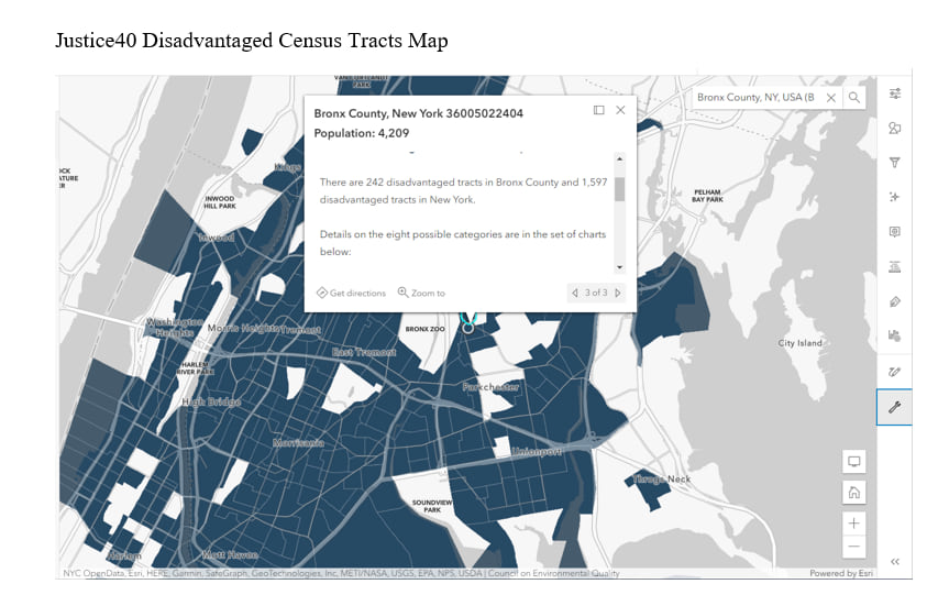
Bronx County has, by far, the highest proportion of vulnerable population of any county in the United States, with half of its population living in disadvantaged communities. In addition, at least one-third of the populations in the following four counties live in disadvantaged communities: Coahoma County in Mississippi, Allendale County in South Carolina, St. Louis City in Missouri, and Baltimore City in Maryland.
This web map of Esri’s Justice40 feature layer provides additional information for each of these communities based on the categories of disadvantage. For example, in Bronx County, 242 communities are identified as disadvantaged in terms of affordable and sustainable housing, training and workforce development, reduction and remediation of legacy pollution, clean transit, and health burdens, highlighting the areas where federal investments could reduce the burden on these communities.
While it is beyond the scope of this article to investigate possible mechanisms behind the numbers, it is hard not to recognize the parallels between the present-day locations of disadvantage and historically redlined areas. A quick look at this feature layer of historical neighborhood-level redlining grades by my colleague Diana Lavery provides insight into how historical and systemic inequalities contribute to present-day disadvantage in our neighborhoods. [i]Looking at this map, we see that almost all of most disadvantaged counties eligible for Justice40 funding, including Bronx, St. Louis City, and Baltimore City, historically received a grade of D, implicating these neighborhoods as hazardous and “infiltrated” with “undesirable populations.”
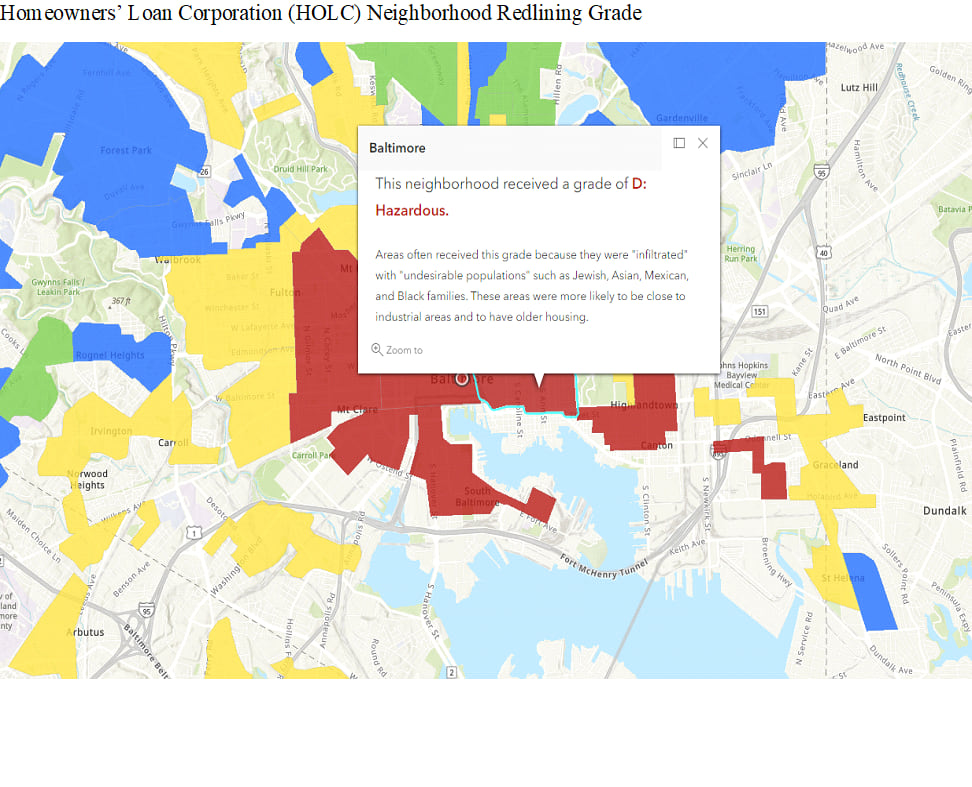
Although the Homeowners’ Loan Corporation’s (HOLC) community classification is no longer legal thanks to the Fair Housing Act of 1968, the effects of severe urban decay and subsequent white flight due to redlining have had decades-long consequences for affected neighborhoods, leading to systematic denial of mortgages, which increased racial residential segregation and reduced home values. These historical practices have had a particularly disproportionate impact on African Americans.
Our next article will take a closer look at racial makeup of the communities eligible for Justice40 funding and address the significance of race in the distribution of disadvantage in the United States.
Find out more about different categories of Justice40 disadvantaged tracts
Find out more about Justice40 Disadvantaged Tracts by State
Find out more about local assessment of Justice40 tracts
[i] Find out more about how historical redlining policies from the 1930s have left an environmental legacy that is visible in cities today


Article Discussion: