The Esri Storytelling with Maps Contest is open for entries. Here are some quick tips from the Esri Story Maps team for how to make the best impression with your story map, not just with the contest judges but, more importantly, with your audience!
Whether or not you are entering the contest, these tips are a handy checklist to make your story maps shine. And if you’ve already entered the contest, judging doesn’t start until the contest closes for entries, so you can continue tweaking your work.
1.
Check your story map in My Stories to make sure it works.
The My Stories section of the Story Maps website lets you automatically check your story maps to make sure that the web maps and data they feature are shared correctly and that your other content is accessible, like all your images. This ensures that people viewing your story won’t be prompted to login or see broken content.
2.
Replace the Esri logo in your story map header with your own logo and supply a click-thru URL.
We often see great story maps where the author has left the default Esri logo in the header. Don’t give Esri the credit for your own story! Adding your logo brands your story as your own and adds authority. Don’t forget to also enter a URL that people can access by clicking your logo. This lets readers get to your organization or agency’s website. Alternatively, turn the logo off if you don’t have one or don’t need to show one. For example if your story map is a personal story, like a travelogue or family history, you most likely won’t want to show a logo. This is all specified in the Settings dialog > Header tab in the Story Map builders.
In most of the apps you can upload your logo graphic directly into the Builder. You can also reference an existing logo graphic that is online via its URL. If you use a URL, make sure that graphic’s URL isn’t going to change or break. We often see missing logo graphics, so we recommend uploading your graphic instead of referencing it. Don’t let this happen to your story’s logo:
![]()
Note: Your story map may automatically be already using your organization’s logo if that logo has been defined as part of the new Shared Theme functionality. This enables ArcGIS Online admins to define various generic app properties, like header color and the logo URL, as Organizational settings so that all apps created by the organization’s members use them by default. See ‘Introducing Shared Theme: a new app styling capability in ArcGIS Online‘,
3.
Take advantage of your story’s header text to convey your organization’s name or brand.
By default, the header text in a story map says ‘A story map’. If you wish, you can edit the header text to add additional branding to your story. You can replace that text with the name of your organization, department, team, or other branding.
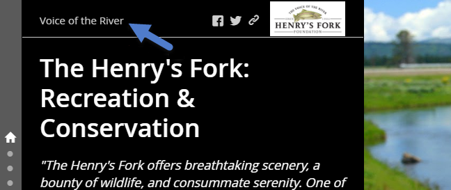
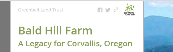
Here’s a good example of this in a Story Map Journal (see below). In this header, the author has included their organization’s logo and used the header text (shown with the blue arrow below) to convey their ‘Voice of the River’ brand. Clicking the ‘Voice of the River’ header text or the logo takes readers to that organization’s website:
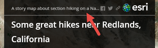
Notice how the header text above is nice and short. The header text is not intended to display a lot of text. In the Story Map Journal in particular, long header text can get truncated on all but the widest displays so it can add clutter. For example the header text below is too long to look good in the Story Map Journal header:
If you provide a click-thru URL for your header text make sure it is what the reader would expect. Some authors are putting their organization or agency’s name in the header text but are not also adding their own click-thru URL, so when readers click that text they get taken to the default click-thru URL, which is the Esri Story Maps website. That’s confusing for readers. Clicking that header text should go to your organization or agency’s website.
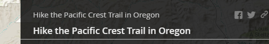
Don’t use the header text to repeat the title of your story map: this is redundant especially in the Story Map Journal where, once readers proceed beyond the home section, the main title automatically appears in the header anyway. Don’t let this happen in your Map Journal:
You can always just keep the header text as the default ‘A story map’ (which people can click to find out more about Story Maps) or remove it altogether. For example if your logo graphic is wide, there’s not much space in the Story Map Journal for any header text. This author hid the header text and the social sharing buttons for a nice, uncluttered look:

If you remove the header text from the Story Map Journal, the social sharing buttons automatically relocate to the opposite side of the header from the logo, giving it a nice balanced look:
4.
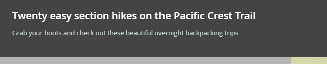
If you use a subtitle, keep it short and interesting.
Try and keep subtitles down to a single sentence or phrase. Long subtitles are much less likely to be read by your readers and can make story maps look cluttered. If readers have to choose between reading a lot of text or exploring attractive maps and images, they’ll likely skip the text and head for the maps and images.
We sometimes see very long subtitles, especially in Story Map Tours, that fill most of the header and need to be scrolled to be read in full. A map tour shouldn’t require that much intro text. If you need to have a lot of text in your story, switch to the Story Map Journal or Story Map Series which are better suited to lengthy narrative text than the Story Map Tour.
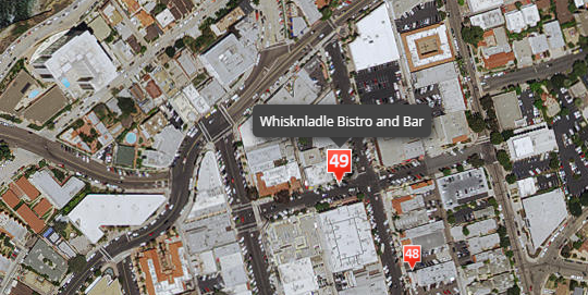
In Story Map Tours you can also put some intro text into the caption of the first image, especially if you are using the option to have the first image be an intro that isn’t represented on the map as a tour point. For example in this map tour showing some places to go in San Diego, the caption of the intro picture is used to provide additional introductory text to set the scene, so that the subtitle in the header can remain nice and short.
Don’t just repeat your title in the subtitle. We often see Story Map Tours like this where the subtitle doesn’t add much to the story:

Instead, use the subtitle to draw people in and make them want to read your story. So a better subtitle might be:
If you don’t really need a subtitle because your title says it all, just leave it out. For example the tabbed Story Map Series below has a great short title that not only tells you where and when but also compels you to read on. No subtitle needed!
5.
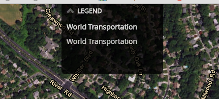
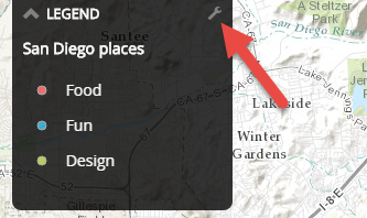
If you show a legend for your map, make sure it is useful.
Does your map need a legend? Don’t just turn the legend on because you can. For example this legend should be turned off:
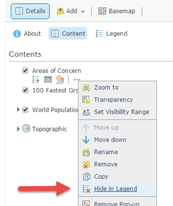
If you choose to use a legend, turn off any entries in the legend that are unnecessary or obvious on your map. For example there’s no need to include US state borders in the legend for your map of the USA. You can remove layers from a web map’s legend using the command in the layer’s menu in the ArcGIS Online Map Viewer:
Don’t forget that in the Story Map Journal and Story Map Series you can do edits to your web map like the one above directly in the builder without opening the ArcGIS Online Map Viewer in a separate browser window. Look for the Edit button in the Edit dialog for the section, tab, etc in your story that contains the map you want to edit.
If your readers definitely need to see the legend in order to understand your map, and you are using the drop-down legend style in the Story Map Journal or Story Map Series, consider using the option to have the legend drop-down be open by default when your readers see the map. This way you don’t have to rely on your readers being able to find and open the legend control themselves. To configure the legend be open by default, look for the little tool control next to it in the builder:
6.
If you reference images using URLs, be aware that they can slow down story performance.
We frequently see story maps that reference very large images on the web via URLs. This can really slow down your story’s load time because images referenced via URLs are not optimized to improve load performance. To add images into story maps, we recommend uploading them by simply dragging and dropping them into the Builder for your app, instead of referencing them via URLs. When you drag and drop images into the Builder, they are automatically optimized for best performance. You can also use images that are already being shared publicly in photo hosting sites like Flickr, which are also automatically optimized.
If you do want to reference images that are on the web directly via URLs, such as images that are already hosted on your agency’s website, avoid images that are much larger than 400KB. If the images are larger than that, you can download the image as a file and then simply upload that file into the Builder for your app instead. If you are creating images that will be referenced via URLs, we recommend using JPG format and saving your images at 80% image quality to reduce file size. You should generally target a maximum file size of 400KB. If you are creating a Story Map Tour or Story Map Shortlist using images referenced via URLs, be sure to create smaller size images for the thumbnails rather than simply pointing at the same URL used for the main image. Large thumbnail images referenced by URLs can really slow down the load time of those place-based apps.
You can find more info about image handling on the Story Maps FAQ page.
7.
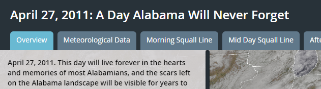
Make it clear to your readers where your story is located geographically.
We often see story maps about a specific place where the authors don’t tell their readers where the place is located. If your story map is about a wetland, make it clear in the opening narrative which state that wetland is in or which city it is near. This helps readers orientate themselves and saves them getting distracted by wondering where the place you are talking about actually is. Don’t make your readers have to zoom out on your map just to see which state or country they are looking at. That’s mental energy they should be expending getting engaged with your narrative and fired up to support your cause!
Similarly, include the name of the country if your story is about an international place or region people may not be familiar with.
It’s true that a lot of story maps are created for an audience who already know where the place is. For example, your wetland story map might be created for inclusion in the website of that wetland’s conservation volunteer group. But it’s a best practice for outreach and advocacy to assume that there will be readers who don’t know where the place is located, especially as your story gets shared via social media.
The Story Map Journal below makes it clear in the subtitle exactly where the place it describes is located. It’s immediately engaging and condenses the message and take-away of the story in a few simple words:
8.
Configure the popups in your maps so they look great, and turn off popups that aren’t needed.
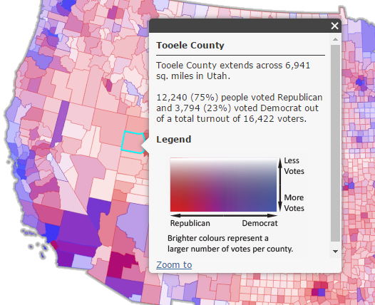
This is one of the biggest issues we see in otherwise great story maps. (And this tip applies to all ArcGIS web maps, not just ones used in the Story Map apps). We’ll be enjoying the narrative, photos and cartography in a story map, but then we’ll click on a feature in a map and get a scary popup containing attributes that story map readers don’t need to know about, like FID numbers, and cryptic looking field names.
If you want your popup to be a list of attributes, configure the popups in the ArcGIS Online Map Viewer to remove unnecessary attributes and enter aliases for those cryptic field names. But for even better results, you can switch from attribute lists and create custom popups for your layers instead. In custom popups you can combine data from attribute fields into reader-friendly sentences like in the example below. See ‘Crafting custom attribute displays in popups‘ by Bern Szukalski.
If a layer doesn’t need popups because it doesn’t have any attributes or it is obvious what its features represent, don’t configure popups for that layer (or turn popups off for it if they are already turned on).
Mastering popups is a useful ArcGIS skill because it lets you tailor how your information appears to your end-users. It’s efficient too because your map’s popup configurations will be used by all applications that you, or others, create using that map. It’s fun and easy as well.
9.
Don’t include too many hyperlinks in your story.
We recommend not presenting your readers with lots of hyperlinks to web pages or other resources like PDF files, particularly not in your story’s introduction. We see a lot of stories where authors start off their narrative with links to other resources. This can be distracting for readers. Your readers aren’t sure if you want them to follow those links or continue reading your story. Plus if they follow those links, they may end up going off somewhere else and not come back to your story.
If readers have to know what a pingo is in order to read your story, simply tell them that they are mounds of ice with on earth on top in your text. Don’t link readers out to the Wikipedia page all about pingos or to a video about pingos.
Aim to keep your story map narrative focused and self-contained. For example if your story map is about a project being planned in a city, don’t feel like you have to link to all the planning documents and resources from your story map. In other words, don’t turn your story map into a website. If you do want to link your readers out to other resources, especially in the very flexible Story Map Journal app, consider waiting until the final section of your story, which is a good time to give readers any additional links so they can dive deeper if they want.
Another way to present additional resources to your readers is to deploy your story map by linking to it or embedding it in a web page on your website, and then adding those additional links to that web page instead of into the story map itself, like in this example by the San Diego Association of Governments (SANDAG). In that example, a story map about a rail corridor project is included as just one of the available resources on the agency’s web page about that project.
10.
Take care when embedding apps in your story map.
It’s a nice feature of the Story Map Journal and Story Map Series that you can embed web content in them, including apps such as other ArcGIS configurable apps. But we sometimes see stories that have too many different apps embedded in them. This can become confusing for readers who have to deal with several different mapping user experiences as they move through your story. Only embed apps if they really enhance your story. Always use the default Fill placement option so an embedded app fills the available display space.
You can embed other story maps inside the Story Map Journal and Story Map Series. Some of these embed combinations work better than others. For example a Story Map Swipe and Spyglass app can make a nice addition to a Story Map Journal. Remember that you can hide the header of the Story Map Series, Story Map Swipe/Spyglass, Story Map Tour or Story Map Basic story map that you embed by adding the &Embed parameter to the end of its URL. This frees up more space for the embedded story’s content and prevents your readers from seeing duplicated headers with your logo, etc. See ‘Embedding a Story Map within a Story Map‘ and ‘Embedding apps and websites in Story Maps‘ if you want to combine story maps in this way.
You’ve read this far, so how about three extra bonus tips!
Bonus Tip 1:
Story Map Tours tend to look best and have the most room for your captions if you use landscape orientation images and try and use the same size and shape images all the way through. The Map Tour can handle a mix of image sizes and shapes, but if you are able to standardize the size and shape, the tour may seem to flow more smoothly for your readers as they progress through and they won’t be distracted by changing image sizes. For example this story map about places to eat in San Diego uses 4:3 aspect ratio main images throughout.
Bonus Tip 2.
Although the Story Map Tour builder doesn’t currently support rich text formatting when you edit captions, you can use HTML tags to format caption text, add hyperlinks, etc. The Places to Eat in San Diego map tour example mentioned above in Bonus Tip 1 uses HTML tags to format and organize the caption text. Note that when you click on a hyperlink in the captions in that tour, the link opens up in a new tab in your web browser. This is important in Map Tours because if they open in the same tab as the Map Tour, the Map Tour will reload from the start if the user presses Back in their web browser to go back to the tour, and they’ll lose their place in the tour. Use the HTML _target=”blank” parameter in hyperlinks in Map Tour captions to ensure that they open in a new tab.
Bonus Tip 3.
If you are using the ‘Imagery With Labels’ basemap in the map(s) in your story, remember that basemap currently doesn’t show labels for streets and roads. So it can be hard for readers to orientate themselves in urban areas:
However it is easy to add street and road names into your map by adding the World Transportation layer. This layer is designed to overlay the ‘Imagery’ and ‘Imagery With Labels’ basemaps. Here’s the same area of La Jolla, California shown above with the World Transportation layer added into the map:
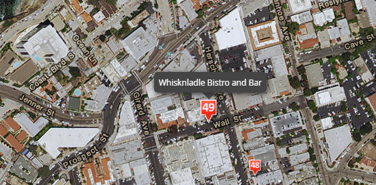
For example, adding street names to the map made it easier for readers of this map tour about a marsh reserve to orient themselves.
You can preview what adding World Transportation on top of imagery will look like for your area of interest using this web map. (This tip applies not just to story maps but to any map or app you make with ArcGIS).
Good luck with the Esri Storytelling with Maps Contest!!
More things to look at:
- Tips for creating a great Story Map Cascade
- Tips for creating a great Story Map Crowdsource
- Ten essential steps for Story Map success
- Story Maps FAQ
- Story Maps Resources
- Story Maps Gallery – go here to get inspired and get ideas from some great examples from Esri and your fellow authors. Use the menus on the left hand side to filter by app, subject, or industry. Or do keyword searches to fish out stories similar to yours. See what you think works or doesn’t work. For example is your story about capital improvements in your city or county? Search for that subject in the Gallery and see how some others have tackled it.
(This blog post was originally published on April 28th 2016 and has been updated)
Article Discussion: