Most often we think about Data Engineering in the context of “engineering” your data. To clean, transform, and prepare the data to do something with it. However, regardless of what you want to do with the data, the first step is to know what data you’re dealing with.
The fields panel of the Data Engineering view in ArcGIS Pro can help quickly visualize the data on a map, through charts, and provides quick navigation to the attribute table. Let’s take a quick tour.
Explore fields using Symbology
If you’ve ever worked with spatial data in ArcGIS Pro, using symbology to create a beautiful and compelling map is something you’ll already be familiar with. But what Data Engineering offers is a quick way to update the map symbology while performing exploratory data analysis. By displaying fields on a map, you can explore where features are located, how values are distributed in space, and whether any places are missing data.
Explore fields using charts
Graphical representations aka charts are powerful tools to get to know your data. The create chart button in the fields panel, automatically picks the most useful chart type to visualize your fields based on its data type. For numeric fields, you’d see a histogram; for text fields, a bar chart; and for date fields, a line chart is created. Or if you want to pick another chart type, simply right-click the field and choose a chart from the available chart types in the Create Chart menu!
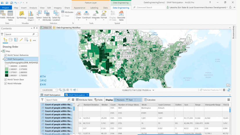
Explore fields using attribute table
Attribute tables are widely used to dive deeper into each field’s attributes. For many of us, it might be the first thing we open to explore the data (at least it was for me before Data Engineering!). But when you have hundreds of fields in your attribute table, navigating to fields of interest can become difficult. The Data Engineering view allows you to quickly go to your field of interest in the attribute table.
Learn more about exploring fields in the Data Engineering documentation


Article Discussion: