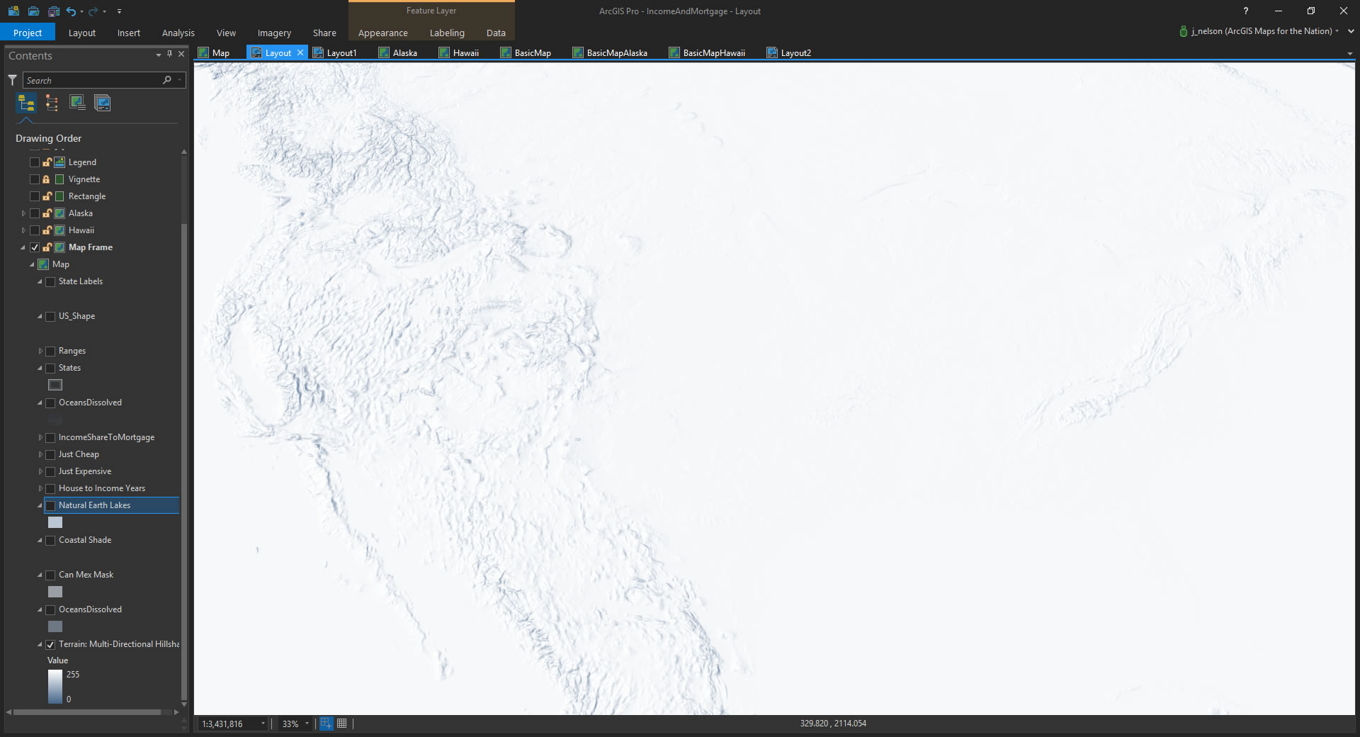
Here’s a run-down of all the general steps required to cook up this map, which happens to show the relative burden of home ownership:
It was created for this story map, of the same name:
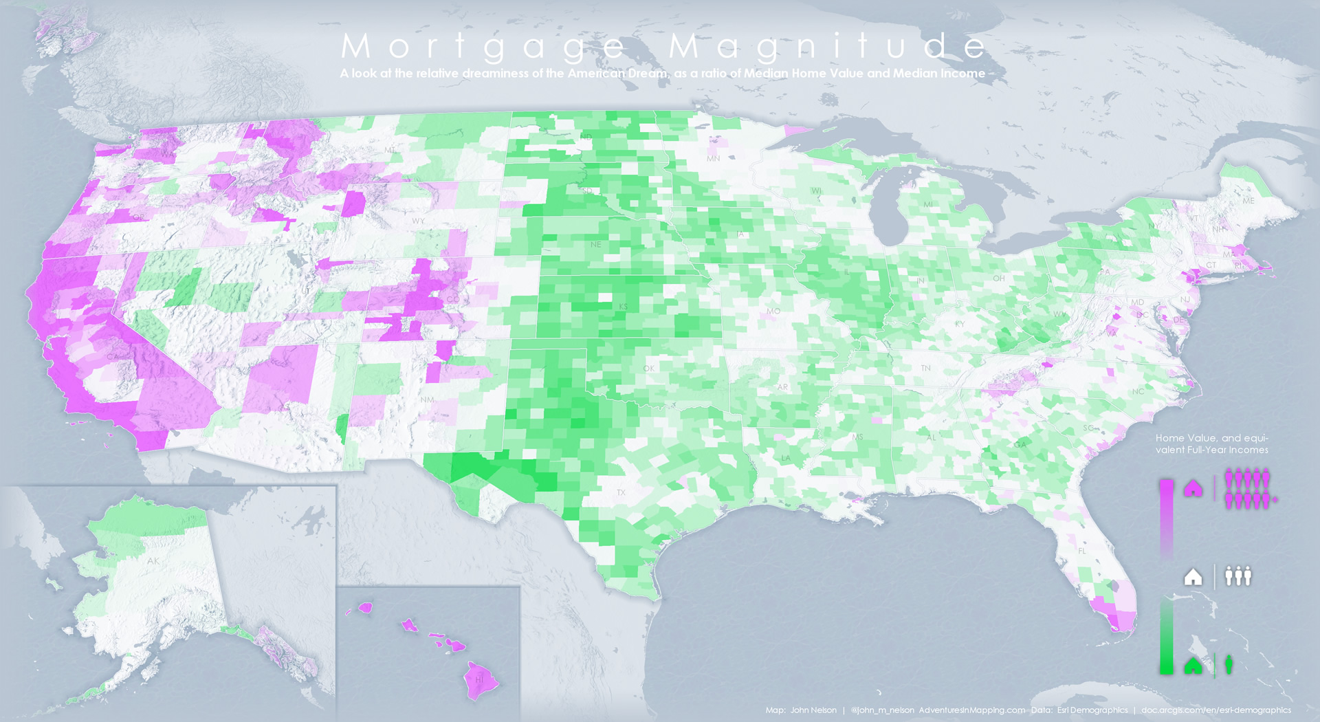
In it, I map the ratio of median home values to median income, pretty much showing how many years of life you trade for a home. Of course real life is more complex than that, but the use of basic comprehensible values for a map can really spark a conversation, even among the more barbed of internet commentators.
Ready? Ok, Time to Plop Down These Layers One at a Time…
Blue Hillshade
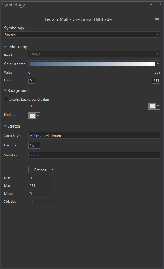
Hillshade is a great way to provide a bit of texture and geographic context to a map. I pulled in the luscious Multidirectional Hillshade from the Living Atlas of the World. Did you know you can browse the Living Atlas right from the “Add Data” dialog in ArcGIS Pro? It’s true. I’ll show you…
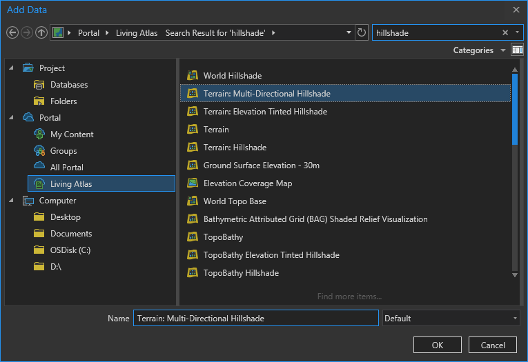
This is an image service from Esri, but you can still play with the symbology in Pro! Check it out. By opening the Symbology panel of the layer, you can change the color scheme and even give it your own color scheme.
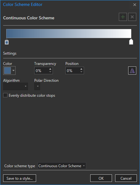
I was inspired by the hues used in this beautiful NYT Great American Eclipse photo map. So I made a custom twilight-ish color scheme using a similar ramp from blue to white.
You can get to the custom color ramp builder by expanding the color scheme dropdown and clicking “format color scheme…”
Oceans
Next I added in an ocean layer, to help define the geography. I like Natural Earth Data because the layers are well organized and available in a handful of handy formats. Here it is with a light blue fill…
Projection
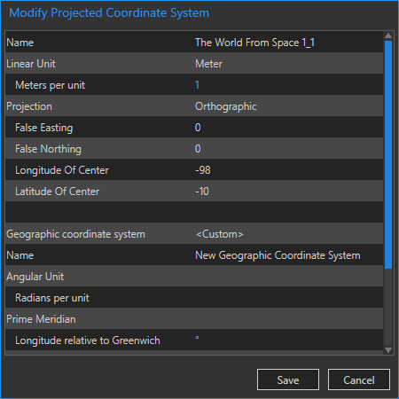
Say, did you notice the cool projection? Sometimes I like to use a spherical appearing map projection, and offset my view so that I can see the curvature or the earth, with my area of interest draped across our wonderful planet. It gives a sense of tangibility and scale that I like, whether I’m mapping a missile test or the diaspora of refugees.
In these cases I used The World From Space projection and edited the parameters (in the list of coordinate systems, right click one and choose “Copy and modify” to monkey with it) so that the area of interest was pushed up toward the top of the sphere.
Focus Mask
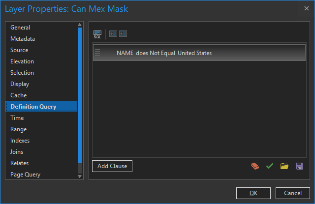
Now that the land is distinct from the waters, let’s bring our area of interest into further focus by adding a Countries layer to cover up everything, except the United States, with a semitransparent fill. How to do that?
I found a Country layer on the Living Atlas, then added it to the map and gave it the same fill color as the ocean, but semi-transparent. To punch out the US, I added a small Definition Query to exclude it.
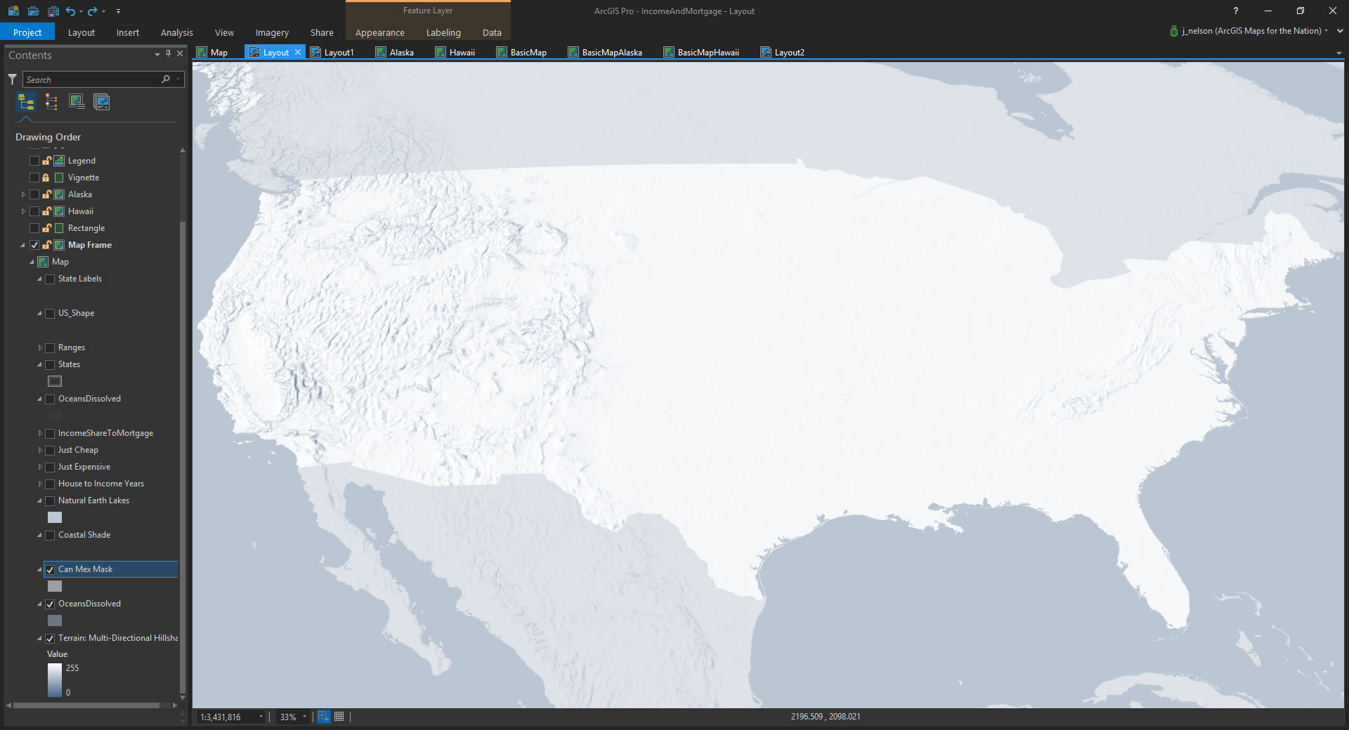
I like that! But it could be better.
Drop Shadow
Many folks think that a glow effect isn’t supported in Pro, but you can totally get there. There is a stroke symbol option that lets you define a gradient, so the effect along the perimeter of a polygon is a glow. Or drop shadow, depending on your inner sense of light. It looks like this…
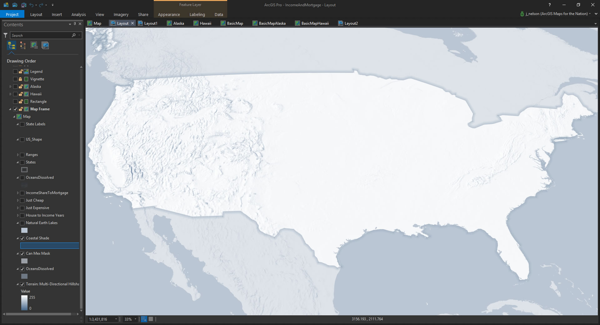
Yes! There is now no question as to where I’m supposed to be looking. Figure and ground, figure and ground. Well, in this case it’s sort of upper ground and lower ground. But whatever. Here’s what that like gradient dialog looks like…
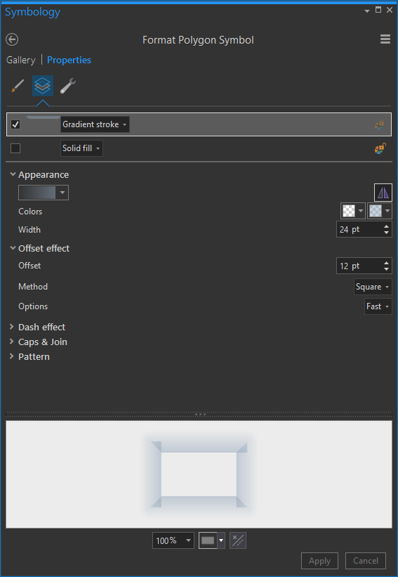
For thick strokes like this, Pro will center the thickness over the geography. So I added an offset of half the thickness, so my fake shadow would render on the “outside”.
Lakes
Being from Michigan, I understand keenly that the visual recognition of shape of the United States is heavily dependent on the Great Lakes. America’s Inland Seas. Here is a layer I added from Natural Earth, given the same color as the oceans.
These lakes, in addition to looking cool, provide some subtle spatial context for folks looking at the map.
Ocean Texture
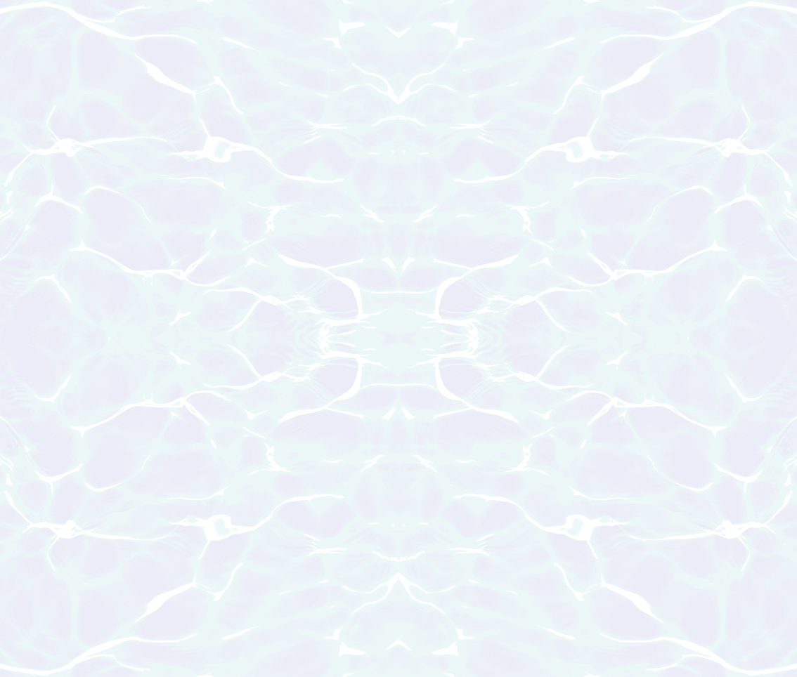
That ocean looks awfully flat, though. I know flat design is in, but I can’t help lobbing in a bit of skeuomorphic texture here and there. I like to give the oceans a bit of a faint chop. It’s really light, but here it is added in…

Now those oceans look more en-thing-ified, and less like abstract boundaries. I just duplicated my ocean layer, and gave it a picture fill…
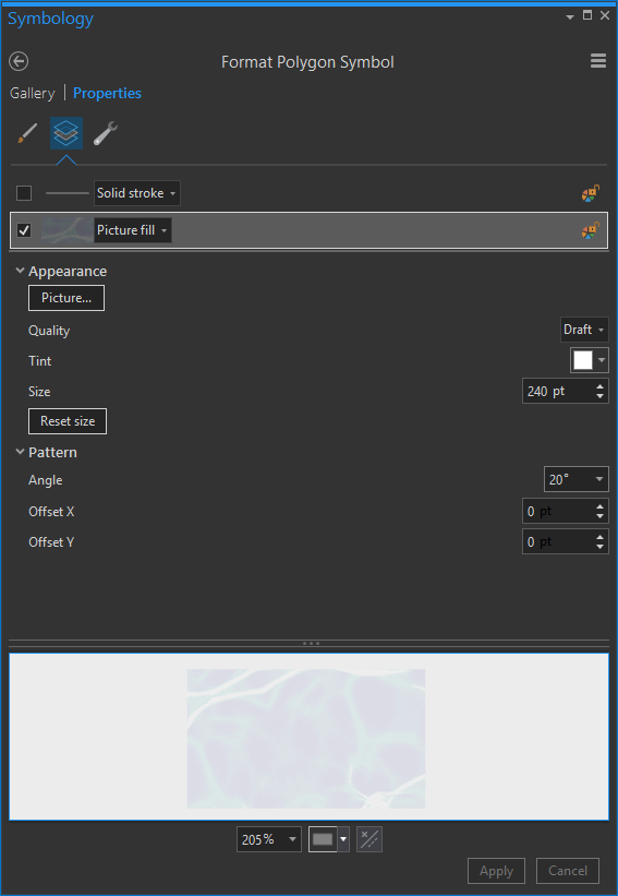
You can steal mine if you like it. It’s mostly transparent, and repeats well. But promise me you’ll use this water surface image for good instead of evil.
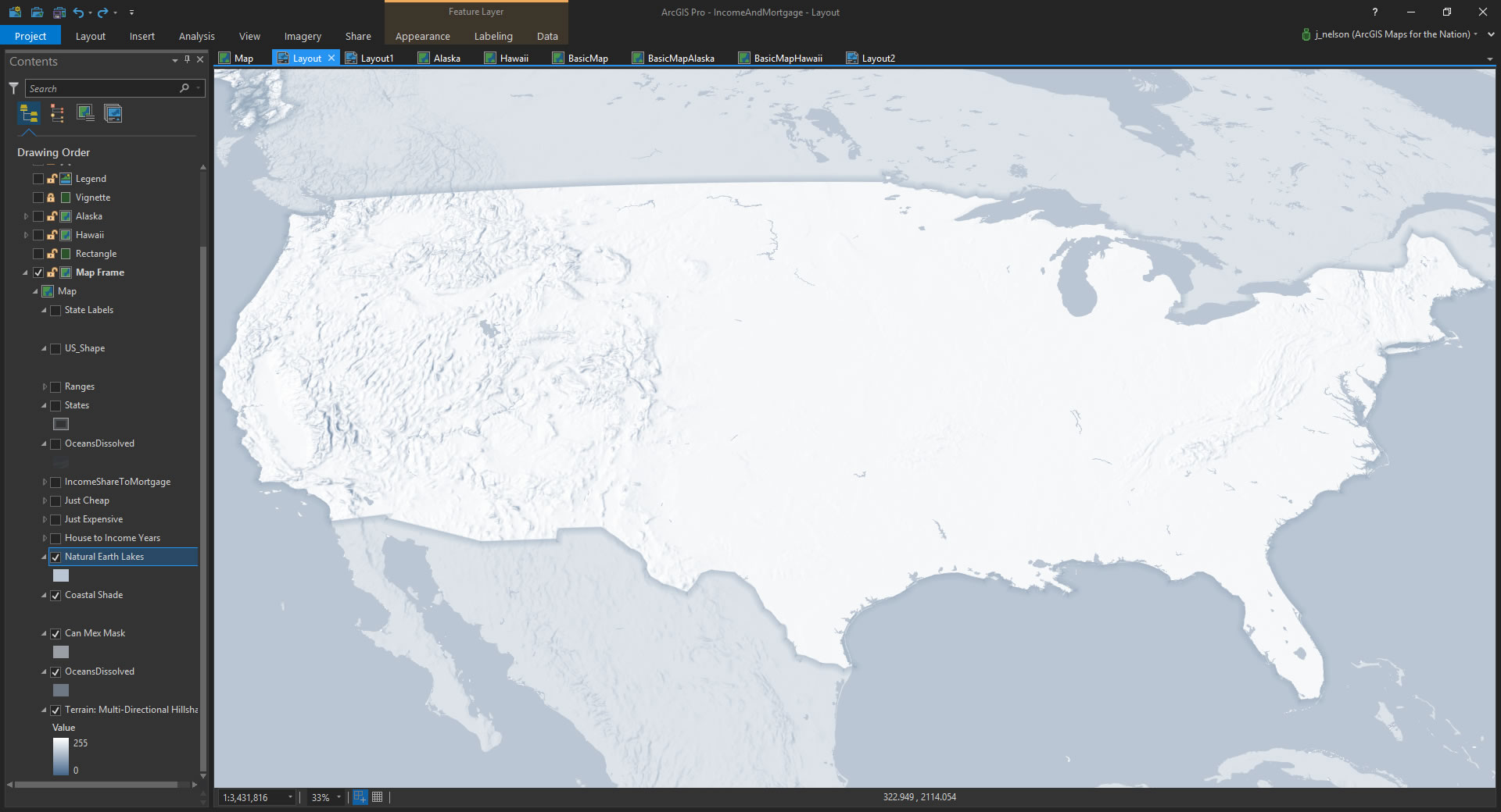
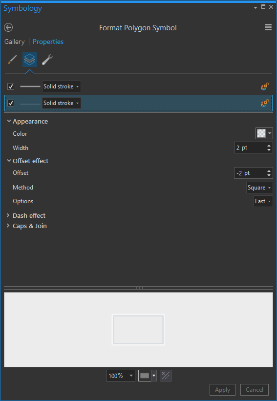
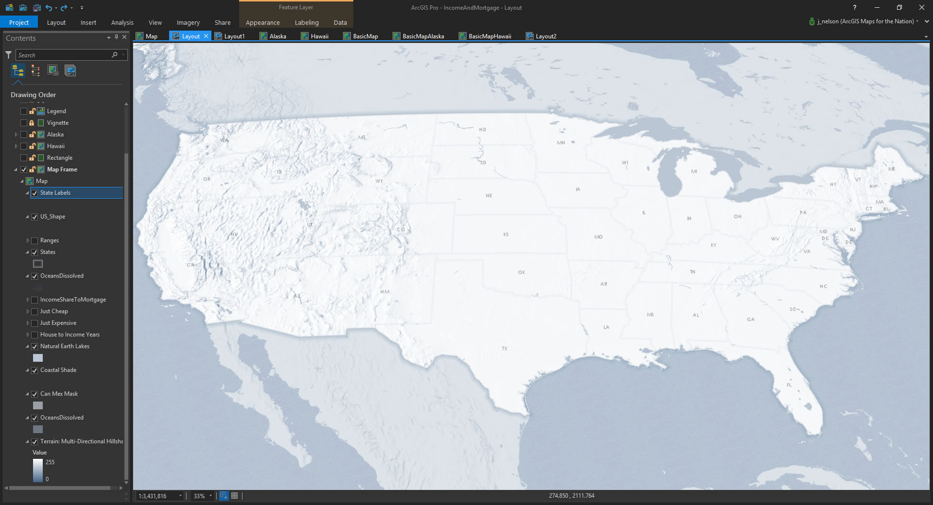
State Boundaries
Speaking of geographic context, it’s time to add a faint layer of state boundaries. This lets folks know more specifically where they are looking and can give them anchors to make specific observations once we have the thematic data layer in there. Here are the states added in…
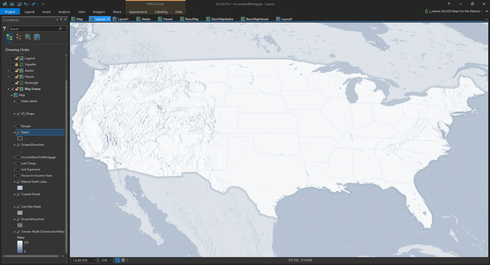
If you look closely, you might notice that the states are thin white lines with shading. This is just a layer with two line strokes applied to it. Here’s how to do that:
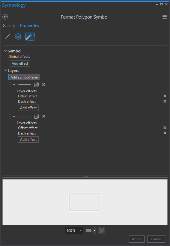
So there are two lines. One line is white, and one is semi-transparent black, with an inner offset. That means the black line is nudged inside the polygons a bit, giving the effect of a double stroke that is visible over both light and dark surfaces.
Labels
Ok, then labels. Tiny little faint abbreviated labels. No need to go bonkers here.
The Data!
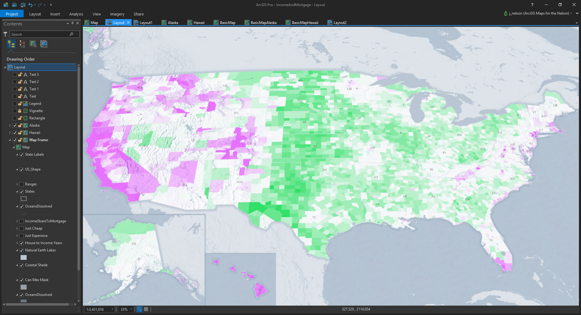
Whew! A lot goes into a basemap like this. But we’ve just established the stage, or “ground.” Now for the data funzo. Here is a county layer (that I got from the fine accommodating folks at Esri Demographics) where I’ve calculated the simple ratio of Median Home Values and Median Income. What does that show us? Just the number of your allotted years on this Earth it takes to trade for a house!
Whew, I got light headed there. I always nearly hyperventilate when thinking about economics and ratios. And this is both!
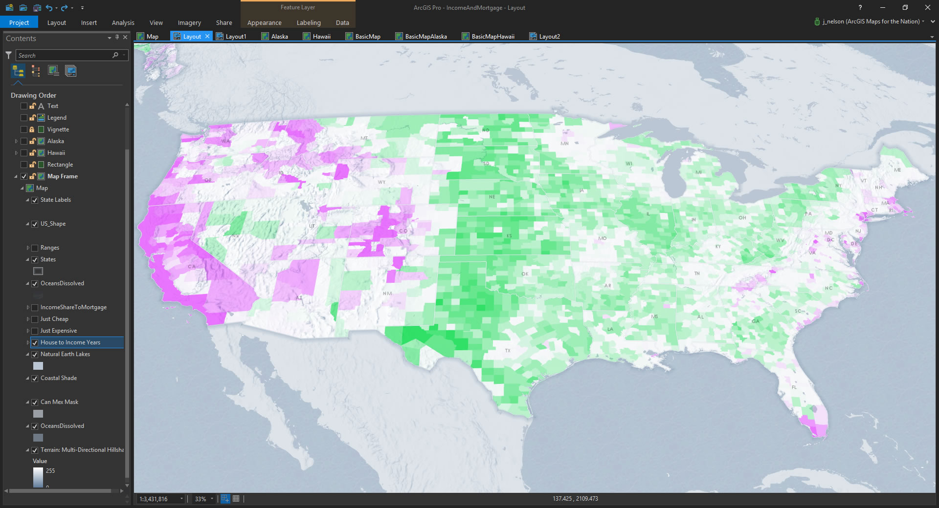
Scrumptious. But what about our friends in the extremities? Worry not, Alaskans and Hawaiians, I have you covered!
Insets
I duplicated my map view twice, and gave each an appropriate projection. Then I inserted them into the layout in their conventional (though admittedly less-than-ideal) lower-left nook. Happy to have them.
Marginalia
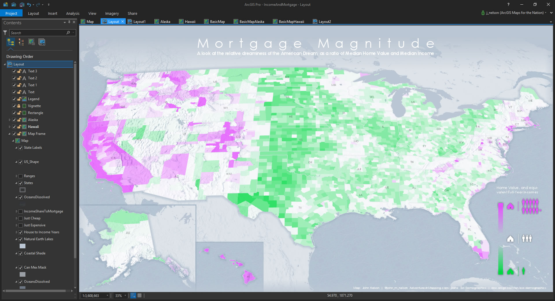
Our geospatial work is done, my friend. All that remains is some map minutia. Here it is with some text fields inserted for a title, citation, and legend label…

…and of course a tidy little legend graphic that I cooked up in a graphic design program. Wait, what? An external program? Of course. I didn’t design the font (it’s Century Gothic) in Esri software, and you aren’t reading this blog in an Esri Browser. We use the tools that let us best accomplish our goals. So I whipped up a little legend in Illustrator. Specialization gave us the Industrial Revolution. The magic is in blending great technologies.
And that’s it! That’s the map. A big old stack of layers with lots of transparency, lots of thinking, and lots of cartographic fun-having.
We live in amazing times and get to do interesting work. I hope you picked up a tip or two in this diatribe that you’ll be tempted to employ in your own maps. But most importantly I hope you have a great time doing it!
Bwa ha ha ha haaaa!
Give Up or Are You Thirsty For More?
Well, if you’ve come this far, perhaps you’ll come a little further. Over at AdventuresInMapping, I’ve whipped up small multiple and animated versions of this map so get ready to live and stuff.
Happy Mapping, John


Article Discussion: