We have gone through the data preparation with ArcGIS Notebooks in ArcGIS Pro in part 1 and forecasted daily new confirmed cases in part 2 of this series. This third blog article is the final part to show how we can forecast cumulative confirmed cases of COVID-19 at the US county level with the Time Series Forecasting toolset. Check out the demo below from the UC 2020 plenary to get a quick overview of these forecasts and analysis, if you haven’t got a chance.

Visualize and explore the data
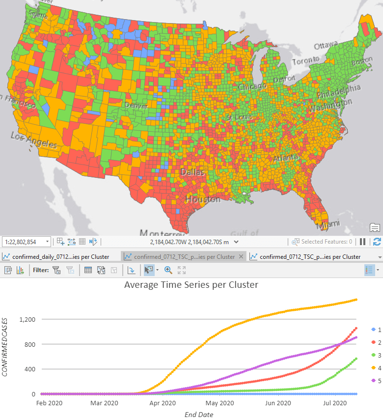
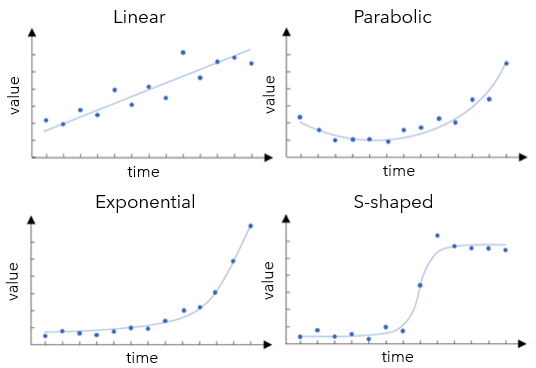
The first step is to have a quick check of what the data looks like. Running Time Series Clustering and checking the Average Time Series per Cluster chart is a good place to start. If you skipped previous parts of the series, you can find a sample space-time cube to run inside the ZIP file. As we can see in Fig 1, the Time Series Clustering tool shows that the cumulative data follows either a linear, exponential, or an S-shaped curve. We can use this result to inform how we apply the Curve Fit Forecast tool.
Forecast with Curve fit forecast tool
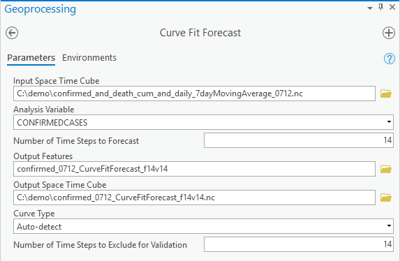
Since the curve shape of cumulative confirmed cases appears to vary among counties, we can use the default option of the Curve Type parameter, Auto-detect, to make two-week forecasts by specifying Number of Time Steps to Forecast as 14 for this daily data. If we were sure, for instance, at the beginning stage of the disease spread, that all these counties followed an exponential growth, we could choose the Exponential curve. Or in another scenario, if social distancing and other interventions had helped to flatten the curve effectively for all counties in the study area, we could choose the S-shaped (Gompertz) curve. Since we know that the disease is not in the same phase in all of the US, we will choose Auto-detect to find the best curve type location by location.
The choice of curve type is based on validation with the last 14 days, as we set the Number of Time Steps to Exclude for Validation to 14. After you hit the run button, internally, for each location, the tool first fits a linear curve with all the time steps except for the last 14 time steps, then calculates a Validation RMSE for the last 14 time steps. We call this a Validation run. Then the tool fits a new linear curve with all the time steps and computes the forecast. We call this a Forecast run. Secondly, the tool does a validation run to fit a parabolic curve and compares its validation RMSE to the linear curve validation RMSE. If the new validation RMSE is smaller, then the parabolic curve has a better fit, so the forecast is computed using the parabolic curve. On the contrary, if the new validation RMSE is larger, the forecast won’t be run for the parabolic curve and the tool will move on to the next curve type, which is an exponential curve. The same process is repeated for the exponential curve and S-shaped (Gompertz) curve, resulting in a forecast using the curve with the lowest validation RMSE. The default is to use the last 10% data as validation, and the upper limit is 25% of the total time steps. To get the ideal choice of the curves, we suggest using 20%-25% if possible as validation. Now you understand all the parameters, you can try out the tool!!
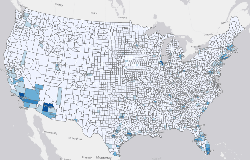
The Output Features are also symbolized with the forecasted value of the last forecasted time step, as in all the four tools in the toolset. As shown in Fig 4, with the darker shade of blue showing higher forecasted values, we can conclude that Los Angeles, Phenix, and Chicago are forecasted to have the highest cumulative cases in the next two weeks, followed by many counties in southern California, Arizona, Texas, Florida, and the Northeast.
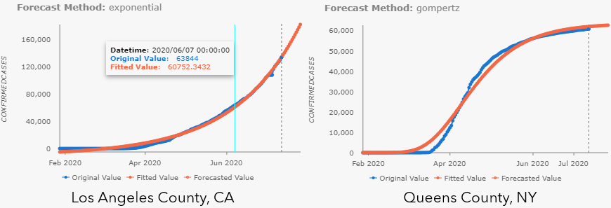
Pop-up charts are also automatically generated in the Output Features. The only difference for Curve Fit Forecast is that there are no confidence intervals for this method. As shown in Fig 5, exponential curve is chosen for the cumulative confirmed cases in Los Angeles County, CA, meanwhile, S-shaped (Gompertz) curve is chosen for that in Queens County, NY.
Additionally, tools from this toolset won’t overwrite the input cubes as previous Space Time Pattern Mining tools. Instead, you can get an optional output, an Output Space Time Cube, to carry all the results, which is useful if you want to:
- Save all the observed data and forecasted data at one single cube.
- Use as a candidate for running Evaluate Forecasts by Location tool.
- Use as input for running Emerging Hot Spots Analysis, Local Outlier Analysis, and Time Series Clustering.

Evaluate various methods and create a hybrid cube
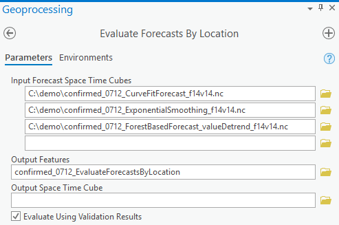
One of the things we really love about this toolset is that it can evaluate which model and which curve type that we’ve used works the best location by location. Just remember to generate the output forecast cube every time you run the forecast tools and use them as input cubes in the Evaluate Forecasts by Locations tool. It can choose the best method either based on Forecast RMSE, which is a measure of overall fitness of model in the forecast run or based on the Validation RMSE, which is the measure of forecasting power of the model in the validation run, by checking the checkbox for Evaluate Using Validation Result. It’s recommended to start with using Validation RMSE since it’s checking if the forecast model from a shorter dataset has good forecast power. See Fig 7 for parameter setting in the tool.
Some tips here:
- You don’t need to have the same Number of Time Steps to Forecast in each input cube in either mode, but the final outputs will only contain the shortest forecast steps.
- But you do need to make sure you have the same Number of Steps to Exclude for Validation if you want to use Validation RMSE to compare, otherwise, you will not be able to run the tool. This information is saved in the Forecast Method field in the output features of the forecast tools, as well as in the metadata of the output cubes, but for the convenience of use, a recommended practice is to include validation steps and forecast steps as part of output cubes’ name, e.g. “_f14v14” as a suffix in our case.
The result is also symbolized by the forecasted value of the last forecasted time step, in our case, this is 2 weeks later. Alternatively, we can visualize by Forecast Method by downloading the layer file and importing symbology to output features. By applying this symbology, we can see whole swaths of the country in Fig 8, where exponential smoothing was chosen, in blue, where the Forest-based Forecast model was chosen, in purple, and other areas where curve fit was chosen in shades of orange. If the pandemic were following the same pattern in every county, we’d expect the map to be dominated by a single color. Since this is not the case, we can see just how complex modeling this pandemic is, and how valuable it is to have multiple methods available and the tools to evaluate them. Since the Forecast Method field contains all parameter information, the symbology for exponential smoothing and forest-based may not work directly to the output features. In this case, you can grab the color and add unlisted values in the Symbology pane.

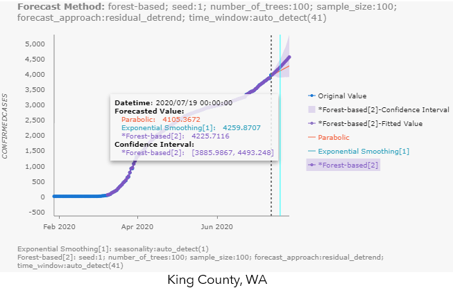
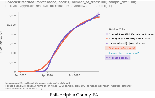
The highlights of the visualization outputs for this tool are the pop-up charts, which contain ALL the alternative forecasts from each of the input cubes! This makes it extremely easy for us to compare the different forecast methods. You can hover over the chart to check the forecasted values and confidence interval (if applicable) for each method, like shown in Fig 9.a for King County, WA. You can also click the label names to the right of the chart, to make the unselected method appear, like the S-shaped (Gompertz) forecast in Philadelphia County’s pop-up chart in Fig 9.b.
So, with this tool, you can:
- Compare multiple cubes with different forecast methods, and
- Compare multiple cubes from Exponential Smoothing Forecast but with auto-detected season length and two or three different pre-set season lengths, and
- Compare multiple cubes from Forest-based Forecast with different forecast approaches and controlling other parameters like the time window.
The possibilities are endless.
There are so many applications for this type of time series forecasting. Everything from store sales to energy usage. In the next article, part 4 of this series, we will switch gears to another dataset, U.S. state-level data of natural gas consumption, to dive deeper into visualizing and interpreting forecast results with Visualize Space Time Cube in 3D and the Space Time Cube Explorer for ArcGIS Pro 2.6.

Article Discussion: