Have you ever heard the term “apply an equity lens” and thought, “What in the world does that mean?” In this post, we are going to talk about applying an equity lens to your index. Let me break it down for you. When we talk about equity, we are talking about fairness and justice. And for something to truly be equitable, we need to be specific about where needs are, and who within those spaces needs the benefit of programming, policy, and/or investment.
For example, rural Hispanic, Asian, and Indigenous students get in trouble at school more often than their peers and receive harsher penalties. Imagine that your organization is focused on helping school-age Black and Brown boys thrive and have built a solution to build diverse teacher workforce pipelines and strategies to get buy-in from teachers, administrators, and parents for an equal school experience in both rural and urban places. The inequity to rectify in this example is the school experience for black and brown students.
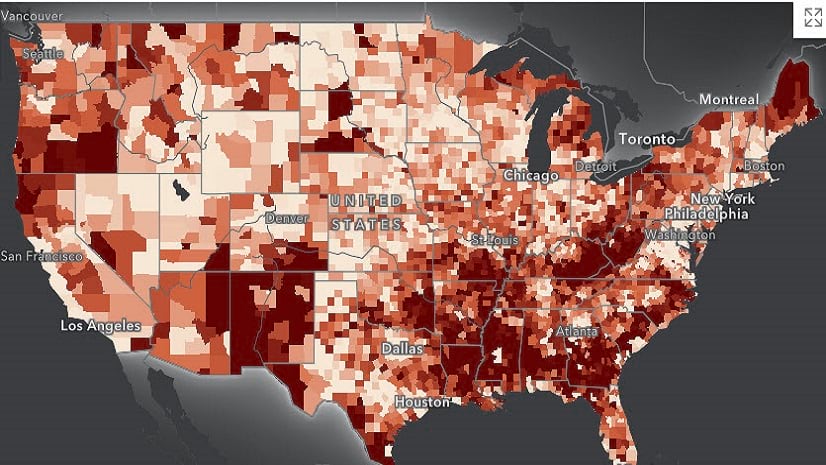
Good example: Economic Distress Index
There are many datasets that come disaggregated by race and ethnicity like Census American Community Survey (ACS) data has many variables (like household income) that include race disaggregated tables. We should be using more of these disaggregated data if we want to better understand how patterns of equity are distributed across social groups. This information, in turn, will give businesses, and organizations a better understanding of the communities they are operating in or serving, and help policymakers target interventions.
As an example, we can visualize racial disparities in household income. We made an economic distress index using household income data and race-disaggregated data tables. We calculated the share of groups in each census tract and added that information to our data. So, when you click any community on the map, in the popup, you get information on economic distress as well as the share of race groups in each tract. To get an overall picture of racial disparities in household income, we use quantile classification to show economic distress scores for each group.
Background
With a composite indicator, we can take a complex issue and break it down into smaller, more manageable pieces and build them into a single index. The index tool is helpful for identifying where potential inequities exist, but we would like to build on this idea and determine who is experiencing inequity.
Unfortunately, an index is often built either by grouping all people of color or completely leaving out race and/or ethnicity. For example, grouping all African American, Asian, American Indian, and Hispanic folks into a group called “communities of color.” So! We thought it would be helpful to show a simple way to take an index and give it a little more depth by breaking down who is living in an area by quintile and race. Keep in mind this is just an example and not a definitive analysis.
We’re building off the blog post that showcases how to use the Calculate Composite Index tool to build a single index. As a recap, the analysis looked at county-level data, not broken down by race, and combined pre-existing risk factors and vaccination rates to demonstrate how an analyst might create an index of Severe Influenza Risk. We want to take this index further to separate the groups of people in each county. In this case, we will need to add race data after the fact.
An important note here is that county-level data is not ideal, it’s too big, census tract or block group is better because this determines what can be done with the data and what conclusions can be drawn from the data. We really want to build an index from the lowest level the data is collected to add a deeper level of detail to the decision-making process.
Distribution by quintiles
When thinking about an indicator or outcome think of them as benefits or burdens. That means, does this indicator benefit the community or burden it? Then think about how it is scored. In this case, higher values show more risk of severe influenza, therefore those values represent burden. Alternately this line of thinking more simplistically is, where within the counties do we need to make investments to fix the inequity? Let’s look at the distribution of severe influenza risk.

For our racial equity and social justice (RESJ) work, we like to use quintiles or deciles to look at distributions because it is a useful way to measure inequity. Typically, inequity is centered on the spread across a given group or population. In this case, we are looking at the distribution of severe influenza risk amongst the general population. In this example, we can use symbology to bin the data into quintiles or directly output quintiles from the tool. This means the population is divided into five equal parts based on their percentile rank.
The quantile method used for symbology is different from just quintiles in that you can pick any number of classes to split the data into. The tool isn’t limited to just 5 or 10 classes you can pick however many quantiles is appropriate for your analysis. So, the first quintile contains the bottom fifth of the population for severe influenza risk (i.e., the 20% of the population with the lowest risk). That means the fifth quintile represents the 20 percent of the population with the highest risk. Before we jump too far ahead, let’s walk through some basic steps to take to apply an equity lens to your index.
Steps to apply an equity lens to your index
Step 1: Transform the data into percentages
For this scenario, we’ll be intersecting race and severe influenza risk. Some other factors to add on could be gender, sexual orientation, disability status, languages spoken, income level, or lack of educational attainment. This really depends on the questions you want to ask of or answer with the data. Moving on, the simplest way to get normalized data is to use the percentile column from the composite index output. This allows us to use transformed data on a 0 to 100 scale to be broken down into quintiles (i.e., 5 data classes) because percentiles go from 0 to 100, which helps us standardize the outputs.
For example, median household income represents the 50th percentile. We interpret everything about the median to be higher income and everything below as lower income. The Calculate Composite Index tool outputs both raw index values, as well as the index values represented as a percentile rank from 0 to 100. Percentiles measure the relative ranks between values as opposed to comparing their raw values. Percentages will resolve outliers or skewed data issues and can be easily turned into quintiles.
Step 2: Use quintiles to symbolize the index values

Step 3: Join data by geography
This step is straightforward—it’s, basically, perform a join by either attribute or a spatial join between the index data and the race data. Data sources can be from the Living Atlas, American Community Survey (ACS), or another source with data at the same granularity with indicators specific to your challenge.
Step 4: Visualize disaggregated data – Try ArcGIS Dashboards

We have reviewed the quintile map and understood that the fifth quintile represents the highest risk for severe influenza risk. Therefore, the dark purple areas show higher risk. Now we can answer the question, who across these areas may be experiencing the most risk?
In the ArcGIS Dashboard, we can quickly see high-level patterns within each group and the proportion of folks within each quintile. American Indian and Alaska Native folks have a higher proportion of people living in higher-risk counties. So, when we think about programs, policies, and/or marketing to decrease risks associated with severe influenza more strategy needs to be in place to reach this audience.
Disaggregate the index
Data disaggregated by race and/or ethnicity is a crucial step in any analysis for ensuring equity in our society. By breaking down data into more specific categories, we can begin to uncover patterns of inequity and better understand which groups of people are being most affected by certain policies or practices. But disaggregating data by race is not just about understanding disparities—it also provides the opportunity to create solutions that address specific groups in a meaningful way. If you already have data that was collected in a disaggregated way, you can look at your data broken down by race directly. We’ve gone through a way to estimate this breakdown when your data is already aggregated without race.
GIS professionals have a unique opportunity to tackle complex social issues by combining their expertise in spatial data analysis with a commitment to equitable, inclusive outcomes. In this blog post, we are showing one way to disaggregate the index by race which is just one approach to applying an equity lens. The end goal is to create a more meaningful and accurate way to use a composite index for real-world applications, from economic development initiatives to healthcare policy reform.
Consider an equity score
Consider an equity score for digital equity as an example. This score serves as a performance metric that enables comparison across various equity initiatives, such as food access, internet access, or quality healthcare, to name just a few possibilities. Imagine the potential if all these initiatives had a comparable score, allowing for performance measurement across all programs
Wrap-up
When done strategically and thoughtfully — using both qualitative and quantitative methods — disaggregated data can help us identify where interventions need to be made for everyone to have equal access and opportunities regardless of their social identity or socio-economic background. We don’t have disaggregated data here, but we were able to indirectly estimate some of the inequity. Having the data measured by race directly is the best way to ensure you can accurately apply your equity lens. This kind of analysis allows decision-makers at all levels to invest directly in the people in places with the greatest needs. This workflow is incomplete because it only focuses on mapping, analyzing, and operationalizing the data. It does not include managing performance or engaging communities. But we need your help to make the world a more just and equitable place – start collecting disaggregated data, by race, in your organization or community.


Article Discussion: