One of the most important components in a supervised image classification is excellent training sites. Training an accurate classification model requires that your training samples represent distinct spectral responses recorded from the remote sensing platform – a training sample for vegetation should not include pixels with snow or pavement, samples for water classification should not include pixels with bare earth. Using the spectral profiles chart, you can evaluate your training samples before you train your model.
If you use the Training Samples Manager, it’s one simple step to create the chart. If you created your training samples separately, where each polygon or point is a different record in the feature class, it just takes a quick geoprocessing tool before creating the chart if you want to look at the average spectral profiles for each class all on one graph.
The purpose of this blog is not to go through the entire image classification workflow from end-to-end, but simply to show you how to use spectral profiles to guide you in creating training samples.

Of course, remotely sensed imagery with large-ish pixel sizes (e.g. Landsat with 30m resolution) is bound to have multiple land cover categories within a single pixel. Still, it’s important to create good training samples in regions where pixels are easily identifiable as a given land cover type, and these samples become even more important when working with lower resolution data or when trying to identify more land cover categories.
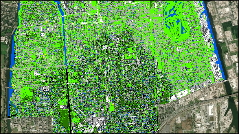
In this example, I used image classification to get an understanding of the amount of land used for agriculture in the Imperial Valley in Southern California, a region situated in the Colorado Desert with high temperatures and very little rainfall.

Scenario 1: With the Training Samples Manager
Using the Training Samples Manager in ArcGIS Pro to generate training samples allows you to create a feature class that’s already organized by class name and class ID according to a schema.
In this analysis, I’m using a schema made up of five land cover types: Barren, Planted/Cultivated, Shrubland, Developed, and Water. Using the drawing tools, I’ve created several training samples for each category. Each time I draw a new training sample, a new record is added to the list in the Training Samples Manager. If I tried to use the Spectral Profile Chart with that many training samples, I’d have to select every record for each land cover class. Instead, I’ll use the Collapse tool to combine all the training samples for a given class into a single record. Then I’ll click the Save button to save my training samples as a feature class.

Scenario 2: Without the Training Samples Manager
If you have a feature class with training samples that you created outside of the Training Samples Manager, where each training site is a separate record in the feature class, you need to run the Dissolve geoprocessing tool before creating a chart if you want to see the average spectral profiles for all your training samples at once. Use the class name or class value as the Dissolve field to combine all records associated with a given land cover class into a single multi-part polygon.
To view the spectral profile for one training sample at a time interactively (e.g. to view each individual training site for Developed), skip this step entirely and start working with your chart.

Charting the Spectral Profiles
At this point, using your imagery and the training samples feature class, you can create your spectral profiles chart:
- Right-click on the image to be classified in the Contents pane
- Select Create Chart > Spectral Profile
- In the Chart Properties pane, choose Mean Line as the Plot Type.
- Use the Feature Selector tool to select one of the polygons. Remember that because we used Collapse, selecting one polygon means you are selecting all the training sites for the land cover category represented by that polygon.
- Symbolize the profile lines to match the color of the land cover type and change the label name so you can easily assess the chart.
** Pro Tip: To change the label of the profile, type the name in the Label field on the Chart Properties pane and hit TAB ** - Try out different chart types to see the types of information you can glean from them – do you see outliers? Consistent trends? Similar profiles? Distinct categories?
Below is the spectral profile chart I created using the imagery and training samples for the Imperial Valley study. I used the “Medium” (grey) theme in the chart to make it easier to view the profiles.

Assessment of Spectral Profiles
At first glance, I can tell that the Planted/Cultivated, Water, and Barren land cover classes have profiles that are distinct enough that I can expect good initial results for classification of these classes. However, the Developed and Shrubland profiles are a little too close for comfort: they have the same general shape and the average reflectance values are similar at each wavelength. From this, I can choose whether I want to re-create my training samples or simply combine the two categories into a single class. Theoretically, combining the Shrubland and Developed into one class shouldn’t impact my analysis because my main focus is an accurate estimate of Planted/Cultivated land cover.
Before making my decision, I’ll take a deeper look at the data. The chart below is the same data in a Boxes plot, and I can hover my mouse over the boxes to get the statistics for each land cover class at each wavelength band.

From the Boxes chart, I can see that the Developed and Shrubland land cover classes have similar average values and similar distribution. However, the Developed land cover type has much higher maximum reflectance values across all wavelengths, and Shrubland has lower minimum values. This makes sense – I would expect developed areas (buildings, roads, parking lots, etc.) to be brighter in general than shrubby areas.
Since the Boxes chart tells me that the minimum and maximum values vary so much between the classes, combining these two classes into a single class could potentially confuse my classification model and impact the overall accuracy. Instead, I’m going to re-create the training samples for the Developed class to capture those higher reflectance values.
The charts below include the spectral profiles for my modified training samples.

Now, in the visible and near infrared bands especially, you can see distinctly higher reflectance values for the Developed land cover training sample data compared to the Shrubland spectral response. With these results, I would be comfortable moving forward with my classification workflow by training my model with all my training samples.
Extra Credit
For bonus points, I used the Multispectral Landsat image service from the Living Atlas to quickly visualize NDVI in the Imperial Valley area. Then I used a spectral profile chart to compare NDVI averages in different areas of interest for vegetation health assessment. Use the steps below to try it yourself:
- In ArcGIS Pro, open the Map tab and select Add Data.
- From the menu on the left, expand the Portal option and select Living Atlas. Use the Search box to search for “Multispectral Landsat.”
- Select the Multispectral Landsat image service and click OK.
- Zoom to Imperial Valley or your area of interest.
- Make sure the Multispectral Landsat service is highlighted in the Contents pane. In the Image Service contextual tab set, select the Data tab.
- In the Processing group, click the Processing Templates drop-down.
- Scroll down to NDVI Colorized. Select this template to display the colormap for NDVI.
- Right-click on the Multispectral Landsat image service in Contents and select Create Chart > Spectral Profile.
- Use the drawing tools to select multiple small areas of interest to compare NDVI distribution throughout the region.

Want to know more?
Try the Image Classification Wizard tutorial
Learn more about the Training Samples Manager


Commenting is not enabled for this article.